New Looks for a New Season
 Sunday · Aug 21 · 2011 | 7:48 PM PDT
  98 Comments
 As a long summer starts winding down, we're now less than a month away from training camps across the NHL getting underway. But before that, I wanted to do a quick run-through of all the new jerseys we'll be seeing this fall. And believe it or not, I have a few surprises in store.
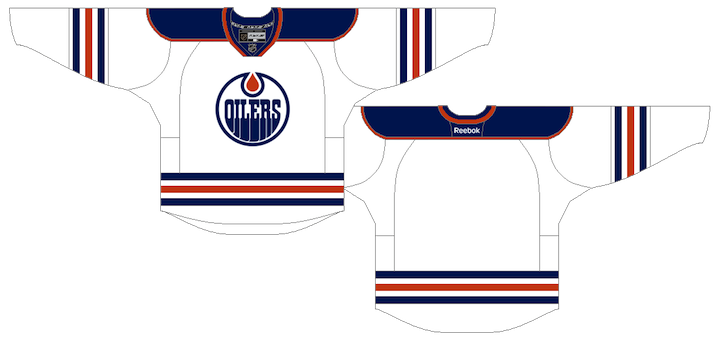
Edmonton Oilers
Fans have been begging for it for years, and the Oilers have responded. This new road jersey pays tribute to the original white sweater the Oilers wore from their NHL inception in 1979 to 1996.
Florida Panthers
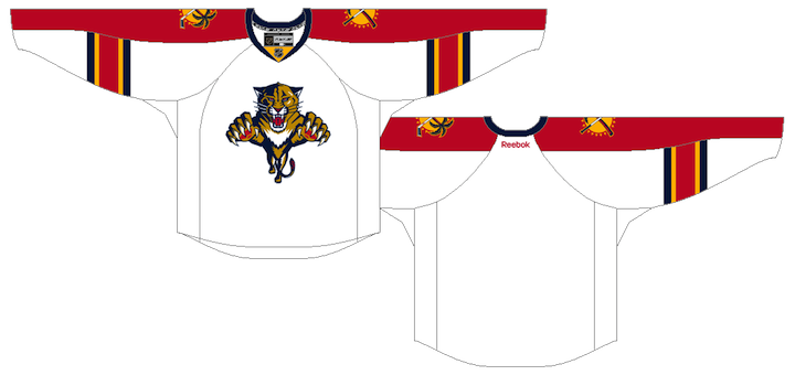
Like the Oilers, the Panthers are fixing their uniforms as well by returning to their roots with a red home uniform. The chest and sleeve piping as also been removed from both the home and road sweaters.
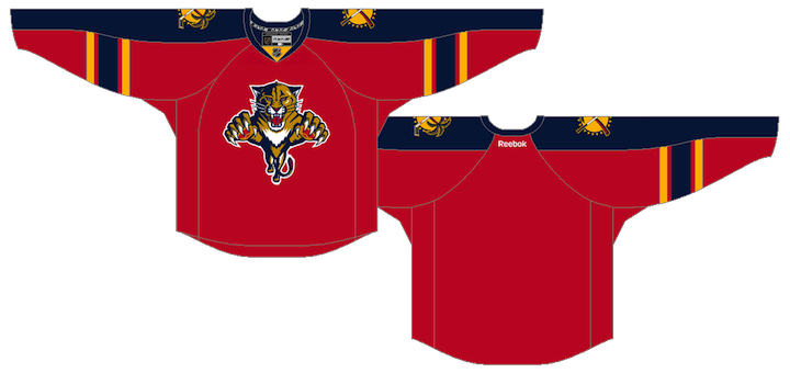
Though the red sweater was unveiled at the draft, the road jersey design below is still unofficial. We know the blue piping is going away but it's not clear if the jersey will see any other changes.
Los Angeles Kings
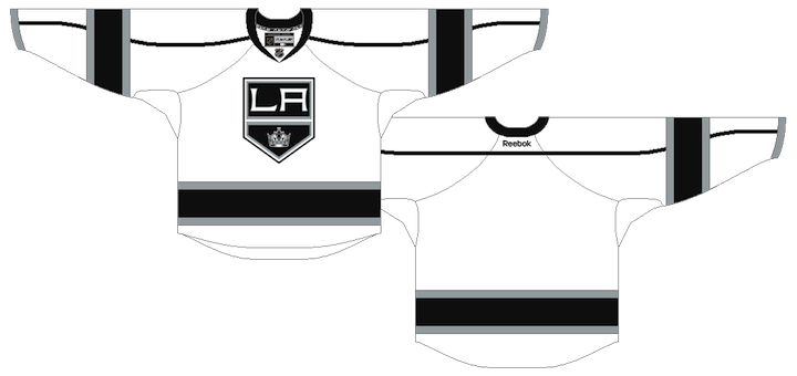
The Kings are undergoing an identity overhaul in 2011, though they're only adding one "new" jersey. The white road sweater is based on the black alternate which launched in 2008.
Nashville Predators
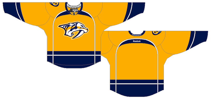
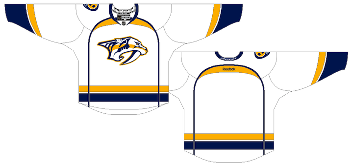
The Predators are also making sweeping changes by introducing new home and road jerseys.
New York Islanders
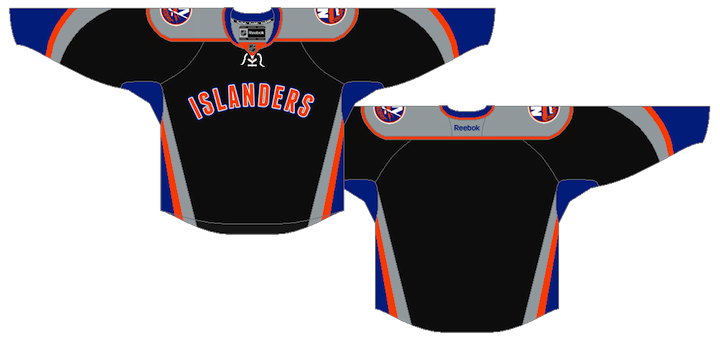
We got our first glimpse at the Isles' new third jersey when a prototype design was leaked recently by a former team employee. But I've recently been made aware of some new details and can confirm report this is what the final version looks like. (Accidentally broke one of my own rules there. I can't "confirm" anything. That's for the team to do. However, this is an accurate representation of the final design.)
Ottawa Senators
We've known for some time that the Senators have had a Heritage Jersey in the works, meant to pay tribute to the original Senators from the 1930s for their own 20th anniversary season. You got your first look at a photocopy of the design earlier this month. This is what it looks like in color.
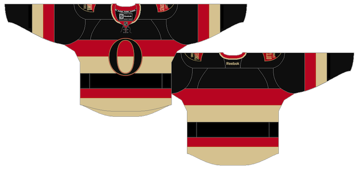
The shoulder patches have been the source of much of the speculation surrounding this jersey since the team itself offered up a sneak peek back in March. I can report that there are two of them, both in the shape of a shield. One reads Ottawa Senators, the other is in French: Sénateurs d'Ottawa.
Pittsburgh Penguins
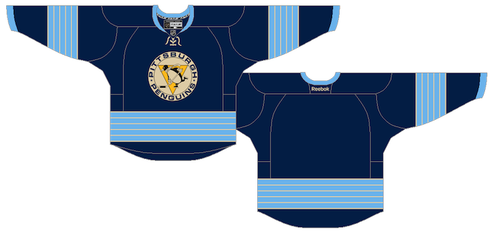
The Pens will be promoting their 2011 Winter Classic jersey to alternate status this season. It replaces the light blue third which debuted at the 2008 Winter Classic.
Tampa Bay Lightning
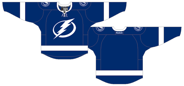
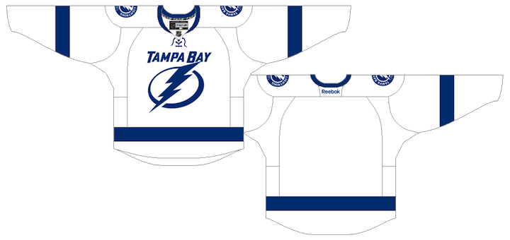
The Lightning unveiled their new branding back in January but the jerseys still aren't available in stores. Here's a refresher of what they'll look like.
Toronto Maple Leafs
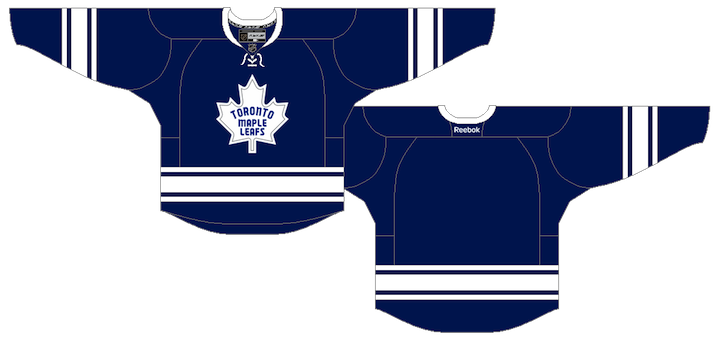
And finally, one of the worst kept secrets of the summer has been the Leafs' new third jersey. It pays tribute to the 1967 design which was only used for a few seasons. Take note of the silver inner-outline of the throwback leaf crest. Other than that, it's practically identical to the old jersey.
Obviously, the odd man out on this post are those elusive Winnipeg Jets jerseys. Plenty of you have emailed and tweeted to tell me the counterfeiters already have them. I refer you to my earlier post about phony leaks. Everyone's favorite thieves are simply manufacturing jerseys based on concept art. As I've said before, this would not be the first time. And it surely won't be the last. Be patient; don't waste your money.
For what it's worth, I can't say how close the fakes will be to the real thing as I haven't seen the final designs yet. They could be close or miles away. But since the Jets haven't scrambled to assemble a press conference on short notice, I'm guessing it's the latter.
I also expect to have another edition of JerseyWatch posted before the end of August, but aside from one busy week, there hasn't been a lot of news this month. Hopefully this will hold you over until then.
 Chris
Chris
Winnipeg Jets
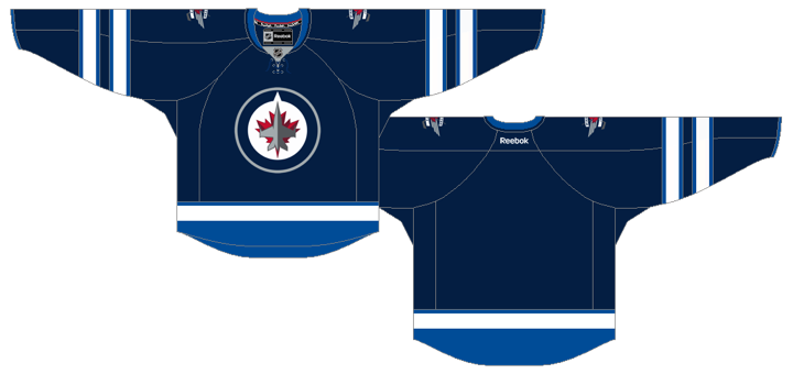
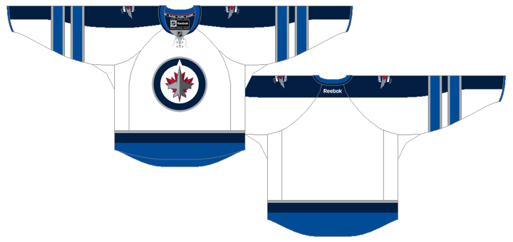
The Jets finally unveiled their new home and road uniforms 10 days ago. Here's another look at them.
Washington Capitals
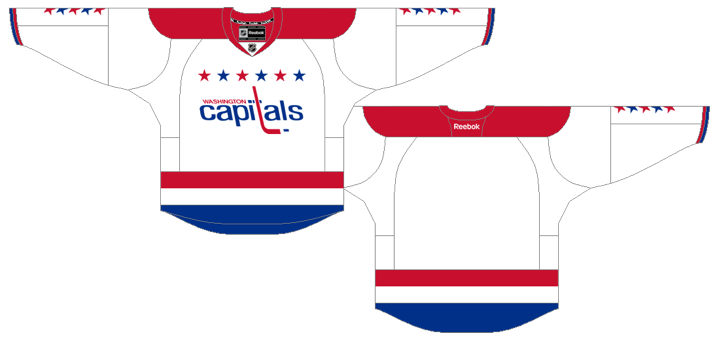
The Caps announced they will bring back their retro Winter Classic jersey for 16 road games this season.
The new season is shaping up to look pretty nice. And I don't think there will be any other new jerseys to add to this list for the 2011-12 season. You've now seen everything there is to see.


Reader Comments (98)
This color scheme that every major New York team seems to want to use has not lent it self to very much success over the years. I am suprised the Islanders would go this route. But as a die hard LA Angels fan, is there any way we can pass this on to the New York Yankees?
which one is going to cause me to hurl first, the Islanders or the Sens? both ugly as sin, in the Sens case retro does not always automatically = good/cool
still love the Preds redo though
For the love of God, I hope the people responsible for this Islanders third-jersey are paying attention to the comments posted about it here and elsewhere on the net. This is not just a few people who dislike it, this is a VAST majority who have seen it that dislike it. Why on Earth would an organization go forward with this??
The Islanders could have had an iconic third jersey if they really wanted that would have sold well to Islanders fans and non-hockey fans looking to rep their city. Use the striping of their homes, but swap the orange parts with the blue parts, and put a great big "NY" from their logo in white with a blue outline, and use blue numbers with a white outline, I've seen similar designs on hats and they look at least better than this current design does. You could certainly see them appearing in your occasional rap video. And I for one didn't fully appreciate the simple appeal of the Red Wings jersey till I saw Tupac wearing one in one of his videos. (No, I don't remember which video.)
Also, to those expressing the desire to see the sleeve stripes go all the way around, the panthers new home jersey, I ask how that would look. The outer-sleeve is the same colour as the main stripe so would you simply continue the two gold stripes? I can't imagine that looking good. I think it would've been better to use the Sharks/Oilers/Devils style for the jersey, because I've never liked the inner/outer sleeve look.
Isles Jersey is shameful...how much more can we take as fans??? Well we still have Haley running all over Pitt last year...aaaahhh. Maybe they will move to Brooklyn or Suffolk and just change their colors to be more like the Yanks instead of the loser Knicks and Mets!!! Damn is anyone awake over there or are they trying to piss off the fans just so moving will be easier!!?? How about just 2 colors like TB or light blue and Dark blue...why black!!!?? How about just an ANCHOR on front or the Island! I went to Art school let me design it, got to be better than that crap!!!
Please tell me the Islanders jersey is a delayed April Fools joke? Oh you funny!!! Please tell me it's a joke??? PLEASE!!!!
I think I read somewhere that the only reason why the Islanders are coming up with a 3rd jersey is $$$$$$.
Unfortunately, they had to do something new because they couldn't simply bring out a retro uniform. I'm willing to bet that Wang and Garth are hoping that Islanders faithful will purchase jerseys with ISLANDERS blasted across the chest as a nostalgic item when they move to Quebec next year.
Reminds of when the Grizzlies left Vancouver. I hate basketball... but I couldn't resist buying an NBA jersey with VANCOUVER on the front when the team moved to Memphis ten years ago.
How is that Islanders jersey bad? All the colors compliment each other and they won't be taking the ice in bright yellow or the retro Ottawa jersey that makes them look like a 1930's chain gang...Should I go on now about the Tampa Bay Lightning Leafs??
Absolutely nothing wrong with the Islanders sweater..Look at the NY Mets uniforms..same thing.
If I buy one jersey this season, it will be the Senators gorgeous new jersey. Man is that brilliant. Somewhere Cyclone Taylor is smiling over that one.
The Islanders jersey is downright abysmal. Fans who go out and purchase the jersey should be ashamed. Islanders do a perfect job of ruining the end of the summer for the fans.
I agree the Isles new look is pretty bad but i think the Sens win the prize of worst jersey. Maybe they'll have a barbershop quartet do the anthem? Or they should broadcast the games in black and white.
@Andrew RE: Barber Pole
I think that the jersey is certainly "barber pole-inspired" or you could say a modern take on the barber pole jersey. The new Sens jersey features 6 horizontal stripes across the front (Black, Red, Wheat, Black, Red, Wheat), but is not the "traditional" barber pole with thinner stripes from top to bottom since the Sens' shoulders are the same color (and without any piping) as the top "stripe" of the design.
I agree with you on people using words they've heard somewhere to describe things that it doesn't describe (a Family Guy episode where Peter calls Lois' dinner 'shallow and pedantic' is a funny representation of it), though we're all guilty of it.
The Senators' new jersey is obviously inspired and derived from the old-school barber pole jersey from the previous franchise, but it's not the same. I don't think it's wrong to just say "barber pole" for short, though I can see where that could be irritating (like calling the new Penguins jersey "vintage" instead of "faux-back").
Its not that the Islanders 3rd jersey is terrible...
But the thing is...is that the best someone who is a designer could come up with?!!!
Come on now...
The Nashville and NYI jerseys are atrocious! Look at the Leafs and home TBL jerseys and tell me they don't look the same and I'll call you dishonest.
I was so excited for the Islanders 3rd and thats what the go with? One of the Ugliest sweaters I've ever seen. Why is it so hard for this organization to design a jersey. All you had to do to appease the fans was make it Orange... Totally disappointed!
^Absolutely nothing wrong, except for the fact that grey/black/blue/orange is quite possibly the most contrasting color scheme I've ever had the displeasure of seeing in my life.
I like the new Islanders jersey for some reason, it does have some good points to it. I think it will look good in person, as long as there are no numbers on the front it should look alright.
(gets the flame shield out and ready)
Actually, if Chris is answering questions, or anyone else knows: For the Sens Jersey, has Vintage White (Wheat, Burleywood, whatever you want to call it) been confirmed as being used? Obviously the projection of the jersey they showed in that presentation back in March is hard to call because it's a projection, but it looked particularly white as well...then Chris got told that it would be vintage white later on. I guess it's looking pretty settled as "vintage white"? Too bad, if so. But maybe it'll look good on the actual jersey.
Personally I'd prefer regular white not just because it's cleaner, but because it's the start of the Sens' rebuild, really, and while looking back you should also look forward. But that may be too lamely poetic for hockey. ;)
SLM, that's WHY the Isles jersey so bad, because it's JUST LIKE the NY Mets. And people who compare the new TB jersey to the Leafs are missing the picture. Ever since Stevie Y has been in Tampa, he's been taking steps to bring class to the organization. These new jerseys are a direct nod to his old Detroit sweater: white + one color, one simple stripe, no bells and whistles. I know it's hard for Leafs fans to comprehend, but not everything int he NHL is about your team.
Isles jersey is pure garbage and this is coming from a big fan. As someone posted earlier, if a fan posted this concept art it would have gotten 2 stars. For all the knocks the fisherman got, at least it showed some creativity. I know taste is subjective, but if you buy this crap, then you have none!
I agree. The NYI jersey is horrible. As a fan, I am disappointed in them. What could rescue this attempt, is to reverse the black and gray color schemes.
isles 3rd =bad
@Quez Actually dude thats pretty awesome on his part that he rocks out all pink pads and auctions them up to donate for breast cancer research so I dont really get that one...are you too insecure to wear pink?
Am I the only one who thinks this Isles jersey template looks a bit too much like the Ducks third?
Aaaaaaand the Islanders once again will have the worst jerseys in the league ... bravo.
i have to say im excited to see all these in action this year.. im happy with the new preds uni's they grow on me more and more everytime i see them.. BUT of course, like everyone eles, i HATE the NYI's jersey !! .....but then again im not suprised, the islanders have by far the worst uniform history in the game (besides current home/away)
There is more grey on this jersey than there is blue and orange combined. This is not an Islanders jersey. This is a scam that pollutes the cool dynasty jerseys. I'm not going to recognize them on MSG+ because they are going to wear the black jersey just like almost every other team in the NHL does.
The new Islanders jersey is awful and, as another commenter said, totally unnecessary. The Islanders logo is the best in all sports and there's no reason not to see it on the front of players' jerseys every single game. Who would possibly green-light this sad and pathetic design? It takes the joy out of the Islanders uniforms and replaces it with morbid drabness.
I have to agree with Quez. I can't imagine JT, Grabs, Matty, and Streit wearing this... Horror in a game. I also can't imagine watching Rick DiPietro giving up 7 goals in Pink pads and a black/blue/grey jersey during BCA week. Nice call Quez, ROB CUSH also had a good point. If you are a real hockey fan or islanders fan. You would know that this jersey does not belong in SHOP. NHL.com or used by any of the players. i don't think that even someone who wastes their money would waste their money on this Islanders jersey. This is a really great way to say WE HATE YOU to your fans after voting NO for the arena. Nice job NYI.
I gave in and bought the Predators last road jersey, as it was, IMO, a definite improvement over their previous white jerseys. However, the crest still had that ugly triangle behind the sabretooth head. Now I'm kicking myself, the triangle's been eliminated from the new whites. I'll have to sell the other one now (which is fine with me; and it's basically still new) to be able to afford one of the new whites.
And I love the new yellow home jersey; but I'll just have to wait a while before I can gather up enough nuts to get that one. Since they're dropping their beautiful blue thirds w. the monochrome crests, I had to buy one before they got scarce. I also have Nashville original blue jersey. Their blue jerseys have thankfully never had the triangle crest.
The only thing I think the Predators dropped the ball on is those mustard yellow thirds. But not because they were mustard yellow; I didn't mind that at all! My problem was that the alternate crest just wasn't original enough compared to the the regular crest. Now, if they had instead used the shoulder patch skull logo as the crest on those mustard yellow jerseys, I would have bought one in a heartbeat!
On the subject of heritage jerseys, I'd love to see the Penguins come up with a jersey in tribute to the old NHL Pittsburgh Pirates. Not a great team by any stretch of the imagination, but they were around for five seasons and did make their mark in the league. They were the first team use different forward lines and change on the fly. And goalie Roy Worters set a record of 70 saves on 73 shots (v. the N.Y. Americans), which stood alone until Ron Tugnutt (my favorite player as a kid) tied that record (v. the Bruins).
The Pirates 1929/1930 jerseys had a nice look that stood out from the rest of the jerseys back then, with a triangle set diagonally to one side on the front, with some complementary double strips perpendicular to the triangle, and some double stripes on the arms. Unlike their earlier sweaters, which just had "Pirates" across the front, this one has a cool pirate head logo at the top edge of the triangle. The triangle ties in nicely with the Pens use of a triangle. All they'd have to do would be to switch back to the golden yellow that the Pirate's used before switching to orange for their last season in 29/30.
Here's a link to the 29/30 Pirates sweater - http://tinyurl.com/3hq4wvz - which looks more golden yellow than orange than orange, IMO. But this is most likely a replica, considering the great shape the sweater is in.
Anyhoo...
You know, The NYI horror may change because the comments we all are making about it will effect it and The Islanders won't be celebrating their 40th season until 2012. that is 3 months time to change and remodel the alternate jersey.
Nashville and Gold: I like where they are heading.
I heard about the alternate jersey plan for NYI and I thought maybe they would use the islanders logo and put 1972-2012 underneath their logo. Then they could use the old shoulder patch from the dark blue jerseys from 2000-10 and change the dark blue to royal blue and use that as their shoulder patch. Instead they leaked a rumor that showed us that the jersey was black like the Knicks and Mets jerseys. Whichever bloggers said that this NYI jersey was good. No offense but, you're insane. I would never say that Fishsticks was better than this jersey because that jersey scheme was Hurrendous. But come on NYI Fans. Lets prove to Wang and the New York Islanders that we hate this jersey and that we hope they don't ruin our excitement again. Just like they do every 5 years when they make a horrible host/visitor jersey scheme or an alternate jersey plan like this. because seriously, The rangers are the only team that deserves the RANGERS across the jersey because they've had that layout since 1930s. Lets go Islanders Fans!!!
Maybe
@HealyJ
My biggest problem with the Isles jersey, besides the horrible use of black and the wordmark, would have to be the fact that they didn't try to get creative. The could have hired a reputed logo artist on Long Island (there must be some!) to design a lighthouse logo, which I would have love to see if done right.
Overall, a fail, and the Isles PR should take in fan feedback and go back to the drawing board.
Islander jersey is baaad. I am an Artist from LI. I say An Anchor on the front would be awesome! It shows the strength and loyalty of the great fans also giving the Nautical feel to it as well. It could have the 4 stripes on it 1 for each cup and their logo on the sleeves. Orange, Blue maybe even light blue also. Who is with me? ANCHOR!!!!!!!!!
IndigoJ, I like the way you think and would like to see this in practice. Truthfully, anything looks better than the mess that is being proposed by the Islanders right now.
Put some stripes at the bottom of the Florida home & away jerseys. And put some stripes on the pants. That goes for all teams whose pants are unstriped.
Every single one of them looks great with the obvious exception of the Islanders. My God, it's like they are just trolling hockey/Islander fans. That thing is an abomination.
I am excited for the Sens new Barber pole jersey. It fits the team really well. Islanders better change their sweater. Islanders don't deserve to wear any color except blue and orange (not forgetting white either) If the islanders wanted to wear a black sweater, they should've put the classic Long Island logo on it rather than ISLANDERS in Orange across the jersey. That just isn't creative, it isn't cool, and it certainly isn't Islanders.
The Islanders just keep trying to kill a once proud franchise with such sad jerseys
I'm a Rangers fan and I feel bad for Islanders fans. That jersey is terrible. They finally got it right by going back to the 80s jerseys and they make this their 3rd jersey? What a joke. There are some real hockey fans out on Long Island that want a good team there but putting them in those jerseys is ridiculous. Hopefully management will not go through with this. But when management is Garth Snow and he's already made great decisions like DiPietro's 15 year contract, I wouldn't count on anything from those guys...
Kevin McGran ( a reporter for the Toronto Star) announced on Twitter that he expects that the Leafs will unveil their new jersey on Monday. Thought I'd pass it along.
haha lol Glen, I know right they sadly were better thats how awful these are. And Go Isles 29 I totally agree with you, im a flyers fan and i feel bad that you die hard fans got ignored by the organization. Black is not a true Iles colr, i mean like you said at least make it an orange of your current home and road. it might look a little weird for you guys but it would def look better.it woulda been better if it was mainly blue but with orange and a little black in it with possibly shoulder yokes with your 40th ann logos on it. Are they not going to have patches on their jerseys cause that would just be stupid lol Well hopefully theyll listen and scratch it or scratch it after this yr. I just cant wait to see what the winter classic jerseys will look like. both teams should either go back to the recent past, flyers bring back the 80s-90s orange(lindros style) and the rangers finally bring back lady liberty. or both teams wear unis of their citys past teams, philly quakers and ny americans. Since the flyers have nothing else to work with since our jerseys have stayed practically unchanged for 40+ years, maybe we can add old with something new like a shoulder yoke with liberty bell patches or something. we'll just have to wait and see
Saw the new Nashville jersey when they were playing their pre-season game. Looks like the Boston Bruins jersey from the back. I thought it was the Bruins that were playing!! Overall, decent jersey put out by the preds.
Bring back the Fishstick jersey before using the new black one
l think l like the lsles 3rd better than the pens new 3rd, which isn't really saying much, theyre both garbage, l just detest that ugly 67 logo on that crappy & over used navy blue & obnoxious swimming lane stripes.
When are the isles jersey offical and when do they announce the schedule?
It's amazing how EVERYTHING is wrong with the Islanders jersey. Obviously: the black, the barfy design, the mash of retro laces with contemporary... barf lines. But it doesn't end there. The children's book font. The primary logo scaled down much farther than ever intended (I imagine the outline of Long Island now looks like a turd – how detailed can a 4" patch be?). Good God, just stop! They finally, FINALLY have a gorgeous set of home and road uniforms, and then they go all New York Mets on ya! It's worth crying over.
i can say as a Die-Hard Devils fan, i DO, in fact, somewhat like the Isles 3rd jersey. is it the most creative thing...? NO. not for a long shot. its pretty much a replica of Anaheim's 3rd jersey template, w/ the Islanders colors, along with the same format of the retired Atlanta Thrashers red 3rd jersey. i personally DO think the addition of a number under the wordmark would look sharp, the removal of the primary logo on the right shoulder and it being replaced w/ the 40th anniversary logo. and the OVERALL removal of gray on the shoulders being replaced w/ white. Gray has never been apart of the New York Islanders color pallet (nor has black for that matter) but if blacks being used as a primary color, i think it works. knowing this uniform will most likly only last a season or two, i think its a MUST-HAVE for any jersey collector. ANY AND EVERY jersey collector. i have 13 jerseys in my collection. from blank jerseys, to custom, to vintage, to hall of famers, as well as future hall of famers (cough* MARTIN BRODEUR *cough) but all-in-all.... if its released for the public come Christams time, it will certainly be a considered item on my list for Ole' Saint. Nick
When will those LA ones be in stores for purchase? I really want to get a Bernier one!