


New Looks for a New Season
As a long summer starts winding down, we're now less than a month away from training camps across the NHL getting underway. But before that, I wanted to do a quick run-through of all the new jerseys we'll be seeing this fall. And believe it or not, I have a few surprises in store.
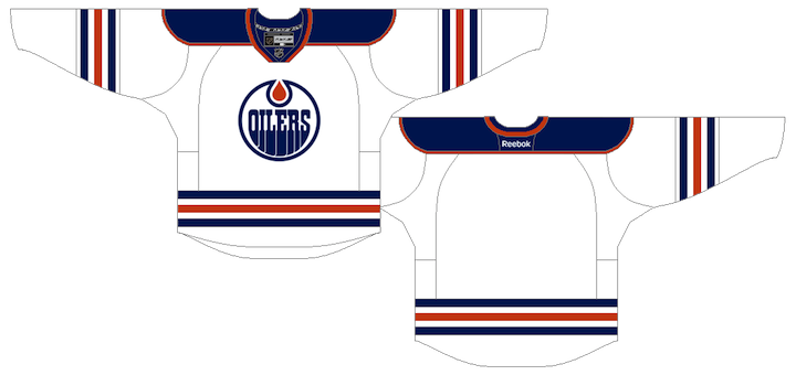
Edmonton Oilers
Fans have been begging for it for years, and the Oilers have responded. This new road jersey pays tribute to the original white sweater the Oilers wore from their NHL inception in 1979 to 1996.
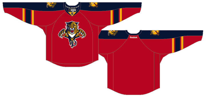
Florida Panthers
Like the Oilers, the Panthers are fixing their uniforms as well by returning to their roots with a red home uniform. The chest and sleeve piping as also been removed from both the home and road sweaters.
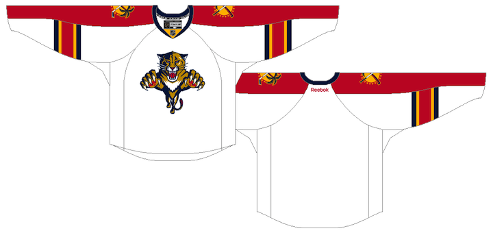
Though the red sweater was unveiled at the draft, the road jersey design below is still unofficial. We know the blue piping is going away but it's not clear if the jersey will see any other changes.
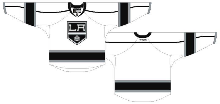
Los Angeles Kings
The Kings are undergoing an identity overhaul in 2011, though they're only adding one "new" jersey. The white road sweater is based on the black alternate which launched in 2008.
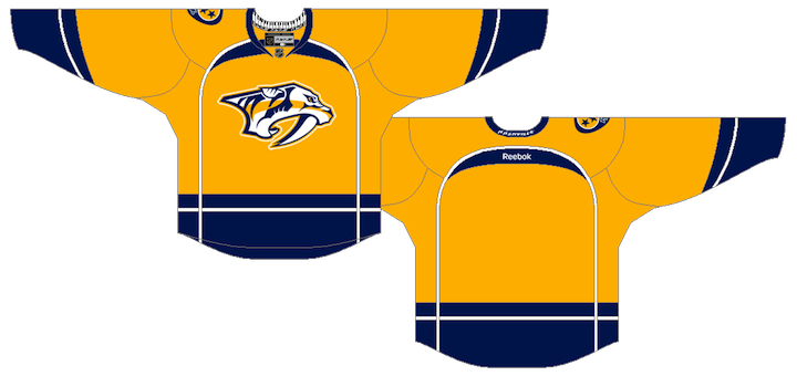
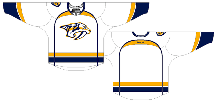
Nashville Predators
The Predators are also making sweeping changes by introducing new home and road jerseys.
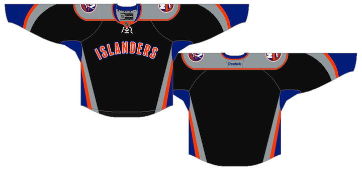
New York Islanders
We got our first glimpse at the Isles' new third jersey when a prototype design was leaked recently by a former team employee. But I've recently been made aware of some new details and can confirm report this is what the final version looks like. (Accidentally broke one of my own rules there. I can't "confirm" anything. That's for the team to do. However, this is an accurate representation of the final design.)
Ottawa Senators
We've known for some time that the Senators have had a Heritage Jersey in the works, meant to pay tribute to the original Senators from the 1930s for their own 20th anniversary season. You got your first look at a photocopy of the design earlier this month. This is what it looks like in color.
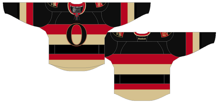
The shoulder patches have been the source of much of the speculation surrounding this jersey since the team itself offered up a sneak peek back in March. I can report that there are two of them, both in the shape of a shield. One reads Ottawa Senators, the other is in French: Sénateurs d'Ottawa.
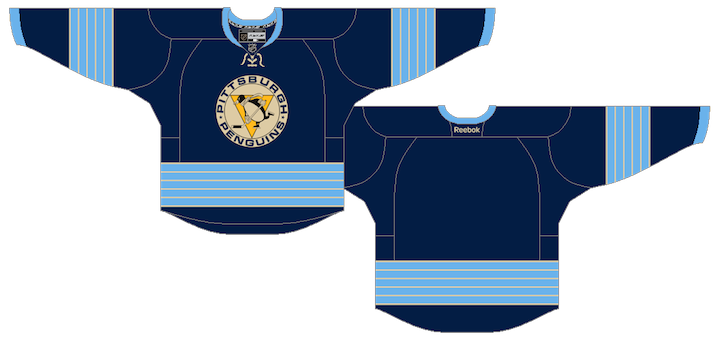
Pittsburgh Penguins
The Pens will be promoting their 2011 Winter Classic jersey to alternate status this season. It replaces the light blue third which debuted at the 2008 Winter Classic.
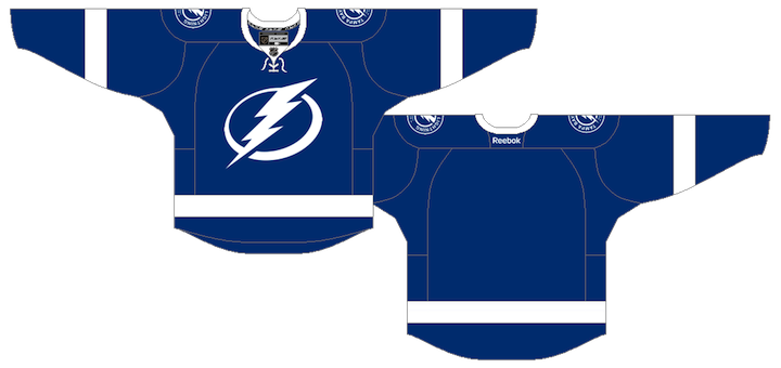
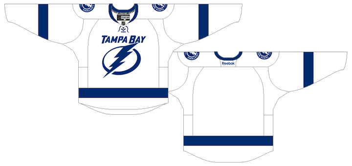
Tampa Bay Lightning
The Lightning unveiled their new branding back in January but the jerseys still aren't available in stores. Here's a refresher of what they'll look like.
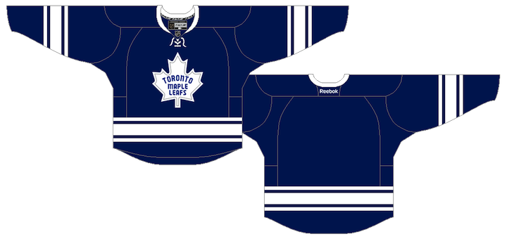
Toronto Maple Leafs
And finally, one of the worst kept secrets of the summer has been the Leafs' new third jersey. It pays tribute to the 1967 design which was only used for a few seasons. Take note of the silver inner-outline of the throwback leaf crest. Other than that, it's practically identical to the old jersey.
Obviously, the odd man out on this post are those elusive Winnipeg Jets jerseys. Plenty of you have emailed and tweeted to tell me the counterfeiters already have them. I refer you to my earlier post about phony leaks. Everyone's favorite thieves are simply manufacturing jerseys based on concept art. As I've said before, this would not be the first time. And it surely won't be the last. Be patient; don't waste your money.
For what it's worth, I can't say how close the fakes will be to the real thing as I haven't seen the final designs yet. They could be close or miles away. But since the Jets haven't scrambled to assemble a press conference on short notice, I'm guessing it's the latter.
I also expect to have another edition of JerseyWatch posted before the end of August, but aside from one busy week, there hasn't been a lot of news this month. Hopefully this will hold you over until then.
 Chris
Chris
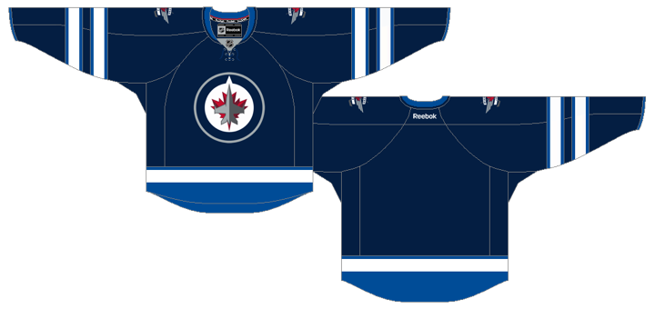
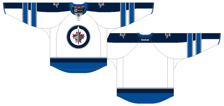
Winnipeg Jets
The Jets finally unveiled their new home and road uniforms 10 days ago. Here's another look at them.
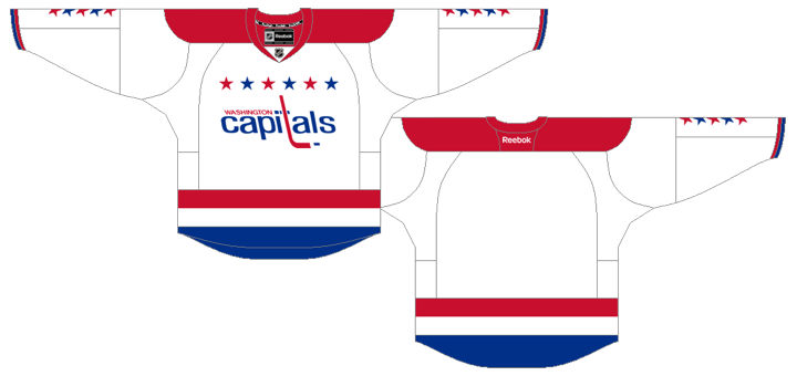
Washington Capitals
The Caps announced they will bring back their retro Winter Classic jersey for 16 road games this season.
The new season is shaping up to look pretty nice. And I don't think there will be any other new jerseys to add to this list for the 2011-12 season. You've now seen everything there is to see.

Reader Comments (98)
That islanders jersey is so sad.
really NYI?! REALLY?! that's the best you could come up with?! i agree with Minnesota, so sad!
Islanders is terrible. I still think that since Tampa added the black outline to the numbers, they should have made the pants black to make black more prominent and differentiate from the Leafs. That silver outline on the Leafs crest is dumb. What does it add? A nod to the last Stanley Cup we won?
Islanders jersey is going to be one of the worst in the NHL. Shame on any NYI fan who buys one.
Thanks so much for pissing on your fans again, NYI.
The Islanders jersey is hideous, aside from being unnecessary. If they wanted to keep it retro, just make an orange version of their current home/road set. That may not even do the set justice. We have seen in the past that adding new colors to their royal blue/orange has been disastrous at best.
The Ottawa jersey is something everyone saw coming and I am a big fan of reaching back that far. Keep it for a third, or go all out and make it the full time home with a white road version. I'm sure Sens fans would like that.
I NEED that new Sens jersey!! They're going to be great, and I like the bilingual touch.
Re: Islanders I wonder if the player's number will be below the "islanders" on the front of the chest, like those red Altanta thirds. Regardless, it's pretty ghastly.
The Islanders franchise is so sad.
That NYI jersey looks like the kind of thing that would get a 2 star rating as a concept on this site. Pathetic.
I love my Islanders but that jersey is complete GARBAGE.
The "leaked" Islanders with white is better than this one with the grey.
..so...this isn't legit? RBK logo...tags...etc? doesn't look shopped...or am i just ignorant?
As an isles fan, I have to say that this jersey is a disgrace. On twitter and facebook the team asked what fans would like in a 3rd jersey, and the overwhelming response was simply "NO BLACK". What do they do? Make a black jersey. Also, no mention of the 40th anniversary on the jersey anywhere, not on the shoulder or anywhere! Horrible.
Feenixx: I don't mean to be rude, but to answer your question honestly, yes you are being ignorant. If you think Reebok tags can't be faked, you're deluding yourself. Counterfeit sports jerseys are made all the time. They even use fabrics and materials similar to what the official manufacturers use to pass off their illegal merchandise as real. In this case, the items are being created based upon fan-designed concept art that was posted on the web. It's not uncommon to see. Don't be fooled.
If I can answer any other questions, don't be afraid to ask. (Just don't ask me if you're being ignorant unless you want the truth.)
while I'm not a fan of the isles jersey I do appreciate the creative attempt. I fear that the success of the recent trend of simplification and vintage style jerseys may lead to a homogenization of uniforms across the league. This current trend lends itself to this more than some more eccentric design trends in the past due to the older teams having well established aesthetics that will likely not change much.
That Islanders jersey is brutal, and I'd even go as far as to say it's miles worse than that orange atrocity from the CCM/KOHO days. Black should not be the color of an Islanders jersey, but if you're dead-set on it, at least make it look like Alex Valvo's or make it look "retro" aside from the color. Don't take the Ducks' alternate template (which is WAY too modern for the Islanders) and make two colors that appear on NO OTHER Islanders jersey the focal point in the scheme. Just terrible...
But on better jersey news, Chris, do you think there's any chance that the Penguins remodel their home/away set after using the Baby Pens as test-runs? I would love to see Pittsburgh go to those uniforms full-time (it's a beautiful combo of the old style with the new colors).
WE WANT FISHSTICKS!!!
(because even that is better than the new Isles jersey)
Not a huge fan of black, but the Islanders 3rd 'jersey' might be semi-bearable if it were simply all black with the Islanders word mark, or all royal blue with the same word mark. Come on NYI, present your team in a decent manner -- you finally have your primary road and away uniforms back to the way they should be after so many wasted years and now you want to have your players wear these abominations?
Is the Tampa Bay blue a different shade than the Toronto blue?
It looks slightly different here, but I remember some of your comments from the draft stating that you felt the Tampa blue was darker than you thought and very similar to the Leafs...
It's hideous! I'm starting to miss the fishsticks jersey. I'm sorry for the Isles fans.
I am somewhat of a contrarian in that I'm not much of a traditionalist, but I can't possibly find anything likeable about the Islanders design. Absolutely horrible.
The gray in the Islanders jersey totally ruined it. A looked better with white.
that Islanders jersey is just horrible, the black jersey could have been ok, but then they've also added grey as well?!?!?
and oh look a baseball / basketball looking word mark as well.......a FAIL in EVERY way possible.
and the exact opposite is the sens jersey, that is instantly one of my favourite jerseys past or present & i want to buy one NOW!!!
the panthers jerseys really need some horizontal striping round the bottom of the jersey, they look like training / warm up jerseys.
the only good third for the islanders would be the home home jersey but witn the orange and blue flip-flopped or maybe something that pays tribute to a past new york team team (buffalo 3rd) like the golden blades or the raiders or maybe some other one
Ugh, if that is the new Islanders 3rd, then I assume that there's a burning desire from the team to have at least one really ugly jersey each year to frustrate their fans even more. Like Mitchell said, it's a jersey that would probably get 2 stars (at most) in the concept here.
And I agree that the Lightning should have black pants to actually have some black in their kit. That and the victory stripes.
The other new jerseys are solid though, just wished the Kings could come up with a better looking logo than that one.
Good call, Cement_Hands - I really like the bilingual touch on the Sens jersey. That's the kind of creative thought that's next-level, imo, and good for whoever came up with the idea initially. Ottawa's right on the Quebec border AND it's the national capital, after all.
In terms of the design, yep, looks good and I'll more than likely (99.9%) be getting one. I'm kind of bummed they went with "vintage white", and kind of hope it turns out they aren't, but that seems unlikely. ^^ I guess my only problem with vintage white is: I plan on keeping this for a long time...that's the colour that regular white goes...so what colour will vintage white go after years of wear? ;) Still, if that's my only complaint, it's not a big one.
Sorry about the Islanders jersey, guys...I maintain that the jersey wouldn't look nearly as bad if the central logo was their main big circular logo, as it would fill up more of the black space, maybe making that stand out less. It's incredibly modern, though, so who knows - it may not look bad on the ice...hopefully. Or maybe it's actually past modernization of a design and into futuristic design, and the bright orange piping is actually fluorescent light tubes that will glow. :-D Too much? Yeah alright.
Also, I say again (though maybe I didn't say here): I'm not sure Tampa Bay's new jerseys are clean and sharp enough. (sarcasm) I mean seriously, you could eat off those things. I can't figure out why I don't feel the same about Toronto's jersey...and it's not because I'm a Sens fan!
I honestly don't think the Isles jersey would be as terrible if it had a logo instead of the stupid word mark. It's another DALLAS/THRASHERS debacle. This is terrible. Why have the Islanders become the Mule of the NHL. They're the family member you know love, but are kind of always ashamed of.
that jersey gives me more reason to hate the islanders
I'm curious to see the final version of that Leafs throwback and whether the piping within the logo is actually silver. If you look back at some of your old hockey cards or whatever, you'll see that the logo on those jerseys had WHITE piping (on the white logo). Do you know if it's actually silver or does it just come out looking silver when attempting to show in these graphics that it's there?
While I'm not entirely a fan of the Isles jersey, I have to say it's a hell of a lot better than I would have ever anticipated. That said, it makes me sad that there will undoubtedly be numbers under the "ISLANDERS" wordmark.
Chris, any word on the font for the names/numbers for these which we haven't seen yet? I'm really hoping the Leafs one doesn't have silver crap on that part as well.
Wow, NY...that is horrible. Way to take the top spot for worst jersey ever. Did thy not bother with any market research? Any hockey fan would have told them how awful that jersey is. Continued embarrasment on the isle.
I can find at least one thing to like about it, which is that it doesn't have the horribly dated Islanders logo front and center in the middle of it. But then, I've never understood hockey fans' hostility to wordmarks (except the Rangers', of course, because the Rangers did it a long time ago and that makes it okay).
More importantly, how awesome is it that Nashville is giving us an actual new main home color for a team? It's very awesome.
Maybe the Isles jersey black because they are in mourning because the lost the vote for a new arena lol
That Isles jersey is so gross.
I can't believe they're adding that to their stellar home/road uniforms.
I would love to see the Pens go back to their yellow jerseys, if they want to go retro then, for me, that's the way to go. At least make the old triangular penguin a shoulder patch.
As far as Ottawa, I dont understnad why they have a French script on one of their shoulder patches, I know its Canadian but, for me, french only belogs on the Canadians. When I think 'Senators' i dont think 'French'. Also I think the should take away their current Logo and replace it with their Alternate logo, that started in 07, the one with the senator head inside a red circle, it looks like their old logo, yet has a more modern swing. When the do this they can use the white jersey in Concept Collection 34 by Glen Cuthbert. That is a perfect Retro/Herritage look for the Sens.
The Islanders concept is terrible. It adds two colours that arent in their colour scheme on any of their other jerseys. Oh, and really, the 'text'. Look how well that worked out for Atlanta, but they did it anyway. I hope no one should buy this Jersey, so it gets retired as quickly as possible. Like really, who ever designed this jersey should be fired.
The Leafs, I would have liked to see that in the next Herritage Classic against the Sens so i could see it, but oh well. It is a very good job. I would take away the silver trimming on the logo, it just doesnt look right. still a very good job.
Chris,Do you know if the Panthers are keeping the 3rd jetblue jersey's this season or beyond?
Kinda sad that the Islanders have managed a jersey worse than the Fishsticks one.
Not a fan of the Senators one either. Just because it recalls the original franchise uniform doesn't make it a good idea. With the O that looks like a zero slapped in the middle the barberpole design, it's just hard on the eyes.
i have to agree with everyone else on the islanders jersey, absolutely disgusting, there's no excuse for that and i expect its gone within two years
@ Jamie_NUMBA1AVSFAN, as a long time diehard Pens fan I agree on the Yellow jersey but I DO NOT ever ever ever want to see the fugly pigeon/triangle logo on another Pens uniform. Pens won back to back Cups '91/'92 wearing the Skating Penguin, Howard Baldwin changes the logo at the beginning of the '92/'93 season to that fugly pigeon thing. Lemieux buys the team and changes logo back to Skating Penguin, although the pigeon thing was a shoulder logo. As much as I hate the RBK Edge garbage, it got rid of the fugly pigeon thing. Kinda odd/ironic that once the pigeon thing died/disappeared from the uniform all together that the Pens went back to the cup finals in '08(lost) and '09(won)??
If i see a fellow isles fan wearing this jersey at a game i will peg them in the back with a mustard soaked hotdog
Answering some questions here...
cement_hands wrote: Is the Tampa Bay blue a different shade than the Toronto blue? It looks slightly different here, but I remember some of your comments from the draft stating that you felt the Tampa blue was darker than you thought and very similar to the Leafs...
In the dimly-lit draft photos, the blue Lightning jersey appeared much darker than it really is. Having seen a Lightning and Maple Leafs jersey side by side, the TB one looks a few shades lighter. Still darker than I would've liked, but what can you do? And to be honest, the blue used in the images above was sampled from the team's own renderings from the unveiling. (It may need to be adjusted once I've seen the two jerseys under arena TV lights.)
Gregg wrote: I'm curious to see the final version of that Leafs throwback and whether the piping within the logo is actually silver. If you look back at some of your old hockey cards or whatever, you'll see that the logo on those jerseys had WHITE piping (on the white logo). Do you know if it's actually silver or does it just come out looking silver when attempting to show in these graphics that it's there?
I can tell you it is actually silver and not white piping in the Leafs crest. I do my homework on these thing.
Josh wrote: Chris, any word on the font for the names/numbers for these which we haven't seen yet? I'm really hoping the Leafs one doesn't have silver crap on that part as well.
Unfortunately, nothing on the font front at this time. That may have to wait until the official unveilings.
AhhDamn wrote: Chris, Do you know if the Panthers are keeping the 3rd jetblue jersey's this season or beyond?
As reported in the previous JerseyWatch post, the Panthers' third jersey will stick around for 2011-12, but that may be its last season. We'll have to wait and see.
The Islanders third jersey is pure junk considering the 40 year history of that team on LI. A Wang era mistake!
Now we know what Wang’s grandson was up to this summer. I mean besides using up a seat at the draft table.
That Islanders jersey looks like a really bad concept design. If they wind up wearing those this season, it'll go down as the worst in Islanders history (even worse than Fishsticks). Don't see why they had to ruin a good thing.
i liked the sabres jersey back in the 90's! gzz isles! cant you come up with an original? its an exact copy of the sabres black jersey minus the 'horns/sabre tips' on the arms...
terrible idea, couldve been much much better.
The Sens jersey has french on it because Ottawa is a bilingual city with many french fans, from both Ontario and Quebec (which Ottawa is literally a stones throw from).
There is a HUGE french presence here, especially in hockey...at all levels.
As if the Isles 3rd jersey isn't bad enough, imagine how bad it's gonna look when DiPietro rocks out his pink gear during breast cancer awareness week!
A relevant question for Chris and anyone else that cares to answer - how do you define 'barberpole'?
I read a thread on a hockey board a year ago about heritage jerseys and there was post after post after post about that sweater Calgary had worn against Montreal, and was massively irritated that it was constantly being referred to as a 'barberpole' jersey, and now I'm reading on different sites people calling this Sens jersey a barberpole uniform and again I'm thinking 'Err, no, it's not'. When did a couple of stripes suddenly = barberpoles, or candy canes or anything similar?.
So is there a reasonably-specific definition for the term or is it just one of those stupid things people say because they see other people saying them, like calling any jersey design that isn't futuristic with neon colors 'vintage' when it isn't vintage at all? A stupid thing to be irritated by for sure, but you can't help what annoys you and I might as well ask.
Oh, crap, didn't we go over this already with the Islanders? Didn't the last leak get someone sacked? Apparently, not an important-enough person, if they're still going through with this. I think the new Isles third jersey should just have Al Arbour giving a facepalm or something.