Monday
Dec022013

One More L.A. Stadium Preview

Video stills from Anaheim Ducks (via Instagram)

Ducks, Kings release new jersey teasers a day before unveiling

The Anaheim Ducks released a video clip via their official Instagram account tonight, showing details of their 2014 Stadium Series jersey. The full uniform will be unveiled Tuesday morning at 9 AM — just like the Kings' — according to the video.

The first shot is a close up of the sleeve, not unlike the teaser we got from the Kings on Friday. And if the knit of the jersey is anything to gauge by, it seems the Ducks may be sharing the Islanders' angled sleeve numbers and stripes. It's hard to say for sure.

Video stills from Anaheim Ducks (via Instagram)

The next shot shows the front of the obviously orange jersey just below the crest. A sliver of it is slightly visible at the top of the frame. Take note. It doesn't look liked the chrome webbed "D" we've been seeing. One rumor suggested the shoulder patch from the Ducks' third jersey would be used here. Could that be what we're seeing? Or will it be something entirely new?

The final shot seems to show the back of the jersey — though it's not clear to me. It could be the back of the sleeve. But some gold and white stitching is visible on the orange fabric, leading me to think we're looking at an area with numbers.

But that's not all...

Video stills from Los Angeles Kings (via Instagram)

The Los Angeles Kings also released another teaser video on Instagram — that's the place to be for jersey teasers these days! It's one shot, five seconds. A rack focus on what looks like the sleeve.

A lot of fans have been saying they see grey in the Kings' teasers. I didn't at first, but more and more I'm seeing how that could be possible. A game of orange and grey jerseys would definitely be unique in the history of the NHL. Could look really sharp.

Both jerseys will be released just over 12 hours from now on their respective teams' websites. Check back tomorrow after 9 AM PT as I hope to have photos up right away.

Saturday
Nov302013

New Kings, Ducks Sweaters Coming

Both teams will unveil Stadium Series jerseys on Dec. 3

The Los Angeles Kings and Anaheim Ducks will unveil their 2014 Stadium Series jerseys on Tues., Dec. 3. We now have confirmation of this from both teams as well as an Instagram teaser video from the Kings. I grabbed a couple of stills to share.

Video stills from Los Angeles Kings (via Instagram)

There are only three shots in the 14-second video clip. The first seems to show the side and under arm of the jersey. The color and lighting seem to suggest the jersey is primarily white — rather than black as we suspected. The final shot of the video is a graphic confirming the day and time of the unveiling on the Kings' website.

Video still composite from Los Angeles Kings (via Instagram)In between was another shot where the camera tilts down the sleeve of the jersey. It's a close-up, so for all the details we see, we don't get to see much of the bigger picture.

The image to the right is the first and last frame of the camera move stitched together — so you can see all of what was shown in a single image.

The lighting is very dramatic and makes it difficult to distinguish colors. But given the outline stitching on the numbers and the visible stripe below, it looks like part of the sleeve is black.

It's probably not unlike the sleeve design we see on the Avalanche and Panthers uniforms.

The sleeve stitching seems to be similar to what we saw on the Islanders' Stadium Series jersey, but I'm really hoping Reebok hasn't decided to paint all the teams with the same brush (i.e.: template).

I'm definitely hoping the tilted sleeve numbers and stripes don't become a thing. As a one-off, it's fine. But it's not something to be repeated over and over.

If you can make more sense than I can out of what we're seeing, please feel free to share in the comments.

Let's move on to the Kings' Dodger Stadium opponent now.

Prior to the holiday weekend, all we knew about the Ducks' Stadium Series jersey is that it will be orange — as confirmed by Ducks' media guy Adam Brady. Then Thursday afternoon, Brady confirmed the unveiling date after being asked by a fan.

This morning, Icethetics reader @EricTheHawk tweeted some details he'd heard about Anaheim's new threads. He wrote the following:

Potential scoop? I spoke w/ employee at Ducks team store yesterday who said Stadium jersey essentially an orange version of 3rd.

Said he'd seen designs, and the one Ducks most likely went with basically flips the orange and black on the current third look.

Take it for what it's worth, but he seemed knowledgeable & was excited to see (didn't know) when final design would be released.

If true, this would definitely get us out of the common template issue, but it doesn't sound all that creative. Bear in mind this is only one report from someone who was unsure of the final look.

That brings us to speculation. Some fans have started looking a little more closely at a piece of Stadium Series merchandise for answers. The Ducks' "Hockey Bear" T-shirt, to be specific.

Image from Shop.NHL.com

Folks have been wondering whether the bear is wearing the Ducks' Stadium jersey. It's orange. And it has sleeve and waist striping not unlike what we saw with the Isles. This doesn't sync up with the report of it being an orange version of the third jersey — unless the employee was merely referring to the webbed "D" crest.

Another thing to note on this T-shirt is the shoulder of the bear's jersey. This is the highest resolution I could find, but if you look closely, it looks like "OC" in the Ducks' font. An orange jersey. Orange County. May be extrapolating a bit, but who knows.

Now, two questions for Ducks fans: 1) Has anyone bought this shirt? If so, would you mind sending me a better photo of the bear? And 2) have you ever seen the team use this "OC" logo anywhere before?

We have 72 hours to speculate. All will be revealed on Tuesday morning.

Thursday
Nov282013

Heritage Classic Uniforms Unveiled!

Photos from Ottawa Senators

Senators officially reveal new outdoor jersey

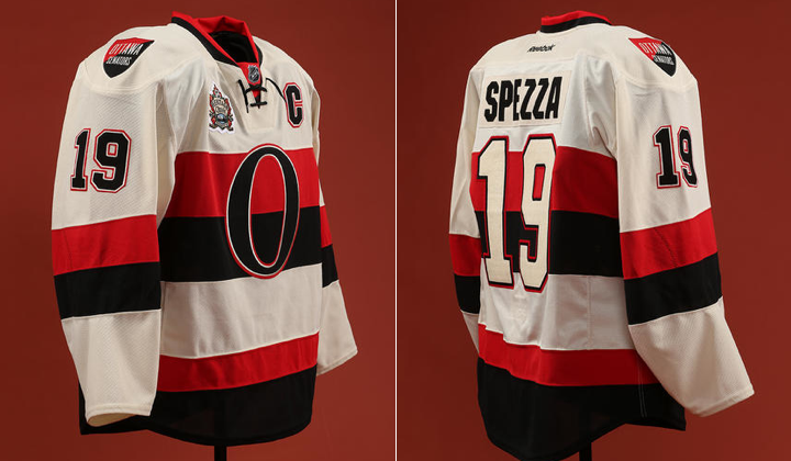
The Ottawa Senators unveiled their 2014 NHL Heritage Classic jersey at a special press event this morning in Ottawa. And it looks even better than it did in yesterday's leaked photo.

In essence, though, it's nothing more than a light version of the black Heritage jersey the Sens debuted two years ago — which is all it needs to be. Here's a look at the full uniform.

Photos from Ottawa Senators

The third Heritage Classic will take place at B.C. Place in Vancouver 99 years after the original Senators club met the Vancouver Millionaires for the 1915 Stanley Cup series. The Millionaires swept them. Will history repeat itself this winter?

We were treated to a few sneak peek photos of this jersey over the past week, but one aspect we hadn't seen was the shoulder patches. They are, of course, the same as what we find on the black jersey. The team's name in English on the right shoulder, in French on the left.

Photo from Ottawa Senators

Canucks will reprise Millionaires sweater

The other big news to come out of this morning's announcement was confirmation that their opponent, the Vancouver Canucks, will indeed bring back last year's Millionaires jerseys for the big game. Jason Spezza and Henrik Sedin were on hand to model the throwback-inspired sweaters.

Photos from Ottawa Senators (via Instagram)

Should be a great-looking, stripe-filled game! And I'm looking forward to being there.

Wednesday
Nov272013

Senators' Heritage Jersey Leaks

Photo by Kevin Daly

New Ottawa sweater seen in sports store a day early

Icethetics ready Kevin Daly spotted the Ottawa Senators 2014 Heritage Classic sweater in an unnamed sports store today and snapped a picture for us. The jersey is scheduled to be unveiled by the team tomorrow — so it probably shouldn't be hanging out in the open like this yet.

As you can see, it's exactly the reverse of the black Heritage jersey launched two years ago. It even includes same the shoulder patches designed by Jacob Barrette. No surprises at all. It's worth noting there's no Heritage Classic patch. But that could simply be because this is only a replica — not what the players will actually wear.

Overall, what do you think?

Tuesday
Nov262013

Islanders' Stadium Look Revealed

Newsday provides uniform sneak peek 10 hours early

Photo from Newsday (via New York Islanders)Late tonight, the Long Island newspaper Newsday presented an early look at the uniform the New York Islanders will wear for their 2014 Stadium Series appearance on Jan. 29.

The photos appeared on the paper's website just after midnight ET, presumably with the team's permission (a reporter announced it was coming earlier in the day).

According to a later tweet from @NewsdaySports, the official unveiling is scheduled for Wednesay morning at 10 AM ET. What's unclear is whether the Isles will go it alone or if the league plans to unveil all seven Stadium Series uniforms in one shot.

But as we're now just hours away, it won't be long before we find out.

Regardless, the Isles' newest uniform is here now. So let's discuss. Here are a few details I noticed: 

  • The crest — believe it or not — is the chrome logo the NHL recently unveiled. So that's an interesting development. My guess: It's not embroidered. It may be screen printed like the guitar-string numbers on the Predators' uniforms.
  • A flat version of the NY logo, however, is also visible on the pants — bigger than most pant logos.
  • The shoulder yoke is unusual, not unlike what we see on the Blues' uniforms — though without the piping on the front.
  • The right shoulder bears the Stadium Series patch while the left shoulder has the classic primary mark to remind us all it's not going anywhere.
  • Looks like everything is on an angle. The pant detail is new and different as is whatever is happening on the sleeves. Hard to judge based on this.
  • What is clear on the sleeves is the stripes do not wrap all the way around the arm (probably because they can't if they're angled).
  • The elongated numbers we talked about last week do not appear on the sleeves. They do, however, appear on the helmet.
  • Haven't seen the back of the jersey yet. That'll come in the morning.
  • The collar laces seem to be tied on the inside of the jersey rather than outside. Player preference or design feature?
  • The CCM branding is very prominent in this photo, clearly seen on the helmet, gloves, pants and skates. The only Reebok logo is on the stick and barely detectable. Of course, CCM is Reebok, but I have to wonder if this is significant beyond Tavares' own deal with the company.

I don't like to make instant judgments on the blog, but my initial reaction to the overall design is positive. There are certainly some unique aspects to it, but that only makes me like it more.

In an NHL being overrun by "traditional" and "retro" uniform designs, it's refreshing to get something out of left field every so often. If the look of this uniform is any indication, I'm really going to like the Stadium Series.

Check back tomorrow for more on the official unveiling.

Page 1 ... 3 4 5 6 7 ... 156 Next 5 Entries »