June Edition Reebok released its planning catalog to retailers for the new season in January. That's when we got our first look at NHL JerseyWatch 2011 here at Icethetics. In the months since then, we've learned a lot more.
As the summer progresses, more of our rumored information will get official confirmation one way or the other. Many teams unveiled jerseys at the draft this month but we're still waiting on plenty of other announcements. New or updated information is noted in red.
Keep in mind that the JerseyWatch updates are primarily intended to be a compilation of information gathered over months, all put in one place. Regular blog readers may not find a lot of new details here. You've been warned.
Dallas Stars
updated

 Stars current third jersey / from NHL.comNew alternate jersey Reebok says the Stars are looking to launch a brand new third sweater. And most of us are hoping they run far away from their current look.
The most recent rumors suggest it will indeed be green with a nod to the past. As we know, retro is all the rage lately. What that means for the actual design is anyone's guess at this point.
Looking back, Dallas may have been the hardest hit by the transition to Reebok Edge in 2007. They went from having a beautiful and unique set of sweaters to some of the blandest in the league. And green — already in short supply around the NHL — disappeared almost entirely.
Currently, the Stars wear a black jersey and a white jersey, each of which simply has the word "DALLAS" arched above the sweater number. They're trimmed in gold and only the white uniform has any hint of green. Their third jersey (right) is the only one with any kind of a logo on the front.
 Stars 2003-2006 / from Getty ImagesNow it seems they're finally ready to advance the brand and add something new — or retro, anyway. I think green would be welcomed as a color that's slowly but surely returning to the league after a long absence.
Maybe even a new logo to go with the green? So long as they learned their lesson from the "Mooterus" (left). That lesson being, don't get too cute with your logo or it will come back to bite you.
Let's be honest, anyone who's ever opened up a sixth grade health class textbook would recognize that shape without a second look. We can all pretend it's the constellation Taurus, but no one is being fooled here. Least of all Trevor Daley.
Not only that, but what was with the red? That was never in their color scheme. And they don't need it. They already have two great colors in green and gold.
Ultimately, it sounds like Stars VP Brett Hull is determined to see the club in something that might've been worn during his NHL playing days. And that's what we like to hear.
However, ownership issues have arisen for the Stars which could put the launch of a new sweater in jeopardy. The current owners may not want to spend additional money while looking for a new buyer. So this new alternate may or may not happen now.
Edmonton Oilers
jersey unveiling

 Oilers new road jersey / OilersNew road jersey At last, Oilers fans can rejoice! A new white sweater (right) was unveiled on June 24 at the NHL draft.
Edmonton selected Ryan Nugent-Hopkins first overall and used the opportunity to reveal the retro jersey which now matches the club's blue and orange home uniform — completing a set fans have been begging for.
If the Stars fared the worst in the switch to Reebok Edge jerseys in 2007, the Oilers weren't far behind. The navy and copper uniforms were a disappointment. As with many new Reebok uniforms, there were no waist stripes. And the sleeve stripes inexplicably stopped on top of the elbow instead of wrapping completely around the arm.
Only a season later, the complaints of fans were quelled by the introduction of a retro third jersey that brought back the brightly-colored blue and orange from the 1980s — most associated with Gretzky's Cup-winning dynasty.
In 2009-10, the fan-favorite uniform got top-billing as the new home sweater. Many fans were hoping the white jersey return last season, but after three straight years of uniform changes in Edmonton, the NHL probably frowned upon a fourth — even though the Isles got away with it.
This means the old white jersey is officially retired and that's great news. The bad news, however, the third jersey will not be changing. So those wanna-be stripes aren't disappearing entirely quite yet.
Florida Panthers
jersey unveiling

 Panthers unveil new home jersey / PanthersNew home jersey The Panthers joined a handful of teams at the 2011 draft in unveiling a brand new jersey at the podium.
As has been rumored for some time, Florida is going back to red for their home uniform (right) in 2011-12.
And even a Lightning fan will admit that's a good thing. The Stinkin' Panthers were never supposed to be blue. That's Lightning territory. Happy to see them reclaim their original identity.
The Panthers' first red jersey was relegated to alternate status in 2003. When the Reebok change over occurred in 2007, the red was gone entirely.
The new red sweater borrows from the same template as the old blue one, without the extraneous piping on the front and sleeves. (But I think gold piping would've been all right on the sleeves in this case.)
The red rumors go back to January when Miami Herald writer George Richards revealed what he'd heard from players and team officials. He believed the third jerseys will remain in place as do I. And that's a good thing.
Since the Panthers have a navy and powder blue jersey that actually looks good, they should hang onto it (as a third) and retire the old blue one. Though it's been reported that team management isn't a fan of that jersey. So we'll see if it sticks around past 2012.
Los Angeles Kings
jersey unveiling

 Kings unveil new road jersey / GettyNew home, road & alternate jerseys The Kings have decided to switch things up in 2011 with an all new uniform set. (Kind of. Only one new jersey is actually being added.)
The Kings unveiled their new white road sweater (right) at the 2011 draft, which officially confirms months of speculation going back to October when we first saw prototypes.
The new jersey nearly matches the black alternate launched in 2008 — which becomes the new home jersey next season. The key difference is in the waist striping. On the black jerseys, there's piping around the bottom but no waist stripes.
The October leak aside, this uniform swap wasn't entirely unforeseen. The team has been dropping hints for some time. For example, the players wore the black third jerseys for home games throughout their 2010 and 2011 playoff runs.
The black and purple home jersey which debuted in 2007 becomes the new alternate in 2011. The white version, the most recent road jersey, is now retired.
The disappointing news from Los Angeles is that the purple throwback launched this season — very popular among fans — will go back into the mothballs for now. Hopefully not for too long.
Nashville Predators
jersey unveiling

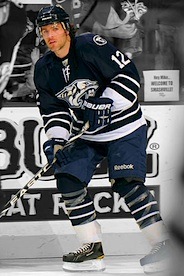
 New road jersey debuts at draft / GettyNew logos, home & road jerseys The Predators are one of a handful of NHL teams undergoing sweeping brand changes in 2011.
On June 22, the team unveiled four new logos and a revised color palette. The new primary mark is a simplified version of the "Pred Head" the team has used since Day 1. There's also a new secondary logo in the shape of a guitar pick featuring symbols from the Tennessee state flag.
Just a few days later at the draft, the Predators revealed their new road jersey (right) by giving it to their draftees. The home jersey will be unveiled on July 13 at the Skate of the Union.
But if you want an early look at that gold jersey (yes, it's gold!), you don't have to wait.
 Home jersey prototype / On The ForecheckPredators fan blog On The Forecheck posted photos of prototype jerseys that were just shy of the final version. In an Icethetics blog update, I shared some details about the direction the team's identity almost took.
So where does that leave us on the rumor scorecard? Well, believe it or not, every rumor we've discussed here has been dead on. A rarity, to be sure, right?
Initial reports said the blue and black third jersey would be the new home sweater and a white version would be added. That was true... until it wasn't anymore (when the team changed its mind). New rumors circulated that gold would be the new home color. And on July 13, that will be official.
Regarding the new logos, a never before seen "NP" lettermark was seen in April on Pekka Rinne's new mask design for 2011. Turns out it is one of the new secondary logos and it will be used on the uniform pants, according to the team.
And finally, to quote an earlier edition of the JerseyWatch:
Other speculation involves a freshening up of the very '90s primary logo — perhaps swapping the navy blue for a brighter shade and increasing the amount of gold in use. Ultimately we'll probably have to wait until summer for any kind of confirmation.
Dead on. Again. I know it sounds like I'm tooting my own horn here, but that's not really the case. What I'm trying to say is that Icethetics has the best readers in the world when it comes to providing early details before they become official. All I do is filter what comes in. So kudos to you guys for keeping us all a step ahead!
One thing I reported that Reebok got wrong was when the said the third jersey wasn't changing in 2011. In fact, no third jersey will be used next season at all. But I'm sure it won't be long before a navy sweater works its way back into the Predators' arsenal.
New York Islanders

 Isles current road jersey / from NHL.comNew alternate jersey Reebok is indicating a brand new third jersey for the Islanders — which will probably ruin everything now that they've finally gotten it right.
Recent rumors all but confirm that, suggesting that the new sweater will be primarily black. Wish I was making that up.
Proponents point to two other New York teams who have historically used the orange-and-blue color scheme. The NBA's Knicks and MLB's Mets have added black in recent years. Perhaps the Isles are just following the beaten path.
This season saw the Isles debuted their new white road sweater (right) to match the blue throwback that's been in use since 2008. We were all relieved and overjoyed to see it.
And that's because the folks on Long Island tend to make bad decisions when it comes to redesigning Isles uniforms. For this team, retro works and it always has.
Remember the "fish sticks" debacle of the mid-90s? If not, you're lucky. Fans revolted at the sight of the new sweaters and logo. So much so that the team was forced to bring back the old look not three seasons later.
The only time the Islanders have attempted a non-retro third jersey, it was orange. For the most part, fans liked it and it was used from 2002 until Reebok ruined the Isles in 2007. Also worth noting: Ex-Isles employee and exiled blogger Chris Botta said in a video blog that the team is indeed adding an alternate sweater next season. When asked why by a fan, his simple answer was "money."
Ottawa Senators
Updated

 Sneak peek at heritage sweater / SenatorsNew alternate jersey Earlier I said the Thrashers may have had the ugliest third jersey in the NHL. Forgot about the Senators.
Luckily, in early March, the Sens confirmed a replacement is coming. They're calling it a "heritage" jersey. Team president Cyril Leeder later went on the radio and divulged a key detail — that being a barber-pole look as "part of the design." He even confirmed already having a prototype in the office.
Then at an event in late March, season ticket holders got a sneak peek at the jersey itself — which the rest of us were treated to later (right) in a video on the Sens' website.
The jersey was folded and framed in such a way that we can't really make out what it's supposed to look like. But you can do your own extrapolating.
Some things to keep in mind: A retro-styled concept designed by a fan has appeared in official team materials and in January, Ottawa's farm team in Binghamton wore the barber-pole throwbacks that the original Senators sported in 1930s.
Ultimately, it has to be an improvement on what they've been wearing since 2008 — with SENS across the chest. I guess the good news here is, at the very least, that jersey is going away.
One other note regarding jersey patches. For years now, the host of the NHL All-Star Game wears a patch with the event's logo on their uniforms. The Senators, hosting in 2012, will be no different. The red home jerseys given to their draftees were outfitted with All-Star patches on the chest. Presumably, the 20th anniversary logo will not be used as a jersey patch unless it's done so after the All-Star break.
Phoenix Coyotes

 Coyotes PHX shoulder patch / NHL.comTeam name change Prior to the Thrashers' relocation to Winnipeg, there were reports that the Coyotes could have a new name next season if they stayed in Glendale.
Prospective owner Matthew Hulsizer pledged to Glendale in December that he'll rename the club Arizona Coyotes — should he actually become the new owner (still up in the air).
If the name is changed, the shoulder patch on the home and road uniforms would have to be updated or removed as it reads "PHX" for Phoenix.
The patch itself is in the shape of the state of Arizona and inspired by the design of the state flag. Perhaps something as simple as replacing PHX with AZ would do the trick.
The alternate uniform's shoulder patch reads "Phoenix" as does the wordmark on the pants. If the name changes, we're likely to see it reflected in an updated primary mark as well.
With the franchise remaining in Glendale for at least another year, the team could be renamed the Arizona Coyotes as early as the fall. If not, perhaps for 2012-13.
We may see new logos and patches, but I can't see anyone spending the money to change the actual uniforms or primary logos for what could be just a season or two.
UPDATE (1:05 PM PT): Today it's being reported that Matthew Hulsizer is no longer pursuing the purchase of the Coyotes. This probably indicates no name change this season. I don't see the NHL initiating any sort of branding overhaul on a club they're trying to find a buyer for.
Pittsburgh Penguins

 Pens' Winter Classic jersey / NHL.comNew alternate jersey This should be the least surprising news in the entire post. The Pens will have a new third in 2011.
The Penguins first talked about replacing their powder blue third jersey last year. But upon the announcement they'd be participating in another Winter Classic, those plans were shelved.
The last time the Pens added a third jersey, it was borrowed directly from the 2008 Winter Classic. Now three years later, it's all but a given that history will repeat itself.
I'd be very surprised if the new uniform isn't the 2011 Winter Classic sweater (right). Chances are this was the same design they were working on last year when the idea of changing the alternate jersey first came up.
The only difference would be the lack of a Winter Classic shoulder patch. I've altered the image to represent that. It's a nice looking jersey on its own. But I do think it would be better if they used real white instead of the trendy vintage white.
Tampa Bay Lightning
 Yzerman, St. Louis, Lecavalier, Stamkos, Vinik and Leiweke unveil new Lightning uniforms / Lightning
 New home & road jerseys The Lightning unveiled a new logo along with new home and road uniforms to very mixed reviews on January 31.
The new management team in owner Jeff Vinik, president Tod Leiweke and GM Steve Yzerman wanted to put a fresh new stamp on the team by changing the entire look.
 New home sweater / LightningThere are simplified logos and fewer colors than before, ultimately leading to a more traditional look worthy of an elite franchise. But for as clean as the new look was, many fans were not happy.
The new uniforms lost some of the personality and history that founder Phil Esposito built in back in 1992 — that being the underarm "victory stripes" and the lightning bolts on the sides of the pants.
After doing what they claim to do best — listening to the fans — Bolts brass made some tweaks which included adding black trim to the sweater numbers as well as white lightning bolts on the pants.
Leiweke also confirmed the "victory stripes" will be part of the uniform design going forward, but that the deadline for such a change in the 2011-12 season has already passed.
At the 2011 draft, the Bolts gave the new blue jerseys to their new picks. They now feature the inner black outline on the numbers, an element which was added after the January unveiling.
The Lightning have also said the BOLTS third jersey will remain for years to come. I imagine that even means keeping the black and gray elements as an alternate color scheme, though the shoulder logo will likely be changed to one of the new marks.
Toronto Maple Leafs

 Leafs current third jersey / from NHL.comNew alternate jersey As rumored, the Maple Leafs will be debuting a new third jersey for the 2011-12 season.
The current third jersey in its Reebok incarnation launched in 2008. Prior to that, the same design was used from 2000 to 2007. It was based on a uniform and logo the Leafs used from 1958 to 1967.
When team management has recently discussed changing the uniform with the media, they've said the plan is to borrow from their own history once again.
 Leafs '70s throwbacks / from Getty ImagesA year ago, Toronto paid tribute to the 1970s as the players skated out in replica jerseys for warm-ups. They matched sweaters worn by the team from 1970 until 1992. Rumors suggest the team may look to that era for its next alternate uniform.
They look great and just different enough to distinguish themselves from the recently altered home and road jerseys. Fans always love the retro look so the Leafs would probably be wise to go this route.
Beyond that, there's not much else in the Maple Leafs' jersey history that isn't a little crazy. So unless they go with the '70s throwbacks, they'll have to come up with something completely new. And that doesn't usually work out well for them.
And I'll say it once again. We won't really know anything until next summer, fall at the latest. But the Leafs usually like to make a big deal about jersey unveilings so I'm sure we'll know when it's coming.
Winnipeg Jets
new!
 Name, but no jerseys at draft / GettyNew logos, home & road jerseys Undoubtedly, the biggest news since the last JerseyWatch update was the sale and relocation of the Atlanta Thrashers to Winnipeg on May 31.
Earlier this month, the NHL Board of Governors unanimously approved the move and days later at the NHL Entry Draft, the team announced its new name, Winnipeg Jets — a call back to the last NHL franchise in the city, which relocated in 1996.
The new team officially announced its name just prior to selecting its first ever draft pick, but logos and jerseys were not yet ready. The Jets were forced to give out generic jerseys at the draft.
To offer a prototype not yet available to buy would've opened the door to knockoff jerseys which, since they're junk, could be prepared faster than Reebok's official jerseys.
Team management has said they will have new logos and uniforms "not completely different" from the old Jets. Perhaps a darker blue and the addition of a third color such as silver? Read the complete draft recap for details on what we might expect.
As far as a timeline, the Jets haven't been specific on that, simply saying that it will "be a while." If I had to guess, I'd say the designs are done and awaiting NHL approval. After that's happened, factor in merchandise manufacturing time and I'd guess we won't see anything until mid to late August.
And just so it's being said, obviously, none of the Atlanta Thrashers jerseys will be used by the Winnipeg Jets. All three are now officially retired.
NHL Special Events
 The 2012 NHL All-Star Game will be hosted by the Ottawa Senators. The event logo was unveiled in September. It's not clear if the same "fantasy team" format from 2011 will be used in Ottawa. For what it's worth, no All-Star uniform set has been worn more than once since 2000 and 2001.
The league has yet to make an announcement regarding the hosts of the annual outdoor games. It's been widely rumored the Philadelphia Flyers will host the Winter Classic on the day after New Year's 2012, against the New York Rangers. That would be unfortunate for jersey junkies as both teams already have retro uniforms.
As for the Heritage Classic up in Canada, I haven't heard a peep. Perhaps we don't get one in 2012? The Canucks, Maple Leafs and Senators each have yet to play a game in the fresh air. Could this be the year? When all of that is decided, we'll hopefully see some neat retro sweater designs.
At this time, there are no changes anticipated for the Ducks, Bruins, Flames, Hurricanes, Blackhawks, Avalanche, Blue Jackets, Red Wings, Wild, Canadiens, Devils, Flyers, Blues, Sharks, Canucks, or Capitals.
As reported in previous editions of the JerseyWatch, the Sabres and Rangers will be hanging onto the alternate jerseys they introduced in 2010 as part of their respective anniversary celebrations.
Wow, that's already the fourth edition of NHL JerseyWatch 2011 all wrapped up. More updates will continue over the summer as a handful of teams still have new stuff to show us. But as always, keep an eye on the blog for the newest information.


 34 Comments
 Reebok's branding transition continuesReebok, the manufacturer and designer of the often-criticized Edge jerseys, quietly began a branding transition back in 2008. Three years later, it's still ongoing and a recent change has spawned an abundance of emails and tweets from Icethetics readers.
 Comparing the Reebok logo on NHL jerseys / NHL.com