Thursday
Jun232011

Predators New Jerseys Leaked?

It may turn out we didn't have to wait for the new Nashville Predators jerseys after all. Some new photos were posted by On The Forecheck today, which seem to show the team's unreleased sweaters.

Are these the Predators' new home and road jerseys? / On The Forecheck

The blog is now saying that a contact with the team says these are not the final jerseys. Perhaps a prototype then? We'll find out for certain — at least as far as the road sweater — this weekend when it's officially unveiled by the team. Until then, we have this to speculate on.

To quote my tweet from earlier in the day, these are astonishingly good. I'm serious. I've never liked the "space-suit" silver used on the sleeves and this is miles away from that. I like almost everything about these jerseys except for the piping on the back. I think it's used brilliantly on the front.

And kudos to the Preds for stepping outside the box and going with a primary color that no one else has. Gold may not be a common color for a hockey sweater, but it looks great here. 

I'll have more to say on the subject when I have some time to write later. For now, what do you think? Are you hoping they're the real deal or real fake?

Wednesday
Jun222011

Predators New Logos Unveiled!

The new and simplified logos for the Nashville Predators were unveiled today in Las Vegas, where the NHL Awards will be held tonight. Here's your first look at the new marks, debuting this fall.

Predators new logos unveiled / Predators

Smashville 24/7 provided its readers with the best look at the marks which now feature only blue, gold and white, dropping the orange, steel blue and silver from the old identity. The logos were officially on display on the Predators' website.

The new primary logo is a simplified version of the mark the Predators have used since their inception in 1998. It's much cleaner and more refined than the previous version. And best of all, it retains the unique identity of the team rather than going back to the drawing board completely.

There are two new secondary logos, including the NP lettermark which we first saw on the side of Pekka Rinne's new mask back in April. The other mark is in the shape of a guitar pick — perfect for a team in Nashville, the home of country music. And perhaps most notably, it honors its home state with the symbol found on the Tennessee state flag.

If we're being nitpicky, the stars aren't technically positioned accurately if they're trying to match the state flag. You can look it up for yourself to compare. Perhaps it will be fixed in time for the uniforms.

Finally, the new wordmark is probably the logo most similar to its predecessor. The text is positioned in the same way, but a new typeface is introduced. I think it looks more... "toothy."

All in all, I have to give this new identity high marks. They're taking their logo out of the '90s, simplifying it, yet not straying too far from the path that's worked for them. Regarding the jerseys for next season, I can't wait to see them.

Several reports have said the new road sweater will be revealed this weekend during the draft. It's worth noting the Predators do not currently own a first round pick, not to say that can't change. These same reports suggest the home jersey will make its first public appearance at the Predators' Skate of the Union event in July. I haven't seen an exact date for that yet.

In addition, RLD Hockey is reporting that Nashville will retire their current third jersey and stick with their two new uniforms next season.

Wednesday
Jun222011

Winter Classic Foes All But Official

2012 Winter Classic temporary logo / NHL.comThe 2012 NHL Winter Classic will take place not on New Year's Day but the day after, when the Philadelphia Flyers host the New York Rangers at Citizens Bank Park.

The New York Times says this information has been confirmed by a league official not authorized to speak publicly on the decision.

Technically, it's still speculative at this point, but it will be official as soon as the NHL releases next season's schedule. And that's expected as early as tomorrow.

This graphic to the right here is the first temporary logo being used to promote the 5th annual outdoor game. The final version of the 2011 Winter Classic logo was unveiled on the same day as the schedule release, so perhaps we could see it Thursday as well.

The Flyers-Rangers game will take place on Jan. 2, 2012, due to the fact that Jan. 1 falls on a Sunday and the NFL season will still be underway. And the NHL doesn't need that kind of competition.

I know most of us, Flyers fans excluded, aren't thrilled with seeing a Pennsylvania team involved in this event for the fourth time in five years. This pattern seems to be repeating past WC opponents to allow them to host a game of their own. If it continues, we could see Detroit hosting in 2013. Who would you like to see them play? The Avalanche? Maybe the Blues or Stars? Think of the throwback jersey possibilities.

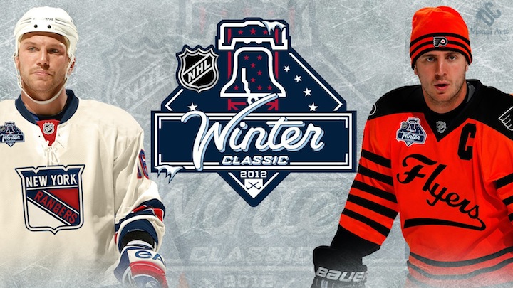
Since I can't leave this post without something interesting to look at, here's a concept designed by DC Visual Arts. How about these for Winter Classic uniforms? Even NESN was sort of fooled.

Winter Classic 2012 concept / DC Visual Arts

Tuesday
Jun212011

Victoria Royals Unveil Logo, Jersey

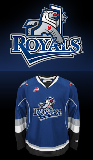
Victoria Royals logo and jersey / RoyalsTwo months ago today, the WHL's Chilliwack Bruins announced their relocation to Victoria. Now, the club finally has a new name and logo.

On Monday, the Victoria Royals revealed their colors, logo and dark jersey (right) — all of which will be used when they hit the ice to start the 2011-12 WHL season this fall.

Before I share my thoughts, got to tip my hat to Chris Creamer at SportsLogos.net for being the first to show the logo to us. He tracked it down in a trademark search a couple weeks ago.

Now the logo. I'm surprised by it. This may be junior hockey, but in Canada that's no excuse for having a below average logo. Nothing really stands out about it, except for the red maple leaf which looks tacked on.

In fairness to the designer, by no means is it on the level of the Connecticut Whale or anything. I was just expecting something more along the lines of fellow WHL clubs like the Giants, Rebels or Silvertips — not the Ice or Rockets.

The Province, in Vancouver, talked to artist Brent Lynch about the design.

The logo is a stylized, heraldic lion designed by Vancouver Island artist Brent Lynch of Nanoose Bay, who designed the Vancouver Canucks’ orca logo and the logo for the WHL’s Vancouver Giants.

“It’s a contemporary look that has a bit of an edge to it,” said Lynch. “It’s cool for the kids, and adults can relate to it, too.”

I'm not so sure. But then there's the jersey. Clearly, it's the Tampa Bay Lightning's blue third jersey with the new Royals logo on it.

The Vancouver Sun said this has to do with the quick turnaround time.

The franchise had to go with an existing colour template. Reebok didn’t have enough time to customize a colour scheme because the relocation of the Chilliwack Bruins to Victoria was only made official in April.

This explains why the jersey itself lacks one of the club's colors — red. No other team wears that color combination — blue, red, silver and black. A white jersey will be unveiled later this summer.

Now it's time for you to weigh in. What are your thoughts on the new Victoria Royals and their branding efforts? Am I missing the mark with my assessment or do you agree with it?

Thursday
Jun092011

The Best Sweaters in the West

Back in February, we conducted a series of polls asking readers to rate the jerseys of all six Canadian NHL teams. We ended up with a complete ranking revealed just in time for Hockey Day in Canada. It was a popular post so now we're going to take it to the rest of the league.

We'll do them in groups of six, split up by geography. This set of polls will feature the teams out west: Anaheim, Colorado, Dallas, Los Angeles, Phoenix and San Jose. You can rate each jersey individually with a 10, 5 or 1. (You can either love it, hate it, or be on the fence.)

After all the votes have been cast, an average rating will be determined. These polls will remain open for two weeks, ending Thurs., June 23. When we've voted on all the teams, I'll assemble a complete league ranking of every uniform worn for the 2010-11 season. Happy voting!

Sorry, no comments on this post. Just vote!

Blog note: I am leaving for vacation on June 11. I'll be out at sea and likely without an internet connection for most of the time I'm away. I should be back on June 21 just in time for the NHL Board of Governors meeting — when everything in Winnipeg is expected to become official and final. However, if the team's name and logo are announced before that time, I'll probably be delayed in posting it here. Sorry.

But fret not, there will be other updates to the site in my absence. I'm currently preparing concept posts that will auto-publish on Monday, Wednesday, Friday and Sunday while I'm gone so keep checking back throughout the week.