Thursday
Jan132011

All-Star Sweaters from the Back

On Tuesday we were inundated by images of the new 2011 NHL All-Star Game uniforms. But there was one problem. All we saw was the front. And that's left us with a few questions.

First, what does the design on the back even look like? And second, how are the numbers and surnames styled? Today we have our answers.
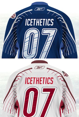
Backs of All-Star jerseys / from NHL.comThe NHL's online store now has the sweaters available for customization and that means we can preview the numbering and lettering in advance of All-Star Weekend.

Of course we won't know who'll play for which team until the Fantasy Draft on Jan. 28. So if you want to get your favorite player's name and digits stitched on the back, you'll just have to guess until then.

One interesting feature you notice straight away about the design on the back is that, while we all thought the pinstripes just stopped at the elbow, it turns out they didn't. They just teleported to the other side of the sleeve and kept going.

Some have called it a baseball-inspired uniform element. I'm not so sure. But regardless, I do like it. It's one of those things that I've not seen on a hockey jersey before.

I talked Monday about how I liked the outside-the-box thinking on these and all All-Star jerseys. One commenter then said, "there's such a thing as going too far."

I have to laugh at the overblown rhetoric for a simple website like this. Going too far? The Florida Everblades decorated their jerseys like Christmas trees this year. That's going too far. This is an attempt at something new that still keeps a very professional feel while attracting a younger crowd.

And sure, you're free to disagree. Many of you seem to be traditionalists when it comes to hockey sweaters. But personally, I hope you don't win out. Because that will make our sport look really dull. And I like that it stands out, especially at the All-Star Game.

Tuesday
Jan112011

Official: NHL All-Star Jerseys Revealed

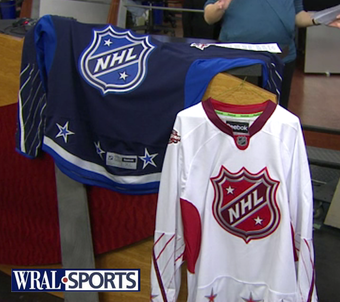
2011 All-Star jerseys / from WRAL-TVThis morning on WRAL-TV, the 2011 NHL All-Star Game sweaters were officially unveiled in the host city of Raleigh, North Carolina.

Carolina Hurricanes marketing director Doug Warf stopped by the station's studio to show off the new jerseys. In his segment, he talked about some of what went into designing them:

  • Colors, six of them, were selected because they represent the majority of teams in the NHL. (At least they kept black out of it.)
  • NHL shield was used as the crest because we won't know the team's names until the captains are selected. (Which we knew already.)
  • Warf says the captains will be picked a week from today on Jan. 18.
  • Red team is "home" while blue team is "road." Warf doesn't say how that was determined since the dark jersey is typically worn at home in the NHL. (Maybe because the host team color is red?)
  • Reebok is trying new things. Oh geez.

This unveiling comes just a day after we got an early look at one of them here at Icethetics. Now we're able to have a good look at both of them.

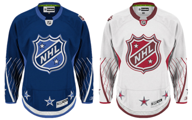
2011 NHL All-Star replica jerseys / from NHL.comAs predicted, the blue sweater is the inverse with all of the same design elements as the red one. Aside from the colors, the main difference between the two is that the All-Star patch is on the left shoulder of the blue jersey while it's on the right shoulder of the white one. 

The league confirms the opposite shoulder will bear the player's home team logo. That article also contains more details about the uniforms including Reebok's new Smoothfit numbering and lettering. Good luck buying an authentic customized jersey.

As a side note, the more I see the red jersey, the more the lighter shade starts looking like pink. But I'm sure it'll look fine under the lights on the ice. Well, I hope. Also today, with just 17 days until the Fantasy Draft, the full 42-man All-Star roster has been announced. Half of that group has never been to an All-Star Game before, so that will be fun.

Who do you think the players will pick as captains? And who do you think the captains will pick? Or instead, if you were an All-Star captain, who would you pick? List your rosters below (paragraph form with commas please, bullet lists will be deleted). And don't forget to tell us what you think of the two sweaters.

Monday
Jan102011

Exclusive: Red All-Star Jersey Surfaces

Red 2011 All-Star jersey / exclusive to IcetheticsJust last week I shared some details of an early sneak peek I got of the 2011 NHL All-Star Game uniforms.

Today, a loyal Icethetics reader emailed in a photo of the red team's jersey. I'm told the sweater was found hanging on a rack inside a Pittsburgh sporting goods store. You can see some Penguins jerseys beside it.

I don't want to reveal where exactly this was found as I'm not looking to get anyone in trouble, merely to show you guys. A few observations based on the photo:

  • The gaudy Reebok patch on the front tells us this is a Premier replica jersey, not an Authentic one like the players will wear.
  • The collar is a style we've never before seen on a Reebok Edge jersey. Nice to see something fresh.
  • The red NHL shield fits perfectly with what was posted last week, but because this isn't a customized jersey, there's no number above it.
  • There appear to be red stars spaced out around the bottom of the sweater just above silver and maroon stripes.
  • The arced pinstripes on the lower part of the sleeves resemble what I was trying to describe as the design inside the numbers on the back of the uniform.
  • And the All-Star Game logo patch seems to be placed on the top of the right shoulder, not the front as previously assumed.

I still don't have a picture of the blue jersey to share but it's probably a safe bet it will be the inverse of this one. Having seen this, are there any concept artists that care to take a stab at the set? You have my email.

Saturday
Jan082011

Reversing the Curse of the Cannon

One of the last stories I posted before my brief leave of absence — to move 5,000 miles from my home in Tampa — was the unveiling of the Columbus Blue Jackets third jersey. That story then proceeded to take on a life of its own while I was getting settled in Seattle.

R.J. Umberger / photo by Bill Wippert/NHLIIf you're all about superstition in sport, then this story I'm about to recount is certainly for you. It's been said the Blue Jackets were cursed by the cannon jersey. Why?

It started with the official unveiling at a mall in Columbus while the players were on the road facing the Islanders — who, by the way, were 0-11-3 in the 14 games leading up. The Jackets took a 2-1 lead into the intermission. Then the jerseys saw the light of day for the first time between periods back at the mall. It only took 51 seconds of the second period for the Isles to tie the game.

A team that hadn't won a game in over a month proceeded to force the Blue Jackets into overtime. It was a W for Columbus, but only just. Still, it put the Blue Jackets atop the Central Division. So it was back home to take on the perennial division champ, the Red Wings.

The jersey made it's debut on Nov. 26, as scheduled, as the Jackets hosted the Wings. But Columbus was edged out, 2-1, ending a five-game winning streak. Two nights later, they brought the new threads to Detroit. Lost again, 4-2.

Almost a week later, the third jersey was on the schedule again. This time, the Blue Jackets were demolished by the Sabres in Buffalo, 5-0. And the next night, back in Ohio's capital city, the Penguins handed them a 7-2 thumping.

Head coach Scott Arniel had enough of this. The cannon sweater was back on the schedule a week later, Dec. 11, when his team was hosting the Rangers. Yet they skated out in their standard-issue home attire.

Blue Jackets wear the cannon / photo by Jamie Sabau/NHLIColumbus Dispatch writer Michael Arace quoted Arniel as saying, “I just thought our red pants against their red pants would look really cool.”

Sure, coach. It wasn't the 0-4 record in the third jerseys. It was your sense of style. Still, the Jackets came away with a 3-1 victory that night. It broke a streak of seven games in which Columbus couldn't close the deal in regulation time. 

On the heels of the swirling rumors that superstition was behind the last-minute change, the third jersey schedule was mysteriously removed from the team's website. But it remained on Icethetics for fans to be reminded of the team's original intentions. So we watched and waited for Dec. 18, the next third jersey date on the calendar.

Sure enough, the Blue Jackets wore the alternates against the Stars. If they had killed the jersey, it would've been bad. For one thing, there was all the publicity surrounding the unveiling. And let's not forget the boatloads of fans who bought them. But Dallas won. That made Columbus 0-5 in the new duds.

The losing streak finally came to an end on Dec. 27, when the Blue Jackets beat the Wild in a shootout. And four nights later, they closed out 2010 with an overtime win against Ottawa, all while wearing the third jersey. But they still haven't managed a regulation win in the alternate sweater.

Is the cannon jersey really cursed? If so, their next chance to break it is Jan. 14 against the Red Wings. But let's not forget this is a team that struggled all month, regardless of what uniform they wore. And the remaining dates originally scheduled for the third jersey are back on the team's website.

So, now I have to ask: Do the hockey gods have something against the cannon? Against it being the umpteenth dark blue alternate jersey in the NHL? Or is it just getting a bad reputation for being in the wrong place at the wrong time?

Friday
Jan072011

The Modesty of the Hershey Bears

Wait, that's not right. I meant "immodesty."

Bears sport Moose patch / photo by Winnipeg Free PressGary Lawless of the Winnipeg Free Press wrote today about how the Hershey Bears are flaunting their recent championship victories over the Manitoba Moose and Texas Stars with patches on their jerseys, reminiscent of notches on a bedpost.

Warning: The rest of this post features opinions you may or may not agree with. Proceed cautiously.

In his article, Lawless thrashes the arrogance of an organization that — despite a rich and classy hockey history — would resort to such childish behavior. I can understand why he'd see it that way. I'm kind of appalled, myself, to be honest.

On the other hand, who says teams have to be gracious in victory? Being classy is overrated. A hockey championship is a long, hard-fought physical/emotional/mental battle. That's just how it is. It's not easy, to say the least. Why should you keep your excitement to yourself when you do win? And on the other side of the coin, who says losing teams have to keep their chins up?

You have bad losers — like the Pittsburgh Penguins refusing to shake hands with the Washington Capitals after their Winter Classic defeat. And you have bad winners — like Penguins fans, who chanted Steven Stamkos' name after an embarrassing fall during a penalty shot amidst an 8-1 Pens victory. Was that necessary? No, but there's nothing wrong with not being classy. This is a sport played by grown men. It's not a debutante ball.

But I seem to have gotten a little off track. I'm not saying it's a classy move for the Bears to brag about their championships by wearing the logos of their victims. I'm just saying it doesn't matter if it's classy. The only thing getting hurt by a patch is feelings. Time to be an adult.

Still... there's a certain level of pettiness that goes with this kind of bravado. If you're going to take the low road, be prepared for the steep drop in respect that follows. And that's what this story is really about. It's hard to have respect for a team that doesn't know how to win well.

That's where I stand. I have no problem with what the Bears are doing, but I certainly wouldn't do it. I'm curious to see how the rest of you feel. Is being classy important to hockey? Do you feel that it in some ways separates our sport from others? Or should we all just get a thicker skin?