Entries in chl (22)

Thursday
Oct142010

CHL Third Jersey Fever, Part 2

After a few weeks of daily updates, I needed a bit of a breather. But it's time now to get back to it. We first need to get to a few more third jerseys from the CHL, as a continuation from last week. That post included only new alternates from the WHL. Today's will be from all three leagues.


Photo credit: John AllenThe WHL's Tri-City Americans unveiled a new red third jersey just a few weeks ago.

The design was first seen on Annie Fowler's Tri-City Herald sports blog on Sept. 23. The jersey then made its on-ice debut a few nights later, Sept. 26, for the Ams' first game of the season.

For the record, the Americans beat the Spokane Chiefs in the new threads in front of their home crowd in Kennewick, Wash. by a score of 6-3.

The standard home and road jerseys for the Tri-City club are dark blue and white. Though the red clearly works very well. The primary logo is the same on those sweaters so it might've been a nice change to see something else there.

Still, this is the CHL and even though it's a junior league it's hard to complain about most of their sweaters. They usually put a lot of work in and tend to hit the mark — unlike a certain major professional hockey league we all know well.


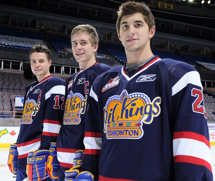
Oil Kings unveil third jerseyJust yesterday, the WHL's Edmonton Oil Kings unveiled their new blue alternate sweater.

Typically, the Oil Kings' dark jerseys are red with more traditional striping so this is a change of pace. And while the rest of the sweater changes, the logo remains the same. A post at etownhockey may have put it best:

The jersey's take on a new modern look but their gaudy symbol is still intact. I like the look but I was really hoping for a completely revamped 3rd jersey which saw a new logo.

The yellow logo is very dated and looks out of place with the rest of the uniform. I understand this goes back to the original Oil Kings days, but with an alternate jersey they had free range to add something new. Unfortunately this wasn't the case.

The Oil Kings' own press release makes no excuses for the design, just pointing out that it will look like a whole new team when the new sweater hits the ice for the first time (in a game) on Friday night against the Medicine Hat Tigers. They also have an extra photo for your enjoyment.


Photo credit: Dave ChanOne of my favorite CHL third jerseys has got to belong to the Halifax Mooseheads of the QMJHL.

The Mooseheads' new black sweater is actually a revisit of a previous third jersey, only now it's made by Reebok. And despite being black, it looks great. You know why black works in the CHL? Because it's used sparingly.

The jersey first hit the ice on Oct. 1 in a shootout loss to the Saint John Sea Dogs. But they sure looked good, aesthetically speaking. Not that they normally look bad. On any other night, the Mooseheads normally look like the Minnesota Wild, whose jersey design they use for both their home and road uniforms.

In other jersey-related news from Halifax, the Mooseheads will hold Pink in the Rink III on Oct. 22. That will involve specially-colored sweaters and the ice surface painted pink. Also, if you have a minor hockey team in Nova Scotia, the Mooseheads could wear your sweater for a night. Details on the Great Mooseheads Jersey Race on their website.


St. Michael's Majors third jerseyThe OHL team with the most ridiculous name ever, the Mississauga St. Michael's Majors, has a new third jersey.

It's a nice one but all these "fauxbacks" are starting to look the same. You got your circle crest in your Habs-style stripe across the chest. We get it. Even jerseys from way back in the day had their own styles. Still, most NHL teams struggle for a look this clean and simple.

The new sweater was unveiled Sept. 26 at the Meet the Majors event. This photo (right) was posted on Twitter by Tony Ambrogio the following day but the team has a small photo gallery on its website. Unfortunately, the "fauxback" thing only gets worse when you see the back. Yes, that's a dark blue nameplate on a vintage white sweater. When did this become a thing?


Greyhounds' new third jerseyWe'll wrap up today's CHL third jersey post with the OHL's Sault Ste. Marie Greyhounds.

I don't know if they're trying to keep this new sweater a secret, but the Soo Greyhounds are doing a good job of it. A reader, Ryan, emailed in this photo (right) with no details on where it came from. There's also this article on the team's website.

The Greyhounds usually wear red and white so this is certainly something new. Still, it looks like they're trying (badly) to borrow an idea from the Mooseheads (mentioned above).

But I guess it's no worse than writing SENS or BOLTS across the front of your alternate uniform. The striping is hard to make out in either image but it appears to be pretty plain as well. Not that that's a bad thing.

Hoping the uniform looks better on the ice than in this photo, though. By the way, if you guys can track down a better shot (perhaps game action), let me know by email.

Friday
Oct082010

CHL Third Jersey Fever, Part 1

We have to be nearing some kind of record: New posts EVERY DAY since Sept. 15. And some of those days have seen multiple posts. I can't remember the last time Icethetics was this busy. But there's no sense in slowing down now. I promised a look at some CHL third jerseys before the week was out. Unfortunately, there are too many for a single post.

We'll begin with the Western Hockey League. The season kicked off a couple weeks ago and already we've got several new sweaters hitting the ice.


Kamloops Blazers 3rd jerseyThe Kamloops Blazers have added a blazing orange blazer. It's not the color but the front of this jersey that is its downfall.

I hate to start on a bad note because last time I discussed Canadian Hockey League uniforms on this blog, it was with great acclaim. I said the NHL should take a page out of their book. But it looks more like the Blazers have taken a page out of the Dallas Stars' book. And the Stars' book is terrible!

The dawn of the Age of Reebok ushered orange out of the NHL. But prior to that, only the Islanders and Flyers used it for their third jerseys. Philadelphia then brought it back in 2008 as an alternate. Only now is it finally a regularly-used color again.

So despite the terrible lack of any sort of crest design for Kamloops, you won't find a more colorful hockey league and that by itself should be applauded.


Kelowna Rockets 3rd jerseySpeaking of colorful, the Kelowna Rockets have barely worn their regular home and road sweaters this season.

On Sept. 25, the Rockets debuted a new red third jersey with silly-looking dragon face on the front of it. Say what you will about it, but how many teams have ever used this color combination? Certainly none in the NHL and the closest one I can think of is the Detroit Vipers in the old IHL.

But that's not all. The Rockets also wore their pink-ribbon jersey recently for (I'm hoping) Breast Cancer Awareness Night. To save space, I'm linking to it rather than displaying. Plus, you've seen one pink jersey, you've seen them all.

Rather ironically, their home and road sweaters are black and white. Still, the fact that they're willing to take advantage of their color scheme, even if only on a third jersey, is good enough for me. More NHL teams need to get a little creative.


Kootenay Ice 3rd jerseyThe Kootenay Ice have a new blue third jersey in the pipeline.

And here's another example of an awful NHL fad creeping into the CHL. Stop with the mismatch nameplates. Philly did it first with their third jerseys to replicate a past design quirk. That's all right. Now stop.

Setting that aside, this is an otherwise perfectly nice hockey sweater with great colors and a slick design that manages to also feel retro. 

In a web release, the team credits the jersey design to Jack Santos of Visible Means Design in Sherwood Park, Alberta.


Red Deer Rebels 3rd jerseyI recently mentioned the unveiling of the Red Deer Rebels third jersey. Now we can see it on a player in full gear.

The photos I have were sent in by Jorden Clarke. One thing he did point out was the poor visibility of the black numbers on the maroon stripes on the back. That's kind of a shame and easy to fix.

Despite that, however, I still believe this to be among the best new hockey sweaters in the world this season. I just wish they could get the WHL logo off the front.

This jersey made its debut last week on Oct. 2. My thanks to Jorden for these photos from the pre-game skate.


Chiliwack Bruins' 3rd jerseyAlso making its first appearance that night was the Chilliwack Bruins' new third jersey.

This is an instance where I think the team would be better suited to just adopt their third jersey as the new standard. As Reebok-ified as the sleeve striping may be, it's still a great looking uniform as a whole.

I don't even think changing the logo would be a bad thing. Not every team called the "Bruins" has to have a spoked letter as their primary mark. (Yes, that's you too Providence.)

By the way, most of the uncredited game photos in today's post, this one included, and many more can be found at WHL.ca and their online photo gallery. Also this next one...


Vancouver Giants' anniversary jerseyThe Vancouver Giants are celebrating their 10th anniversary with a special jersey.

The most notable feature of the sweater is the 10th anniversary logo placed front and center. The ECHL's Florida Everblades did something similar for their decennial in 2007-08. But they actually put the 10th year logo on the home and road jerseys all year.

For the Giants, they've just taken their standard white jersey and swapped out the crests. Might've expected a little more creativity from these guys so it's a tad disappointing.

Maybe we'll get something better from them next season. Last thing today then I'll leave you alone...


Lethbridge Hurricanes' 3rd jerseyAccording to blogger Scott Wasilewski, this is the Lethbridge Hurricanes third jersey.

This photo appears to have been taken on a store shelf last Friday and I haven't seen anything on the team's website about an alternate sweater, so maybe you guys could help shed some light on this particular subject.

It looks like a frightening fusion between the Washington Capitals and Carolina Hurricanes. Scott isn't sure if he likes it. I'm pretty sure I don't. And heck, while we're talking about bad Lethbridge jerseys, they've announced plans for Pink in the Rink Night on Nov. 19-20.


More new sweaters from the OHL and QMJHL this weekend. Also new stuff in the AHL and ECHL as well. Check back for updates.

Thursday
Sep232010

A Trio of CHL 3rd Jerseys

A large chunk of Canadian Hockey League teams are adding alternate sweaters this season. It would be impossible for me to keep up with all of them on my own. So I thank all my awesome Canadian readers for their emails. Today, a trio of new third jerseys for your enjoyment.

WHL: Rebels go for retro feel

Rebels unveil third jerseyThe Red Deer Rebels unveiled their new third jersey on Wednesday morning.

I'm starting with this one because I'm a huge fan. It is by far one of my favorite junior league sweaters, with a great vintage look. And that's what they were going for.

Here's an excerpt from their news release:

The most noticeable change from the previous "R" uniform is the base color. The predominant burgundy has been replaced by a beige color that adds both a retro tone, along with a western feel.

The standalone "cow skull" shoulder patch, taken from the teams primary logo, reinfoces this western concept. The striping has been moved to the middle of the jersey, and a burgundy shoulder "yolk" [sic, I hate it when I get egg on my jersey] added to the top of the sweater.

The most predominant feature of the jersey, the popular "R" logo which the team has worn since 2001, has been made over. The black fill adds strength to the logo, and compliments the neck collar.

The team will wear black pants and black helmets to complete the look. Player socks will be beige with two burgundy stripes through the middle.

The jersey will make its debut on Oct. 2 when the Rebels face the Medicine Hat Tigers.

OHL: Frontenacs add impressive third

Frontenacs unveil third jerseyThe Kingston Frontenacs also unveiled an impressive new third jersey on Wednesday.

I'm really blown away by the uniform designs that come out of the CHL. Their designers really need to take a stab at the NHL because rarely do we find a bad one in the bunch. In fact, a Frontenacs official may have put it best:

“We went for a retro look and they turned out better than what we ever imagined,” said Jeff Stilwell, Director of Marketing and Communications.

Indeed, Jeff. You really don't need to say any more than that. Well done, Kingston!

And here's another picture, because it's just that good.

OHL: Rangers rely on fan favorite

Kitchener unveils third jerseyLastly, the Kitchener Rangers unveiled their 2010-11 third jersey about three weeks ago.

I may be a little late to the party picking this one up but it's still very much worth a mention. This is a sharp sweater that is a big fan favorite. The team's press release has details:

This exciting new jersey was influenced by the Rangers 2008 Commemorative MasterCard Memorial Cup Jersey, and will feature the same highly popular soldier crest.

The crest on the front of the jersey was designed by the Kitchener Rangers Hockey Club in honour of the Canadian Forces. The design was derived from a recruiting poster that was used in England during WWI. This popular recruiting poster was inspired by "Lord Kitchener", the same individual that the City of Kitchener was subsequently named after.

The poster's popularity led the United States to use it as the basis for the creation of their "I Want You - US Army" poster in their recruiting efforts on this side of the Atlantic.

As I said, if only NHL teams were this thoughtful and inspired when it came to uniform designs. Time to stop marketing your slick, flashy jerseys to A.D.D.-addled children and think about what real hockey sweaters are meant to look like. Call the CHL. They can help.

Thanks to Andy for the email on this jersey and to everyone who wrote in about the Rebels' top-notch sweater. Remember, if you see something that hasn't been on the blog, drop me a line and I'll share it with everyone.

Friday
Mar192010

Back to the Minors

It's once again times to revisit our friends in the minor leagues. They've always got unique jerseys for us.

Wranglers girl scout jerseysUp first, the ECHL's Las Vegas Wranglers spent last Friday dressed up as girl scouts. Remember that?

Now we get to see them in action and it's an absolute riot. I'm as fascinated as anyone by the special auctionable jerseys the minors have become known for, but sometimes I can't help but laugh.

This photo (right) comes from the Las Vegas Sun, which has a bunch more pictures, I know you're dying to see.

There's yet another on the Wranglers' official website along with a write-up of the game, which they won 5-4. How do the Condors feel about getting beaten by a bunch of girls?


Mudbugs "go green" jerseysOne team I can always count on for a crazy specialty jersey is the Central Hockey League's Bossier-Shreveport Mudbugs. And just this week they decided to "go green."

And by that I mean they wore jerseys depicting and open field and wind turbines. So let's waste resources by manufacturing yet another new hockey jersey. Makes sense. If they were smart, they would've worn jerseys made out of recycled plastic bags or something. (Now that I'd like to see!)

If you find yourself in need of a Mudbugs "go green" jersey, auction details can be found here. And for the record, the Mudbugs are actually a pretty good hockey team. They wore these jerseys on Sunday, winning 5-4, and again on Tuesday with a 5-1 win that catapulted them past the first round of the CHL playoffs.


Monsters go pinkAnd lastly, the AHL's Lake Erie Monsters will hold Pink the Rink Night this evening.

As the graphic (right) says, the ice will be painted pink and the team will wear special pink jerseys to be auctioned off following the game.

I will try to track down photos after the game to share here in this post so check back tomorrow for that.

By the way, as I do my best to keep my thumb on the pulse of minor league hockey jerseys, I'm always looking for more. I know we've got a lot of readers in minor league towns, so feel free to drop me a line when your team is up to something.

Tuesday
Mar022010

Only Real Men Wear Pink

Pink seems to be a popular subject around Icethetics these days. You guys have been a great help in tracking down photos of some unique minor league uniforms. The best and most common theme seems to be breast cancer awareness — in other words, an excuse for grown men to wear pink. That's what we've got today.


Stingrays pink jerseyThe ECHL's South Carolina Stingrays held Pink in the Rink night back on February 20.

Icethetics reader Jeff forwarded along this photo (right) of the Stingrays' pink jersey. I know I chopped off the guy's head, but he's not as important as the jersey, right?

The Stingrays were successful in pink, beating the Toledo Walleye 6-0. And according to their website, there was a record crowd in attendance for the win.

If you're interested in more pictures, and I know you are, Facebook is the place to be. On the team's official page is a gallery showing the process of painting the ice pink. They've also got tons of fan photos from the game. Including this one:

Stingrays players thank the crowd for their pink support


Jarret Lukin #40In the Central Hockey League, the Allen Americans wore pink just this past Friday — but failed to find the win.

They lost to the Mudbugs, who've been featured on Icethetics a lot recently for some outlandish specialty sweaters.

The Americans' website said the following with regard to the jerseys:

The players wore pink specialty jerseys as part of the "Pink in the Rink" night. The effort with Susan G. Komen for the Cure aims to raise awareness about breast cancer. The proceeds from the live jersey auction following tonight’s matchup benefited Susan G. Komen for the Cure.

Anyone else notice that the pink socks don't quite match the pink jersey? Just saying.


Jordan Evans #5The WHL's Swift Current Broncos refuse to be left out of the pink party. They wore theirs on February 19.

However, they got whacked by the Chilliwack Bruins 3-0. Notice the trend? A big win for the Stingrays, a big comeback (but in the end a loss) for the Americans. And a big loss for the Broncos.

I know this photo isn't the best quality, but it's what they have on their website. You can see more here.

Just look at those things. Obviously we've seen a lot of pink jerseys so we're getting pretty good at telling the good from the bad. This has to rank squarely in the bad. Pink ribbons on the socks!

But if you think that's bad, just wait until you see what's next.


Pink ExpressThe Atlantic Junior Hockey League's Walpole Express may take the cake for pinkest pink jersey of all time — you know, if there were a cake available for such an accomplishment (for what it's worth, I'm sure it would be pink too).

Normally Icethetics doesn't cover much junior hockey outside of the Canadian Hockey League, but the Express sent me these photos directly and they were too good not to share.

The thing about these jerseys is their almost hot pink. I'm told by the team they were supposed to be a lighter pink, but a deadline snuck up on them and they got stuck with this color.

Anyway, that's not the most interesting thing about Walpole's Pink in the Rink event.

Refs wear pink too!This is.

Even the officials got i on the action, donning their own pink garb. I'm told the AJHL was in full support of the Express' pink event, which took place November 1, 2009. They raised over $6,000 for breast cancer research and $2,000 alone from the jersey auction.

So good for them!

As always, if you've come across any pink jerseys worth sharing, don't hesitate to send them along. Obviously everyone's really getting a kick out of this series.

Maybe some sort of poll is in our future to decide which team has the best use of pink in a hockey jersey. If nothing else, it would just be a laugh to see dozens of teams wearing pink.


Icethetics returns to its roots. 3.8.10