 With just nine days until the Stanley Cup Playoffs begin, no one is interested in hockey uniforms or logos anymore. I can tell because since the news has dried up, most of you have checked out. But that's all right. I'm just as guilty. Would much rather watch my Bolts shut out the defending champs than write a blog post.
Still, it's coming up on two weeks since I freshened up this page and heck, I've actually manufactured some content today. Fans of playoff-bound teams may have noticed new temporary logos popping up around the arena as well as team websites. Postseason marketing is in high gear!
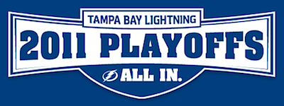
 Almost a dozen teams have special playoff-promoting logos and I'm going to give into homerism by starting with the Tampa Bay Lightning.
As with all of the Bolts' current marketing, it's nothing but blue and white featuring the new logo and the "All In" slogan. It's very simple, just like the team's new look — which doesn't actually take effect on the ice until the fall. Of course the club's newfound fetish for blue makes one wonder whether they plan to use the blue BOLTS jersey for home games this postseason rather than the blacks.
The NHL permits teams to use only two sweaters during the playoffs, but does allows dark alternates to stand in for dark home uniforms. The Kings have taken advantage of that in recent years. It would be a good opportunity for the Lightning, who have only worn the sweater for Saturday home games during the season.
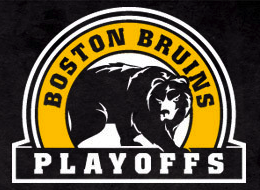
 The Boston Bruins have a simple 2011 playoffs logo which takes advantage of the bear in the secondary mark. It's a great looking drawing that should get used more. Glad to see it here.
Of course the nice thing about this logo is that it's evergreen in that it doesn't include a year. So it's possible it's been used before this season. I'll be honest in saying that I've never really paid attention before. (I just needed blog filler today.)
If you check out the Bruins' splash page, you'll notice David Krejci next to this logo sporting his third jersey. A subtle hint that the B's may be among those clubs donning alternates in these playoffs?
 The Anaheim Ducks appear to have put the most effort into their 2011 postseason logo.
The "webbed D" is used in place of the 0 in 2011. Clever customization. They've also put the NHL's Stanley Cup logo into use here.
Nothing crazy but then the Ducks haven't exactly nailed down that playoff berth yet, have they? They sit at 7th in the West with three different teams nipping at their heels.
 Speaking of which, the Dallas Stars are one of those heel-nipping teams. Despite sitting in 10th place, their playoff logo encourages fans to believe that the postseason is possible.
And really, it's not out of the question as they're only three points out of that final spot. I'm enjoying watching the Western Conference playoff race, but that's only because my team is in the East — and has already clinched. Less stress that way.
Still, I pity the West team that ends up in 8th because I get the feeling it'll be a short ride for them. Then again, the Canucks did just get whomped by the last-place Oilers over the weekend.
 There were no graphic artists straining themselves on this one. The New York Rangers are employing the simplest of 2011 playoff logos with a simple "just add text" directive.
Simplicity aside, the mark is nicely assembled. Getting that spacing just right can be a great irritation on any design project. And the Rangers are one of two teams with a corporate sponsorship for the their playoff run.
 I'm not certain this counts as a logo exactly, but it's a well-designed playoff slogan anyway. (I think I just like the font.)
It's the Countdown to the Playoffs for the Montreal Canadiens, who also have yet to clinch, technically.
 The other team with a sponsored playoff run would be the San Jose Sharks. Of course they don't exactly have a special logo for the playoffs. Really, it's just an opportunity to use another one of their half-dozen 20th anniversary logos.
What slipped under my radar until I was researching for this article was the fact that the Sharks have only missed the playoffs five times in their 20 NHL seasons. That's impressive. Other expansion teams haven't been quite so lucky.
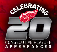
 But speaking of 20 years, it should come as a surprise to no one that the Detroit Red Wings are touting their 20th consecutive playoff appearance. They've been ridiculously good for a lot of years now and have a decent amount of hardware to show for it.
I was trying to remember the last time the Wings weren't in the playoffs and the problem was they've never missed them since I've been a hockey fan. They last time they missed was 1990. And they've only missed twice since 1984. Though again, I'm sure no one is surprised by those numbers.
One question though: What happened in 2003? Should it count as a playoff appearance if you get swept in the first round by the 7th seed?
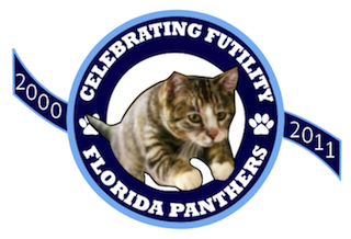
And not to leave out all the teams that didn't qualify, the Florida Panthers, for example, have not qualified for postseason play since 2000 when they were swept by the Devils in the quarterfinals. The Cats haven't won a playoff game since 1997 and even then they only got the one. And that was only a year after their Stanley Cup Final appearance — in which they were swept.
 Playoff disappointment banner / On Frozen PondSo Miami Herald writer George Richards, via his blog On Frozen Pond, asked Panthers' fan(s) to channel their decade of disappointment into a work of art.
You know, every year teams raise banners to the rafters commemorating divisional, conference and of course Stanley Cup championships. Richards held a contest amongst his readers for a banner commemorating 10 seasons of futility.
The winning entry, Richards said, wouldn't fly as a uniform patch. The runner-up (right) was really quite brilliant, however.
Anyway, did I miss any legitimate logos? My research wasn't exhaustive but it gives us something look at for the next week or so while we wait for the playoffs to begin.
Update on Monday · Apr 4 · 2011 | 11:27 AM PDT by
 Chris
Chris
 A couple of readers pointed out that I overlooked a pseudo-logo for the Vancouver Canucks' 2011 playoff run.
Of course like a handful of the teams previously mentioned above, it's not really a logo, but specialized marketing. And like the Sharks and Rangers, the Canucks have a sponsor.
Thanks to those of you who mentioned this item.
Also, if only because it's related to the Canucks, I have to point out something that Bob McKenzie tweeted this morning about the Canucks' Stanley Cup odds. I'm fascinated by stats like this:
- In 1976, Montreal hosted the Olympics. In 1977, the Canadiens won the Presidents' Trophy and subsequently the Stanley Cup.
- In 1988, Calgary hosted the Olympics. In 1989, the Flames won the Presidents' Trophy and subsequently the Stanley Cup.
- In 2010, Vancouver hosted the Olympics. In 2011, the Canucks won the Presidents' Trophy and... well we'll wait and see what comes next.
And for the record, it's not like any stats are being left out here. These are the only three times Canada has hosted the Olympic Games. McKenzie attributes the research to Nate Jones at ESPN.
Update on Tuesday · Apr 12 · 2011 | 10:49 AM PDT by
 Chris
Chris
Needed to wrap up this post with one more update. A few Icethetics readers noticed some playoff logos/marketing that I didn't include earlier. They are as follows.
 The Philadelphia Flyers are using a rather basic logo which contains the slogan "With All of Our Will... We Will." Oddly similar to Tampa's 2009-10 season slogan of "Together We Will."
Damn sentence fragments.
And like the Rangers and Sharks above, the Flyers are getting sponsor money just for making the postseason, thanks to Xfinity WiFi.
 The Los Angeles Kings are going with the "Back in Black" motto again this year, which is what makes me think they'll be sporting their third jerseys at home once again, just like last year.
The design contains one of the league's standard Stanley Cup Playoffs logos but the Kings are using the version without the actual Cup in it. Don't know if that's superstition or an aesthetic choice.
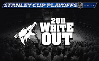
 The Phoenix Coyotes will be doing the whole White Out thing again where they get all the fans to wear white... because I guess that distracts the opponent? My question is: How is your own team immune from the so-called distraction?
And enjoy it while you can. If this is the final season of the team in Glendale, that will be sad. Of course it will probably make a lot of Canadians happy.
The Pittsburgh Penguins are whiting out for home playoff games but they don't really have a special logo for it the way the Coyotes do.
 And the Buffalo Sabres used this March to the Playoffs logo during the final weeks of the regular season. Now that the march is over and they're actually in the playoffs, they went with something a little more on the nose.
 I'm guessing this is the standard logo that the league probably offers to every team. Very easy to swap out any team logo on the left there.
Surprisingly, I haven't seen any other teams using it. Or maybe that's not a surprise as everyone else is taking the opportunity to get creative. No offense to the Sabres. They are the only ones doing it after all.
So there it is. I just did one more quick scan of the playoff teams' websites to make sure I didn't miss anything else. We're covered. This post is officially wrapped up.
 Friday · Nov 9 · 2012 | 10:30 AM PST
  12 Comments


