Entries in dallas stars (21)

Sunday
Mar172013

When Hockey Sweaters Go Green

It's a time for green beer and greener hockey jerseys. Happy St. Patrick's Day, everyone! The only way I can think to celebrate here on Icethetics is by sharing the many green warm-up jerseys being worn around the NHL this weekend. Enjoy!

First up — alphabetically — are the Boston Bruins. On Saturday night, ahead of their game against the Capitals, the Bs skated out for warm-ups sporting a color far from their existing palette.
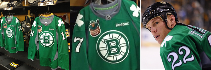
Photos from Boston Bruins via social media

The team shared a number of photos of these green jerseys online today. A shot of the uniforms hanging in the locker room showed up on Instagram along with another of Shawn Thornton on ice. Then on Twitter, they shared a shot of Dougie Hamilton inspecting his own green threads.
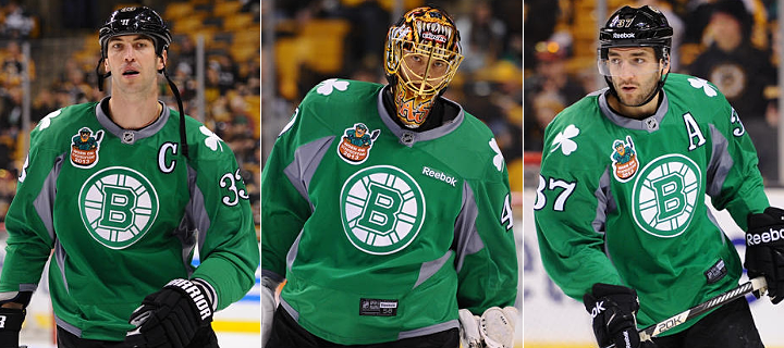
Photos from Boston Bruins official website

UPDATE (3/17): Following last night's game, the Bs added a handful of action shots on their website.

The Columbus Blue Jackets couldn't keep their Irish-themed jerseys off of social media. The team suited up in green ahead of their scoreless affair with the Coyotes on Saturday.
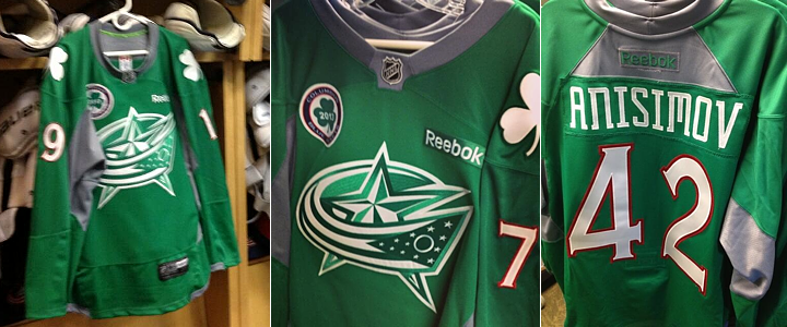
Photos by Alison Pegg via Twitter

Team publicist Alison Pegg was perhaps the most prolific sharer of photos, including these shots of the sweaters from the locker room and auction table. She even offered up a moving picture through Vine. Of course green was not absent from the official Twitter account of the Blue Jackets.

And Icethetics reader Dan Caron even shared some of his own photos with us on Twitter. Needless to say, Columbus' St. Patrick's Day jersey was well-covered on social media.

The Dallas Stars were entertaining as ever with their St. Patty's jerseys on Saturday night. No surnames needed. Just add some Ireland-inspired nicknames to the backs of these bad boys.
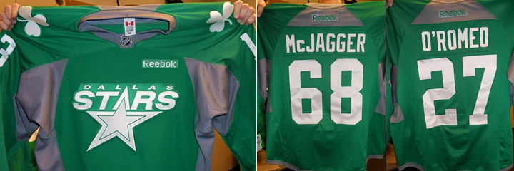
Photos from Dallas Stars via Facebook

The Stars posted a picture of every player's jersey on their Facebook page. I pulled a couple of my personal favorites to post above — "McJagger" for Jaromir Jagr and "O'Romeo" for Aaron Rome. They're up for auction starting today if you find yourself in need of one.
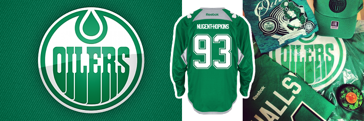
The Edmonton Oilers are hosting the Predators tonight and may be among those teams donning green duds during warm-ups this weekend. On Instagram, the club posted a shot of a St. Patrick's Day prize pack which includes a green Oilers practice jersey. They also shared pictures of more St. Patty's-themed team merchandise on Twitter.

Conspicuous on this St. Patrick's Day was the noticeable absence of a recent tradition of the New Jersey Devils. Since 2010, the Devils have sported a throwback jersey which featured their original colors — red and green — every year for a home game on or near St. Patrick's Day. But not this year. And they were home hosting the Canadiens last night and everything. Would've been a perfect game for it.

Beating everyone to the St. Patrick's Day punch were the New York Islanders, who celebrated in green last weekend, when they hosted the Capitals on March 9.
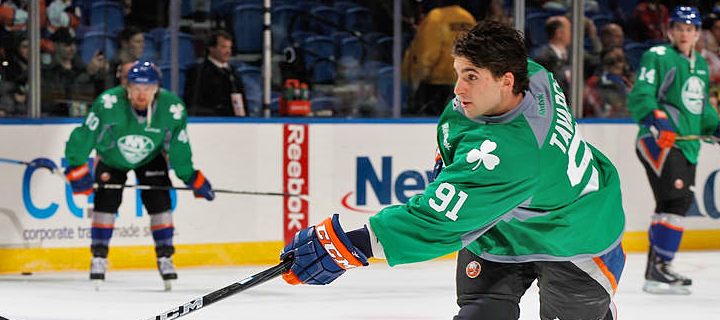
Photo from New York Islanders official website

The Isles posted another great photo on their Facebook page after the game last night.
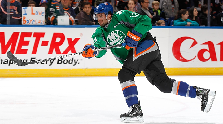
Photo from New York Islanders via Facebook

The jerseys were auctioned online leading up the big game.
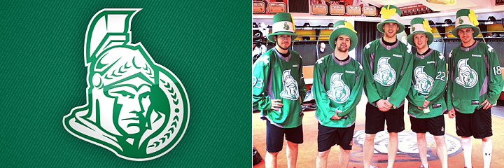
Photo from Ottawa Senators via Instagram

UPDATE (3/17): The Ottawa Senators also joined the St. Patty's Day celebrations with the above photo posted on Instagram this morning. I presume they'll be wearing them during warm-ups today prior to their game later against the Jets.
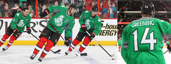
Photos from Ottawa Senators official website

The Sens posted a couple of photos of the players skating in green on their website.

Later today, the Pittsburgh Penguins will host the Bruins. But before they do, the players will skate a little while wearing the green practice jerseys seen below.
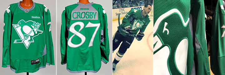
Photos from Pittsburgh Penguins

According to the team: "The unique warm-up jerseys feature a green skating Penguin crest with Celtic lettering and numbering — and shamrocks on each shoulder." They will be put up for online auction beginning Friday.
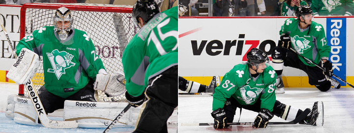
Photos from Pittsburgh Penguins official website

UPDATE (3/17): This morning, the Penguins shared some more shots of the green on Instagram. There's one in the locker room and another of Craig Adams on the ice. Later, they posted a few more in the game's photo gallery.

UPDATE (3/17): The San Jose Sharks have been celebrating the Irish all week. The Sharks Foundation has been coordinating auctions of these green jerseys on March 9 and 14.
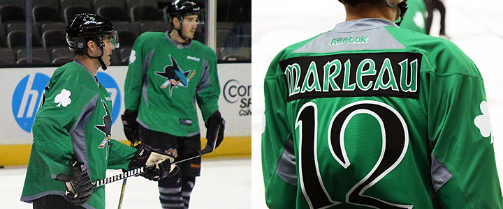
Photos from San Jose Sharks via Twitter and Facebook

Just today, the team tweeted a shot of the players wearing green at a recent morning skate. They've been a bit more prolific on Facebook with close-ups of the backs of these special sweaters, showing Patrick Marleau as well as Douglas Murray and others. (Thanks to @puckguy14 for the help!)

The Tampa Bay Lightning also joined the ranks of St. Patrick's Day teams on Saturday night by warming up in green before taking on the Hurricanes. The team did share some photos with us as well.
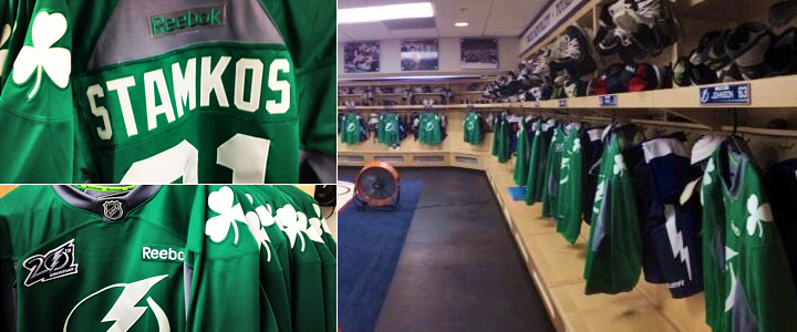
The Bolts posted some close-up photos on Instagram and a shot of the full locker room decked out in green gear on Twitter. There are several photos of players wearing the sweaters on the team's website.
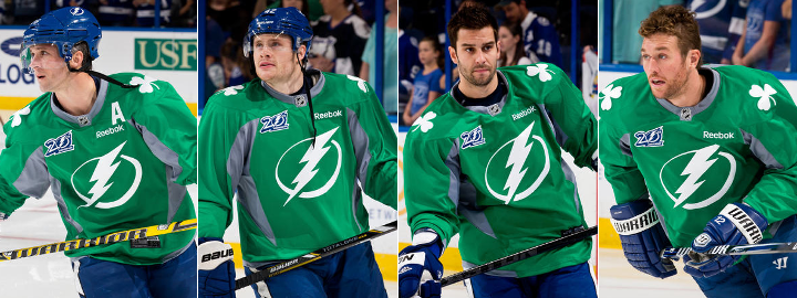
Photos from Tampa Bay Lightning official website

Thanks to everyone who pitched in with links on Twitter yesterday! Let me know if you've spotted any teams I've missed and I'll be sure to add them. I'm also working on a separate post to highlight St. Patrick's Day jerseys around the minor leagues.

UPDATE (3/17): Also joining the St. Patty's Day fray were the Washington Capitals, who hit the ice in green tonight prior to defeating the Buffalo Sabres in the nation's capital.
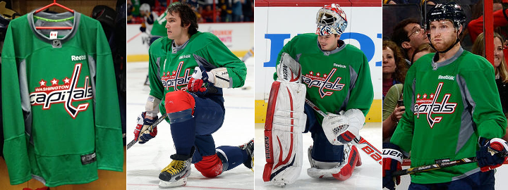
Photos from Washington Capitals

Earlier tonight, the team tweeted a shot of a couple of jerseys hanging up in the locker room. Later, all of the green sweaters were on display at the arena so they could be auctioned off. And for more photos, check out the game's photo gallery.

Sunday
Feb032013

Design Firm Reveals Stars Concepts

Torch Creative via dribbble

Torch Creative releases concept logos designed for Dallas

What will the Dallas Stars look like next fall? That's still a big question mark. However, the design firm that's worked closely with the team in recent years has designed and released a pair of logo concepts via social media this past week.

Torch Creative is responsible for the logos above. After tweeting them out on Wednesday morning, the company posted more images — including the Stars' 20th anniversary logo — to their dribbble account the following day. As a reminder, here's that anniversary mark.

It's not clear from their tweets if Dallas-based Torch is working on the Stars' forthcoming rebranding or if those logos were just for fun. Have to think they put together a proposal at least.

In any case, Torch called the above logo concepts "the favorites." They don't specify whether it's their own favorites or the Stars'. Though presumably, if they were the team's favorites, they would've used them and we wouldn't be seeing them like this.

Torch Creative has done a lot of design work for the NHL, including the 2008 Winter Classic, the 2009 and 2011 All-Star Games, the Stanley Cup Playoffs logos, and much more. I recommend a trip to Torch's website to peruse some of their past work. It's very impressive.

What do you think of these logos? Could you see the Stars going with something like that next fall?

Saturday
Jan192013

What's New in the New Season

The NHL opened its shortened 48-game 2013 season tonight with a few changes and new logos hitting the ice. So let's run down what's new in the new season.

Kings, Bruins start ugly Stanley Cup banner trend

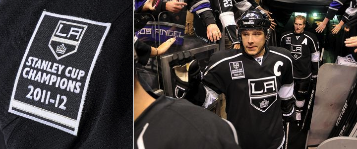
We begin with what I consider a pretty ugly trend over the last two seasons. This afternoon, the Los Angeles Kings raised their 2012 Stanley Cup championship banner. Then each player skated out wearing that same banner as a shoulder patch.

Now that's just tacky. I'm all for being proud of an accomplishment like this, but doesn't a sweater patch go a little bit too far? Is the 20-foot banner hanging in the rafters not enough?

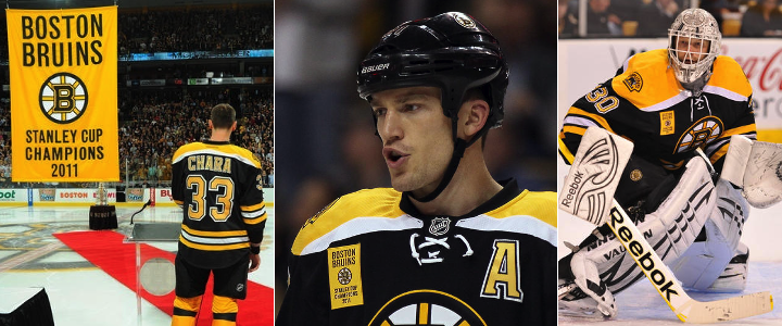
But the Kings aren't the only guilty party. Last year, the Boston Bruins started this awful trend by wearing their banner on their sweater as well. Just uncalled for.

Come on. We all know you won. Nobody missed the banner raising. The patch is unnecessary. Fittingly, both of these teams lost the games where they flaunted their titles. The Bruins fell to the Flyers 2-1 last year. And earlier today, the Kings were stung by the Blackhawks 5-2. Serves them right.

We'll note that the Chicago Blackhawks, after raising their 2010 Stanley Cup championship banner, did not wear any kind of gaudy patch to commemorate their commemoration ceremony. Nor the Red Wings or Penguins in 2008 and 2009. So kudos to them.

Before I wrap this up, I do want to point out that at least the Kings and Bruins weren't as bad as the AHL's Hershey Bears — who you may remember actually wore the logos of the teams they beat for championships back in 2011.

Lightning and Stars mark 20th anniversaries

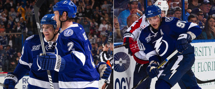
Next up are a couple of sweater patches we can't argue with. First, the Tampa Bay Lightning turned 20 in 2012 — but the lack of hockey between October and December means their celebration starts a little late. But better late than never. It's a cool logo!

The Lightning's 20th anniversary patch is a simplified version of the full logo unveiled over the summer. And for what it's worth, this isn't the first time we're seeing it — just the first time it's making an appearance on the ice. The logo debuted in June at the draft.

The Ottawa Senators, who joined the NHL with the Lightning in 1992, celebrated their 20th anniversary last season while assigned All-Star Game hosting duties.

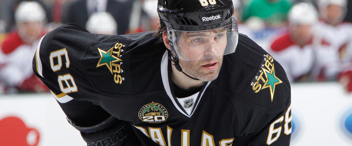
The Dallas Stars moved from Minnesota in 1993 — a year after the league expanded to Ottawa and Tampa. But they're also marking 20 years during this lockout-shortened season.

This is the first we've seen this logo. It prominently features the American Airlines Arena Center — home of the Stars — as well as the skyline of the city of Dallas. It's a pretty sharp logo even if there is a lot going on.

Here you can see it being worn by newcomer Jaromir Jagr.

Capitals reverse colors on socks

This last bit of "news" would get a big shrug from a lot of hockey fans. But not Icethetics readers. Hold everything because the Washington Capitals have changed their socks!

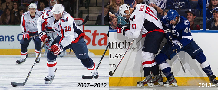
I think that visual aid tells you all you need to know. But just in case, they've reversed the colors. On the road uniforms, the blue is now used on the bottom half going into the skate instead of the top half coming out of the pants. The configuration is now more like what we see in the rest of the NHL.

Presumably the socks on the home uniforms will see the same change — red on top, blue on the bottom now. But we'll find out for sure when the Caps open their home schedule on Tuesday against the Jets. Unless they wear their third jersey, that is. But the next home game would be Thursday.

Did I miss any 2013 uniform changes? If so, shoot me an email or comment and I'll update this post as needed.

Sunday
Jan062013

Stars Going Green with New Look

Dallas will get new primary logo, new dominant color in 2013

Yes, it's finally happening!

According to Dallas Morning News beat writer Mike Heika, the Dallas Stars will look "drastically different" in 2013 with a revamp that includes a green jersey and a brand new logo.

Heika posted these new details on his Dallas Stars Blog this evening. Here's an excerpt:

This came up in conversations today, and I know a lot of you have been asking about it.

The Stars have asked for an extension on their deadline to submit new uniforms for the 2013-14 season, and have received it from the NHL. They probably have until late January now. They are awaiting prototypes from Reebok so that they can be approved by the team and submitted to the NHL in time. Among the key points:

  • They are drastically different from the current look.
  • There will be a new logo.
  • Green is the dominant color.

Heika also added that there's a chance the redesign could hold until 2014-15 if the team doesn't think it's on the right track. But it seems like they're ready to pull the trigger.

On a personal note, I'm thrilled to hear they're moving back toward green. We know design is cyclical and hopefully the decision makers are starting to realize that black and dark blue don't make your team stand out or attract fans to your jerseys. Maybe we're moving back toward another age of bright colors like the '60s and '70s... just a little less gaudy.

Anyway, this is great news and I can't wait to see what the Stars go with. For sure, it'll be far better than what they have now! Right?

Tuesday
Nov272012

Speculating on Dallas' Future Rebrand

Assuming the NHL ever plays another game, the Dallas Stars will have a whole new look when they take the ice for the 2013-14 season. This much we know. What we don't know is what that will look like.

The Dallas Morning News has posted a few stories on the subject over the last couple of weeks. Thought it might be worth sharing them here so we all know what to expect.

Red, white & blue mockups from Stars' website

Rendering from Dallas Stars (official website) via Dallas Morning News

On Nov. 13, they posted these mockups credited to the Dallas Stars' official website. I haven't been able to find a link to where they were featured on the Stars' site, but it's my understanding that TV color analyst Daryl Reaugh — who writes a blog on the site — is behind the designs which may be about a year old.

I'll be straight with you. They're ugly. Really ugly.

I, for one, have no desire to see the Stars in anything but green and gold. But that's not up to me.

Stars owner answers questions about coming redesign

The day after those mockups were posted, beat writer Mike Heika talked to Stars owner Tom Gaglardi about what's coming. There's a lot of great information in his report. Here are some excerpts.

Gaglardi wants logo crest, not wordmark

"I’d like to wear our logo on our chest. That’s something that appeals to me. I think it’s the classic way to go, and I like classic things. We are one of the original 12 teams, and I do think that carries with it some history and weight, and that’s also something I believe we should consider when looking at a possible change.

"I just want a jersey that’s a classic hockey jersey. I want a jersey that looks like it could have been worn for 40 years. That’s kind of how I see things.

"I think the current jerseys are attractive. I really don’t have a problem with the style or the look. I don’t like just the wordmark "DALLAS" on there. I don’t think that’s really unique or clever, but the actually jersey to me is a good looking jersey."

I think Gaglardi just made up "Original 12," but at least it sounds like he looks at hockey uniforms the same way a lot of us do. That's a great thing to see in an NHL owner.

Stars considering a color scheme change

Gaglardi confirmed the team is looking at changing team colors, but didn’t want to go beyond that. He cautioned that the discussions change every day, and that there is a lot of positive on both sides (changing colors or remaining green, gold, black and white).

Process started in April; must be done by end of December

In talking to others in the organization, they confirm that a decision will need to be made by the end of December if the team wants to wear new colors for the 2013-14 season. They emphasized there is a little wiggle room with Reebok and the NHL, but that they have about six weeks to get this done.

You may recall that when the Lightning redesigned their uniforms (a process that would've been wrapped up by December 2010), they unveiled them right away (January 2011) to avoid any leaks. If the Stars follow this precedent, we might not have to wait too long to see what the final result is.

Throwbacks kept in mind even if colors change

On the good side, there appears to be some thought that if they do go in a new direction with color, they still can recall old throwbacks and wear them — and they seem to be comfortable with the possibility of having more than just two "kits," and could actually push the NHL to consider more specialty uniforms.

That's an interesting notion. Heika goes on to talk about the variety of alternate uniforms seen in the NCAA.

Stars not necessarily interested in fan input

On the bad side, there appears to be no appetite for fan input. They already have a lot of differing opinions, and the people making the decisions all are aware of what the fans think. They either interact with season ticket holders or they view fan blogs and websites.

As such, they will likely reveal these the same way they did the Mooterus and the current uniforms. You will be told when the decision is made, and that will be it. That’s not unusual in the world of pro sports.

I’m a fan of allowing possibly five different looks and letting fans vote down to two or three on the website. The buzz created would be fantastic, especially at a dead time like this. That would also allow the team to have the final say, but the fans to eliminate what they feel are the worst ideas.

That's a great idea, but as Heika points out, not all that realistic. But I have hope Gaglardi will find a way to hit the mark. He wants the same thing we all do. A sharp look for a team with a long history.