Entries in jerseys (170)

Monday
Mar212011

Kings Confirm Uniform Changes

The best source for Los Angeles Kings jersey news continues to be blogger Rich Hammond of LA Kings Insider, who's talking of changes for 2011.

Sneak peek at Kings' prototypes?On Sunday, Hammond confirmed our suspicions regarding the uniform changes the Kings will undergo for the 2011-12 season, saying that the black alternate sweater will become the new home jersey. He also says there will be a white version for the road. This is the first we're hearing of it officially since photos leaked last year.

Regular readers will recall getting an early look at prototypes of white Kings jerseys back in October. This photo (right) was taken from outside Luc Robitaille's office window at the team's practice rink. Robitatille is the Kings' president of business operations.

Now as for the third jersey in 2011, there's a twist. Here's an excerpt from his post:

It seems that the vintage purple-and-gold jerseys will go into mothballs for a while now. This has been a very poorly kept secret, but the Kings are likely to change their primary uniforms next season.

The current third jersey — the black jersey with the “LA” logo — is scheduled to become the full-time home jersey, while a newly created white version of that jersey would become the full-time road jersey. The current home jersey, the black-and-purple jersey with the crown logo, would become the third jersey. Is that confusing enough?

The only thing that confuses me is the idea of dropping the purple-and-gold crown jersey instead of the purple-and-black one. (The throwback was used for the last time this season over the past weekend.) Perhaps they felt it too soon to drop a jersey they've only been wearing for four seasons. However, it does look like this will be the swan song for the current road sweater.

Promotional graphic / KingsCouple of things to note. Rich Hammond's blog is affiliated with the Kings' official website so as far as I'm concerned, his information is practically team confirmation.

And speaking of the team's official site, the marketing images being used to promote 2011 season tickets (right) prominently features the current third jersey — and no purple at all.

So I'm sure I already know what most of you think of the Kings' possibly dropping this year's throwback sweater, but do you think hanging onto the current home jersey is a good idea?


Related: Los Angeles Kings jersey gallery

Saturday
Mar192011

Jerseys Meant to Make a Buck

Have you ever spent time browsing the official online store of the NHL? I mean really digging around. There's some pretty wild stuff in there and that's before you get to the team-branded hammers and tape measures (clearly an early push for Father's Day). I'm just talking about the jerseys.

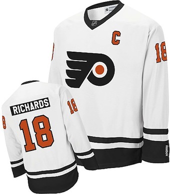
Flyers "replica" jersey / NHL.comIcethetics reader Brad M. emailed in Friday wondering about this Philadelphia Flyers jersey (right) he saw at Shop.NHL.com.

It's white with minimal striping and comes with player customization. But it's unlike anything the Flyers have ever worn on the ice. And what's more, it couldn't look more generic. And they want $80 off of you for it.

Another reader says he's seen a Bruins jersey in a store based on this same template. But who would really pay for that? You're only saving $35 compared to a Reebok Premier jersey that actually looks like what the players wear.

Shop.NHL.com lists the product as a "replica jersey." What is it replicating exactly? A jersey? I hope it's not just a baggy, long-sleeve T-shirt.

The official product description says the letters and numbers are heat-sealed on but that's no surprise. What would be is if they sold any.

If it seems like I'm riding this topic pretty hard, it's only because stuff like this dilutes brands. It's a cheap ploy to sell junk with logos on it. And I think NHL logos deserve better.

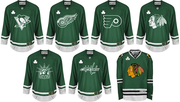
So after seeing that "jersey," I started digging around in the Flyers store a bit. As we just celebrated St. Patrick's Day this week, the NHL has introduced a line of St. Patty's Day branded jerseys for a handful of teams. Again, it'll never see ice time in an NHL game, but the league figures it can charge you $100 for one.

Only six teams had St. Patty's Day jerseys in stock. I'm not sure how many other teams have been made, but you have to figure your biggest Irish-American populations are in the northeast and surrounding regions. Take note of the Lady Liberty logo on the Rangers jersey. I keep holding out hope that old third jersey will find its way back. All of the logos on these jerseys are screen printed.

I also included the green Blackhawks jersey which has been around for ages. It's basically the home sweater with the red swapped out for green. That's available in addition to new St. Patty's Day line. It's never been used in a game, but I know it's a popular one with fans.

A few teams even have digital camo jerseys available. They'll run you $100 as well. These actually have seen ice time as teams often sport camouflage jerseys during warm-ups on the various military appreciation nights held around the league throughout the season.

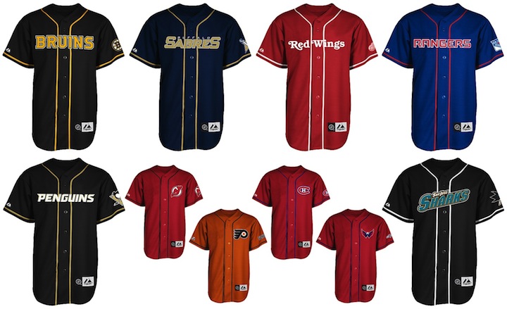
And the last oddball line of apparel which annoys me more than all of the above combined — are these.

If you're a baseball fan, buy a baseball jersey. Hockey players wear hockey jerseys. I want to slap people I see wearing hockey logos on baseball attire. Again, these were the only teams I saw that were offering the "Majestic Button Front Baseball Jersey" on the website. Let's hope they're at least smart enough to keep them out of non-MLB markets. But it's still no excuse.

By the way, I may be mocking these jerseys, but of course any fan is well within his right to spend his money on any item with his team's logo on it. I'm actually curious to know how many — if any — Icethetics readers have bought any of the above jerseys. And what else have you come across that just should not have had an NHL team's logo on it?

Friday
Mar112011

67's Bring Back Barber Pole

New 67's jersey / Blitzen PhotographyThe OHL's Ottawa 67's announced yesterday that they'd be bringing back their classic barber-pole jerseys for the 2011-12 season.

The new sweater will be unveiled to fans at tonight's game but the team has posted a preview on their website. In addition, the Ottawa 67's Fan Blog posted a better shot (right).

The 67's haven't been able to wear the full stripes since before Reebok took over the CHL's uniforms for the 2009-10 season. The manufacturer blamed limitations to the jersey "technology" on the inability to recreate the unique effect.

Reebok says the technology has now "advanced" allowing the 67's to bring back their classic sweater. It replaces the black jersey the team had been wearing since 2009.

I may not be the biggest fan of the barber-pole look, but I certainly know it has its place in Ottawa. And with their combination of logo and colors, it just looks right on the 67's.

Now that we've seen the 67's new sweater, could you see the Senators borrowing this look for their forthcoming new third jersey? Do you think it'll be more like the black jersey the 67's just retired? Or will it be something entirely new?

Tuesday
Mar012011

Worth a Thousand Words

The Icethetics-related news really tends to dry up this time of year, but I hate to let the blog dry up with it. So I'm declaring today Picture Day. Later this week, I'm planning an update to NHL JerseyWatch 2011. But for now, I'm just offering some things to look at. Feel free to add your comments at the end.

Canucks sport new practice threads at SuperSkills / Vancouver Canucks

For those that missed the Facebook post, over the weekend the Vancouver Canucks were wearing special practice jerseys at their SuperSkills competition, featuring the updated Johnny Canuck logo. It was Team Blue vs. Team Green and these sweaters made it clear that logo doesn't belong on the front. Maybe the shoulders. But definitely the helmet, where it already is on the alternate uniform.

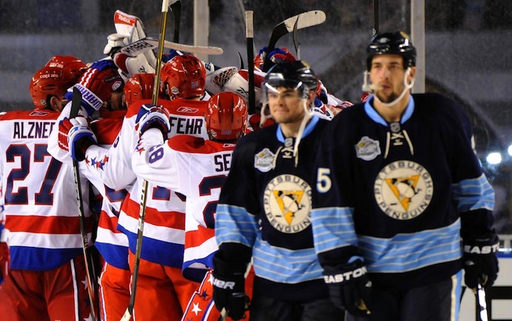
2011 NHL Winter Classic / Pittsburgh Penguins

It's a shame I haven't posted pictures from any of the outdoor games yet. Way back on New Year's Day, we all saw the Washington Capitals defeated the Pittsburgh Penguins on their home turf. (Haha, turf.) If you've been following along with the Jersey Gallery updates, you've seen the Caps' uniform, but I haven't gotten around to the Penguins yet.

I'm torn on it, by the way. Dark blue just doesn't work for the Pens. I think I like the '08 version better. Still...

Dan Bylsma coaching at the 2011 Winter Classic / Pittsburgh Penguins

Nobody rocks a hat like Dan Bylsma. 

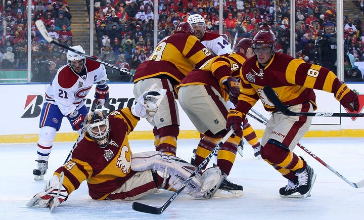
2011 Heritage Classic / Calgary Flames

You know what, I'm only all right with this because it was one game. But let's not do this anymore, Calgary. Let's not look like a skating advertisement for a Big Mac. It wasn't a good look a century ago and it isn't now. Even more disappointing than what the Flames wore was what Montreal wore. They're the Habs and they're classic but they've got an entire arsenal of throwback jerseys from a hundred years ago. Why not?

Miikka Kiprusoff in a cloud of snow / Calgary Flames

So many thoughts on this one: Is there supposed to be a goalie hiding in there? ... This is what I imagine to be the Canadian version of walking around with a raincloud over your head. ... If any player could just manifest a cloud of snow around himself, it would make cherry-picking a lot easier. ... Goalies are not born; they simply appear after a snowstorm. ... Should I stop now? ... Abominable goalie? ... Yes, stop? Okay.

WHL's outdoor game / Dylan Lynch

The WHL's Calgary Hitmen and Regina Pats borrowed the temporary ice rink at McMahon Stadium just prior to the Heritage Classic. And like their NHL counterparts, they sported retro-style sweaters. They're pretty much the same jerseys, just in different colors. Spooky.

Canucks' hall of sweaters / Vancouver Canucks

And we'll finish where we started — Vancouver. I'm sure Canucks fans are well aware of the sweaters hanging outside the team's locker room, so you can ignore this. For everyone else, how cool is this? From the Vancouver Millionaires on through to the orange third jersey from the '90s, they have a very rich and very colorful uniform history and it's nice to see they don't bury it and pretend it never happened.

That's all. If you've got any pictures you'd like to share, shoot me an email.

Friday
Feb252011

Preds Confirm Plans for New Sweater

Predators announce new jersey / Seth WrightThe Nashville Predators have confirmed to season ticket holders that a "newly re-designed jersey" is in the works — and they can have one for free.

Icethetics reader Seth Wright has written in with some solid information. Back in January, he was first to provide a photo of the white version of the Preds' blue third jersey — which was the subject of speculation regarding a new road sweater. The team has since refuted that theory via social media.

Now Seth is sharing some marketing materials sent to Nashville season ticket holders. Specifically, this:

Free Newly Re-designed Jersey

Be the first in "Smashville" to own the new look Predators home jersey to be debuted for the 2011-12 season. This jersey is exclusively available for season ticket holders and those that choose to upgrade to full season tickets by March 19th.

First of all, they reference the "new-ness" of the jersey about five times in that little paragraph, so it's probably a safe bet we're not looking at a promotion of the third jersey. This will be an entirely new sweater.

Second, there's nothing about a new road jersey, though if we pay attention to Reebok, we should be expecting one. But the away uniform isn't necessarily a selling point for your home crowd so why mention it to season ticket holders? We should also probably assume that the third jersey will remain the same.

And finally, let it be said that this note serves as official confirmation from the team that there will be a new home uniform beginning in 2011-12. Will the NHL's uniform changes in the Age of Reebok never end?

Season ticket holder renewal booklet / Seth WrightThe big question remains: What will this new jersey look like? Seth contends that the color of the marketing materials seen here (left) may be an indication. They're yellow.

Paired with last week's report from a fan, via his ticket agent, that a new mustard-colored sweater was being considered, maybe we're on the right track. Or maybe not.

It's obviously too soon to guess at this point and all the "evidence" we have is inconclusive. Still, it's worth noting that this Season Ticket Holder Renewal booklet does not feature the third jersey logo — but rather the same primary mark that's always been in use. It seems the logo won't be changing.

Based on all this, any guesses as to what's cooking in Smashville? Is it okay that I called it Smashville?

Page 1 ... 7 8 9 10 11 ... 34 Next 5 Entries »