Entries in los angeles kings (33)

Saturday
Jun252011

The Big Bad Draft Recap of 2011

I can't remember the last time an NHL draft yielded so many new jerseys. Eight different teams used the 2011 NHL Entry Draft in St. Paul to showcase something new. So settle in, there's a lot to cover.

Oilers Go Full-On Retro

1 Ryan Nugent-Hopkins, 19 Oscar Klefborn, 62 Samu Perhonen, 92 Dillon Simpson

After 16 years, the Edmonton Oilers once again look like they did when they entered the NHL in 1979. The Oilers used the first overall pick in the draft to select Ryan Nugent-Hopkins as well as to unveil their new retro road sweater — which now matches their home uniform, with the colors reversed.

This is exactly what Edmonton fans wanted and I'm happy to see them get it. The jersey looks fantastic! On the team's website, Oilers president Patrick LaForge said, "We listened to our fans and know they will be happy to see the set complete with the new road vintage jersey." Truer words were never spoken.

The Oilers also announced that the previous road jersey is officially retired. And while they didn't say so specifically, it's likely the navy and copper third jersey will remain in use next season.

Seeing Red in South Florida

3 Jonathan Huberdeau, 64 Vincent Trocheck, 76 Logan Shaw, 87 Jonathan Racine

Earlier this month, the Florida Panthers launched their "We See Red" marketing campaign — an effort to return to the franchise's color roots. This weekend, it culminated with the reveal of their new red home sweater, which was given to each of their 2011 draft picks.

The Panthers didn't do an all-out redesign with this jersey, but more of a color swap. The sleeves are now blue, but there is no piping on — a refreshing change of pace from the old jersey. So that's a big plus. All in all, I think this is easily the best jersey in the Cats' arsenal at this point.

But that's not to say it's perfect. The elbow striping is an element of the Reebok Edge template that I just don't like. Maybe if it went all the way around the arm. I also think gold piping would've looked sharp and added contrast between the red and blue on the sleeves. But these are not dealbreakers.

I don't yet know about the fate of their other jerseys. I would assume the white road uniform will remain unchanged. They could use the old home jersey (the blue one) as a third jersey, but I think the blue alternate they already have is superior. So I'd bet the old home sweater is retired.

On Behalf of the Winnipeg Jets...

78 Brennan Serville, 7 Mark Scheifele, 119 Zachary Yuen, 157 Jason Kasdorf

The new Winnipeg franchise used the occasion to announce their new name — or should I say old name? The Winnipeg Jets are once again an NHL team. How about that. Unfortunately, while the team had a name ready to go, they couldn't say the same about a logo and jerseys.

Each of their draftees were given generic black jerseys with the NHL shield on the front. Rest assured, this will not be the uniform of the Jets come the fall. True North chairman Mark Chipman has said it may be a while before we see the new uniforms and logo.

Illegal Curve tweeted some details from Chipman yesterday. He said they wanted to have a prototype jersey ready for the draft, but were worried about knockoffs showing up before they were able to put official merchandise on sale. So production time is likely the reason we'll have to wait to see the new branding.

The team has also said that the colors "won't be completely different" from the old Jets. I take that to mean possibly a darker shade of blue and the addition of a third color such as silver. So another red and blue team, then. Fun. I may sound bitter, but at least the Thrashers and their too many colors were unique.

Earlier today, TSN's Darren Dreger tweeted, "I haven't seen the Winnipeg Jets new logo or sweater design, but I'm told it's very impressive." I'm sure it is. And I'm sure a lot of money is being spent to make sure of that. To be honest, I hope it doesn't leak so as to avoid the knockoff issues.

New Bolts Get New Blues 

148 Nikita Nesterov, 27 Vladislav Namestnikov, 178 Adam Wilcox

The Tampa Bay Lightning unveiled completely redesigned blue and white uniforms back in January. This weekend, they handed them out to their new draft picks in St. Paul.

There is one element of the jerseys that has changed since we last saw them at the January press conference. The numbers now feature an inner black outline after enough Bolts fans complained about the lack of black in the new threads. (I wasn't one of them.)

As much as I've praised these new sweaters, I was disappointed by one thing I noticed this weekend. Based on the previous pictures I've seen, I thought the blue was a lot lighter than it is. Turns out it's basically identical to the Maple Leafs' blue. Really not happy about that. Don't get me wrong, I'm still buying one, but I was hoping Stevie Y would do something to make us stand out.

Predators Decide to Simplify

38 Magnus Hellberg, 52 Miikka Salomaki

The Nashville Predators didn't have a pick in the first round this year due to the Mike Fisher trade, so we had to wait a day to see their new road jersey. As the NHL draft picked up with Round 2 this morning, the Preds gave the new sweater to their draftees, who became the first players to wear them.

While both new jerseys were sort of leaked on Thursday, we learned they weren't the final versions. Today we can play spot the differences. The biggest one (and only one that I could spot) would be the left shoulder which featured the word NASHVILLE in small text. On this version, it's only seen on the back of the collar. Everything else is basically how we first saw it.

Prior to the jersey leak, the new logos were officially unveiled, so I won't spend anymore time discussing them. I did want to note, however, that the new guitar pick logo is only used on the right shoulder of the road uniform. I suspect it will be the same on the gold home jersey.

Kings' Worst Kept Secret is Official

49 Christopher Gibson, 110 Michael Mersch

The Los Angeles Kings will have a new road uniform next season and their 2011 draft picks became the first to sport it for cameras today. (Like Nashville, they lacked a first round pick.) And for what it's worth, it was the worst kept secret of the year. We first saw this jersey way back in October!

Well a version of it, anyway. An Icethetics reader snapped a photo of what appeared to be prototype jerseys in Luc Robitaille's office at the Kings' practice facility before last season even started. To be fair, though, there's an L.A. pee wee team that's been wearing something similar for a while now.

They're nice. That's really all I can say. By dropping the purple from their palette, I think the Kings have done themselves a disservice. But the new jerseys aren't bad. But for the waist stripes, this new road sweater nearly matches the black and silver alternate the Kings have been wearing for a couple of years. It will become the new home jersey.

The old black and purple home sweater will become a third jersey and the old road sweater will be retired.

Isles, Sens Add Patches to Mark Special Occasions

5 Ryan Strome, 127 Brenden Kichton, 21 Stefan Noesen

The New York Islanders have created a new 40th anniversary shoulder patch while the Ottawa Senators will wear an All-Star Game patch for the 2011-12 season. The new add-ons were first spotted on the teams' first round draft picks on Friday night.

This is our first time seeing the Islanders' new 40th anniversary mark and I'm still waiting to get a better look. So far the above pictures are the best I've seen. The Isles entered the league in 1972 with the Atlanta Flames, but Calgary tends to only recognize the Calgary years with their anniversary logos.

Ottawa hosts the 2012 All-Star Game next season but the logo was first unveiled way back in September. The Senators are also celebrating their 20th anniversary, but it seems that logo will be trumped on the jersey this season. Perhaps they could change it after the All-Star break?


If you've made it this far into this post, you're clearly the kind of person who will be interested in the following minutia. I'm talking about the breakdown of what jerseys were handed out by teams to their draftees.

  • 21 teams gave colorful home jerseys to their draftees, 1 of which was seen for the first time (Florida).
  • 7 teams gave white road jerseys to their draftees (Buffalo, Colorado, Edmonton, Los Angeles, Nashville San Jose and Vancouver), 3 of which were unveiled at the same time (Edmonton, Los Angeles and Nashville).
  • 6 teams gave jerseys that have never been used in a game before, one of which will never be used in a game (Winnipeg).
  • And 1 team gave an alternate jersey to its draftee. And that would be Minnesota. Perhaps a privilege of being host of this year's festivities.

I hope that answers all of the jersey- and logo-related questions you had about this year's draft. If it doesn't ask in the comments and I'll do my best to answer.

Thursday
Jun092011

The Best Sweaters in the West

Back in February, we conducted a series of polls asking readers to rate the jerseys of all six Canadian NHL teams. We ended up with a complete ranking revealed just in time for Hockey Day in Canada. It was a popular post so now we're going to take it to the rest of the league.

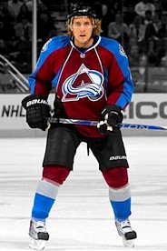
We'll do them in groups of six, split up by geography. This set of polls will feature the teams out west: Anaheim, Colorado, Dallas, Los Angeles, Phoenix and San Jose. You can rate each jersey individually with a 10, 5 or 1. (You can either love it, hate it, or be on the fence.)

After all the votes have been cast, an average rating will be determined. These polls will remain open for two weeks, ending Thurs., June 23. When we've voted on all the teams, I'll assemble a complete league ranking of every uniform worn for the 2010-11 season. Happy voting!

Sorry, no comments on this post. Just vote!

Blog note: I am leaving for vacation on June 11. I'll be out at sea and likely without an internet connection for most of the time I'm away. I should be back on June 21 just in time for the NHL Board of Governors meeting — when everything in Winnipeg is expected to become official and final. However, if the team's name and logo are announced before that time, I'll probably be delayed in posting it here. Sorry.

But fret not, there will be other updates to the site in my absence. I'm currently preparing concept posts that will auto-publish on Monday, Wednesday, Friday and Sunday while I'm gone so keep checking back throughout the week.

Wednesday
May112011

Loose Threads: Kings of All Kinds

Haven't done one of these in a while but there's a laundry list of things I need to get on the blog sooner rather than later. I'll try to keep it brief, but no promises.

Kings Dropping Hints About New Road Jersey?

Since being eliminated from the playoffs, the Los Angeles Kings have been getting their website in shape for next season. As mentioned over the weekend, the purple has been removed, leaving just the black and white logos.

Frozen Fury promo graphic / KingsThey're now starting to promote the 2011 preseason, which includes the annual Frozen Fury event — which usually pits the Kings against the Avalanche at MGM Grand Garden Arena in Las Vegas.

A cursory glance at this home page promotional graphic (right) might have you thinking you're looking at a new jersey! The team's "Insider" blogger has indeed said a white version of the current third jersey will become the new road uniform.

In reality, however, it's just the black jersey with a little color inversion magic via Photoshop. But might that be what the new sweater will look like? Will they wear it for the Frozen Fury game?

LA Kings Hockey Fest logo / KingsBut wait, there's more. A few weeks ago, the club announced this year's LA Kings Hockey Fest will be held on Sept. 11. It's one of those fan-centric events every team holds in late summer to get folks jazzed up about the new season.

Why do we care? Well, for one you have a new logo there. But more importantly, I try to keep tabs on these events because teams tend to use them to unveil new jerseys to fans.

With that new road uniform expected from the Kings for the 2011-12 season, it might not be a bad idea to keep an eye out. I've added the event to the Icethetics calendar (sidebar).

In the meantime, I'll continue to watch for an official unveiling date or event. Until then, this is probably our best bet to see it before the regular season begins.

NHL Premiere: 4 teams, 3 countries

As has become tradition, the NHL will open the 2011-12 regular season with a handful of games in front of European crowds in an event called NHL Premiere. Four games will take place over two days amongst four different teams in three different cities. Did you follow that?

The NHL made the announcement a month ago and, since then, some logos have been trickling out. They're basically the same as the NHL Premiere logos used in 2010, customized for next season.

That graphic should quickly explain who's playing who in which cities and when. So you're welcome. But just for the sake of having it in text form: Helsinki, Finland hosts the Ducks and Sabres on Oct. 7. Stockholm, Sweden will see the Rangers play the Kings (10/7) and Ducks (10/8). And for the first time, the NHL will play a regular season game in Germany as Berlin hosts the Kings and Sabres on Oct. 8. 

NHL Premiere 2011 generic logo / KingsFor what it's worth, this generic logo (right) has been featured on the Los Angeles Kings' website as they try to sell tickets to fans eager to make the journey to watch their team open the season on the other side of the world.

As for the logos above, it's clear they're all built on a standard template that varies based on location. The city name, national flag and dates are customized for each event.

Teams playing in these games have customarily worn the logos as jersey patches to recognize which one they're playing in. Only difference is the sponsor logo at the top is replaced by the NHL shield and the date is moved below the circle. Click here to see an example from 2010.

R.I.P.: Victoria Salmon Kings (2004—2011)

As Victoria, B.C. prepares to welcome WHL hockey, they said goodbye to the ECHL on Friday with the folding of the Victoria Salmon Kings franchise — one of the league's originals. (And really, that title should read 1988—2011. I'll explain shortly.)

For now, I throw it to our friend Woody Wommack who covers the ECHL for the Naples Daily News in Southwest Florida. He writes about the Victoria club's sudden demise:

The Victoria Salmon Kings are no longer a part of the ECHL. The team announced Friday that requested and was granted a withdrawal from the league by the league's board of governors.

From the team's official Facebook page: "The Salmon Kings have officially announced today that the team has withdrawn from the ECHL wit h the unanimous approval from the league's Board of Governors."

Victoria isn't leaving for financial reasons, but rather because the team's owners recently purchased a WHL franchise with the intent of moving the team to Victoria next season. The Salmon Kings didn't have a place to play and therefore don't have a franchise.

Rumors continue to swirl about the possibility of the ECHL adding one or more teams to the Western Conference for next season. With the loss of Victoria, the Western Conference only has seven teams.

Now I have a little history lesson which explains how this is like the NHL losing an Original Six franchise. 

When the ECHL launched in 1988, it was called the East Coast Hockey League and made up of just five franchises. In the 23 years since, all of them have either relocated or folded. And believe it or not, the Salmon Kings are the second to hang 'em up for good.

The Erie Panthers were a founding franchise in 1988. They had one good season in 1989-90 but lost a lot more than they won. In 1996, they left Pennsylvania and moved to Louisiana to become the Baton Rouge Kingfish in an ECHL now made up of 21 teams.

But the losing didn't stop in the new city and people don't usually like to pay for hockey tickets to see the other team win. The Kingfish suspended operations in 2003. By this time, the ECHL had a new name and was expanding west with the demise of the West Coast Hockey League. In 2004, a new arena in Victoria was begging for a hockey team. They got the Kingfish and renamed them the Salmon Kings.

Despite spending the last five straight seasons in the playoffs, no deal could be worked out to keep the team together in a new market when the WHL's Chilliwack Bruins arrived Victoria on April 20.

Victoria's new WHL team has yet to be named. But it's safe to say they're dropping the Bruins moniker.

Saturday
May072011

Isles in Black and Other Rumors

I've never been a fan of writing blog posts based on pure speculation with no independent confirmation. Unfortunately, it's May and that's all I have for you at the moment. (The summer should be more fruitful.) So let's dive into the latest rumors.

The most ridiculous thing I've heard yet is that the New York Islanders could launch — are you sitting down? — a black third jersey next fall. Right.

Icethetics readers Jeremy and Marco have linked us to a thread at HFBoards.com in which a user claimed to have a friend at a sporting apparel store with inside information. Honestly, don't we all?

To properly dissect his assertion, let's have a look at the original post.

I stopped into my friend's store ... he sells NHL jerseys, other sports too, but has alot more NHL then anything else. ... Anyway, I was discussing with him about jersey changes for next season, he showed me the reebok catalog ordering book he gets and the Kings, Predators, Panthers and Lightning (already unveiled) are all getting new home and aways, while the Sens, Thrashers, Penguins are all getting new alternates.

...the Islanders are getting a third jersey and he said the jersey will be Black. Apparently they made up 5 different proto-types and all 5 were black jerseys. I was kind of suprised because the Islanders dont have any black in their team colors, so I am kind of afraid that it could be awful.

The mind-numbingly awful grammar aside, there are a few things wrong with this. First, I'm suspicious about Reebok already sending out unreleased uniform designs to retailers. Not impossible, but unlikely. But more importantly, under no circumstances would Reebok include team prototypes in retail planning information.

So it seems as if someone's trying to take us for a ride. I can certainly see the Islanders doing something as silly as creating a black third jersey. But where this "friend" is getting his information is suspect. Either he's making things up to appear to be "in the know" or the person who posted this is.

Guess we won't know for sure, though, until the Isles show it to us.

It's looking more and more like the Nashville Predators will be sporting gold next season. (According to unnamed sources, of course.)

Back in February, a team ticket rep apparently told a reader that a yellow sweater design was being tested. A week later, the club sent out season ticket renewal forms — which were primarily yellow — confirming a new jersey was in the works.

More recently, the unveiling of Pekka Rinne's new mask showed us a logo we've never seen before. Now, we supposedly have new rumors to support these things.

An Icethetics reader — not wanting to be named — again cites a "friend" who works for the team as indicating the following:

  • New home and road jerseys are slated for 2011
  • Home jersey will be unveiled at the 2011 NHL Entry Draft (June 24 in Minnesota)
  • Road jersey will be unveiled in July
  • Home jersey will be "yellow/gold"

Again, all speculation at this point. And more rumors doesn't make it more true. But now you know what I know when it comes to unconfirmable information.

Kings redesign website without purple / LAKings.com

Last item of the day relates to the Los Angeles Kings, who have almost completely rid their website of the color purple. This fuels the belief that the Kings will swap their home and alternate jersey and add new threads for the road.

Again, not new information but just one more thing that points in the same direction. In March, Kings official blogger Rich Hammond did confirm that a white version of the black alternate would be employed for road games beginning in 2011-12.

If anything, the one new element included in this new look for the Kings is the crown logo sans purple. It's been previously seen only inside the third jersey crest, not standing alone as it now is on the website banner.

Hat tip to Eric P. for bringing the Kings' web redesign to my attention.

Monday
Mar212011

Kings Confirm Uniform Changes

The best source for Los Angeles Kings jersey news continues to be blogger Rich Hammond of LA Kings Insider, who's talking of changes for 2011.

Sneak peek at Kings' prototypes?On Sunday, Hammond confirmed our suspicions regarding the uniform changes the Kings will undergo for the 2011-12 season, saying that the black alternate sweater will become the new home jersey. He also says there will be a white version for the road. This is the first we're hearing of it officially since photos leaked last year.

Regular readers will recall getting an early look at prototypes of white Kings jerseys back in October. This photo (right) was taken from outside Luc Robitaille's office window at the team's practice rink. Robitatille is the Kings' president of business operations.

Now as for the third jersey in 2011, there's a twist. Here's an excerpt from his post:

It seems that the vintage purple-and-gold jerseys will go into mothballs for a while now. This has been a very poorly kept secret, but the Kings are likely to change their primary uniforms next season.

The current third jersey — the black jersey with the “LA” logo — is scheduled to become the full-time home jersey, while a newly created white version of that jersey would become the full-time road jersey. The current home jersey, the black-and-purple jersey with the crown logo, would become the third jersey. Is that confusing enough?

The only thing that confuses me is the idea of dropping the purple-and-gold crown jersey instead of the purple-and-black one. (The throwback was used for the last time this season over the past weekend.) Perhaps they felt it too soon to drop a jersey they've only been wearing for four seasons. However, it does look like this will be the swan song for the current road sweater.

Promotional graphic / KingsCouple of things to note. Rich Hammond's blog is affiliated with the Kings' official website so as far as I'm concerned, his information is practically team confirmation.

And speaking of the team's official site, the marketing images being used to promote 2011 season tickets (right) prominently features the current third jersey — and no purple at all.

So I'm sure I already know what most of you think of the Kings' possibly dropping this year's throwback sweater, but do you think hanging onto the current home jersey is a good idea?


Related: Los Angeles Kings jersey gallery

Page 1 ... 2 3 4 5 6 ... 7 Next 5 Entries »