


Professional Concepts Revealed
It's a rare but always welcome treat when we get a peek at the hidden process of branding NHL teams. For whatever reason, we all have a unique interest in this aspect of marketing, and naturally, we usually only see what they want us to. Every once in a while, though, we do get a look behind the curtain.

 Kings logo evolution / The Royal HalfThis morning, Los Angeles Kings fan blog The Royal Half posted some required reading for any Icethetics regular.
Chris Kontos interviewed Dan Simon, the creative director behind one of the most memorable third jerseys in NHL history. He had a lot of fascinating revelations about the process, including why he wanted to distance himself from the project.
Other cool tidbits: Why the beard was never meant to be purple. Why the sweater featured horrible gradients. Plus, see some video from the alternate jersey's debut, 15 years ago today — against the even more memorable Mighty Ducks third.
Anyway, it's a very fun read and I highly recommend it. It also provides the perfect opportunity to post some items I've been hanging on to for a little while.

 Original Blue Jackets logo / Ken LohThe designer of the above Kings logo, Ken Loh, was also the mind behind the Columbus Blue Jackets original insect logo.
Mercifully, this logo was replaced by Loh's secondary mark in time for the uniforms to be designed. The little bug head, however, still took a place on the shoulders.
And for what it's worth, I always liked the electric green because it made the team stand out. Guess it was just too revolutionary to survive. But if you think you've seen it all, prepare yourself for this.
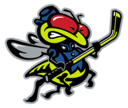 Blue Jackets mascot / Ken LohAccording to Loh's portfolio, this was going to be the full-body version of the bug — not that we ever needed to see that. And let me be clear here. Ken Loh is obviously a talented artist. I just don't think an electric green insect necessarily has a place in the National Hockey League.
His online portfolio also contains colorful concept logos and uniforms for the Carolina Hurricanes (rust/purple/gray) and Philadelphia Flyers (orange/teal). You might be surprised by what you see there.
And while we're on the subject of the Blue Jackets, the team took it upon themselves to show off some of the concepts considered for the new third jersey, launched in November.
 Alternate logo concepts / Blue JacketsThis video on the club's website explains what was involved in designing the new sweater. But most notably, it gives us a glimpse at some of the initial logo designs that were shown to focus groups.
We're now familiar with the cannon logo they ultimately chose, but it's interesting to see some of the other options they thought about, including the crossed cannon, the simple CBJ mark, and — taken right out of the Wild/Penguins playbook — the primary mark encircled by the club's name.
It seems they had their minds made up about a circular logo pretty early on in the process. And notice that in each of this displays, there's an option without red — bringing back the steel blue from that original 2000 insect logo.
And there last thing I wanted to leave with is what terrible manner of thing could've happened to the Mighty Ducks of Anaheim back in the early '90s. I think this image was originally posted at Uni Watch but later showed up in my email.

 Chris
Chris
For those of you having trouble accessing Ken Loh's portfolio in the link I provided earlier, I'm adding a couple of images from his site to this post just so you can see his work.
First, here's what he has on display for the Philadelphia Flyers.
 Flyers logo and uniform concept / Ken Loh
Whether you like it or not, there's no denying that it would not have been out of the realm of possibility in the mid-90s the way it would be today. Even with the non-traditional teal in the mix.
The other can't miss element of Loh's portfolio was designed with the Carolina Hurricanes in mind.
 Hurricanes uniform concept / Ken LohAgain, he's a very talented artist but this certainly does not fit within the branding standards of the NHL. And those colors are definitely one of a kind. Instead, the Canes just look like the Devils.
It's not clear on Loh's site whether these are just concepts he toyed with or actual artwork submitted to and considered by the league and aforementioned teams.
I just have to ask Flyers fans... could you imagine your team wearing that half-teal/half-black jersey up there? Take yourself back to that era when you think about it. Remember the Kings and Ducks, and that the Lightning were wearing rain and lightning bolts down their sleeves.
What a time that was. I'm sure it'll all come back again some day.


