Entries in los angeles kings (33)

Saturday
Jan192013

What's New in the New Season

The NHL opened its shortened 48-game 2013 season tonight with a few changes and new logos hitting the ice. So let's run down what's new in the new season.

Kings, Bruins start ugly Stanley Cup banner trend

We begin with what I consider a pretty ugly trend over the last two seasons. This afternoon, the Los Angeles Kings raised their 2012 Stanley Cup championship banner. Then each player skated out wearing that same banner as a shoulder patch.

Now that's just tacky. I'm all for being proud of an accomplishment like this, but doesn't a sweater patch go a little bit too far? Is the 20-foot banner hanging in the rafters not enough?

But the Kings aren't the only guilty party. Last year, the Boston Bruins started this awful trend by wearing their banner on their sweater as well. Just uncalled for.

Come on. We all know you won. Nobody missed the banner raising. The patch is unnecessary. Fittingly, both of these teams lost the games where they flaunted their titles. The Bruins fell to the Flyers 2-1 last year. And earlier today, the Kings were stung by the Blackhawks 5-2. Serves them right.

We'll note that the Chicago Blackhawks, after raising their 2010 Stanley Cup championship banner, did not wear any kind of gaudy patch to commemorate their commemoration ceremony. Nor the Red Wings or Penguins in 2008 and 2009. So kudos to them.

Before I wrap this up, I do want to point out that at least the Kings and Bruins weren't as bad as the AHL's Hershey Bears — who you may remember actually wore the logos of the teams they beat for championships back in 2011.

Lightning and Stars mark 20th anniversaries

Next up are a couple of sweater patches we can't argue with. First, the Tampa Bay Lightning turned 20 in 2012 — but the lack of hockey between October and December means their celebration starts a little late. But better late than never. It's a cool logo!

The Lightning's 20th anniversary patch is a simplified version of the full logo unveiled over the summer. And for what it's worth, this isn't the first time we're seeing it — just the first time it's making an appearance on the ice. The logo debuted in June at the draft.

The Ottawa Senators, who joined the NHL with the Lightning in 1992, celebrated their 20th anniversary last season while assigned All-Star Game hosting duties.

The Dallas Stars moved from Minnesota in 1993 — a year after the league expanded to Ottawa and Tampa. But they're also marking 20 years during this lockout-shortened season.

This is the first we've seen this logo. It prominently features the American Airlines Arena Center — home of the Stars — as well as the skyline of the city of Dallas. It's a pretty sharp logo even if there is a lot going on.

Here you can see it being worn by newcomer Jaromir Jagr.

Capitals reverse colors on socks

This last bit of "news" would get a big shrug from a lot of hockey fans. But not Icethetics readers. Hold everything because the Washington Capitals have changed their socks!

I think that visual aid tells you all you need to know. But just in case, they've reversed the colors. On the road uniforms, the blue is now used on the bottom half going into the skate instead of the top half coming out of the pants. The configuration is now more like what we see in the rest of the NHL.

Presumably the socks on the home uniforms will see the same change — red on top, blue on the bottom now. But we'll find out for sure when the Caps open their home schedule on Tuesday against the Jets. Unless they wear their third jersey, that is. But the next home game would be Thursday.

Did I miss any 2013 uniform changes? If so, shoot me an email or comment and I'll update this post as needed.

Saturday
Nov052011

Bruins, Kings 3rd Jersey Schedules

Couple of new third jersey schedules to get on the blog today. 

The Boston Bruins are bringing back their black third jerseys for a fourth season this year. On October 21, the club released a schedule detailing when it will be worn during the 2011-12 season.

I'm still holding out hope that one day they'll come to their senses and drop this jersey in favor of the gold Winter Classic one. But if I recall right, I don't think many Bruins fans would agree with me on that one. 

Zdeno CharaThe alternate threads will see action in 11 home games throughout the year. Here's the breakdown:

  • Sat., Oct. 22 – vs. San Jose Sharks
  • Tues., Nov. 15 – vs. New Jersey Devils
  • Fri., Nov. 25 – vs. Detroit Red Wings
  • Thurs., Dec. 8 – vs. Florida Panthers
  • Mon., Dec. 19 – vs. Montreal Canadiens
  • Sat., Jan. 21 – vs. New York Rangers
  • Tues., Jan. 31 – vs. Ottawa Senators
  • Sat., Feb. 11 – vs. Nashville Predators
  • Sat., Mar. 3 – vs. New York Islanders
  • Sat., Mar. 17 – vs. Philadelphia Flyers
  • Sat., Apr. 7 – vs. Buffalo Sabres

The Bruins also pointed out that on Sat., Dec. 3, they'll wear their road white jerseys at home when they host the Toronto Maple Leafs.

Still think it's incomplete without waist stripes.

Moving on now to L.A.

The Los Angeles Kings basically have two alternate jerseys to wear this season. And according to the team, both are going to be used rather sparingly.

The new third jersey is a reprise of their old home jersey which lasted from 2007 until last year. (The new home jersey was the third until last year.) Plus, they're bringing back the brightly-colored purple and gold Legends Night jersey for a few games.

Justin WilliamsBut first, the third jersey will see action in just eight games (two on the road), about half of the league maximum.

  • Thurs., Nov. 3 – vs. Edmonton Oilers
  • Tues., Nov. 8 – vs. Nashville Predators
  • Tues., Nov. 22 – at St. Louis Blues
  • Wed., Nov. 23 – at Dallas Stars
  • Thurs., Dec. 8 – vs. Minnesota Wild
  • Thurs., Jan. 5 – vs. Phoenix Coyotes
  • Thurs., Jan. 12 – vs. Dallas Stars
  • Thurs., Feb. 16 – vs. Phoenix Coyotes

Some of those dates are pulled from the Kings' website via the link above. The rest come from LA Kings Insider Rich Hammond in a blog post from October 25.

There are only three Legends Nights, where the Kings will don those über-retro sweaters from the 1960s. They are as follows:

  • Sat., Dec. 10 – vs. Dallas Stars
  • Mon., Jan. 2 – vs. Colorado Avalanche
  • Sat., Feb. 18 – vs. Calgary Flames

A couple other teams should be sporting retro jerseys on Jan. 2, but we're still waiting to see what the Rangers' and Flyers' Winter Classic jerseys will look like.

All of these schedules are going in the sidebar calendar along with the Tampa Bay Lightning's schedule. They haven't officially released a schedule, but they've historically worn the BOLTS jersey for weekend home games only and that's continued into this season.

Thursday
Aug252011

Aeros Unveil New Uniforms

Aeros unveil new jersey / AerosThe AHL's Houston Aeros unveiled new uniforms today which include a further integration of their brand with their NHL affiliate's.

The updated sweaters were unveiled at a press conference today and pictures were posted on the team's Facebook page. They're already getting great feedback from fans. Lots of compliments and excitement.

Here are some direct links to the original photos they posted:

Because of the way the jerseys are laid out in these photos, it's difficult to make out some of the details. The white and green jerseys look like hybrid Reebok Edge templates while the the third jersey is a reversed version of the Wild's.

The Aeros have even modeled their alternate logo off of the Minnesota Wild's. Now we know what their green jersey would look like in white. Not a bad look but I prefer their current white sweater. It's the only one that retains any of their original look from 2000.

But back to Houston. Their previous home and road jerseys, matched those sweaters the Wild used when they joined the league 11 years ago. They were nice, but I can see the Aeros wanted to advance their own brand a little. Still, there's no question the alternate was inspired by Minnesota's.

I think it's a nice mix of originality and paying tribute to their parent club. What do you guys think of them?

Now a couple of quick NHL-related stories...

Blackhawks dropping 3rd jersey in 2011-12

The Chicago Blackhawks will not be sporting a third jersey at all this season, according to ESPN Chicago.

This information was previously reported on the blog but it's worth noting that others are now reporting it as well. Here's an excerpt from Monday's "mailbag" post on the Chicago Blackhawks Report by Jesse Rogers:

Q: I cannot wait for the season to start. Do you know if the Blackhawks will ever bring back the black alternate jerseys or are they sticking with the Winter Classic alternate look again this year? -- Andrew (Chicago)

A: The answer is neither. The Hawks are going with just two jerseys this season -- the home red and road white.

Apparently, the Hawks front office weren't huge fans of the 2009 Winter Classic jersey which had been adopted as a third in 2009-10. Personally, it was my favorite Blackhawks jersey. I'll be sorry to see it go. Still, we got two good years out of it and that's better than none.

Kings to wear four jerseys during 2011-12

We also have more confirmation from the Los Angeles Kings on the four uniforms they'll be wearing throughout the 2011-12 season. That's right, four.

Yesterday on the LA Kings Insider blog, Rich Hammond laid out the Kings' new wardrobe for fans. He confirmed the old black-and-purple home jersey will now be the new alternate and the vintage purple-and-gold sweater will get a reprieve after we spent most of the summer thinking it was a goner.

Kings COO Chris McGowan told Hammond that the throwbacks will be worn on three occasions during the upcoming season. He didn't specify which games. I recommend a read of that post, but if you're too lazy to click, here are a couple of interesting excerpts:

McGowan: “We’re introducing a new look, but in a way we’re not. The look has already been introduced, with the alternate jersey, the black version of it with the L.A. crest on the front. So we simply just produced a reversed version of that, in white, because of positive feedback from multiple people that are involved with the jerseys, including our fans, our ownership group, the players, the NHL, Reebok. … Then we will still keep the purple elements in our organization. Not primary, but we still want to keep them because there are people who like the purple part of the Kings brand.”

Also, McGowan talked about the players' input on the new look.

Question: I’d heard that the players actually voted to wear the black jerseys in the playoffs the past two seasons. Is that true? Did that factor into things?

MCGOWAN: “They did vote. If you notice, the last two years we wore the black jerseys in the playoffs. You want the players being comfortable with what they’re wearing, and you want them to like what they’re wearing. They didn’t dislike our old jerseys. They just simply liked the alternates better. Then we started showing them mock-ups of what a reverse, a white version, of that would look like. We did the camera tests and the designing of it. You could just see it in their eyes, that that’s the one they want to wear primarily. They definitely played a part in the decision. ..."

Nice to hear the guys who wear the uniforms actually get to have a say in them. Though I worry what the league would look like if the players got to make every uniform decision. Perish the thought.

That's all for now. I know the Winnipeg Jets jerseys are still at the top of everyone's mind. Shouldn't be more than a couple of weeks now.

Sunday
Aug212011

New Looks for a New Season

As a long summer starts winding down, we're now less than a month away from training camps across the NHL getting underway. But before that, I wanted to do a quick run-through of all the new jerseys we'll be seeing this fall. And believe it or not, I have a few surprises in store.

Edmonton Oilers

Fans have been begging for it for years, and the Oilers have responded. This new road jersey pays tribute to the original white sweater the Oilers wore from their NHL inception in 1979 to 1996.

Florida Panthers

Like the Oilers, the Panthers are fixing their uniforms as well by returning to their roots with a red home uniform. The chest and sleeve piping as also been removed from both the home and road sweaters.

Though the red sweater was unveiled at the draft, the road jersey design below is still unofficial. We know the blue piping is going away but it's not clear if the jersey will see any other changes.

Los Angeles Kings

The Kings are undergoing an identity overhaul in 2011, though they're only adding one "new" jersey. The white road sweater is based on the black alternate which launched in 2008.

Nashville Predators

The Predators are also making sweeping changes by introducing new home and road jerseys.

New York Islanders

We got our first glimpse at the Isles' new third jersey when a prototype design was leaked recently by a former team employee. But I've recently been made aware of some new details and can confirm report this is what the final version looks like. (Accidentally broke one of my own rules there. I can't "confirm" anything. That's for the team to do. However, this is an accurate representation of the final design.)

Ottawa Senators

We've known for some time that the Senators have had a Heritage Jersey in the works, meant to pay tribute to the original Senators from the 1930s for their own 20th anniversary season. You got your first look at a photocopy of the design earlier this month. This is what it looks like in color.

The shoulder patches have been the source of much of the speculation surrounding this jersey since the team itself offered up a sneak peek back in March. I can report that there are two of them, both in the shape of a shield. One reads Ottawa Senators, the other is in French: Sénateurs d'Ottawa.

Pittsburgh Penguins

The Pens will be promoting their 2011 Winter Classic jersey to alternate status this season. It replaces the light blue third which debuted at the 2008 Winter Classic.

Tampa Bay Lightning

The Lightning unveiled their new branding back in January but the jerseys still aren't available in stores. Here's a refresher of what they'll look like.

Toronto Maple Leafs

And finally, one of the worst kept secrets of the summer has been the Leafs' new third jersey. It pays tribute to the 1967 design which was only used for a few seasons. Take note of the silver inner-outline of the throwback leaf crest. Other than that, it's practically identical to the old jersey.

Obviously, the odd man out on this post are those elusive Winnipeg Jets jerseys. Plenty of you have emailed and tweeted to tell me the counterfeiters already have them. I refer you to my earlier post about phony leaks. Everyone's favorite thieves are simply manufacturing jerseys based on concept art. As I've said before, this would not be the first time. And it surely won't be the last. Be patient; don't waste your money.

For what it's worth, I can't say how close the fakes will be to the real thing as I haven't seen the final designs yet. They could be close or miles away. But since the Jets haven't scrambled to assemble a press conference on short notice, I'm guessing it's the latter. 

I also expect to have another edition of JerseyWatch posted before the end of August, but aside from one busy week, there hasn't been a lot of news this month. Hopefully this will hold you over until then.

Sunday
Aug072011

Loose Threads: Ending a Busy Week

Seven blog posts in seven days, and I even took yesterday off. But believe it or not, there's still more news to talk about. I have four items today I'll try to get through as quickly as possible.

Sens Release Partial Third Jersey Schedule

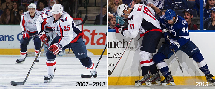
One of the big stories of this week has been the Ottawa Senators' new third jersey. They're calling it the Heritage Jersey and we got our first look at it on Tuesday. Then a few days later, the team officially announed its 20th anniversary plans.

In the press relase, the Sens confirmed the existence of the Heritage Jersey but, despite the leak, opted not to officially unveil it. That will happen closer to the start of the season. However, the team did post ticket package options online which tell us, in part, when the new sweater is scheduled to be used.

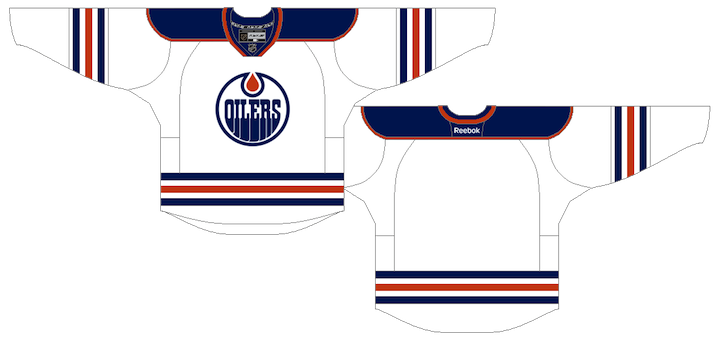
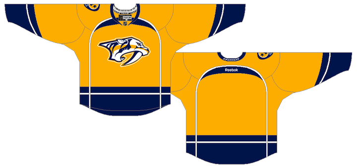
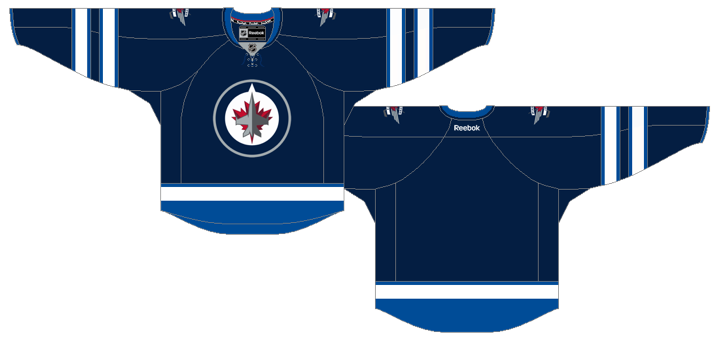
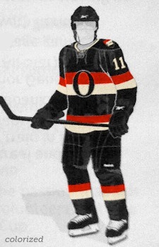
Ottawa Heritage Jersey (colorized)The Heritage Jersey will be worn for 11 home dates, but the ticket packages only reveal eight. Here's that list along with a couple more: 

  • Thurs., Oct. 13 — vs Colorado Avalanche
  • Sun., Oct. 30 — vs Toronto Maple Leafs
  • Sat., Nov. 12 — at Toronto Maple Leafs 
  • Wed., Dec. 14 — vs Boston Bruins
  • Tues., Dec. 27 — vs Montreal Canadiens
  • Sat., Jan. 14 — at Montreal Canadiens 
  • Tues., Feb. 7 — vs St. Louis Blues
  • Fri., Mar. 2 — vs Chicago Blackhawks
  • Fri., Mar. 16 — vs Montreal Canadiens
  • Sat., Mar. 17 — vs. Toronto Maple Leafs

† Along with the 11 home games will be a pair of nationally televised road contests in Toronto and Montreal, according to information that was part of the jersey leak. I take that to mean Hockey Night in Canada broadcasts — which are on Saturday nights. The Senators visit the Maple Leafs for Saturday matches on Oct. 8 and Nov. 12, but the team has already stated the jersey will see its debut on Oct. 13. And the only Saturday game hosted by the Canadiens takes place Jan. 14. By process of elimination I think we can safely include Nov. 12 and Jan. 14 on the schedule. But that's subject to change, of course.

UPDATE (9/25/11): As it turns out, Nov. 12 wasn't a safe date to include. The Toronto Maple Leafs just released their full third jersey schedule which includes that date. And for TV purposes, we won't see blue versus black. So strike that date from the list. Must be a different nationally-televised game.

I've also taken the liberty of colorizing the leaked jersey design from earlier in the week to give us an idea of what it might look like. I've used vintage white since many things are hinting at that right now.

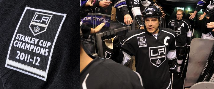
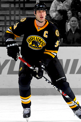
Kings Throwbacks Coming Back

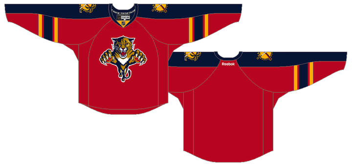
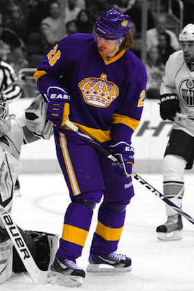
Kings throwback jerseyIn March, LA Kings Insider Rich Hammond wrote that the Los Angeles Kings would be overhauling their uniforms next season. He added, "the vintage purple-and-gold jerseys will go into mothballs for a while now."

I've been citing that little nugget for months in the various NHL JerseyWatch updates. What I didn't know until I started scouring his archives is that just over a month later, Hammond changed his tune.

Buried in a mailbag-type post on April 30, where he answered reader questions, was the news that the Kings were in fact bringing back the throwbacks for at least three home games next season.

Minnesota Kings Fan asked: To add to the uniform questions what about something with purple & gold?

Answer: The current plan is for the Kings to wear the purple-and-gold vintage uniforms for three home games next season.

I feel bad I overlooked that little piece of information during the last few months, but thrilled that the Kings are bringing this uniform back in 2011-12. It looks great and fans love it!

It's also the perfect counterweight for a club with black and white primary jerseys. I won't call them boring because I actually like them, I just don't want to see them lose the purple altogether.

And for the record, neither does Luc Robitaille.

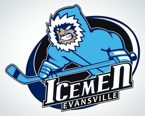
IceMen unveil modified logo, new jerseys

The Central Hockey League has been getting a lot of blog time lately, and they're about to get a little more. In just their second season, the Evansville IceMen will already be donning a new logo and jerseys.

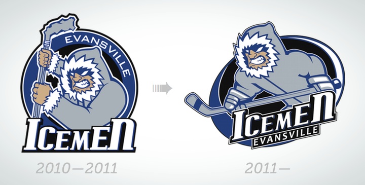
It's not really a new logo so much as a modified version of their previous logo which was used during their inaugural season in the CHL last year. They're keeping the same "ice man" as before, but with a different posture and some new gear. As for the uniforms, they're completely new — even if they aren't entirely original.

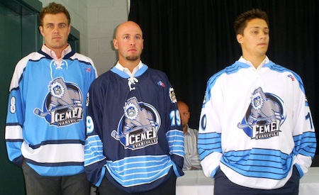
IceMen unveil new jerseys for 2011 / IceMenManiacs.comThe IceMen held a press conference on July 14 to show off the (not so) new look. (Try to ignore the blatant headline misspelling.) They had a few players on hand to model the new jerseys (right).

Mark Cody (18) wore the alternate, Todd Robinson (19) had the blue and Brian Bicek (10) donned the white sweater. In the CHL, teams wear white at home for the first half of the season and then switch.

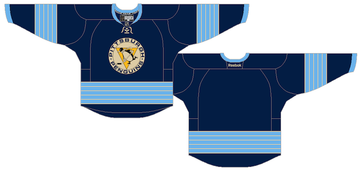
If you can look past the fact that all of these uniform designs come from the Pittsburgh Penguins' closet, what else do you notice?

We've seen it before, but never this bad. Not one color in the logo is found on the jerseys. Each one uses two shades of blue, neither of which match the single shade used in the logo. There's also no grey in the uniforms even though it dominates the primary mark.

I'm not oblivious to the fact that minor league teams have to spare expense by using existing jersey designs. But knowing that, why not make it look like you put some thought into the design and alter the logo colors to match? It doesn't look that bad, considering the logo they have to work with. But I'd lose the black.

That's all I really have to say about that because the truth is I love these jerseys — just not the crest. I think the colors and striping look great. By the way, I should give a shout-out to IceMenManiacs.com for the photo above and coverage of the unveiling.

Blazers celebrate 30 years with Oilers logo

On Friday, the WHL's Kamloops Blazers unveiled their 30th anniversary logo and it may look awfully familiar to you. That's because it's based on the Edmonton Oilers' 30th anniversary logo from 2008. The green craze is really hitting hockey design hard this year. Everybody's recycling!

The use of the Oilers' logo for the Blazers isn't as odd as it might seem at first. When the team was founded in 1981, they were known as the Kamloops Junior Oilers. So in reality, this logo works well as an homage to the team's own history. They became the Blazers in 1984.

The Blazers have announced some of the 30th anniversary celebration plans. Here are the ones of interest to Icethetics readers:

To celebrate 30 years, the Blazers have introduced a new logo that will be placed at centre ice for the entire 2011-12 season. The Blazers will also be wearing vintage jerseys to commemorate the anniversary this season.

I'll keep an eye out for that vintage jersey. Maybe that Kamloops Junior Oilers logo could be resurrected too. And I have to say that despite the obvious reuse of that Edmonton 30th logo, I do like how the team has worked in both the Junior Oilers and Blazers imagery into the design. Just wish they could've been more original.


I think that finally does it for today. You're now caught up on everything — that I know of. Next up, I'm working on a page that will be under the VOTE tab above. Basically, you'll be able to vote on all of the new logos and jerseys — even the unofficial ones — that we've seen this summer. Should give us an idea of where everyone stands on the new looks around the hockey world. Plus, it'll be a good recap with lots of links in case you missed anything admist all the crazy blog updates lately.