Entries in minnesota wild (30)

Friday
Oct302009

Green is the Way to Go

There are many reasons for going green. Today, a sampling of some of those reasons.

The hue between yellow and blue is quite a popular topic these days. Most of us understand it in the figurative sense — a method of curbing our effect on the slowly heating planet (which hockey fans should be most concerned about as our sport relies heavily on frozen water). Others take it in the literal sense.

Namely, the AHL's Rockford IceHogs, whose color scheme does not include green. They will wear special green jerseys on Friday, Nov. 20 as part of their "Going Green Night."

The announcement was made on the team's web site last week and includes details as well as an example of what this new sweater will look like.

AHL's Rockford IceHogs go green!

I bet the Blackhawks could pull off the green pretty well.

In any case, the release doesn't specify as to whether these jerseys will be auctioned for charity or saved and worn again in the future. All it says is that this is "the first time in which the IceHogs will sport green uniforms."

Also recently announced, Team Canada will be donning green threads at the upcoming IIHF World Junior Championship in Saskatchewan to pay tribute to "Saskatchewan's favourite sports team" — the CFL's Roughriders.

Team Canada's junior club goes green

The official release talks about how this new sweater will be used.

Canada’s National Junior Team will wear the jerseys twice — once in a pre-competition game and once during the championship. Canada is attempting to win its sixth-straight IIHF World Junior Championship gold medal.

The jerseys will be auctioned online (though it doesn't say where the money is going). The event takes place from December 26 until January 5 in Regina and Saskatoon.

Now back to the NHL.

The Minnesota Wild are going green this season for yet another reason having to do with neither the environment nor a pro football franchise. The club is going back to their roots with a new green third jersey — which just debuted last week.

But actually the Wild news I have to share has little if anything to do with that — I'm just trying to keep a theme going.

A type designer Rob Leuschke was interviewed by MyFonts.com for their monthly newsletter. Relevance? Apparently, in 1997, Leuschke was offered his dream job when he was asked to design a word mark for the newly formed Minnesota NHL expansion franchise.

Meet the designer of the original Wild word mark

That's right, he created the Wild's the original word mark which you can still find on the shoulders of the club's road sweater.

Since I was a small boy I had an interest in art and lettering. Handwriting was my favorite subject in first grade and I liked to copy the emblems of professional football, hockey and baseball teams.

I’ve never been much of an illustrator, but graphic drawings — especially those containing letterforms — were always a big pleasure. When I got the call to design the word mark for the Minnesota Wild back in 1997, it was an especially nostalgic thrill to do something I dreamed about as a kid.

Read more about font designer Rob Leuschke at MyFonts.com.

• • •

And finally, breaking away from the green theme entirely, here's an interesting article. It's all about the hockey glove and its unachieved potential as a fashion statement. If that wasn't enough of a reason to click through, perhaps this will do.

(Just a little something to freak you out — on a Friday.)

Wednesday
Sep232009

Icethetics Season Preview, Part 3

We're midway through the Icethetics Season Preview and after yesterday's three-section post, I'm going to make Part 3 short and sweet. It's a recap of the new logos that will be seen around the NHL this season.

Part 3: New NHL Logos

At least six NHL clubs will have new logos in their arsenal beginning with this 2009-10 season, presented here in alphabetical order.

Boston Bruins (special)

The Boston Bruins will face the Philadelphia Flyers in the Winter Classic on New Year's Day 2010. The NHL's annual outdoor game typically sees its participants dig into their history for special vintage uniforms. And the Bs had a long history to dig into.

For this year's big game, the Bruins pulled elements from five of the different looks they've had over the last 85 years. This logo comes from the sweaters worn 60 years ago to commemorate the franchise's 25th anniversary.

The logo will be used on the jersey as well as other Winter Classic-related merchandise. No plans have been announced to make the jersey the new third beginning in 2010-11, but it's not out of the question. The Penguins and Blackhawks have both given their Winter Classic threads an upgrade.

Buffalo Sabres (vintage)

While nothing has been made official just yet, everything is beginning to point to the notion that the Buffalo Sabres will retreat from the slug and give that classic 1970s primary mark another go. (I'll have details on this from Larry Quinn soon.)

Retro is in right now in the NHL and it seems like a vast majority of the teams are looking backward to move their uniforms forward. Sabres fans have been begging for a return to the team's original look. Their wish may soon come true.

The logo will continue to appear this season at center ice in the HSBC Arena and on tons of merchandise along with the team's official web site and other electronic and social media.

Calgary Flames (vintage)

After scrapping plans to release a brand new black third jersey complete with a fancy new logo, the Calgary Flames jumped on the throwback bandwagon. In fact, forget the black jersey — black is nowhere to be found on the new vintage threads the team is trotting out for their 30th anniversary season.

The club will wear a red jersey that's nearly identical to what was originally worn when the Flames moved from Atlanta to Calgary in 1980. Front and center will be that classic, white-hot flaming C.

No word yet on whether this vintage jersey and logo will be sticking around beyond the five games its scheduled for this season or if that previously designed black third will ever see the light of day.

Florida Panthers (alternate)

After 15 years in the NHL, the leaping cat logo most associated with the Florida Panthers is disappearing. While nothing has been announced officially, this legless feline has been popping up all over the place — everywhere but the jerseys, that is.

The Panthers are also one of a handful of teams expected to release a third jersey this season. They, along with the Colorado Avalanche, have yet to do so. It's not clear yet what to expect for the alternate sweater, but it wouldn't surprise me if this new logo somehow figures in.

For now, you can find it all over the team's electronic media outlets as well as publications and merchandise. And I haven't seen it yet, but it'll will probably be painted at center ice as well.

Minnesota Wild (third jersey)

So far this summer, two teams have unveiled third jerseys and both have involved new logos. The Minnesota Wild's new green duds feature a script rather than a typical logo. But that M will be making its way onto all sorts of Wild gear this year.

The logo is an encapsulation of the history of classic Minnesota hockey. From the simple M to the shooting star which dots the I that, no doubt, calls back to the Minnesota North Stars.

It's not my favorite thing for the front of a jersey, but it has a lot of meaning and the Wild still have the best primary mark in the entire league if you ask me.

Nashville Predators (third jersey)

The launch of their third sweater brought two new logos into existence for the Nashville Predators. However neither is entirely new. The one you see here is a simplified and recolored version of the Preds' primary mark.

A mix of black, grey and shades of blue join a brand new color in the team's identity — the red in the eye. I certainly prefer the simpler version of what is surely the most detailed primary logo in the NHL.

The other logo, found on the shoulders of the new jersey, is an adaptation of the current secondary mark which depicts the skull of a saber-toothed tiger. It's now encircled within the same checkerboard pattern found on the uniform itself.

I might've been more impressed with a completely new logo, but then we do know Nashville's track record in this category (see the old mustard jersey). Still, they're at least moving in the right direction by simplifying a complicated set of logos.

I'm not anticipating any other new logos around the NHL. The Colorado Avalanche have yet to unveil their third jersey, but it's expected to feature text across the front with the primary logo on the shoulders — nothing new.

And that wraps up Part 3. We're back tomorrow with Part 4. Can you guess the topic?

Sunday
Aug302009

Wild 3rd (Officially) Unveiled!

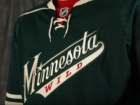
As promised, the Minnesota Wild officially unveiled their brand new third jersey today to fans at the State Fair. The sweater was first leaked by Icethetics on Tuesday.

The new official pictures from the Wild offer us a better look at the new crest. Elements from it — such as the new stylized "M" — are set to make their way onto a bunch of new merchandise this season.

Here's a closer look at the front from the team's official photo gallery.

Minnesota Wild third jersey (photos by Bruce Kluckhohn)

In the previous leak, we never actually got to see what that "M" really looks like. Now that we have, I'm not so sure about it. It may grow on me but it just feels more Wild West than Minnesota hockey at the moment.

Back of new third jerseyThe new third makes use of the same numbering and lettering style seen on the red home jersey — the old third. You can see an example on jersey model Derek Boogaard here to the right.

This whole uniform very much lacks red — a plus, if I'm the one being asked. You see it very sparingly on the new crest and right at the collar behind the laces. Technically it's also on the gloves as well but that's just because players aren't going to get new gloves every time they wear a different jersey.

Even the socks are devoid of red, as you saw the in the leaked pictures this past week. The Wild's release had this to say about the new sweaters.

Based in the Wild’s Forest Green with Wheat trim and a hint of Iron Range Red, the jersey’s classic sports look was the overwhelming favorite of Wild fans surveyed during the summer of 2008. The jersey crest features a script “Minnesota” with “WILD” emblazoned below. The script look, including the classic “M”, harkens back to historic Minnesota teams of the past including Minneapolis and Saint Paul teams of the 1930s and 1940s. The familiar “north star” element, borrowed from the primary Wild logo, dots the “I” and adds a decorative detail to the stylized “M”.

“We wanted to provide our fans with a new look and feel for our third uniform that is uniquely Minnesota and true to our brand — authentic, classic, contemporary and truly worthy of The State of Hockey,” said John Maher, Vice President of Brand Marketing.

The new third jersey was designed by New York City-based SME and produced by Reebok, the exclusive provider of jerseys to all NHL clubs. SONY is proud to partner with the Wild for the introduction of the third jersey. Look for SONY high-definition displays throughout Xcel Energy Center beginning this fall.

Minnesota will debut the jerseys on Wednesday, Oct. 21 against the Colorado Avalanche on FOX Sports North and wear them 15 times this season (13 home games and two road contests). The Wild will continue to wear their original white jerseys for most road matches and their Iron Range Red jerseys for the remaining home games.

When/if the team releases a full third jersey schedule, look for it here on Icethetics.

Overall, it's an incredibly well-designed third uniform and should rank among the likes of the Penguins and Sabres in terms of current alternates. It may well rank among the best third jerseys in NHL history.

I'd like to do a complete ranking of all-time NHL third jerseys later this year after all of this year's new ones have been unveiled. Let THN try to stomp all over our turf, but nobody does logo/jersey tournaments better than Icethetics!

Tuesday
Aug252009

Wild 3rd Jersey Leaked!

We're getting our first look this morning at the Minnesota Wild's brand new third jersey — just five days before the official unveiling. The new sweaters are scheduled to make their public debut on Sunday at the Minnesota State Fair. Icethetics has a sneak peek right now.

Minnesota Wild new third jerseyI believe this is Brent Burns modeling the new sweater here to the right (correct me if I'm wrong). The photo is part of the background image on the Wild's forthcoming redesigned web site. Since the jersey won't be unveiled until Sunday, the new site will have to wait at least until then. 

Meantime, this is what we've been hearing about from the Wild and it's hard not to be impressed. As I said, Minnesota was the team I felt had the farthest to fall in terms of third jerseys for 2009. They have such a great (albeit short) history that it would've been very easy to ruin this one.

The minute amount of red works in its favor. We wanted a green sweater and we got a green sweater. The striping is dead-on, reminiscent of the 2004 All-Star jersey. And the only thing I might change is probably the thin piping around the shoulders.

Aside from that, I don't think there's anything else to improve. It's what most of us were hoping for. Easy on the red, heavy on the green.

By the way, so you have an idea where this came from, here is the full background image that will be featured on the new site — probably next week.

Wild's new web site background

Got an opinion on the Wild's new third? Share it in the comments. And check back on Sunday for more photos from the official unveiling.

Wednesday
Aug192009

Wild, Avs 3rd Jersey Info

The Minnesota Wild have announced the dates for the official unveiling of of their new third jersey as well as its on-ice debut, according to their web site.

The Wild will offer fans a first look at the new green sweater on Sunday, August 30 at the Minnesota State Fair. It will then debut on Wednesday, October 21 when they face the Avs — who will also be getting a new third jersey (scroll down for more on that).

The National Hockey League’s (NHL) Minnesota Wild announced today that the club will introduce a new third jersey for the upcoming 2009-10 NHL season on Sunday, Aug. 30 at 12:30 p.m. at the Minnesota State Fair’s FAN Central building.

Minnesota’s new third jersey will be unveiled on stage in front of the FAN Central building starting at 12:30 p.m. The event will include Wild players and Nordy. The Wild’s State Fair booth will be located in the new FAN Central building this year at the intersection of Dan Patch Avenue and Underwood Street.

Minnesota is scheduled to wear its new third jerseys in a game for the first time on Wednesday, Oct. 21 against the Colorado Avalanche.

Not mentioned in this release is the fact that Derek Boogaard will be modeling the new sweater at the event. I'm sure there will be pictures and you can count on Icethetics to do all the heavy lifting for you.

I also added a countdown to the sidebar since we have an actual date! Just 11 days to go...

Now comes the time when I have to eat my words. It doesn't happen too often, but when I do make a mistake, I own up to it. Most of you read my initial reaction to the rumored leak of the Avs' new third jersey. Out of embarrassment, I won't link to it (you can find it), but I basically called it a sham.

I have come into new information that now has me 99% convinced that the rendering originally posted at the SportsLogos.net forums, and later picked up by Mile High Hockey, the Denver Post and Icethetics (damn!), is actually rather accurate.

To protect my source (whose first name is Matt), I won't go into detail, but let's just say, more or less (emphasis on more), this is what the Avalanche will be wearing on several occasions this coming season.

Yep, this will be the Avs' new third jersey

So, to Matt and everyone else who counts on Icethetics for solid information, I sincerely apologize for my rush to judgment. If you guys got some of the emails I get on a daily basis, you'd be cynical too. But it's no excuse. There you have it.

Now, regarding the jersey itself, I think it'll be nice to see the Avs in blue — a subtle nod to their franchise's history perhaps? Burgundy is undeniably the color most associated with the Avalanche, but isn't the purpose of a third jersey to experiment with your look? To color outside the lines?

Based on earlier comments, I know many of you aren't so thrilled about the sweater, but all I can say is give it a chance. And don't rush to judgment the way I did. Wait until you see it on the ice.

And that's my take on that. Later tonight, I'll get to those pictures of the new Team USA jerseys. I'm trying collect the cream of the crop as there doesn't seem to be any official source the way there was for Team Canada.

I also promised to post all of the other Ice Bulls submissions that came in. They'll be up at some point tonight. Over 25 different artists sent in artwork in less than a week! Icethetics readers/designers really are the best around! Also, if you haven't seen it yet, head to IceBulls.org to see the team's new logo.