Entries in minors (159)

Wednesday
Oct172012

San Francisco Gets the Horns

Photo from San Francisco Bulls official website

The San Francisco Bulls made their ECHL debut over the weekend, giving us our first opportunity to see the team in action. And if you were paying attention when the club unveiled its uniforms last March, you'll notice a few differences.

Photos from San Francisco Bulls (Facebook)

Mainly, the name and numbers on the back of the jerseys have been changed. But apparently, that was the plan all along. When it was pointed out via Twitter (by @Puckguy14) that the numbers looked a lot like those of the MLB's San Francisco Giants, a response came from the guys who actually do the jersey customizations for the Bulls, Junkyard Athletic.

They also added that that was the team's plan from the beginning. (I think someone has an unhealthy attachment to the Giants. What happened to building your own identity?)

You may also note that conspicuously absent from these jerseys is any sign of a shoulder patch designed by one of our talented Icethetics artists. A week before the Bulls unveiled their jerseys, they said they'd be interested in looking at secondary logo proposals from our designers.

Well, they were interested in a couple but after a communication breakdown, the whole idea went nowhere. So instead, the jerseys feature the ECHL's 25th anniversary patch on the right shoulder and another smaller patch on the left that I haven't been able to make out. (Looks like it says BAT or something.) Can't tell if it's a sponsor or some kind of memorial patch.

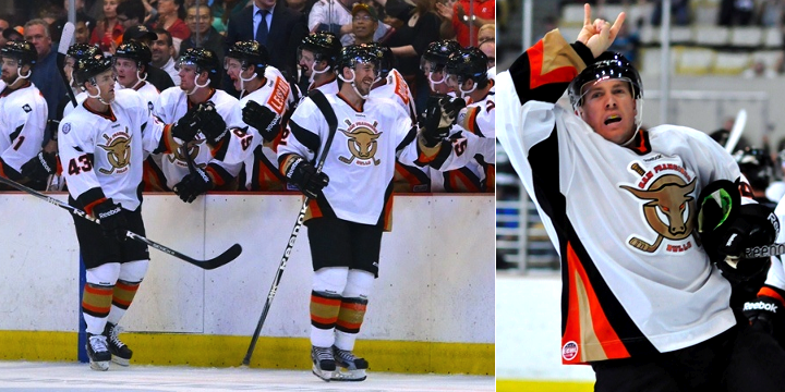
Photos from San Francisco Bulls official website

I can't say I'm impressed with the uniforms and I still hate the logo, but I do like how Justin Bowers and his teemmates keep giving the horns to Bulls fans at the Cow Palace.

Does seeing the Bulls' uniforms in action change your view on them? Love 'em? Hate 'em? The comments await.

Tuesday
Oct162012

Denver Cutthroats Unveil Uniforms

Photo from Mile High Hockey

On Monday, the CHL's Denver Cutthroats officially unveiled their jerseys. The expansion team gave us our first look at its logo back in May. To say I disliked it is putting it mildly. But I was very much a fan of the color scheme. Both opinions hold five months on.

With the jerseys, I'm torn. How can I hate a green hockey sweater? I love green hockey sweaters! But this an abomination. It's basically the generic Reebok Edge template employed by the Penguins, Senators and even Lightning for a few years. Worse than that, the jersey isn't even made by Reebok. It's made by SP Apparel but has the look of a cheap knockoff.

All right, you know I'm not a fan of the Cutthroats look, but they're actually putting NHL players on the ice this season — unlike, you know, the NHL itself. That's right, the team also used this jersey-unveiling press conference to introduce their newest member, ex-Av Kyle Quincey.

Photo from Denver Cutthroats (Facebook)

What does it say that the Central Hockey League is the best Quincey can do right now? That's him, second from the left. This lockout needs to end now! Anyway, the unveiling of these jerseys was also the first time we really got to see the Cutthroats' secondary logo.

It's not bad if you can look past the crossed hockey sticks cliché. It incorporates elements of the city of Denver's official flag, which is actually a pretty nice flag (as city flags go, anyway).

To sum up, I love the colors, dislike the crest and hate the jerseys. The shoulder patch gets a pass. What do you guys think? Are we on the same page or am I being too harsh?

Monday
Oct152012

Barons Sync Up With Oilers for New Uniform

Photo from Oklahoma City Barons official website

The AHL's Oklahoma City Barons unveiled their new third jersey last week and it looks rather familiar. The Barons are syncing up with their NHL parent club, the Edmonton Oilers, with this new look. It's essentially the Oilers' home sweater with some logos moved around.

From the Barons' press release:

The Oklahoma City Barons unveiled a third jersey at their annual Open House at the Cox Convention Center late Tuesday [Oct. 9] evening.

The third jersey uses the same color combination worn by the Barons parent club, the Edmonton Oilers. The royal blue and orange combination features one of the Barons alternate logos on the crest, the letters “OKC” with an oil drop just above the middle of the logo.

It's a sharp look and I think we were all ecstatic when Edmonton brought it back. Great to see Oklahoma City carrying it on this season.

Saturday
Oct132012

New Sweaters with Ties to Tampa

With no Tampa Bay Lightning hockey to follow at this point in the fall, I'm a little lost and turning to the minors for comfort. And it just so happens the Bolts' AHL and ECHL affiliates are sporting new uniforms this season. So let's have a look.

Photos from Rochester Americans and Syracuse Crunch official websites

It happened with the Norfolk Admirals a few years ago and now it's happening to the Syracuse Crunch, who opened their season last night wearing not quite what you'd expect. For a team that just unveiled a very blue logo this summer, I'm surprised to still see so much orange in their uniforms.

But who knows what goes on behind the scenes with these teams? It could very well be that the rebrand happened too late in the game to get the uniforms completely overhauled. (Plus, they probably still have a lot of orange gear leftover that they need to sell, right?)

What's cool: The lightning bolt down the pants. Crunch players are actually wearing the same pants as their NHL affiliate. (You can even see the NHL shield on them in the photo above.) This is useful for two reasons. For one thing, it ties the branding of the two teams together. But more practically, players who are getting called up already have a key piece of their gear in tow.

What's not cool: The white Lightning logo over orange on the right shoulder. Someone at SME has to be shaking their head over that. I would've at least used the blue bolt if the shoulders had to be orange. Which brings me to my other point: Why not make the shoulders blue? These are obviously not recycled jerseys. They're new, with the blue piping added all over the place. Fix it.

That's all I have to say on Syracuse for now. Their home opener is tonight so I assume we'll get to see the other jerseys. I'll add photos as an update to this post later on.

Photo from Florida Everblades (Facebook)

Also this season, the ECHL's Florida Everblades are celebrating their 15th anniversary along with their 2012 Kelly Cup championship. You can see both represented in the photo above as the team hit the ice in their new green anniversary sweaters and raised a special banner last night.

By the way, that Blades game was also the first time that expansion team Orlando Solar Bears hit the ice. You can see what their uniforms looked like in action for the first time on their Facebook page. The Orlando Sentinel also has a neat side-by-side shot of both teams' uniforms.

Interestingly, both of these games required extra time to decide. The Everblades won on a goal 26 seconds into overtime while the Crunch fell to the Rochester Americans in a shootout.

Wednesday
Oct102012

Wranglers Roll Out New Uniforms

Back in July, we got our first look at the new look of the ECHL's Las Vegas Wranglers. The team kept its color scheme but launched a whole new set of logos. Then last week, they debuted their new home sweater during a preseason tilt which introduced us to even more logos! But more on that in a sec. First, take a gander at the new uniform.

Wow, is it red! Really red. As Icethetics reader Jeannette H. pointed out, what ever happened to finding that balance in your color palette? Before this, the Wranglers wore almost solid black. Now they've swung completely the opposite way.

Add to that, I count four different logos on that uniform, including the ECHL 25th anniversary patch on the right arm.

So between the graphic above and the one to the right, we have our logo bases covered — the crest which prominently features Las Vegas in giant letters, the shoulder patch made up of a big W, a tiny LV and the new shield shape (new since the July unveiling), and finally the 10th anniversary logo comprised of a pair of fives.

For a better look at the Wranglers' new red road jersey, reader Matt McCall sent in this shot from the team's merchandise counter. It's the same design as the white with the colors flipped.

Photo by Matt McCall

Nothing earth-shattering in Vegas, but now we know how the Wranglers will look this year.

Page 1 ... 8 9 10 11 12 ... 32 Next 5 Entries »