It's been a week since the last blog update, so it's time for a nice long one. Let's take a trip across Canada and try to figure out why the natives like stripes so much. We start in the capital city. The blog's been a little Ottawa-heavy these days, but that's where the news is.

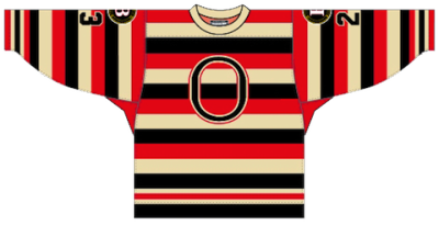
 Ottawa 67's dark uniform / Robert LefebvreThe OHL's Ottawa 67's — not the Senators — have announced they will unveil a new dark uniform on Friday. They're bringing back the old barber-pole look from just prior to the Age of Reebok.
According to Reebok, the "high-tech" Edge uniforms were not conducive to the top-to-bottom striping the 67's were known for. So they switched to this (right) and fans weren't very happy with that.
Now, it's apparently "technologically possible" so they're bringing them back once again. Details from the team's website:
The Ottawa 67’s will return to their roots next season by wearing the barber pole jersey/socks as their “dark” uniform. The team was forced to temporarily switch from the barber pole to a solid colour prior to the start of the 2009-10 season when the OHL adopted the new Reebok EDGE jersey.
At the time, 67’s Owner and Governor Jeff Hunt pledged that his team would return to the barber pole design as soon as it was technologically possible, and that time has now arrived.
“The barber pole jersey is synonymous with 67’s hockey,” said 67’s Owner and Governor Jeff Hunt. “It’s the jersey of Denis Potvin, Doug Wilson and Bobby Smith. It’s the jersey of our Memorial Cup winning teams. And it’s fantastic to finally be able to return to it and give our fans the look they’ve been asking for.”
The jersey will be unveiled to 67’s fans at the Rona Centre on Friday evening, just before the start of their game against Niagara at 7:30 PM. Great seats for that game are still available.
 Binghamton Senators' barber-pole jerseySo that's cool and I'll get pictures on the blog tomorrow. If any 67's fans in attendance feel like sharing a picture, everyone here would be grateful.
The AHL's Binghamton Senators recently sported the full stripes — though not in the Reebok Edge cut (right).
But that's not all. Now we bring it back to the NHL club. Icethetics reader Dan P. emailed in about what the change-up for the 67's might mean for the Ottawa Senators in 2011.
Given the conversations regarding the Sens jersey changes, this news could likely have an impact as it probably rules out a complete return to the straight barber poles... not likely that two teams in the same town sport the same jersey.
While I can't think of a specific example to refute Dan's claim, I don't see why that necessarily has to be the case — especially if it's just an alternate for the Sens. It might be cool to have that connection with the junior club in town.
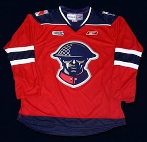
Still, let's say Dan is onto something and the Sens wouldn't go full-on barber-pole. Team president Cyril Leeder has said that the barber-pole design will be part of the new third jersey. So that brings me back to the above jersey the 67's have been wearing since 2009. I think it would work perfectly for the Senators and it will no longer be in use by the 67's.
So that's that put to bed for the time being.
 Here's an interesting one. Remember my April Fool's joke in 2008? It was about the NHL dropping Reebok Edge jerseys and turning to Project Runway for redesigned uniforms. Maybe it was just crazy enough to be true.
ESPN The Magazine asked fashion designer Tommy Hilfiger for his take on the uniforms of the most historic teams in major sports for their Style Issue (March 21 edition). He tried his hand at the Yankees, Lakers and Cowboys before turning to the Montreal Canadiens.
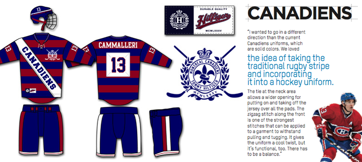 Tommy Hilfiger gives the Canadiens a new look / ESPN The Magazine
Here's what Hilfiger had to say about his Habs' redesign:
I wanted to go in a different direction than the current Canadiens uniforms, which are solid colors. We loved the idea of taking the traditional rugby stripe and incorporating it into a hockey uniform. The tie at the neck area allows a wider opening for putting on and taking off the jersey over all the pads. The zigzag stitch along the front is one of the strongest stitches that can be applied to a garment to withstand pulling and tugging. It gives the uniform a cool twist, but it's functional, too. There has to be a balance.
I like the rugby stripes much better than the barber-pole the 67's are talking about. But it would be hard to see the Habs in a uniform that didn't bear the CH. If you're so inclined, you should check out Hilfiger's other redesigns.
 This next item relates to Canada, but not stripes. Chris Creamer tweeted a link to a story saying the sale of the WHL's Chilliwack Bruins is "70% done" — meaning it's looking like they'll be playing in Victoria next season.
And it apparently relates to the possibility of the Phoenix Coyotes moving back to Winnipeg if they can't sort things out in Glendale, Ariz. This pretty much sums it up: "With the impeding collapse of the Phoenix Coyotes in Glendale and their move to Winnipeg in the cards, it is imperative to the WHL that they move into the Victoria market before the Vancouver Canucks affiliate, the Manitoba Moose does."
I don't know all the ins and outs of this story, but I do know the ECHL is already in Victoria with the Salmon Kings — and they're affiliated with the Canucks and Moose. I guess it'll be interesting to see what new team names and logos we end up with next season when all of this gets worked out.
By the way, I have an extra-long Winnipeg Jets concept post in the works for tomorrow. Thanks to all the artists who've submitted their work!

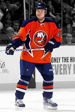 Islanders 2001—2007 / Getty ImagesAnd now to drop my Canadian theme altogether, we'll move on to the subject of the New York Islanders and their new third jersey.
In a video blog on NYI Point Blank, Chris Botta addressed a reader's question. He says the Isles will indeed launch a new alternate sweater for 2011-12.
The reader asked what we're all thinking by pointing out that the Islanders already "got it right" with the new white sweater this season. So why risk a "fishsticks" ordeal?
The simple answer: money. As Botta points out, if the club adds a new jersey, even if it has a fisherman on the front, fans will buy it. And the Isles would like to have their money.
Botta had no details to offer on the design, but did say he was working for the club when the orange jersey was launched. He liked it. Personally, I'm not a big fan, but it is different and we have seen worse. Much worse.
Thanks to Andy F. for sending along the link.


 18 Comments
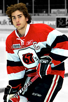 New 67's jersey / Blitzen PhotographyThe OHL's Ottawa 67's announced yesterday that they'd be bringing back their classic barber-pole jerseys for the 2011-12 season.


