Entries in whl (27)

Tuesday
Jun212011

Victoria Royals Unveil Logo, Jersey

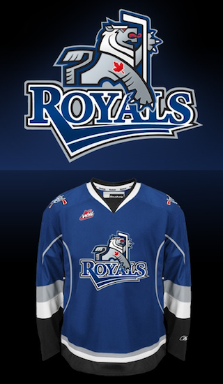
Victoria Royals logo and jersey / RoyalsTwo months ago today, the WHL's Chilliwack Bruins announced their relocation to Victoria. Now, the club finally has a new name and logo.

On Monday, the Victoria Royals revealed their colors, logo and dark jersey (right) — all of which will be used when they hit the ice to start the 2011-12 WHL season this fall.

Before I share my thoughts, got to tip my hat to Chris Creamer at SportsLogos.net for being the first to show the logo to us. He tracked it down in a trademark search a couple weeks ago.

Now the logo. I'm surprised by it. This may be junior hockey, but in Canada that's no excuse for having a below average logo. Nothing really stands out about it, except for the red maple leaf which looks tacked on.

In fairness to the designer, by no means is it on the level of the Connecticut Whale or anything. I was just expecting something more along the lines of fellow WHL clubs like the Giants, Rebels or Silvertips — not the Ice or Rockets.

The Province, in Vancouver, talked to artist Brent Lynch about the design.

The logo is a stylized, heraldic lion designed by Vancouver Island artist Brent Lynch of Nanoose Bay, who designed the Vancouver Canucks’ orca logo and the logo for the WHL’s Vancouver Giants.

“It’s a contemporary look that has a bit of an edge to it,” said Lynch. “It’s cool for the kids, and adults can relate to it, too.”

I'm not so sure. But then there's the jersey. Clearly, it's the Tampa Bay Lightning's blue third jersey with the new Royals logo on it.

The Vancouver Sun said this has to do with the quick turnaround time.

The franchise had to go with an existing colour template. Reebok didn’t have enough time to customize a colour scheme because the relocation of the Chilliwack Bruins to Victoria was only made official in April.

This explains why the jersey itself lacks one of the club's colors — red. No other team wears that color combination — blue, red, silver and black. A white jersey will be unveiled later this summer.

Now it's time for you to weigh in. What are your thoughts on the new Victoria Royals and their branding efforts? Am I missing the mark with my assessment or do you agree with it?

Wednesday
May112011

Loose Threads: Kings of All Kinds

Haven't done one of these in a while but there's a laundry list of things I need to get on the blog sooner rather than later. I'll try to keep it brief, but no promises.

Kings Dropping Hints About New Road Jersey?

Since being eliminated from the playoffs, the Los Angeles Kings have been getting their website in shape for next season. As mentioned over the weekend, the purple has been removed, leaving just the black and white logos.

Frozen Fury promo graphic / KingsThey're now starting to promote the 2011 preseason, which includes the annual Frozen Fury event — which usually pits the Kings against the Avalanche at MGM Grand Garden Arena in Las Vegas.

A cursory glance at this home page promotional graphic (right) might have you thinking you're looking at a new jersey! The team's "Insider" blogger has indeed said a white version of the current third jersey will become the new road uniform.

In reality, however, it's just the black jersey with a little color inversion magic via Photoshop. But might that be what the new sweater will look like? Will they wear it for the Frozen Fury game?

LA Kings Hockey Fest logo / KingsBut wait, there's more. A few weeks ago, the club announced this year's LA Kings Hockey Fest will be held on Sept. 11. It's one of those fan-centric events every team holds in late summer to get folks jazzed up about the new season.

Why do we care? Well, for one you have a new logo there. But more importantly, I try to keep tabs on these events because teams tend to use them to unveil new jerseys to fans.

With that new road uniform expected from the Kings for the 2011-12 season, it might not be a bad idea to keep an eye out. I've added the event to the Icethetics calendar (sidebar).

In the meantime, I'll continue to watch for an official unveiling date or event. Until then, this is probably our best bet to see it before the regular season begins.

NHL Premiere: 4 teams, 3 countries

As has become tradition, the NHL will open the 2011-12 regular season with a handful of games in front of European crowds in an event called NHL Premiere. Four games will take place over two days amongst four different teams in three different cities. Did you follow that?

The NHL made the announcement a month ago and, since then, some logos have been trickling out. They're basically the same as the NHL Premiere logos used in 2010, customized for next season.

That graphic should quickly explain who's playing who in which cities and when. So you're welcome. But just for the sake of having it in text form: Helsinki, Finland hosts the Ducks and Sabres on Oct. 7. Stockholm, Sweden will see the Rangers play the Kings (10/7) and Ducks (10/8). And for the first time, the NHL will play a regular season game in Germany as Berlin hosts the Kings and Sabres on Oct. 8. 

NHL Premiere 2011 generic logo / KingsFor what it's worth, this generic logo (right) has been featured on the Los Angeles Kings' website as they try to sell tickets to fans eager to make the journey to watch their team open the season on the other side of the world.

As for the logos above, it's clear they're all built on a standard template that varies based on location. The city name, national flag and dates are customized for each event.

Teams playing in these games have customarily worn the logos as jersey patches to recognize which one they're playing in. Only difference is the sponsor logo at the top is replaced by the NHL shield and the date is moved below the circle. Click here to see an example from 2010.

R.I.P.: Victoria Salmon Kings (2004—2011)

As Victoria, B.C. prepares to welcome WHL hockey, they said goodbye to the ECHL on Friday with the folding of the Victoria Salmon Kings franchise — one of the league's originals. (And really, that title should read 1988—2011. I'll explain shortly.)

For now, I throw it to our friend Woody Wommack who covers the ECHL for the Naples Daily News in Southwest Florida. He writes about the Victoria club's sudden demise:

The Victoria Salmon Kings are no longer a part of the ECHL. The team announced Friday that requested and was granted a withdrawal from the league by the league's board of governors.

From the team's official Facebook page: "The Salmon Kings have officially announced today that the team has withdrawn from the ECHL wit h the unanimous approval from the league's Board of Governors."

Victoria isn't leaving for financial reasons, but rather because the team's owners recently purchased a WHL franchise with the intent of moving the team to Victoria next season. The Salmon Kings didn't have a place to play and therefore don't have a franchise.

Rumors continue to swirl about the possibility of the ECHL adding one or more teams to the Western Conference for next season. With the loss of Victoria, the Western Conference only has seven teams.

Now I have a little history lesson which explains how this is like the NHL losing an Original Six franchise. 

When the ECHL launched in 1988, it was called the East Coast Hockey League and made up of just five franchises. In the 23 years since, all of them have either relocated or folded. And believe it or not, the Salmon Kings are the second to hang 'em up for good.

The Erie Panthers were a founding franchise in 1988. They had one good season in 1989-90 but lost a lot more than they won. In 1996, they left Pennsylvania and moved to Louisiana to become the Baton Rouge Kingfish in an ECHL now made up of 21 teams.

But the losing didn't stop in the new city and people don't usually like to pay for hockey tickets to see the other team win. The Kingfish suspended operations in 2003. By this time, the ECHL had a new name and was expanding west with the demise of the West Coast Hockey League. In 2004, a new arena in Victoria was begging for a hockey team. They got the Kingfish and renamed them the Salmon Kings.

Despite spending the last five straight seasons in the playoffs, no deal could be worked out to keep the team together in a new market when the WHL's Chilliwack Bruins arrived Victoria on April 20.

Victoria's new WHL team has yet to be named. But it's safe to say they're dropping the Bruins moniker.

Thursday
Apr212011

Saying Goodbye

Wednesday night brought a couple of possible "last times" in the NHL.

For example, with the Red Wings' sweep of the Phoenix Coyotes, it could turn out to be the last time fans gathered to watch an NHL game in Glendale, Ariz. Rumors have run rampant that any deal to keep the team in the desert has dried up (I intended that pun) — paving the way for a relocation back to frosty Winnipeg.

Those pesky rumors also suggest that such an announcement would be imminent as soon as the club's playoff run ended — which it has, in rather short order. It could be today (Thursday) or even as soon as tomorrow. On one hand I'm hoping they don't move because I can only imagine the devastation for the few hardcore Coyotes fans. But then again, I'd be fascinated to see another rebranding this offseason — and thrilled to see Canadians getting one of their teams back.

Another last time: If the Tampa Bay Lightning don't turn things around in their series against the Penguins, Wednesday night could prove to be their last time wearing black jerseys for the foreseeable future. Icethetics readers are well aware of the rebranding efforts unveiled in January, which eliminated the black from the team's identity

Imagine if the Bolts were to win the Cup wearing black (again). It would make it a lot harder to see them completely lose that color scheme in the following season. But if they keep playing the way they have been, that won't be an issue. They face elimination in Game 5 first thing Saturday in Pittsburgh.

One more thing hockey fans are saying goodbye to are the WHL's Chilliwack Bruins. It's official. They played their final game on April 2 in a 6-4 loss to the Spokane Chiefs.

At a media conference today, the league announced the sale and relocation of the club to Victoria, B.C. The ECHL's Victoria Salmon Kings are expected to be sold or folded, according to the Times-Colonist. Either way, it boils down to two groups of fans losing their teams.

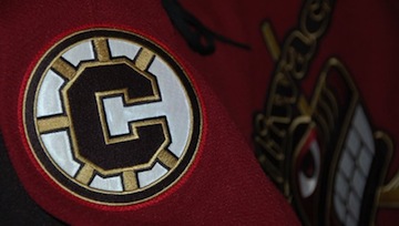
Chilliwack Bruins third jersey / BruinsA website has already launched — www.vicwhl.com — for the Victoria franchise. By the way, the Chilliwack Bruins' website has been wiped from cyberspace and you'll find no reference to the team on the WHL's website. It's kind of annoying, actually. But I digress.

Currently, the new owners of Victoria's WHL team are holding a poll on their website asking fans what name they prefer for the team. The choices are Victoria Capitals, Dragons, Force, Royals, Tide and Thunder. (They do not offer a "none of the above" option. But Royals would probably be for the best.)

My guess is that poll couldn't matter less. The jerseys are probably already headed into production along with a load of knick-knacks with the new name and logo — whatever that may be. Though it could just be my cynical side saying that.

What else are we saying goodbye to in 2011?

Thursday
Mar102011

Canadians Heart Stripes

It's been a week since the last blog update, so it's time for a nice long one. Let's take a trip across Canada and try to figure out why the natives like stripes so much. We start in the capital city. The blog's been a little Ottawa-heavy these days, but that's where the news is.

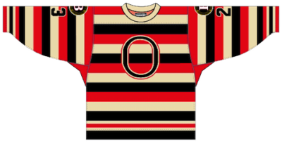
Ottawa 67's dark uniform / Robert LefebvreThe OHL's Ottawa 67's — not the Senators — have announced they will unveil a new dark uniform on Friday. They're bringing back the old barber-pole look from just prior to the Age of Reebok.

According to Reebok, the "high-tech" Edge uniforms were not conducive to the top-to-bottom striping the 67's were known for. So they switched to this (right) and fans weren't very happy with that.

Now, it's apparently "technologically possible" so they're bringing them back once again. Details from the team's website:

The Ottawa 67’s will return to their roots next season by wearing the barber pole jersey/socks as their “dark” uniform. The team was forced to temporarily switch from the barber pole to a solid colour prior to the start of the 2009-10 season when the OHL adopted the new Reebok EDGE jersey.

At the time, 67’s Owner and Governor Jeff Hunt pledged that his team would return to the barber pole design as soon as it was technologically possible, and that time has now arrived.

“The barber pole jersey is synonymous with 67’s hockey,” said 67’s Owner and Governor Jeff Hunt. “It’s the jersey of Denis Potvin, Doug Wilson and Bobby Smith. It’s the jersey of our Memorial Cup winning teams. And it’s fantastic to finally be able to return to it and give our fans the look they’ve been asking for.”

The jersey will be unveiled to 67’s fans at the Rona Centre on Friday evening, just before the start of their game against Niagara at 7:30 PM. Great seats for that game are still available.

Binghamton Senators' barber-pole jerseySo that's cool and I'll get pictures on the blog tomorrow. If any 67's fans in attendance feel like sharing a picture, everyone here would be grateful.

The AHL's Binghamton Senators recently sported the full stripes — though not in the Reebok Edge cut (right).

But that's not all. Now we bring it back to the NHL club. Icethetics reader Dan P. emailed in about what the change-up for the 67's might mean for the Ottawa Senators in 2011.

Given the conversations regarding the Sens jersey changes, this news could likely have an impact as it probably rules out a complete return to the straight barber poles... not likely that two teams in the same town sport the same jersey.

While I can't think of a specific example to refute Dan's claim, I don't see why that necessarily has to be the case — especially if it's just an alternate for the Sens. It might be cool to have that connection with the junior club in town.

Still, let's say Dan is onto something and the Sens wouldn't go full-on barber-pole. Team president Cyril Leeder has said that the barber-pole design will be part of the new third jersey. So that brings me back to the above jersey the 67's have been wearing since 2009. I think it would work perfectly for the Senators and it will no longer be in use by the 67's.

So that's that put to bed for the time being.

Here's an interesting one. Remember my April Fool's joke in 2008? It was about the NHL dropping Reebok Edge jerseys and turning to Project Runway for redesigned uniforms. Maybe it was just crazy enough to be true.

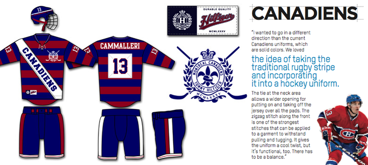
ESPN The Magazine asked fashion designer Tommy Hilfiger for his take on the uniforms of the most historic teams in major sports for their Style Issue (March 21 edition). He tried his hand at the Yankees, Lakers and Cowboys before turning to the Montreal Canadiens.

Tommy Hilfiger gives the Canadiens a new look / ESPN The Magazine

Here's what Hilfiger had to say about his Habs' redesign:

I wanted to go in a different direction than the current Canadiens uniforms, which are solid colors. We loved the idea of taking the traditional rugby stripe and incorporating it into a hockey uniform. The tie at the neck area allows a wider opening for putting on and taking off the jersey over all the pads. The zigzag stitch along the front is one of the strongest stitches that can be applied to a garment to withstand pulling and tugging. It gives the uniform a cool twist, but it's functional, too. There has to be a balance.

I like the rugby stripes much better than the barber-pole the 67's are talking about. But it would be hard to see the Habs in a uniform that didn't bear the CH. If you're so inclined, you should check out Hilfiger's other redesigns.

This next item relates to Canada, but not stripes. Chris Creamer tweeted a link to a story saying the sale of the WHL's Chilliwack Bruins  is "70% done" — meaning it's looking like they'll be playing in Victoria next season.

And it apparently relates to the possibility of the Phoenix Coyotes moving back to Winnipeg if they can't sort things out in Glendale, Ariz. This pretty much sums it up: "With the impeding collapse of the Phoenix Coyotes in Glendale and their move to Winnipeg in the cards, it is imperative to the WHL that they move into the Victoria market before the Vancouver Canucks affiliate, the Manitoba Moose does."

I don't know all the ins and outs of this story, but I do know the ECHL is already in Victoria with the Salmon Kings — and they're affiliated with the Canucks and Moose. I guess it'll be interesting to see what new team names and logos we end up with next season when all of this gets worked out.

By the way, I have an extra-long Winnipeg Jets concept post in the works for tomorrow. Thanks to all the artists who've submitted their work!

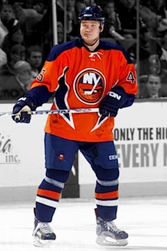
Islanders 2001—2007 / Getty ImagesAnd now to drop my Canadian theme altogether, we'll move on to the subject of the New York Islanders  and their new third jersey.

In a video blog on NYI Point Blank, Chris Botta addressed a reader's question. He says the Isles will indeed launch a new alternate sweater for 2011-12.

The reader asked what we're all thinking by pointing out that the Islanders already "got it right" with the new white sweater this season. So why risk a "fishsticks" ordeal?

The simple answer: money. As Botta points out, if the club adds a new jersey, even if it has a fisherman on the front, fans will buy it. And the Isles would like to have their money.

Botta had no details to offer on the design, but did say he was working for the club when the orange jersey was launched. He liked it. Personally, I'm not a big fan, but it is different and we have seen worse. Much worse.

Thanks to Andy F. for sending along the link. 

Tuesday
Mar012011

Worth a Thousand Words

The Icethetics-related news really tends to dry up this time of year, but I hate to let the blog dry up with it. So I'm declaring today Picture Day. Later this week, I'm planning an update to NHL JerseyWatch 2011. But for now, I'm just offering some things to look at. Feel free to add your comments at the end.

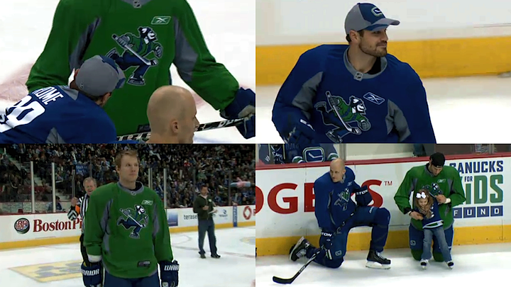
Canucks sport new practice threads at SuperSkills / Vancouver Canucks

For those that missed the Facebook post, over the weekend the Vancouver Canucks were wearing special practice jerseys at their SuperSkills competition, featuring the updated Johnny Canuck logo. It was Team Blue vs. Team Green and these sweaters made it clear that logo doesn't belong on the front. Maybe the shoulders. But definitely the helmet, where it already is on the alternate uniform.

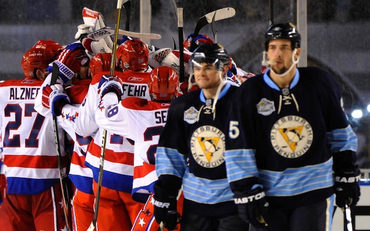
2011 NHL Winter Classic / Pittsburgh Penguins

It's a shame I haven't posted pictures from any of the outdoor games yet. Way back on New Year's Day, we all saw the Washington Capitals defeated the Pittsburgh Penguins on their home turf. (Haha, turf.) If you've been following along with the Jersey Gallery updates, you've seen the Caps' uniform, but I haven't gotten around to the Penguins yet.

I'm torn on it, by the way. Dark blue just doesn't work for the Pens. I think I like the '08 version better. Still...

Dan Bylsma coaching at the 2011 Winter Classic / Pittsburgh Penguins

Nobody rocks a hat like Dan Bylsma. 

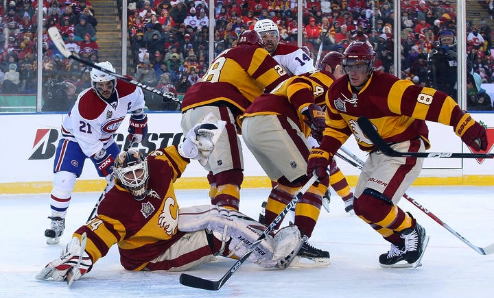
2011 Heritage Classic / Calgary Flames

You know what, I'm only all right with this because it was one game. But let's not do this anymore, Calgary. Let's not look like a skating advertisement for a Big Mac. It wasn't a good look a century ago and it isn't now. Even more disappointing than what the Flames wore was what Montreal wore. They're the Habs and they're classic but they've got an entire arsenal of throwback jerseys from a hundred years ago. Why not?

Miikka Kiprusoff in a cloud of snow / Calgary Flames

So many thoughts on this one: Is there supposed to be a goalie hiding in there? ... This is what I imagine to be the Canadian version of walking around with a raincloud over your head. ... If any player could just manifest a cloud of snow around himself, it would make cherry-picking a lot easier. ... Goalies are not born; they simply appear after a snowstorm. ... Should I stop now? ... Abominable goalie? ... Yes, stop? Okay.

WHL's outdoor game / Dylan Lynch

The WHL's Calgary Hitmen and Regina Pats borrowed the temporary ice rink at McMahon Stadium just prior to the Heritage Classic. And like their NHL counterparts, they sported retro-style sweaters. They're pretty much the same jerseys, just in different colors. Spooky.

Canucks' hall of sweaters / Vancouver Canucks

And we'll finish where we started — Vancouver. I'm sure Canucks fans are well aware of the sweaters hanging outside the team's locker room, so you can ignore this. For everyone else, how cool is this? From the Vancouver Millionaires on through to the orange third jersey from the '90s, they have a very rich and very colorful uniform history and it's nice to see they don't bury it and pretend it never happened.

That's all. If you've got any pictures you'd like to share, shoot me an email.