NHL Tournament of Logos

Entries in ducks (61)

Thursday
Sep132007

Ducks Unveil New Uniforms!

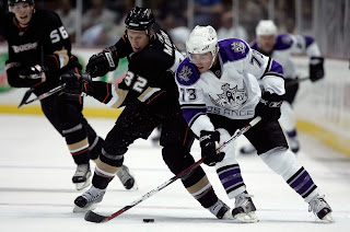
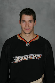
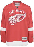
Even though they were already on the web site, I'm calling this the official unveiling as the Anaheim Ducks wore their new Rbk EDGE uniforms on the ice for the first time in a preseason game against the Los Angeles Kings. That game was also our first look at two teams in action wearing the new threads.
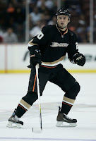
Here you see Maxim Kondratiev sporting the new look on the ice. He scored a power play goal for the Ducks in the league's first exhibition game of the season.

Looks very much the same as last year's jerseys. I still can't get over the wordmark for the logo. I like the jerseys. I think they're great. But really, get rid of the "ucks" and just use the "D" as your logo, all right?

But that's not all. I've still got more pictures from last night's opener.

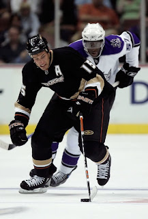
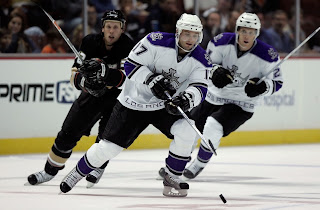
I hope no one is complaining anymore. These new Reebok uniforms really do look awesome on the ice. I know it was hard to tell since they were all draped over mannequins. We're used to seeing them in action. Now we are and it's quite a sight.

My one beef is the oversized "C" and "A" on the captains' sweaters. I don't really think they need to be that big. In the Ducks' case, it sort of overtakes the logo on the front of the sweater.

These action photos will also be a good chance for us to keep a tally of which teams are wearing the numbers on the front as well. As of yet, we still don't know how many teams are doing that.

By the way, later on today, I'll be adding these photos to the Rbk EDGE gallery. I'll try to do that for as many teams as I can find photos for as we go through the preseason and beginning of the regular season.

Wednesday
Sep122007

Ducks To Debut New Unis

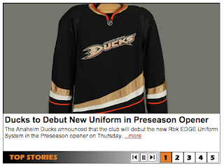
The Anaheim Ducks previewed their new Rbk EDGE uniforms on Wednesday evening via their web site, saying the debut will come tonight during preseason action against the Los Angeles Kings. That means hockey is officially back tonight everybody!

We did get a first look at the new home sweaters via a Maine newspaper yesterday. We still have yet to see the road jersey.

I'll post pictures from tonight's game as soon as I can. Be aware, however that since it's a west coast game, I won't be able to post anything from it until after 2 AM (Eastern). I will add those photos to this post.

Wednesday
Sep122007

Newspaper Displays Ducks' Threads

A couple of people emailed in this tidbit. Apparently the Portland Press Herald had team photos of J.P. Levasseur and Jonas Hiller of the Anaheim Ducks wearing their new Rbk EDGE jerseys.

Not much to speak of. They're basically the same, but you'll notice the NHL shield on the collar as a main difference from last year's sweaters. You can see the original article here.

By the way, I know there've been a lot of updates about new jerseys in a very short span of time this afternoon, so if you're having trouble keeping up, I'll be adding all the photos to my official Rbk EDGE photo gallery.

Saturday
Sep082007

No Word On Ducks' Jerseys?

We've managed to go this long without hearing anything from the Anaheim Ducks regarding the unveiling of their new uniforms so I'm not anticipating a big announcement.
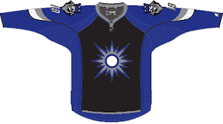
However, Anaheim was the only team left not yet in the sidebar countdown so I added them for this Thursday, September 13. The reason being they have their first preseason game then and will likely be wearing them. So while we may get no unveiling ceremony, I expect we'll see them on that date.

As a side note, I just wanted to mention that I'm working on a Rbk EDGE FAQ because there seems to be a handful of people with inaccurate information. Just to clear everything up, I'm going to put all the facts in one easy-access post. Hopefully I'll have that up tonight at some point.

One big thing that seems to be misunderstood: Teams will be wearing darks and home and whites on the road this season. I don't know if that will change in the future, but that's how it stands now.

Saturday
Sep082007

On A Western Swing

California is the running theme of today's concept art. We'll kick things off in the City of Angels. This first concept jersey for the Los Angeles Kings makes use of the original 1960s logo with silver replacing yellow.

Not terrible, but my personal favorite was the king face logo used on the mid-'90s third jersey. While the jersey sucked, I thought the logo was the strongest in the team's history. Once again, the gold is changed to silver producing a jersey that might look something like this.

I'm not a Kings fan, but I'd buy that jersey or one like it in a heartbeat. As a great alternate to a set like this, there's this design.

I like the silver in the beard of the king face logo on the shoulders. I think that would work better on the purple jersey above. Maybe it could be one of those logos where the colors change depending whether the jersey is light or dark — like the Flames and Canucks.

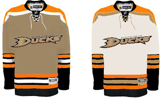
Moving along now to Anaheim, we have a Ducks jersey that isn't black.

Unfortunately, if it's gold, the logo (read wordmark) almost completely disappears. And I'm not sure it could be orange without looking like the Flyers. So black it is.

This concept might well turn out to be what the Ducks' new jerseys actually look like. I'd expect to see the team change the logo to the duck foot only, but that may just be wishful thinking.

My only other issue with this design is its lack of gold. That's an important part of this color combination and they should make good use of it.

And now we'll finish off this post with a trip up to San Jose. Got some interesting Sharks concepts to share.

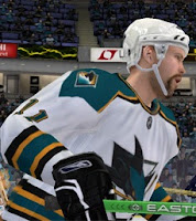
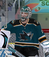
These next images are renderings from a video game — not NHL 08 — featuring a concept someone created for the Sharks. Very simple and classic. Shouldn't garner many complaints.

This cool jersey concept utilizes the shield logo unveiled by San Jose back in July. I really like that idea and it's not completely unheard of to use two different logos on NHL uniforms. Look at the new Wild sweaters.

The white one feels a little plain but not terrible.

Now Californians, let us all know how you feel about these concepts.

We've already seen the Kings' new uniforms, but we're still waiting on the Sharks and Ducks. Word out of San Jose is we should expect to see the new jerseys on September 17 while Anaheim has a preseason game on September 13. So at the latest, we'll see the new Ducks duds on Thursday if they don't unveil them sooner.

Friday
Sep072007

Just To Freak You Out... Some More!

Yes, you read that title right. Back by popular demand, I'm going to get your weekend off to a kicking start. I have the weird and crazy; a whole slew of new and wacky concept designs just meant to freak you out. So buckle in, it's going to be a long one.

I'm going to have a theme of red and black tonight. You'll see what I mean, but first I need to show you this.

From the brilliant creator of the Sabres and Canucks mish-mash logos comes this gem. True art in its rawest form. I dare anyone to attempt to improve upon that.

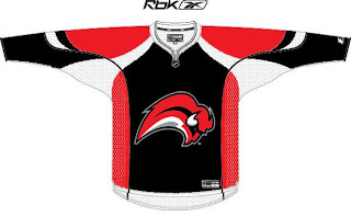
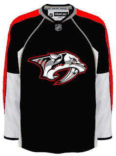
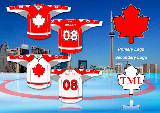
But since you can't, we'll move along. Do you like the color combination of red and black? Sure, if you're a Devils, Hurricanes, Senators or Coyotes fan. But what about Sabres, Predators and Canadiens fans? What about Leafs fans? Look on if you're brave enough.

It's a little blinding, isn't it? You might be surprised to discover that these designs all came from different people. Bad enough to have one disturbed mind out there Devil-ifying all these jerseys. There are at least four.

This Canadiens concept just scares me so I want to stop looking at it. The Sabres one just looks like a bloody slug (I knew that comment was coming so I wanted to head it off). And the Predators... well that doesn't look half bad if you ask me.

But imagine what kind of disturbed mind I must be to posting this stuff.

Wait. You need to catch your breath before you see this. Maple Leafs fans, ready your eyeballs for this one.

Wow, you're still here. I'm impressed.

All right, now I'm going to ease off a little bit. These designs are not so much horrifying as funny.

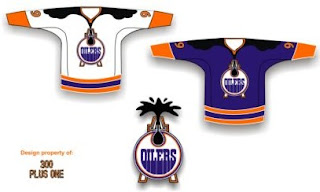
Dude, you spilled some oil on your— oh, wait... I see... yikes. Yeah. Oilers fans, I'm genuinely interested to know how you feel about this particular concept. I know it's been floating around a little, but it's just so... out there.

So what if the Rangers did this?

We probably ought not think about it.

Someone spent at least 30 seconds making this.

A missed opportunity, I say.

As a tribute (or not so much) to what I'm going to start calling the "VANCOUVER Incident," someone had some fun with other jerseys.

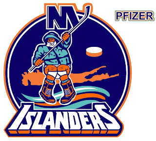
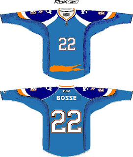
Similar work on the Sens, Isles and Jackets can be found in the Concepts Gallery. Now I'm going to wrap up where I began — Long Island. Imagine if Reebok decided the NHL should go the way of basketball.

Check out that outline of the island in place of a horizontal stripe. All is well.

Just remember, you guys asked for this. Let this be an object lesson in the notion of being careful what you wish for. Actually, if this keeps up, we'll make it into a weekly feature. So if you've made or found crazy crap like this, feel free to send it my way at nhllogos@gmail.com and who knows, you just might freak somebody out.

Sunday
Sep022007

Concepts For 'Hawks, Ducks, Devils

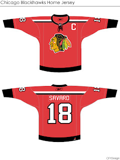
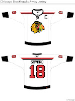
I'm curious to see the reaction in this one. A lot of you profess the Chicago Blackhawks to have the "most beautiful" uniform in all of sports. I don't see it but that's only me. However, I could very much get behind a design like this.

Even the white one is awfully sharp. The striping is clean and very minimalist. But would something like that result in an upheaval of the hockey world? Do things always have to stay the same?

Either way, the design work is very clean and I'm curious to see comments on this set.

This next one will be met with nothing but hate I'm sure. The striping is one thing. The name above the logo is another.

I'm sure that would result in even more blowback than 'VANCOUVER" across the front of the Canucks' jersey. But of course, these are all just fan-created concept designs. A bunch of what-ifs.

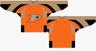
Here's a thought for the Anaheim Ducks.

It's the orange sweater Flyers fans have been begging for. Personally, I think it's too much for the Ducks. I think orange needs to be an accent for them. Let gold be the main color. As much as I don't like black jerseys, I think the Ducks' look sort of requires it. Thoughts on that?

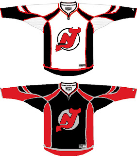
And then we have a look at all-star template-based New Jersey Devils concept.

You know you love the piping. I like the idea of a black Devils jersey — despite that fact that I just said I don't like black jerseys. The reason here being that too many teams have red jerseys now. You can add the Wild and Capitals to the fray this season. Red's a good color until it gets overused. Which is right about now.

I'll have more later. By the way, I have tons of Canadiens and Flames concepts for tomorrow — they day before their big unveilings!

Monday
Aug202007

Result: Wild vs Ducks

Minnesota
WILD

82% 6,986 votes

Anaheim
DUCKS

18% 1,584 votes

8,570 total votes

Minnesota Wild
Advancing to Quarterfinals to face Colorado Avalanche

Anaheim Ducks
Eliminated


Poll opening date
Aug 13 @ 4:38 AM
Poll closing date
Aug 20 @ 11:59 PM

07CHTRN | #W1A | MINvANA

Tuesday
Aug142007

NHL Concept Logos, Part 2

You know, it occured to me that two months ago, I posted a bunch of concept logos under a headline that read "Part 1." Well you could've searched all day and never found the second part that supposedly followed — until today. I'm finally just now getting around to publishing that post and it's about damn time.

Have a look at some of the craziest logos you'll ever see.

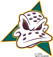
This logo was designed during the "Mighty" era with the old crummy colors. It's nothing special but I felt like it was still worth posting. The duck goalie mask is definitely a Disney design and would therefore never be used now even if the colors were changed to match what the team wears today. Plus it's just not cool enough.

And there's more where that came from. I know you were wondering.

I know the New Jersey Devils don't really need a change and it would be ridiculous for anyone to suggest that they did, but I've got these to share just the same.

Check out these renderings of possible (or impossible) New Jersey Devils logos. Personally, I'm all for leaving the Devils logo the way it is. No reason to mess with perfection there. But I just thought these might be interesting. Any thoughts?

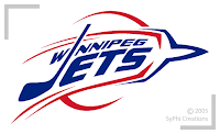
As a special bonus, we've also got an idea of what the Winnipeg Jets might look like if they were still in Winnipeg and not called the Coyotes.

What do you think of this? As far as logos go, I think this one wouldn't work well because it's too open. There need to be more closed-in areas in a logo. This one is all over the place.

Anyway, feel free to comment on these monstrosities if that is in fact how you see them. Don't worry about ever seeing them on NHL ice. It won't happen.

Monday
Aug132007

Poll: Wild vs Ducks


vs
Minnesota
WILD
Anaheim
DUCKS


Place your vote and then feel free to leave a comment as to how you came to your decision. Tell all your friends to drop in and vote! The more voices heard, the more accurate the results!

Poll opening date
Aug 13 @ 4:38 AM
Poll closing date
Aug 20 @ 11:59 PM

07CHTRN | #W1A | MINvANA

Page 1 ... 2 3 4 5 6 ... 7 Next 10 Entries »