NHL Tournament of Logos

Entries in ducks (61)

Saturday
Aug112007

Additional Ducks Designs

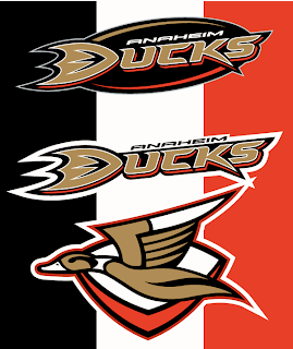
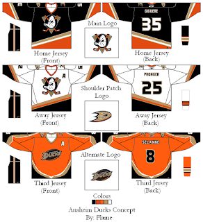
The Anaheim Ducks logo and uniform designs I posted on Wednesday were mostly well-received though a handful of you were wary. So I came across a couple more I thought might be worth considering.

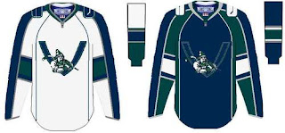
These concepts are in keeping with the current color scheme with some minor alterations. What about using the duck logo from that original design in the new colors and making it a secondary or converting the current logo to secondary.

That's one possibility. Another is more nostalgic, keeping the old Disney logo. It mixes the new colors with the old logo.

Would you buy any of those jerseys or should we just leave well enough alone and stop messing with it?

Wednesday
Aug082007

Amazing Ducks Concept Art

Earlier in the week I posted some awesome concept art that went over a storm with you guys. We saw designs for the Ottawa Senators and Boston Bruins as well as the New York Islanders and Atlanta Thrashers.

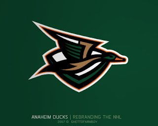
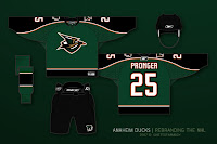
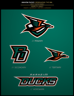
Today we're treated to some work on the Anaheim Ducks. These designs were based on concepts that "leaked" prior to the unveiling of the new Ducks logo last summer. Have a look and be impressed.

If you ask me, that's what the Anaheim Ducks should look like. And it couldn't be further away from the old Mighty Duck look. However, while the green is sharp, tan doesn't make for a vivid secondary color. So what about orange?

Our favorite designer upgraded his original logo with much more vivid colors. Can anyone deny this would be one killer logo package?

If the logos weren't enough for you, check out the uniform designs. Any NHL team would be lucky to look that good. How come this guy doesn't already work for the league?

Are there any Anaheim fans reading that would be repulsed by something like this? Would that even be possible?

Anyway, it's artwork like this that gets me so excited to do a blog like this. So what do you think? Am I going a little over the top with my glowing praise? Or are these designs really that good?

Tuesday
Aug072007

Oilers vs Ducks


vs
OILERS
DUCKS
1-11
1-12

The Aesthetics
Lately it seems like all the good logos are facing off. Today, it's a couple of the worst. With barely 11 points between the two of them and only three more days left in the tournament, I think that is fair to say. The Ducks logo is a word mark, nothing more. To some extent, so is the Oilers logo, but at least there's a little more to it. They'll squeak by with this point.
Oilers

The Nickname
We've all seen what happens when Ducks and Oil get together. Not a pretty sight.
Oilers

The Analysis
You've got to give credit to the Ducks on the rebranding campaign this season. They're like the Tampa Bay Buccaneers. Change a goofy logo, win a championship. The major difference being, the Bucs have a cool logo. The Ducks lack that, though I am a fan of the webbed duck foot in the form of a "D." The Oilers logo, after 20 plus years just still saddens me. I like the red trip and copper in for orange, but it's just not enough. I'm giving this point to the Ducks in hopes they drop the "ANAHEIM UCKS" in the coming season. For now, the Oilers put the lame Ducks out of their misery. Only 17 teams left with matches in the next few days.
Ducks


WINNER
2-1


Sunday
Aug052007

New Stuff For Ducks, Canucks

Got some fun stuff for your Sunday. The first is a jersey design for the Anaheim Ducks that playfully (and pitifully) attempts to look like a "leak." Thought it was funny.

The designer himself said it's a manipulation of the old Nashville road jersey. As far as the webbed duck foot "D" logo, I'm really hoping its what Anaheim goes with this season. I've heard that they will be dropping the wordmark on the uniforms, but we have yet to see anything official from them. Anyway, enjoy this and try not to take it seriously. It's not the real thing.

Looks like another fan came up with this concept for a new Vancouver Canucks uniform.

It seems to borrow from the newly unveiled Florida jerseys. It's not a well-balanced logo, but what do you Canucks fans think? Would you like to see something like this? Or do you prefer the orca logo, which we're hearing will stay on the new Rbk EDGE jerseys (in new colors)?

And for everybody else, what do you think about all this stuff? Don't be fooled. None of it is actual team artwork — just fan-created fun. But do you think it's good work? Or should it have stayed in the minds of these fans and off this site? Be gentle.

Monday
Jul302007

Get Ready To Be Horrified

Okay so I didn't want to go to bed before I got one more post in for today. (I go to bed by 7 PM because I have to be at work by 4 AM. I work on a TV morning show. Which should explain why I have so much time to do a blog like this. I get off work at noon. And that's enough parenthetical nonsense for one day.)

Anyway, this is what I have to offer. A joke.

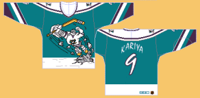
If you don't get the reference, look below. For what served as the inspiration to this mockery, you have to get in your time machine and travel back to the 1995-96 season when the Mighty Ducks of Anaheim donned this monstrosity on a couple of rare occasions.

Probably the worst third jersey ever. And you want to know the worst part? I have one of them in my closet! And if you were thinking that part was the joke... no, sir. I actually bought one back in the day because I was 11 and thought it was so cool. Let the ridicule begin.

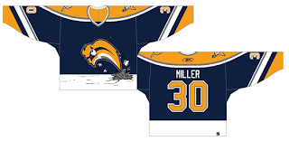
Anyway, how much do Sabres fans hate the Buffaslug?

As far as actual news for your Monday night, I'm afraid I'm at a loss. Maybe Wednesday we'll get to see the Vancouver Canucks' new uniforms. Maybe. That reminds me. I found a bunch of mock-ups and fan art, I believe, at Canucks Central. So we can all look forward to that tomorrow on the day before August 1.

If you know or hear of anything else, I'd be happy to hear about it. Leave me a comment. Thanks.

Saturday
Jul282007

Coyotes vs Ducks


vs
COYOTES
DUCKS
4-4
1-11

The Aesthetics
The Coyotes logo isn't the greatest, but the Ducks logo is a wordmark. Lesser of two evils, here. Not sure what else there is to say about it.
Coyotes

The Nickname
If motivated, I'm sure a Coyote would eat a Duck.
Coyotes

The Analysis
Where is the duck? I see the coyote but where is the duck? Oh right, there's not one. Yeah, I'm still not getting over that yet. I understand the webbed duck foot "D" will become the primary this season. I guess they just wanted to establish the change of name. But in doing so, they get swept yet again.
Coyotes


WINNER
3-0


Thursday
Jul262007

Ducks vs Flames


vs
DUCKS
FLAMES
1-10
8-1

The Aesthetics
Is it wrong of me to keep hating on the Ducks logo? I like the colors but the wordmark just rubs me the wrong way as far as crests go. Meanwhile, the flaming "C" continues to impress... me. Let's clean things up on the Ducks side and make the duck foot the primary and lose the rest of the letters. Then maybe they'll have a real shot in this competition.
Flames

The Nickname
What do you get when you cross a Duck and a Flame? Dinner. (You knew I was going there.)
Flames

The Analysis
For many teams, I understand it's a difficult task to find some way to represent the home city visually in a way that would be universally recognizable. Anaheim and Calgary are two such cities I would lump in that category. So instead, I'm looking at the basics. Do we see ducks and do we see flames? In fact, I do see flames attached to a "C" meant to do its best job of representing both Calgary and even Canada. As far as ducks, all I see is a footprint, meaning that duck was there. Or it's just a duck foot indicating to me what was left after the stew was made.
Flames


WINNER
3-0


Wednesday
Jul252007

Canucks vs Ducks


vs
CANUCKS
DUCKS
4-6
1-9

The Aesthetics
This is easy. The wordmark the Ducks are claiming is a logo... isnt. Meanwhile, the color combination in the Canucks logo is cool, not that the Ducks colors aren't — but they need a better logo.
Canucks

The Nickname
If he was a good shot, a Canuck might be able to successfully hunt a Duck.
Canucks

The Analysis
Aside from the "C" formed the logo itself, the Canucks logo doesn't do much to represent the very team name it's meant to — but neither does the Ducks logo. A webbed duck foot in the form of a "D" isn't enough of a saving grace for this logo. And it gets swept again.
Canucks


WINNER
3-0


Friday
Jul202007

Kings vs Ducks


vs
KINGS
DUCKS
4-5
1-8

The Aesthetics
All three California teams are getting play today. Need I say anything beyond that the Ducks are still using a wordmark as their primary logo? They don't get this point. They don't deserve it. Plus, the crown is just cool like that
Kings

The Nickname
The King rules all the land. A Duck is an insignificant bird.
Kings

The Analysis
While I applaud the unique colors of the Ducks logo, the Kings colors are equally unique and are featured in a logo that is not letters. Plus, I like the subtle hockey sticks and the suns on either side of the crown. The Kings logo is a cool one that I could see sticking around for a long time, unlike their half-dozen previous logos. The Ducks just need to go with the webbed "D" or design something new altogether. This really isn't working.
Kings


WINNER
3-0


Monday
Jul162007

Avalanche vs Ducks


vs
AVALANCHE
DUCKS
6-0
1-7

The Aesthetics
The Avalanche logo is one of those sports logo classics that I feel will be one of those icons that lasts forever. It certainly has the potential. The Ducks logo needs a change and fast. Perhaps it can lose the words and just stick with the duck foot "D." I'm assuming that's what they're going to do this summer, but until they announce it, we're stuck with this version.
Avalanche

The Nickname
If a Duck got caught in an Avalanche, he'd be toast.
Avalanche

The Analysis
The great thing about the Avalanche logo is that I can't actually envision anything else in its place. What would be a better logo for the team than that? There's nothing. Meanwhile, the Ducks need help and I'm going to say flat out that they're losing this point because the logo is nothing more than a wordmark.
Avalanche


WINNER
3-0