NHL Tournament of Logos

Entries in fan art (328)

Saturday
Oct132007

Stars, Sharks Fan Art

Some days I just love the concept art I get to post. I've got some well-designed stuff to show off today that I'm predicting will be met with an overall negative response. But that's never stopped me before, has it?

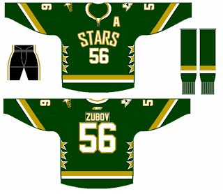
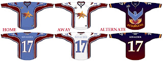
Personally, I like the Dallas Stars' new home sweaters. I know I'm among the minority on that. But here's something I would consider to be a great alternate in a year or so. I like that the shoulders have the primary and secondary logos. The Columbus Blue Jackets did that for a while prior to this season.

My favorite thing is the fact that it's a green jersey. My least favorite thing is that it has no black. I like the black. I think the jersey should be green overall, but I like the black.

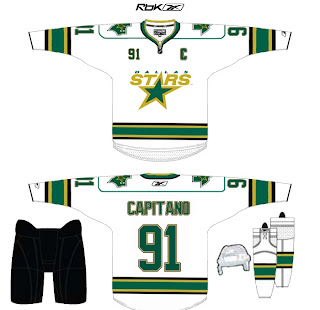
And here's another idea for the road sweater. It's pretty much just an alteration to the striping, but it works well. It's not quite as boring as the current jerseys. I don't really understand the shoulder piping though. Carolina did that and I feel like it just bogs down the whole uniform.

Maybe that's just me.

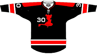
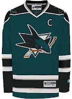
Another reader sent in this concept for the San Jose Sharks.

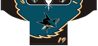
Before you tell me it looks like a roller hockey jersey, let me stop you. It is. He said the design was based off of his own roller hockey team's uniform. And while NHL teams tend not to wear things like this anymore, I totally could've seen it back in the late '90s alongside the Tampa Bay Lightning's storm jersey.

Oh and about that, speaking as a Bolts fan, I loved those jerseys. The regular ones were so boring. There may have been a lot going on with those blue sweaters, but at least there was something going on!

Enough about that. Feel free to leave your comments about these concepts. What are you thinking?

Friday
Oct122007

Just To Freak You Out X

It's like watching a trainwreck. It's horrible, but there's just something about it that prevents you from looking away. There's all manner of scary stuff out there and now I'm bringing some of it straight to you on another Freak Out Friday. Here goes.

I wouldn't be able to live with myself if I didn't start with this one.

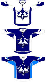
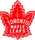
It shouldn't take you more than a second to realize the designer was trying to offer us something different for the Toronto Maple Leafs.

Leafs fans, I really want to hear from you on this one.

We've got a brand new logo with a very prominent "M" worthy of perhaps a place like Minnesota — or Montreal! And that leaf! Don't look it in the eye or it will cut you. Deep.

Even the second shade of blue worries me some. I'm not sure how I'm supposed to feel about this, but let's just say it's not great.

Anyway, I'd like to move along now because I can't take looking at this anymore. There's a point when doing this to a team like the Leafs starts to hurt.

Once again, Leafs fans, please comment.

Speaking of prominent letters in place of actual logos, I've got a pair of concepts from each coast.

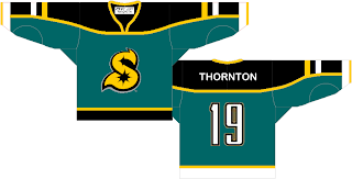
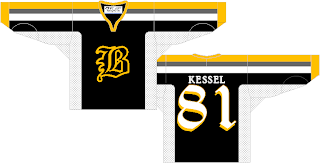
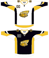
Cleverly, though, we can't know exactly what these letters stand for as alliteration was employed to mask it. Is the "S" for San Jose or Sharks? And is the "B" for Boston or Bruins? Perhaps, the ultimate question is why dump perfectly good logos for these two teams in favor of members of the alphabet?

Even more disturbing is that "S" keeps reminding me of the Minnesota North Stars. Make it stop.

Each of those were delivered to me with a road sweater design to match. I wouldn't do that to you, though.

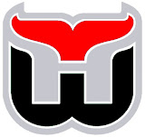
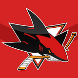
Here's what concerns me, though. I've been send a number of logos which have been converted to red and black for no apparent reason. Do any of these work?


It may be that the blood-in-the-water shark is the scariest one. I do see what's going on, though with the Hurricanes colors on the Whalers logo and the old Sabres colors on the new logo — but that doesn't make it any better.

I'm still worried about the killing to follow.

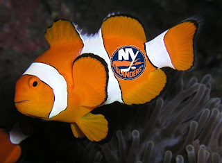
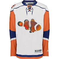
I'll wrap things up today with the thing that might frighten you the most. Did you ever get to feeling like that Rbk EDGE New York Islanders jersey reminded you of something? Perhaps you couldn't quite put your finger on it. But maybe it evoked feelings of being lost. In the ocean.
One reader thought so and sent in this.

If you wanted to know what they were thinking when designing the new Isles uniforms, now you do. Don't you wish you didn't?

So there it is. Another in the Freak Out series is behind us. I'm looking forward to next week. In the meantime, I await your crazy concept art. You can send it to me at nhllogos@gmail.com.

Thursday
Oct112007

Loading Up On Oil Art

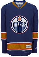
With all the turmoil over the new Rbk EDGE jerseys of the Edmonton Oilers, the concept art has been arriving by the ton. Lots of people have suggestions for improvements and I'm all ears (and eyes). I figured I'd take a moment a share some of it with you.

By far, one of my favorite Oilers concepts. My only problem is with the lack of color. The Detroit Red Wings can pull off uniforms with just one color but nobody else can even come close. Blue by itself is boring. I see the silver there but it needs a color to make it stand out. I'd recommend copper.

But other than that, in terms of logo design, I'm a big fan. I even like the alternate logo used on the jersey on the right. The Oil would be in a bit better shape if they had something like this to wear every night.


Here are a couple of other options. But the copper and red usage here has me a bit thrown. I think they are good colors when used in moderation on this sweater. They're fine as stripes, but let's not go making huge panels with those colors. I do, however, like the shoulder logo used. Sharp colors and sharp design.

And finally we have this, featuring a logo, I believe, stolen from the Tulsa Oilers of the Central Hockey League. The striping I could deal with. The logo, not so much. This is the NHL.

And that's that. What do you think of these? Any winners for Edmonton or do they need to go back to the drawing board? Remember, if you have any concept art you'd like to submit, please email it to nhllogos@gmail.com

Wednesday
Oct102007

Odd Art, Part II

First off, if you missed Part I then click here. Now that you know what's going on, let's dive right in. You know you like the weird stuff I post here.

We'll get things going with some imaginative Original Six designs.

Let me begin by saying the new Bruins jersey is not something you'd be wanting to mess around with. Trust me. It's that awesome. Now, as far as this concept goes, history has taught me that logos like this were probably not originated by the creator of the jersey design itself. If anyone would like to explain from where this particular Bruins logo is derived, leave a comment.

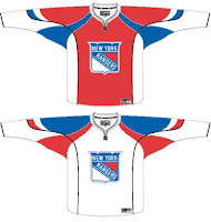
The Rangers jersey is interesting because there's actually a logo on it. A novel concept, not exactly, but it's something I feel the Rangers have struggled with. The 1970s taught us that this might not be the best use of the logo. I'm also concerned about the whole Broadway Blueshirts thing. For those of you lacking the ability to tell one color from another, that is red.

I will say this though, I am a huge proponent of the Lady Liberty logo and those jerseys. They've used a blue one and a white one and both looked better than anything the Rangers have ever worn. I might even go so far as to say it's the best any team has ever worn. But my suggestion to the Rangers is go with the NYR logo full time, and save the current sweater as a third jersey — beginning next season of course.

But who would want to listen to me anyway?

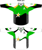
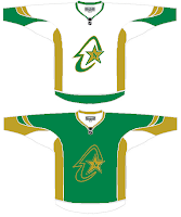
I haven't yet been able to fully grasp what's going on here but near as I can figure, we're looking at a couple of concepts for the Dallas Stars/Minnesota North Stars franchise. I get the shooting star thing in the one on the left, but I really can't work out what's going on in the one on the right. If you have any ideas I'd be happy to hear them. Comment away.

But that's not all. I'll leave you with one more today.

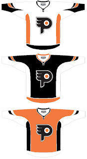
I understand what the designer is trying to do here, but I don't think the "P" in the real logo is that difficult to see. It doesn't jump out at you, but it shouldn't. Logos are meant to be looked at over and over again, so they're more effective when you discover something new every time you see it.

I know a lot of folks would disagree with me on that, but I think it's the reason the Minnesota Wild's logo is so spectacular.

But back to this. The striping is not great and the logo doesn't really need a change. But I feel like an ass for having nothing good to say about it. It's not like it's the worst thing in the world, I'm only thinking that Philly fans would revolt.

But that's all just my opinion. Feel free to share yours below.

And if you or someone you know has been afflicted by the concept art disease and would like help with public dissemination, you know how to reach me. Send an email to nhllogos@gmail.com.

Tuesday
Oct092007

Caps, Sharks, Leafs Get Cool Concepts

Today I've got a post with some very cool artwork. Take a look.

Lots of folks have suggested using the Washington Capitals' secondary logo as a primary. Here's a sweater design with that in mind.

The only problem I have is the star beneath the wings. Other than that, it's the best design I've seen with the "Weagle" logo, as it's been dubbed. Even the stripes on the sleeves look awesome with that logo.

These San Jose Sharks sweaters are nice if not slightly reminiscent of the new Blues jerseys with the piping and the Islanders jerseys on the sleeves. I like the shield logo being used on the shoulders, but I think it needs to be bigger. For being a design I like, it sure sounds like I have a lot of complaints. But honestly, though, I am a fan.

Finally, I have a concept with the best Toronto Maple Leafs logo I've seen yet. It's the one on the right.

While I'm not loving the striping pattern, I really like that logo. It mixes the current leaf silhouette with the old Toronto Arenas logo. It kicks ass, to put it quite simply. Any Leafs fans out there that like that idea? Or is it just me?

And remember, if you have any concept art you'd like to see posted here or in the Concepts Gallery, feel free to send them along to nhllogos@gmail.com.

Monday
Oct082007

Odd Art, Part I

Do you know how much I love my multi-part series? As much as I write them, how could you not?

Anyway, I'm looking at stuff that borders on being worthy of a Freak Out Friday. Unfortunately, it's not quite there but nor is it to the point where I'd want it to be taken seriously as far as that goes. Don't try and figure out what I just said. It's not worth it.

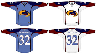
Let's move along. We'll start with the Atlanta Thrashers.

If anyone can work out what's going on here, I congratulate you. And fill the rest of us in, if you wouldn't mind.

Interesting choice going with the old unused Atlanta All-Star Game logo. I kind of like the head logo on its own. That way it doesn't look like the bird is stirring itself in a bowl. Yummy thrasher!

I wanted to let you look at this one before I explained it. It took me a minute, but if you stare at it for a very long time, you'll slowly begin to see the shape of the state of New Jersey appear in there somewhere. Oh yeah, it has horns and a tail. That's probably what's tripping you up. This was spawned along the lines of using state/province outlines in team logos.

Not sure how I feel about the placement of that number on the front, but I would someday like to see a black third jersey for the Devils. That would look pretty killer.

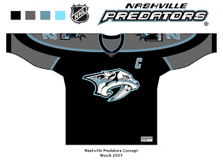
And finally, the Nashville Predators.

This is a very interesting color scheme. However, I think the only way you can really get away with limiting the colors is by first simplifying the logo itself. It's a very detailed mark and all of its colors do work in its favor. But then I've always like the Preds' logo the way it was. Crazy? Perhaps.

I'll have more where that came from tomorrow, if you're good. Eat your peas and don't stay up past your bedtime.

Sunday
Oct072007

Secondary Logo Idea For Canucks?

I've been depriving you guys of some great concept art the last couple days. For that, I apologize and I plan to make it up to you. A handful of teams make good use of maps in their branding.

My Lightning are right there among them with the outline of the state of Florida on their shoulder patch. You can see an orange Long Island right in the middle of the Islanders' logo and a green state of Texas sits on the shoulders of the Stars.

I guess the question, what if the Vancouver Canucks followed suit? We recently saw a concept with Alberta on the Oilers' shoulders and Minnesota on the Wild's shoulders, so why not put British Columbia on the Canucks'?

My personal favorite is the one in the middle. The other two don't really do anything for me.

Another slight alteration I'd make is to rotate the province a few degrees to the left so as to make the north and south borders horizontal. It may not be geographically accurate, but we all passed middle school (I'm assuming!) so we can look past that.

Now there was one team I failed to mention above that has a shoulder patch outlining their home state. This next concept reminds me a lot of the Coyotes' Arizona logo.

I like how the stripes start in Vancouver and, as the designer put it, "radiate out to the rest of British Columbia" since the Canucks are "B.C.'s team." If it were me, though, I'd lose the text out of the logo. It would end up being illegible anyway.

So now's your turn to critique these designs. Leave a comment and let us all know what you think.

Saturday
Oct062007

Sabres, Here's How You Fix It

Apologies for the late posts tonight. I've been working on something I'll tell you more about later. But at the moment, I'm watching the Lightning game via NHL.tv since I no longer live in the Tampa market (sadly). I'm debating whether to go ahead and buy the Center Ice package.

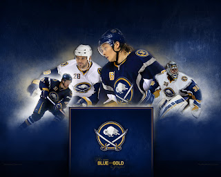
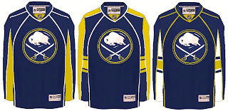
Anyway, that's not what this post is about. We all know the Buffalo Sabres' new uniforms need fixing. I mean it kind of goes without saying. And I think we all know exactly how.

As any Sabres fan knows, John Slabyk's work epitomizes exactly what needs to be done for this team. There should be no question, yet for some reason these designs have yet to hit the ice. What are you guys waiting for anyway?

Anyway, here are a couple of other options borrowing from the designs of some of the other new Rbk EDGE sweaters.

Not sure how I feel about the chest piping, though. I think if you're going to go with a traditional-style logo, you should have the jersey match it. My exception to that rule is the San Jose Sharks.

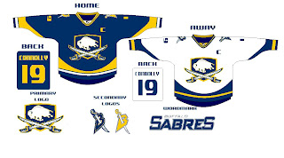
I also just got sent this design which I really like, as well.

The artwork needs a little cleaning up, so try to see past that. But here we see how to use the buffalo and sword elements without just arbitrarily placing them inside a circle.

But I know there are a lot of Sabres fans reading here, so I'm really interested to see what you guys think your team needs to be wearing. The floor is yours.

Friday
Oct052007

Reworking Some EDGE Jerseys

I've gotten some pretty decent artwork this week I feel like sharing today. We've got a handful of various Rbk EDGE jerseys that have been modified. I wouldn't necessarily categorize them as "fixes" but they're worth a look.

I actually like this one, but probably only because the elbow stripes go completely around the arm and don't stop inexplicably. But it could be anything.

It's a recolored Canucks jersey, obviously and the stripes aren't proportional to what the Oilers typically wear. Not that that's a bad thing entirely, but I'm not really a fan.

Otherwise, the Edmonton jersey's odd piping and lack of, well, anything visually appealing makes anything an improvement upon the present.

So it should be clear how I feel then.

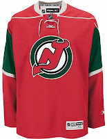
Had to laugh at this one. Imagine the Devils reintroducing the green.

And then imagine them putting it on a Minnesota Wild jersey. It's definitely one of the more interesting concepts I've posted here. But it looks horrible if we're talking about the New Jersey Devils. That does not look like them at all.

I do like Christmas though. So maybe I can find a way to use this in my favor. It needs a Santa Claus logo on the front. I wonder what that would look like.

Then some minor league team could wear it as a specialty jersey for a holiday game.

This San Jose Sharks concept is only interesting because it does away entirely with the orange in the jersey. And I have to say, I don't really like it. I think the orange is all right. It really works.

I did like the old jerseys but I like that striping pattern better for those colors than this one. This one needs brighter colors.

This design also features dark cuffs that extend down from the elbow stripes vis-a-vis the Canucks' new duds.

Finally, it's the Dallas Stars we're going to take a look at. Their whole marketing thing was "black is the new green." But what if, as some of you believe, Reebok hadn't brainwashed team management into going all black with no logo?

Might it look like this?

It might. I actually like that a lot. But as one of you humorously stated — the NHL has banned jerseys that aren't white, black, red or blue this season. (And while you could argue the Sharks aren't blue, I'd argue that they're more on the blue side than the green side. Beside the point.)

I like the new Stars' uniforms the way they are and there's nothing wrong with that. But this isn't bad either. Perhaps something to consider for a future third jersey.

So now's your turn to tell me what you like and don't like. Leave me a comment.

Friday
Oct052007

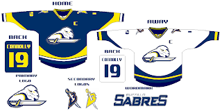
New Sabres Logo Concept

Got some interesting artwork from a reader trying to redesign the Buffalo Sabres logo. Personally, I think John Slabyk has the perfect design which could never be improved upon — but then my opinion isn't the only one that matters. Shockingly.

Seriously, though, check this out and see what you think.

He even put it on a jersey for us.

Leave your comments as I'm sure he'd like to hear what you think.

UPDATE (5:14 PM): By the way, just so as not to confuse anyone, Slabyk did not design the logo posted here. This was sent in to me by a reader of the blog. Just wanted to clear that up.