NHL Tournament of Logos

Entries in hurricanes (51)

Saturday
Oct202007

Poll: Hurricanes Franchise Logos


WHALERS
HURRICANES


Place your vote and then feel free to leave a comment as to how you came to your decision. Tell all your friends to drop in and vote! The more voices heard, the more accurate the results!

Poll opening date
Sat Oct 20 @ 9:40 AM
Poll closing date
Wed Oct 24 @ 11:59 PM

07BONRF | RFCAR

Saturday
Oct062007

Rbk EDGE Review: Hurricanes

Part 13 of 30. All 30 NHL clubs have unveiled new jerseys under the new Rbk EDGE Uniform System for the 2007-08 season. Here at the NHLToL, we're going to review every one of them. Read up and then rate the new sweaters. We'll do a full ranking after completing all of the reviews.

Rbk EDGE Uniform System

Carolina Hurricanes


New Uniforms

Old Uniforms

The Unveiling
Thursday, September 6. The Hurricanes unveiled their new jerseys at a press conference where they also discussed plans for the 10th anniversary season.

Home vs. Road
Home: Red. Road: White. The two sweaters are essentially mirror images of each other and feature secondary logo patches on both shoulders.

The red home jerseys feature the signature hurricane flags wrapped horizontally around the waist with a silver-white stripe above it and a white-black stripe below it. A silver stripe wraps around the elbow above a larger white stripe. The cuff is black. White piping extends around the sholders from the collar which is white with a thin black stripe on the inside. The primary logo serves as the crest.

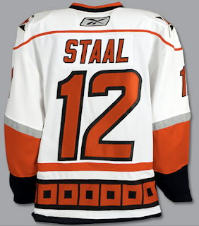
The white road jerseys feature the signature hurricane flags wrapped horizontally around the waist with a red-white stripe above it and a white-black stripe below it. A silver stripe wraps around the elbow above a larger red stripe. The cuff is black. Red piping extends around the sholders from the collar which is black with a thin red stripe on the inside. The primary logo serves as the crest.

In The Details
The Hurricanes jersey, when compared to the rest of the league, has the most going on in terms of horizontal striping around the waist.

New & Old
The striping remains primarly the same between the old and new uniforms. The only differences are the piping around the shoulders and addition of the NHL shield at the collar which is a league-wide change.

Standard FAQ
Numbers on the front? No.
Laces at the collar? No.

NHLToL Editorial by Chris
When we talk about "busy" jerseys, these are the first ones that come to my mind. I do like the originality, however. The hurricane flags (technically tropical storm flags) are are a nice touch. And I think both the primary and secondary logos are top-notch. But those stripes! Not to mention, I for one, could live without the piping around the shoulders. I think it only detracts from the jersey. I don't hate it, but I don't love it either. 3/5


Buy your new Hurricanes jersey!

Wednesday
Oct032007

Some Unusually Familiar Concepts

I got a funny email yesterday. Check out these. See if you notice a pattern.


I don't feel a need to explain or comment on them really. They sort of speak for themselves. Pretty clever, if you ask me. What do you think of them?

Friday
Sep282007

Your Daily Dose Is Here

You know what this is. I've got today's concept art right here and there's a lot of it! And it's gonna be good. Mostly.

We'll start out with this Florida Panthers logo that caught my eye whilst I perused my inbox.

It's a sort of fusion between the primary and secondary logos that the designer said stemmed from an idea based off of the old Buffalo Sabres logo. But while that logo seemed to red "Buffalo Sabres" from top to bottom, this one seems to say "Panther Palm Trees."

No but seriously, it's very sharp. A little to detailed to ever see printed anywhere but here, but still nice.

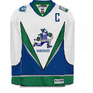
What I'm concerned about is this logo. I'm certainly more a fan of the official VC logo introduced by the Vancouver Canucks last month. They introduced so many cool new logos, though. It's hard to like the orca on the crest anymore.

I got an email a while back, the source of which I cannot vouch for, that suggested the Canucks have planned to change their logo again in 2010 following the Olympics. This time they would feature Johnny Canuck as their primary symbol. I won't take a position on whether or not that has any validity, despite this logo just being introduced.

Anyway, perhaps a jersey may look something like this.

Although that V across the front of the jersey really scares me.

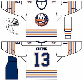
In other news, one of my things is that I feel like the New York Islander should make use of a lighthouse in their logo — if even just as a secondary. This concept borrows a recolored lighthouse logo from the mid-90s logo introduced as part of the "fish sticks" get up. That design wasn't all bad.

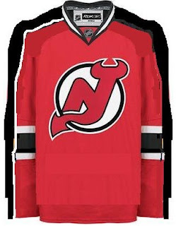
What I could live without is any changes to the New Jersey Devils' uniforms. I rated them a 5/5 in my review yesterday. Still, someone toyed with it a little.

That is something I feel would work for improving the Edmonton Oilers' sweaters, but not so much the Devils. Interesting as it is, I'd never want to see the Devils hit the ice in it.

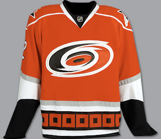
Along those same lines is this item. The Hurricanes are just one of those teams that I cannot possibly envision in any colors but black, red and silver. I just can't do it.

So this whole Hartford Whalers thing has me thrown. It's just so unacceptable, you know? Or maybe it's just me. I often tend to go against the grain. You know this already if you're aware of my feelings regarding the Blackhawks' logo and uniforms.

And that about wraps things up. If you have any comments you'd like to share with the rest of the class, please do so by leaving a comment below. If you have any of your own artwork or have stumbled across someone else's that I haven't posted, feel free to email me.

Monday
Sep172007

Hurricanes, Caps In Action

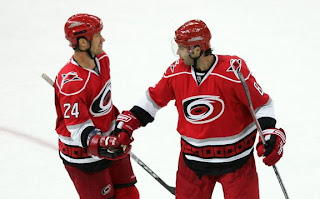
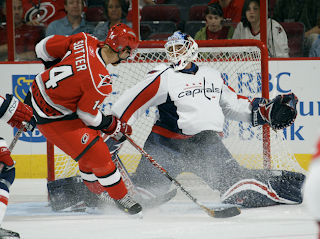
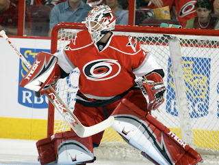
Last night, the Carolina Hurricanes defeated the Washington Capitals in overtime in each team's first game of the preseason. Both teams wore their brand new Rbk EDGE uniforms and I thought I'd share some photos.

The Capitals jersey has grown on me a little, though I don't like the wordmark posing as a logo.

Anyway, I really feel like these new sweaters look great on the ice. I may stand alone in that belief, but I'm all right with that.

Also wanted to point out that I've been collecting game photos from as many preseason games as I can for the Rbk EDGE gallery. Hope you guys are enjoying that. And if you come across any photos I don't have, please let me know. I'm trying to compile as many as possible — just for the hell of it, I guess.

Thursday
Sep062007

Hurricanes Unveil New Uniforms!

This afternoon, the Carolina Hurricanes officially unveiled their brand new Rbk EDGE uniforms! Photos follow!

It's pretty much what we saw in the NHL 08 renderings from EA Sports — only in physical form. I like them. Not sure about the shoulder piping. Seems unncessary, but what do I know. I do like the hurricane flags around the bottom of the jersey. Glad they kept that element from the old uniforms. Check out the back!

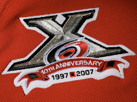
Also unveiled today was the club's 10th anniversary patch.

As you can see here, it will be worn on the front of the sweater on the right side — where a potential Stanley Cup Finals patch would go.

It's a very nice logo. One nitpick I have though is the flag between the 1997 and 2007 at the bottom. That's a tropical storm flag. A hurricane flag is two of those side-by-side. But that's only minor. You'll notice the banner that reads "10th Anniversary" has the flag on both ends.

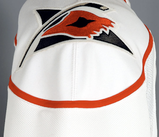
The 'Canes also kept their secondary shoulder logo which features a torn hurricane flag ripping in the wind.

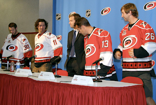
And here you can see Cam Ward, Justin Williams, Ray Whitney and Erik Cole modeling the new sweaters before the press today at the RBC Center.

As always, you can find these and as many more photos of the new jerseys as I can find in my official Rbk EDGE gallery.

Tuesday
Sep042007

Hurricanes' New Sweaters Coming Early

A couple of people emailed me a link to this post at the The News & Observer regarding 'Canes jersey news.

According to writer Luke DeCock, the Carolina Hurricanes will unveil their new Rbk EDGE uniforms tomorrow afternoon at the RBC Center in Raleigh. Now, before you start commenting with links to pictures from EA Sports' NHL 08, I know all about them but I don't consider video game renderings to be actual images of the new uniforms. For that, we need good old-fashioned photographs.

And apparently we're getting them on Thursday.

September 4, 2007

New uniforms unveiled Thursday

The Hurricanes will unveil their new Rbk uniforms at a press conference Thursday afternoon at the RBC Center. Eric Staal, Justin Williams, Erik Cole and Ray Whitney are scheduled to attend.

One new, new addition: a patch commemorating the franchise's 10th season in North Carolina.

Fans can get their first look at the new uniforms on Sept. 16 at the Caniac Carnival. The Canes will wear them in the preseason game against the Capitals that afternoon.

As you know, I'd previously reported the unveiling date as September 16. It's been corrected in the sidebar countdown.

Thanks to all of you who emailed in with this info!

I'll have photos posted as soon as I can. Just remember, I usually don't get home from work until after 12 PM (Eastern) and I can't post anything until then. 'Canes fans, your big day is tomorrow! Get excited!

Sunday
Sep022007

Result: Hurricanes vs Devils

New Jersey
DEVILS

71% 8,633 votes

Carolina
HURRICANES

29% 3,593 votes

12,226 total votes

New Jersey Devils
Advancing to Quarterfinals to face Penguins or Canadiens

Carolina Hurricanes
Eliminated


Poll opening date
Aug 26 @ 7:05 AM
Poll closing date
Sep 2 @ 11:59 PM

07CHTRN | #E2A | CARvNJD

Friday
Aug312007

Southeast Concept Designs

I know a lot of people — Tampa Bay Lightning fans included — aren't in love with the new logo and uniforms. Speaking as one of the biggest Bolts fans out there, I can say I love the designs. It's miles better than what we had even if it's not perfect yet. You have to admit that much. And hell, I already pre-ordered my black jersey. I can't wait until mid-September.

Anyway, on to the subject at hand. I've got concept art from across the Southeast Division today (except for the Stinkin' Panthers). And I'm starting with the Lightning.
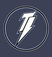
Like I said, I like the new logo but I'm open to new ideas as well. This logo is cool in that it forms a lightning bolt out of the letters "TB." That sort of thing is why I wake up in the morning.

Unfortunately, as drawbacks go, there sure is a lot of negative space in that design. Maybe we don't need such a large circle. Let the bolt overlap the bounds of the circle sort of like the new logo does. And the muted colors don't market well. And whether we want to think so or not, that is an important element.

So let's see what that logo looks like on a jersey.
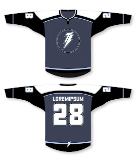
I like the lettering style but it doesn't really seem to go with the jaggedness of the logo. Loving the bolt on the bottom of the back. And the black sleeves with a blue body is pretty cool. Another one I'd be curious to see on a player. Overall, it's not horrible, but it could still use some touching up.

We talk a lot about simplicity in logos. Check this out.
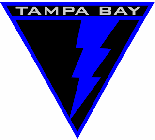
You can find these designs and many others in the Concepts Gallery. I highly recommend a look through what's there.

Moving on now northward to the Atlanta Thrashers. I got emailed a couple of cool Reebok-style concepts worth a look.
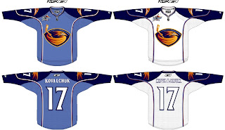
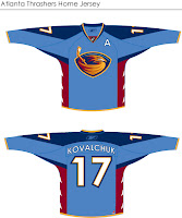
The design above is very sharp. You'll notice the all-star logo on the shoulders which was a nice touch. Also this concept does away with the overhead Thrasher logo, opting instead for the head from the primary logo on the shoulder. Overall, Atlanta could do worse. Personally, however, I'm partial to the design on the left.

I think the red sides are very nice. I think that is a very smart accent color and there's no reason to do away with it. However, it seems the red pushed out most of the gold. I think it could use a little more. But my favorite thing about both designs is the retention of the sky blue used for the home sweaters. I think that was a great move by the Thrashers and I wouldn't want to see it go away.

How do you Thrasher fans feel about it?

Continuing up the east coast, we have some Carolina Hurricanes fan art. Check out this guy.
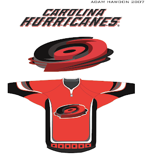
How about that logo?

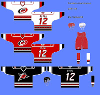
This design here to the left is a rendering of the 'Canes unis based off of what we've seen from EA Sports in NHL 08. The black jersey is merely a suggestion at what could be done in the future for an alternate. I like the black and the hurricane flag is growing on me as a crest. I wasn't a fan at first.

Anyway, what really matters is what Carolina fans like. Any feelings on the matter, guys?
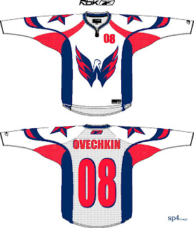
We'll wrap up our Southeast Division tour with the Washington Capitals. I agree with the above design almost whole-heartedly. That "W" eagle should definitely be the new primary. The wordmark "logo" should be relegated to the shoulders if you ask me. The stars on the shoulders are nice, but stolen from the Columbus Blue Jackets and that's not acceptable.
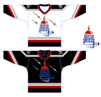
But this design fascinates me. That's a very nice use of the Capitol dome. Very impressive. I also like the black, silver and red jerseys. The blue being used sparingly works in its favor, I think. I'd like a better look at the shoulder logos to see what's going on there. Too small in this graphic.

Any Capitals fans out there to share an opinion? Because we know I'm certainly not one.

That does it for the Southeast today. Apologies for the long post. I know that irks some of you. If someone's holding a water gun to your head forcing you to read this blog, let me know and I'll see what I can do to shorten them.

Wednesday
Aug292007

Just To Freak You Out, Part 3 of 5

So this week I'm running a series of crazy concept designs meant to freak you out a little bit. Let's get to it now.

I have to start with the colors we've all grown fond of this afternoon. Yes, you know the ones. But beware, you're about to see them on a jersey that will make you blink a few times and perhaps tap the side of your monitor. No need, though.

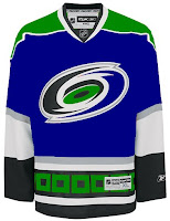
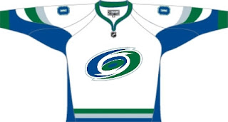
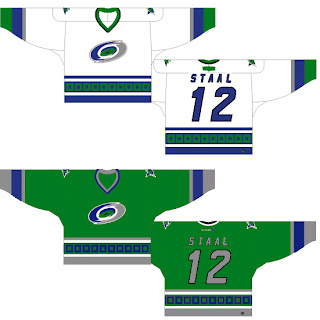
Being of generally slow wit, it took me a moment to realize that this Carolina Hurricanes jersey was being recolored based on the team it used to be. Yes, friends, the Hartford Whalers. But just look at that blue and green hurricane. Scary.

Somebody else had a similar idea. Look at that thing.

And then somebody with a twisted soul had an idea. Let's go all the way back to the New England Whalers... and kill Pucky... on a jersey... made by Reebok.

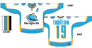
Yeah. And while we're on the topic of creatures of the deep, let's see what could've happened if certain fans had been asked to design the new uniforms and logo of the San Jose Sharks.

Huh? Wait, that one's actually kind of good. Dude, I like that logo. What is it doing here? Oh I remember. It's serving as a segue to this.

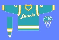
I can hear the screaming all the way from here. But before you go all thinking this design is completely without merit, don't forget about our friendly California Seals. Yes, this design is based on that old '60s uniform.

Completely and utterly crazy if you ask me. And I know no one did, but I'm sharing my thoughts anyway.

Let's roll on, now. Because before I go, I need to show you this logo someone emailed me for the Dallas Stars. Yes, the Stars need a logo redesign, but is this really the answer?

There's only one way to find out. Comment now and come back tomorrow for Part 4.