NHL Tournament of Logos

Entries in oilers (81)

Friday
Oct122007

Online Petitions Seek New Unis

With so many new sweaters being unveiled this season, you just had to know that at least a few would be rejected by a large group of fans. It's inevitable. So a few online petitions have cropped up hoping to rid certain teams of their new duds.

Right now, 65 San Jose Sharks fans have signed a petition to "return to the jersey design introduced in the 1998 season along with the return of the color grey and the elimination of the color orange."

But one Edmonton Oilers fan has gone so far as to start a blog in an attempt to "revive the Oiler jersey." Certainly worth a read if you feel strongly about the craptastic nature of the new Oil sweaters. (And it takes a lot for me to use a made up word, just so you know.)

Anyway, if you've started a petition or a blog or know of one that you'd like me to post here, feel free. It should go without saying that while I don't necessarily endorse them (the Oilers site excepted), I wouldn't mind sending folks along to help your jersey-related cause.

UPDATE (10/13 7:14 AM): By the way, Oilers fans now have their own online petition, if you feel like signing it.

Thursday
Oct112007

Loading Up On Oil Art

With all the turmoil over the new Rbk EDGE jerseys of the Edmonton Oilers, the concept art has been arriving by the ton. Lots of people have suggestions for improvements and I'm all ears (and eyes). I figured I'd take a moment a share some of it with you.

By far, one of my favorite Oilers concepts. My only problem is with the lack of color. The Detroit Red Wings can pull off uniforms with just one color but nobody else can even come close. Blue by itself is boring. I see the silver there but it needs a color to make it stand out. I'd recommend copper.

But other than that, in terms of logo design, I'm a big fan. I even like the alternate logo used on the jersey on the right. The Oil would be in a bit better shape if they had something like this to wear every night.


Here are a couple of other options. But the copper and red usage here has me a bit thrown. I think they are good colors when used in moderation on this sweater. They're fine as stripes, but let's not go making huge panels with those colors. I do, however, like the shoulder logo used. Sharp colors and sharp design.

And finally we have this, featuring a logo, I believe, stolen from the Tulsa Oilers of the Central Hockey League. The striping I could deal with. The logo, not so much. This is the NHL.

And that's that. What do you think of these? Any winners for Edmonton or do they need to go back to the drawing board? Remember, if you have any concept art you'd like to submit, please email it to nhllogos@gmail.com

Sunday
Oct072007

Rbk EDGE Review: Oilers

Part 14 of 30. All 30 NHL clubs have unveiled new jerseys under the new Rbk EDGE Uniform System for the 2007-08 season. Here at the NHLToL, we're going to review every one of them. Read up and then rate the new sweaters. We'll do a full ranking after completing all of the reviews.

Rbk EDGE Uniform System

Edmonton Oilers


New Uniforms

Old Uniforms

The Unveiling
Sunday, September 16. The Oilers unveiled their new jerseys to fans at the Joey Moss Cup event in Edmonton.

Home vs. Road
Home: Blue. Road: White. The two sweaters are essentially mirror images of each other.

The blue home jerseys feature copper piping on the front that extends from the collar to the bottom of the jersey. Spaced white-copper-white stripes wrap under the elbow but not completely around the sleeve. The copper stripe has red trim. The collar is copper and the primary logo serves as the crest.

The white road jerseys feature blue piping on the front that extends from the collar to the bottom of the jersey. Spaced blue-copper-blue stripes wrap under the elbow but not completely around the sleeve. The copper stripe has red trim. The collar is blue and the primary logo serves as the crest.

In The Details
This uniform is the only one with the unique striping pattern at the elbows. The stripes to do not wrap completely around the arm, rather leaving a large gap on the outside of the elbow. The same numbering and lettering style has been retained.

New & Old
The striping pattern remains primarly the same around the sleeves with the exception being the gap at the elbow. The horizontal striping on the bottom of the sweater is gone as are the shoulder patches. The addition of the piping on the front and the altered collar are the only other differences.

Standard FAQ
Numbers on the front? No.
Laces at the collar? No.

NHLToL Editorial by Chris
Upon first seeing the Oilers' new jerseys, I was stunned. Not in the good way. I've always liked this team's sweaters — the caveat being the WHA years. Even when orange was replaced by copper and red, I still thought the Oil had one of the best jerseys in the NHL. That is so far from the truth now. The biggest problem is obviously the elbow stripes, but the list goes on. Adding to the banality of these sweaters is the the lack of a shoulder patch. Edmonton had one of the best up until last season. These monstrosities, and I do not use the word lightly, do honestly look so plain and unimaginative as to almost warrant being called practice jerseys. They are my least favorite of all. 1/5


Buy your new Oilers jersey!

Friday
Oct052007

Reworking Some EDGE Jerseys

I've gotten some pretty decent artwork this week I feel like sharing today. We've got a handful of various Rbk EDGE jerseys that have been modified. I wouldn't necessarily categorize them as "fixes" but they're worth a look.

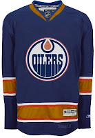
I actually like this one, but probably only because the elbow stripes go completely around the arm and don't stop inexplicably. But it could be anything.

It's a recolored Canucks jersey, obviously and the stripes aren't proportional to what the Oilers typically wear. Not that that's a bad thing entirely, but I'm not really a fan.

Otherwise, the Edmonton jersey's odd piping and lack of, well, anything visually appealing makes anything an improvement upon the present.

So it should be clear how I feel then.

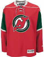
Had to laugh at this one. Imagine the Devils reintroducing the green.

And then imagine them putting it on a Minnesota Wild jersey. It's definitely one of the more interesting concepts I've posted here. But it looks horrible if we're talking about the New Jersey Devils. That does not look like them at all.

I do like Christmas though. So maybe I can find a way to use this in my favor. It needs a Santa Claus logo on the front. I wonder what that would look like.

Then some minor league team could wear it as a specialty jersey for a holiday game.

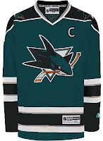
This San Jose Sharks concept is only interesting because it does away entirely with the orange in the jersey. And I have to say, I don't really like it. I think the orange is all right. It really works.

I did like the old jerseys but I like that striping pattern better for those colors than this one. This one needs brighter colors.

This design also features dark cuffs that extend down from the elbow stripes vis-a-vis the Canucks' new duds.

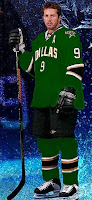
Finally, it's the Dallas Stars we're going to take a look at. Their whole marketing thing was "black is the new green." But what if, as some of you believe, Reebok hadn't brainwashed team management into going all black with no logo?

Might it look like this?

It might. I actually like that a lot. But as one of you humorously stated — the NHL has banned jerseys that aren't white, black, red or blue this season. (And while you could argue the Sharks aren't blue, I'd argue that they're more on the blue side than the green side. Beside the point.)

I like the new Stars' uniforms the way they are and there's nothing wrong with that. But this isn't bad either. Perhaps something to consider for a future third jersey.

So now's your turn to tell me what you like and don't like. Leave me a comment.

Sunday
Sep302007

Result: Oilers Logo History

BEST ALL-TIME
1996

59% 2,402 votes

4,089 total votes

1979
41% 1,687 votes


Poll opening date
Sep 23 @ 8:34 AM
Poll closing date
Sep 30 @ 11:59 PM

07BONLH | LHEDM

Thursday
Sep272007

Oilers, Here's How You Fix It

The Fix It series trudges on tonight as we consider improvements to the new Rbk EDGE NHL uniforms. I told you yesterday that you'd be in for a treat on this one.

As far as I'm concerned, the Edmonton Oilers have gotten stuck with one of the worst new sweaters in the league. That's a personal opinion, but I stand by it. Many have complained that the Rbk EDGE jerseys look a lot like practice jerseys. I disagree with that statement as a generalization. But here, I find it appropriate.

I have several designs to show you and I'll save the best for last. We'll start out by making some very slight alterations that would improve the jerseys on a major scale.

By simply extending the stripes on the sleeves to wrap completely around the elbows and adding a shoulder patch — one borrowed from last year's third jersey — you already end up with a sweater that doesn't look quite so blank. It's disappointing to see that the Oil couldn't manage something as easy as this on their own.

Then we have another design very similar to this but with a brand new shoulder patch.

I think that's a very interesting logo and with a little work, it could be great. I also truly believe that fixing the elbow stripes and adding something to the shoulders is all this jersey needs to really make it shine.

But speaking of shining, this is what you've been waiting for. Personally, I feel like it's one of the best Edmonton concept designs I've seen this summer.

The pattern was borrowed, obviously, from the Florida Panthers' new duds, but these colors are what Oilers hockey is all about. Imagine Gretzky and Messier wearing this. You almost can't help it. I am very impressed with this design, but as a Bolts fan I'm not sure I really have a say. I'll leave it to the rest of you now to decide. Especially Oilers fans.

Tell us how you feel about these fixes in the comments.

Up next: Washington Capitals.

Tuesday
Sep252007

Result: Oilers vs Blues

St. Louis
BLUES

52% 11,555 votes

Edmonton
OILERS

48% 10,696 votes

22,251 total votes

St. Louis Blues
Advancing to face Montreal Canadiens

Edmonton Oilers
Eliminated


Poll opening date
Sep 18 @ 4:37 AM
Poll closing date
Sep 25 @ 11:59 PM

07CHTRN | #W4 | STLvEDM

Sunday
Sep232007

Poll: Oilers Logo History


1979
1996


Place your vote and then feel free to leave a comment as to how you came to your decision. Tell all your friends to drop in and vote! The more voices heard, the more accurate the results!

Poll opening date
Sep 23 @ 8:34 AM
Poll closing date
Sep 30 @ 11:59 PM

07BONLH | LHEDM

Wednesday
Sep192007

Concepts For Oilers, Blues, Coyotes

I've got a few concept designs for you to check out this afternoon. We'll start way up north in Alberta and work our way south to Arizona.

Here's what one designer had in mind for reconfiguring the Edmonton Oilers' logo and uniforms.

It's an "E" merged with an "O" that, quite frankly, might work better as a secondary logo. That isn't to say that the logo found on the shoulder of this jersey wouldn't work just as well. The one big thing that struck me with the Oilers' new Rbk EDGE jerseys is the plainness. I know a lot of people have been commenting on how some of the new sweaters look like practice jerseys, but for the Oilers, that couldn't be more true. The fact that the elbow stripes don't even go completely around the arm just adds to that.

But anyway, we're talking about this concept. And overall, I like it. The logo could use a splash of creativity, I've seen worse. And the oil drop might be a nice addition to the plain uniforms they have now.

We're moving along to St. Louis now where one fan is mixing the old with the semi-old with the new. Usually when you throw to much stuff in a pot and cook it, the end result is less than delicious. That isn't necessarily the case here, but I don't think the red ever really worked for the Blues.

I think those would be solid designs if the red was removed entirely. Now, here's what you don't want to do — with a third jersey or otherwise.

That'll give a person nightmares. It doesn't go the horrifying length as the alternate Blues sweater Mike Keenan vetoed in the '90s, but it sure is trying. Look at those blue notes across the waist.

I like the idea of a trumpet for a secondary logo, but this really isn't the way to go. And how can a team called the Blues have a dark jersey that's anything but blue?

But I say we move on. A Phoenix Coyotes fan recommends reintroducing green into the color scheme. Here's how.

First off, I'm not sure you can put a team logo above the nameplate and have it look good. Secondly, I'm not sure it's even allowed. However, I think it would look just fine on the shoulder. I still like the PHX patch more, but the moon isn't terrible for the other side.

That's all I've got for now. I plan to have more later. Plus, don't forget to check out the Concepts Gallery where you'll find all the work I've posted plus some I haven't.

Tuesday
Sep182007

Poll: Oilers vs Blues


vs
Edmonton
OILERS
St. Louis
BLUES


Place your vote and then feel free to leave a comment as to how you came to your decision. Tell all your friends to drop in and vote! The more voices heard, the more accurate the results!

Poll opening date
Sep 18 @ 4:37 AM
Poll closing date
Sep 25 @ 11:59 PM

07CHTRN | #W4 | EDMvSTL

Page 1 ... 2 3 4 5 6 ... 9 Next 10 Entries »