NHL Tournament of Logos

Entries in oilers (81)

Sunday
Sep022007

Dipping Into The Oil

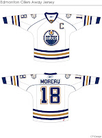
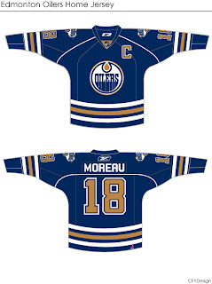
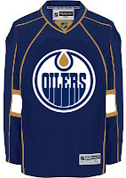
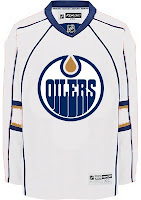
More concepts! These fan-designed works of art were created for the Edmonton Oilers.

These concepts were created by the same artist who brought us the Chicago Blackhawks jerseys I posted earlier today.

They're very clean designs and would make great uniforms for the Oilers. I especially like the use of the shoulder patch from the third jersey on this set. I don't think it should necessarily replace the crest, but I do like it a lot. I could definitely see them going with something like this.

But I'm not an Oiler fan so it's not really my place to say.

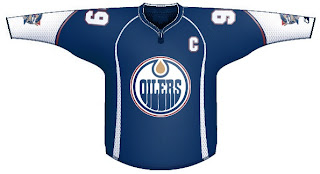
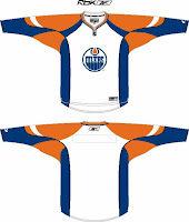
If you're not a fan of the copper, you might enjoy this.

I'm not sure the secondary logo would work at the wrist — being hidden by the gloves. The curvy stripes up the sides are reminscent of the Buffalo Sabres' current sweaters, but not all bad. You could do a lot worse.

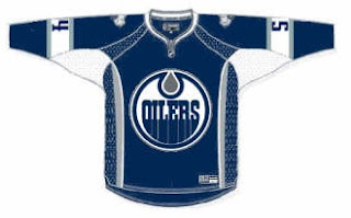
I've got one final design for you that eliminates both the copper and red, replacing it with the silver from last year's third jerseys.

I think that's a little too plain. Oiler fans, what really matters is your opinion. See anything you like here? Or does the Oil need an extreme makeover?

Wednesday
Aug292007

Poll: Blackhawks vs Oilers


vs
Chicago
BLACKHAWKS
Edmonton
OILERS


Place your vote and then feel free to leave a comment as to how you came to your decision. Tell all your friends to drop in and vote! The more voices heard, the more accurate the results!

UPDATE (9/2 2:45 PM): Closed the comments. My apologies. That was getting a little out of hand. Just vote for the logo you think is better (for whatever reason you choose) and save the political arguments. Enjoy your weekend!

Poll opening date
Aug 29 @ 4:27 AM
Poll closing date
Sep 5 @ 11:59 PM

07CHTRN | #W2B | CHIvEDM

Monday
Aug272007

Oilers Take Pre-Orders; Plus Concepts

The Edmonton Oilers have joined the Philadelphia Flyers in making their new Rbk EDGE uniforms available for pre-order prior to their unveiling. There's now an animation on the front page of their site.

Similar to other teams, they're trying to cash in on their heritage and tradition by saying, "the evolution of the Oilers jersey continues." The following information regarding the pre-sale comes directly from the Oilers' web site.

August 25, 2007

Pre-Purchase the all-new Oilers jersey!

The Edmonton Oilers will debut an all-new jersey for the 2007-08 season. We can't give you the exciting details of when and how the jersey will be revealed, but stay tuned here for details.

In the meantime, you can pre-purchase the Oilers jersey by clicking the link below. And best of all, if you purchase before September 7, you can have your jersey crested in time for pre-season.

So, not even date is provided. However, various sources have reported September 16 or 17. A source I trust more says th 16th and that's why that date is in the countdown.

In the meantime, you can always count on me for concept designs and I've got a few to share for the Oil.
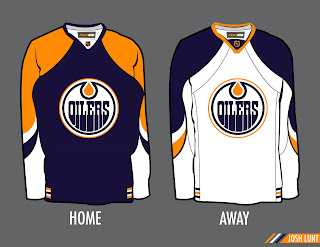
This design was emailed to me by Josh. It's based a lot off of this year's all-star jerseys. Not too bad, though, if you ask me. They could do a lot worse. You might notice the old NHL logo on the collar. Not sure if that was done on purpose or not.
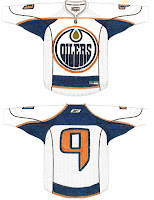
Another reader went all old school on us with this design he put on a piece of paper. I think the nameplate would be found in the blue area above the number on the back.

Very interesting though. Once again, they could do worse. I know a lot of you have been unhappy with most of the designs of the new Rbk EDGE jersey — save for the Bruins — but they're not all bad. It's definitely an intriguing time for the NHL and I'm kind of excited to be a part of it.

To see these and other Oilers concept designs, be sure to check out the Concepts Gallery!
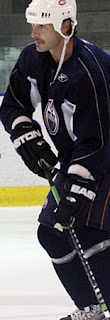
UPDATE (3:23 PM): I meant to post this initially. It's caused quite a stir among Oilers fans. The photo you're looking at comes to us by way of LetsGoKings.com and features new Oiler Sheldon Souray practicing with members of the Los Angeles Kings.

Apparently, what's got everyone in Edmonton in a tizzy is the pants he's wearing. They're saying the copper stripes are a new feature and may be an indication of what to expect for the new uniforms. Personally, as a non-Oiler fan, I couldn't even tell you how the old pants looked.

Anyway, there it is. Many of you have emailed me this image and I appreciate that but I also wanted to acknowledge that I have it and I've seen it. And now the rest of you have as well.

Saturday
Aug252007

Result: Blue Jackets vs Oilers

Edmonton
OILERS

62% 6,467 votes

Columbus
BLUE JACKETS

38% 3,888 votes

10,355 total votes

Edmonton Oilers
Advancing to Quarterfinals to face Chicago Blackhawks

Columbus Blue Jackets
Eliminated


Poll opening date
Aug 17 @ 4:26 AM
Poll closing date
Aug 24 @ 11:59 PM

07CHTRN | #W1C | CBJvEDM

Thursday
Aug232007

Canadian Team Unveiling Dates

Yes, I have just a little more Canada for you guys. I almost forgot about this. With the Senators having released their new Rbk EDGE jerseys, that leaves five other Canadian teams left to do so. Only the Canucks and Flames have made official statements. Vancouver will do the deed on August 29 and Calgary on September 4.

The Oilers, Maple Leafs and Canadiens have yet to announce official dates, but I've been told of likely dates for unveilings for those teams that I've added to the sidebar countdown. Apparently, Montreal will go on September 4. Toronto shows off their duds on September 13 — this according to CBC. And Edmonton will supposedly unveil theirs on September 16.

Once again, those three dates are speculative until the teams make official announcements. But the sources seem reliable enough to add the dates to the countdown.

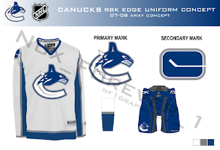
And all right, Canucks fans, I won't leave you out. I mean, how could I in good conscience share Nordiques and Jets concepts and not Canucks?

One fan designed this concept based on the teaser photo on Vancouver's official web site. Have a great night, all!

Thursday
Aug232007

Hey, Canada! Part 2

My Canadian road trip today continues with some interesting artwork out of the province of Alberta. So as not to offend anyone, I'm flipping a coin. Heads, Oilers. Tails, Flames.

... flipping ...

Heads. Okay, first up is the Edmonton Oilers. I was emailed these concepts based off of the new Florida Panthers uniforms.

It's all dark blue and copper here. But if what you seek is a revival of days gone by, I have a treat for you. WHA/Gretzky-era Oiler fans, eat your heart out.

One reader emailed me this concept design based off of the all-star game template I posted in the sidebar. Not too shabby. Good ol' blue and orange.

And remember the extremely orange fan creation I posted last week? I was sent a logo based on that concept. You can see it below along with a recolored version of the oilman logo — which we've heard is not long for this earth. The Oilers will likely go without a shoulder patch this season, but they also might get a completely new one. We'll just have to wait and see.

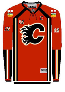
But that's not all. I also promised some fan-created artwork for the Calgary Flames. See that below.

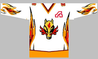
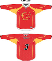
That jersey is on fire! But like the oilman logo of the Oilers, this horse logo will likely become part of the Flames' history this summer. Word is a new secondary logo is on the horizon. With that in mind, let's look at an Rbk EDGE template.

Very, very red. What is it with all the red anyway these days? That's the most popular color in the NHL. But I know, it's the Flames. Red is one of their obvious colors. All I'm saying, is that the black jersey might look good with a red flaming "C." In the alternative, a black flaming "C" would be the only way to go on a red jersey.

Any thoughts, Albertans? Please don't bicker. Lively back-and-forth, I can deal with. Resist the urge to pick on your fellow countrymen if you can.

Tuesday
Aug212007

Flames To Wear Alberta On Sleeve?

Just wanted to keep everyone up to date on a rumor that's been floating around regarding the Calgary Flames new duds. It's been widely reported that the horse head logo with the flaming nostrils will bite the dust in favor of a new secondary logo. Some believe that secondary logo will prominently feature the flag of Alberta in a shield sort of style.

For an example, check out this fan concept that was emailed to me recently.

The designer used the Albertan coat of arms as a jumping-off point in coming up with this idea. Some people wonder whether this would stir up unhappy feelings in the Edmonton Oilers, also based out of Alberta.

As an interesting corollary, the Oilers are also reportedly dropping the secondary logo they've used for the last decade. Word is, the oil man on the shoulder will be gone. Are plans in the works for a new Alberta-related secondary for them too? Should be interesting.

Any Albertans out there? What do you guys think of all this?

UPDATE (5:58 PM): Unfortunately I made the mistake of pitting Flames and Oilers fans against each other. I don't know what I was thinking. Just to avoid things getting out of hand, I'm shutting down comments on this post. Thank you to those of you who posted comments with civility in mind (apologies for closing them down). To the rest, I can live with a few jabs back and forth in good fun, but I won't tolerate attacks of any kind. We're all just trying to enjoy ourselves here.

Sunday
Aug192007

A Handful Of Uniform Concepts

My web travels today led me to Erik Kuhre's Portfolio of Art & Design site. Found a handful of jersey concepts I thought I'd share this afternoon. So let's dive right in.

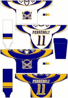
Buffalo Sabres fans, you want blue and gold? Here's blue and gold. And a lot of it.

That's quite something, I thought. A little too much to actually be an NHL jersey, but there it is. I'm a big fan of that crossed-sabres logo but I like it better in black and red.

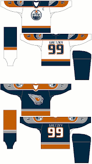
Here he had some fun with the Edmonton Oilers' third jersey logo — a logo I'm rather fond of. I don't like the orange in it, though. The blue looks better. That being said, I don't hate it on the blue jersey. I think the silver along the sleeves is pretty cool too. The Gretzky 99 sells me completely.

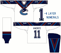
We know the Vancouver Canucks are getting new colors for this season, but take a look at this design anyway. I like the use of the "V" around the collar of this jersey, but the recolored '80s logo is too far down the sleeve at the cuff. The gloves would hide it. I also like the "V" on the sleeves and pants of this uniform concept.

I've got one more design to share from this artist, but I'm going to save it for a later post. I've got a bunch of New York Islanders concepts to add in the near future.

But anyway, what do you guys think of all these? Good work or not so much?

Friday
Aug172007

Mailbag: You Can Stop Sending These Now

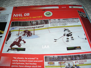
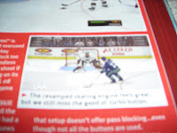
All right, I've said I don't want to get bogged down in the whole video game screen grab thing, but I think popular demand almost requires this one. I've gotten about a dozen emails in the last 24 hours with the following images attached or linked.

From what I've been told, what you're seeing in these pictures is a page from the official Xbox magazine — a yet-to-be released issue I'm assuming. Apparently, the picture above shows a game between the Coyotes and Sharks (a completely new San Jose design we've yet to be treated to officially) in EA Sports' NHL 08. The picture you see here to the left, although blurry, supposedly shows the Oilers and Canucks.

I can't speak to the veracity of these pictures nor really anything else with regard to them. But I just wanted to post them in the hopes that my awesome readers would stop sending me them.

Once again, I don't mind you guys sending in screen grabs from video games, but don't expect me to post them too often. If we're going to see official new jerseys, I'd prefer photos. Thanks everyone!

Friday
Aug172007

Poll: Blue Jackets vs Oilers


vs
Columbus
BLUE JACKETS
Edmonton
OILERS


Place your vote and then feel free to leave a comment as to how you came to your decision. Tell all your friends to drop in and vote! The more voices heard, the more accurate the results!

Poll opening date
Aug 17 @ 4:26 AM
Poll closing date
Aug 24 @ 11:59 PM

07CHTRN | #W1C | CBJvEDM

Page 1 ... 4 5 6 7 8 ... 9 Next 10 Entries »