NHL Tournament of Logos

Entries in oilers (81)

Tuesday
Feb052008

Fan Art For The North

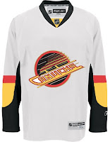
Yesterday our theme was California. Today we're moving directly north. (I haven't had a Canucks post recently enough.) Actually, I'm getting excited since my trip to Vancouver is now just four weeks away. I really can't wait. I've got my hockey tickets and even a Canucks t-shirt. And that's hard for me, as a lifelong Lightning fan. But I'll cope. It's hockey, isn't it?

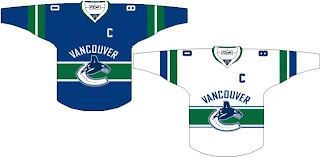
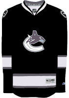
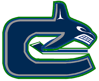
Speaking of which, let's dive in. Simply put, it's a Canucks concept based on the new dark Dallas Stars sweaters. Though I'm not wild about the idea of a logo on the front shoulder.

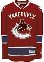
This one takes its cue from the Montreal Canadiens. Not feeling it either.

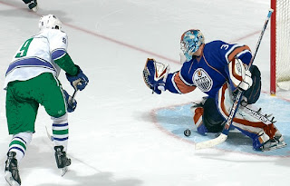
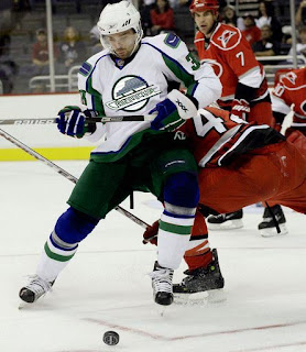
Here's one I do like: the green pants.

Also I kind of like the brighter blue for the Oilers while we're at it. Nice little time travel there.

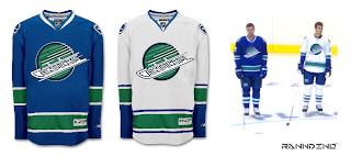
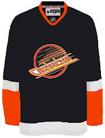
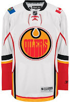
But if you really want to mess with the whole time-space continuum thing, why not just mix a bunch of stuff together? Let's say we recolor the '80s logo and throw it on the new jerseys.

I gotta say, it could be a lot worse.

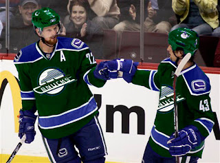
Not a fan of the forest green, however.

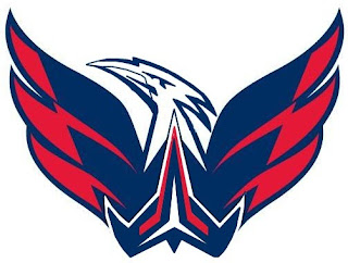
Even on a white Capitals jersey. But if you really want to go nuts with the colors, how about this?

Your choice is apparently Kings colors or Avs colors. Or we could just go back to those good ol' '80s colors.

And that should just about complete the spectrum of visible color, wouldn't you say? Talk about a team with an identity crisis.

By the way, for any Vancouverites out there (is that what you call yourselves?), give me some ideas on what I should do while I'm in town. I've got a week and there's really a lot to do according to all my travel books. See you in March!

Monday
Feb042008

Poll: Golden Seals vs Oilers


vs
California
GOLDEN SEALS
Edmonton
OILERS


REMEMBER: You're choosing the WORST logo!

Place your vote and then feel free to leave a comment as to how you came to your decision. Tell all your friends to drop in and vote! The more voices heard, the more accurate the results!

Poll opening date
Mon Feb 4
Poll closing date
Fri Feb 8

Thursday
Jan242008

Poll: Avalanche vs Oilers


vs
Colorado
AVALANCHE
Edmonton
OILERS


REMEMBER: You're choosing the WORST logo!

Place your vote and then feel free to leave a comment as to how you came to your decision. Tell all your friends to drop in and vote! The more voices heard, the more accurate the results!

Poll opening date
Thu Jan 24
Poll closing date
Mon Jan 28

Saturday
Jan122008

Just To Freak You Out XXIII

I've been pretty bogged down with getting this next tournament ready. I really hoped I'd have it posted by now, but obviously it hasn't happened yet. Patience. In the meantime I've got some other cool stuff for you guys to enjoy.

First thing, a reader emailed in a link to a site called MG's Helmets — specifically to a page where the designer has come up with a bunch of NHL concept football helmet designs. It's quite clever actually. My favorite thing is how any references to hockey have been removed from the logos. You'll find no hockey sticks and no pucks. Haters of the "Buffaslug" might notice at a quick glance how ridiculously appropriate that logos looks on a football helmet. The only other logo that even comes close to looking good on a helmet is the Flyers.

It's just weird.

Now you're good and prepared for the freak out stuff. I would've done this yesterday, but I didn't. This one is all wacky logos.

First, the Atlantington Thrashitals.

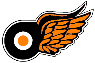
Then the Phitroit Flyer Wings. I know, creative names.

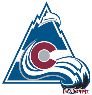
This next one here is a combination of the two Colorado clubs that have graced the NHL — the Rockies and Avalanche.

Not too horrible. I haven't quite figured out how the avalanche of snow has passed directly through the mountain, but I've found in my life it's best not to ask questions.

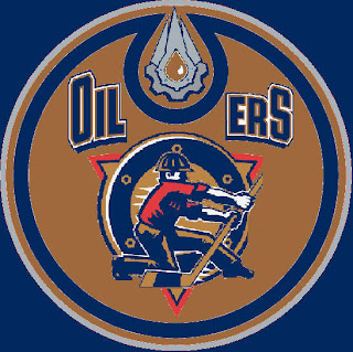
Here, I think we've got an amalgamation of just about every Edmonton Oilers logo ever used.

Learn what it means to be freaked out. Learn it well.

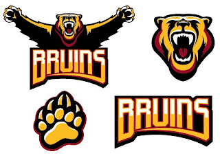
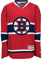
And finally, a weird generic Bruins logo design that could be used for absolutely any team called the Bruins whether they happen to be located in Boston or not.

Thanks, but I'll keep the spoked B.

Saw Charlie Wilson's War tonight. Philip Seymour Hoffman is my hero. Enjoy the other half of your weekend. The Quest For The Worst is imminent.

Tuesday
Dec252007

Merry Christmas, Edmonton!

Santa has delivered some Edmonton Oilers concept art for me to post this evening.

This first one keeps with the copper theme but makes a few adjustments. For one thing, there are two different secondary logos — one for each shoulder. It also continues the stripe all the way around the sleeve.

Not too bad overall, though. The letters on the nameplate might be a bit hard to read but the secondary logos are well done. I like the one on the left, personally.

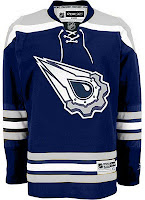
These two jerseys are a couple of designs featuring the logo you guys voted as the NHL's best third jersey logo. One with silver, one with copper. I like the silver.

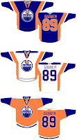
And these two were just fun. I think that jersey on the left looks bad with an Islanders logo on it. The Oilers logo doesn't improve it. On the right are a few concepts with some interesting striping. The orange jersey was ill-conceived, I think, but the other two have my attention.

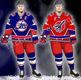
Finally, as a bonus for those of you longing for the days of the Winnipeg Jets, enjoy this.

Those are pretty sharp. Too bad we'll never get to see jerseys like that anytime soon.

I hope you all enjoyed your Christmas (if you celebrate it) and the day off (if you were lucky enough to get it). The third round of the Secondary Logo tournament kicks off tomorrow.

Sunday
Dec162007

Painted On

I think you guys know by now one thing I'm a fan of is concept designers putting the extra effort in and painting their designs onto player photos. It's the closest thing we'll get to seeing what these jerseys might look like on the ice without them actually being stitched together.

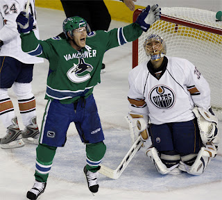
Tonight's post is all about that. I'm starting with my favorite of the bunch. Why don't the Canucks wear green? Why isn't there any green in their logo?

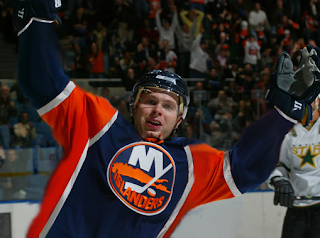
Here's a new idea for the Islanders. I like it better than their real jerseys, but that's just my opinion.

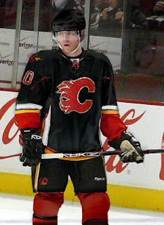
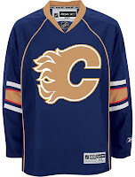
Imagine the Flames in a black jersey. (Not sure what's going on on the shoulder there.)

Frankly, anything with a flaming C on it disgusts me right now after the 9-6 stomping the Lightning received at the hands of the team they once defeated for a Stanley Cup championship. Or did we forget that part?

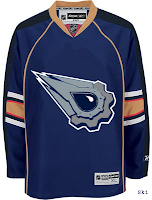
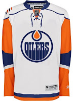
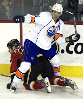
Sticking to Alberta, many Oilers fans have been praying for the day that their club returns to their original colors.

While I'm on the subject, apparently word has been floating around that the Oilers have designed a third jersey that's awaiting NHL approval and will be worn next fall. I'm sure everybody's looking forward to that. I'll be sure to post something when I have more information.

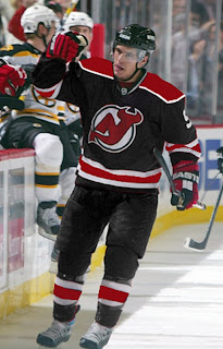
And finally, we have black for the Devils.

If you have comments, you know what to do.

Saturday
Dec082007

Just To Freak You Out XVIII

It's time for another belated edition of the Freak Out series. Hopefully I'll get over this cold soon. It's making me very unreliable here at NHLToL. And it's supposed to be Freak Out Friday, right? Anyway, let's dive in.

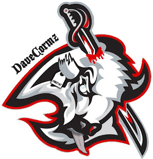
Wow, that was awfully violent. Who's hungry for buffalo tongue?!

I got a ton of submissions this week for the "If They Mated" category. And these are all about rivalries.

I don't even know what to say about this. Except that once again, don't send me hate mail as I am excessively illiterate and wouldn't understand it anyway. Also I didn't make these.

Perhaps slightly less inflammatory are these.

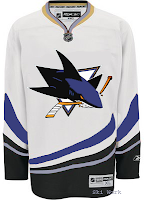
Everything's gone haywire. But wait it gets better. Sure anyone can mix two teams in a blender, but it takes a special kind of talent to do three.

Presenting the Anaheim King Sharks. Let me break it down for you. You've got the Sharks logo in Kings colors on a Ducks jersey. Can't get much more to the point than that.

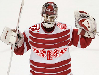
While we're still on the topic of ridiculous jerseys, do you remember the crazy Red Wings design I posted a while back. (It's the second one down in that post.) Were you wondering what it might look like on Dominik Hasek? Wonder no more.

Don't know what he's so happy about. Hideous if I do say so.

Here's a scary merging of the current and original Canucks logos.

Whales that play hockey. I love it.

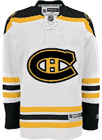
To finish up this morning's post, I've got a couple more whacked out logos. I'm pretty sure these come from a Quebecois looking to break away from Canada. It's like if Texas decided it wanted to be its own country. I laugh. But then I am a lousy Floridian who knows nothing of the politics of Canada. Look!


But wait, there's more!

So what do you guys think?

Oh and I'm just warning you now that any comments with discussion of politics will be promptly removed. Go elsewhere for that.

In the meantime, I hope I managed to freak you out a little. Until next time.

Sunday
Dec022007

Result: Rangers vs Oilers


OILERS NAMED CHAMPION!


Congratulations go out to the Edmonton Oilers' third jersey logo this morning for being named by the voters here at NHLToL as the best! The Oilers finished the final poll with a 55% of the more than 2,700 votes.

Over 30,000 votes were cast in this tournament on the way to determining the champion. So as always, my biggest thanks go out to everyone who cast a vote. You guys are the reason I bother. Oilers fans, enjoy your bragging rights!

But it's not over. We'll be determining the best secondary logo in the NHL next. So stay tuned for that. I should have a bracket and first-round schedule posted soon.

Thursday
Nov292007

More Fancy Concept Jerseys

Do you guys remember the incredibly sharp concept art I posted back on Saturday? If not, I just linked to it, so go look at it. Anyway, a guy named Pete designed the jerseys and basically, he's got a lot more where that came from.

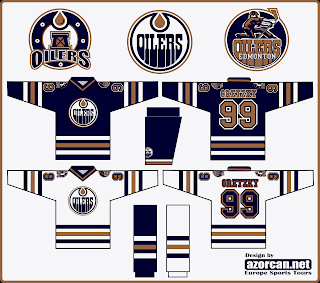
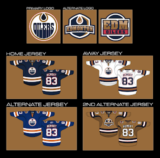
For example, you're about to see an Edmonton Oilers concept that I think rivals the Anaheim Ducks artwork created by GhettoFarmBoy. It's that good. Just look.

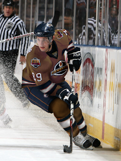
I like the idea of reworking the Oilers logo to have an oil drop in the proper color. Oil is black, not copper. However, I don't know how I feel about the copper circle. Might take a little getting used to. But my personal favorite is the copper "2nd alternate" jersey. I'm also a huge fan of that alternate logo. And if you were wondering what such a jersey might look like on a player, well look no further.

I would almost buy that if I were the kind of person who could buy a jersey that had anything but a Lightning logo on it. I like that uniform a lot. Can you tell?

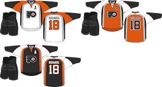
Anyway, Pete also did a little work on the Philadelphia Flyers. The striping pattern is unique — and not in a bad way.

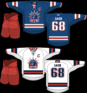
And finally, this isn't entirely the work of Pete. In Saturday's post, you saw his Rangers jersey with the words NEW YORK spelled out across the front instead of RANGERS. I suggested that the jersey might be improved with the Lady Liberty logo. So a couple of you made some modifications.

I think I was right. (Modesty is rarely my strong suit.) Thoughts?

Feel free to comment below. I'm sure Pete would like the feedback on his work — which is obviously rather excellent.

Tuesday
Nov272007

Poll: Rangers vs Oilers


vs
New York
RANGERS
Edmonton
OILERS


This is it for the Third Jersey Logo Tournament. The final round of voting. Time to determine a champion. Place your vote and then feel free to leave a comment as to how you came to your decision. Tell all your friends to drop in and vote! The more voices heard, the more accurate the results!

Poll opening date
Tue Nov 27
Poll closing date
Sat Dec 1

07TJTRN | #4A | NYRvEDM