NHL Tournament of Logos

Entries in rebranding (15)

Thursday
Sep202007

Rebranding The Panthers

We've seen some great work from this guy in the past. He's redesigned images for the Ottawa Senators and Boston Bruins as well as the New York Islanders, Atlanta Thrashers, and Anaheim Ducks.

GhettoFarmBoy has now posted his Florida Panthers redesign. In this instance, however, his concept isn't so much a complete overhaul, as a rethinking of that which we already know.

He simply reworked the current primary logo a bit. Sharp work if not familiar. He basically simplified it in areas and added more curved lines to replace straight ones.

He kept the secondary logo, essentially, the way it was. Overall, though, the biggest issue I had with the logo was that the panther itself seemed a little cross-eyed compared with the old one. Others on the SportsLogos.net message board felt the same, so he reworked the eyes a bit.

A great improvement. The new eyes make the animal feel more cat-like.
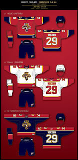
The jersey designs are also pretty nice. Again, they still feel more familiar to me than anything else. Certainly an improvement, but not to the point that they're downright amazing the way his earlier Ducks redesign was.

I commend the work being done by this artist though. I think he has a real talent and it's a shame the NHL doesn't hire peole like him to handle uniform and logo designs. I think it would be a much better looking league if they did.

I should also point out that he's said his next "rebranding" will be the San Jose Sharks and that we should expect the New Jersey Devils soon as well.

Personally, I'm pulling for the Lightning, just to see what he comes up with.

Now the floor's open to you all. What do you guys think of this work?

Wednesday
Aug082007

Amazing Ducks Concept Art

Earlier in the week I posted some awesome concept art that went over a storm with you guys. We saw designs for the Ottawa Senators and Boston Bruins as well as the New York Islanders and Atlanta Thrashers.

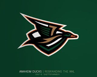
Today we're treated to some work on the Anaheim Ducks. These designs were based on concepts that "leaked" prior to the unveiling of the new Ducks logo last summer. Have a look and be impressed.

If you ask me, that's what the Anaheim Ducks should look like. And it couldn't be further away from the old Mighty Duck look. However, while the green is sharp, tan doesn't make for a vivid secondary color. So what about orange?

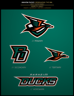
Our favorite designer upgraded his original logo with much more vivid colors. Can anyone deny this would be one killer logo package?

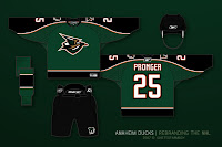
If the logos weren't enough for you, check out the uniform designs. Any NHL team would be lucky to look that good. How come this guy doesn't already work for the league?

Are there any Anaheim fans reading that would be repulsed by something like this? Would that even be possible?

Anyway, it's artwork like this that gets me so excited to do a blog like this. So what do you think? Am I going a little over the top with my glowing praise? Or are these designs really that good?

Monday
Aug062007

Cool Sens Concept, Bruins Too!

A lot of people responded well to the Islanders concept art I posted yesterday. It came from the artist who also designed the Thrashers concept art from Friday. (NOTE: I updated that post with higher-resolution graphics if anyone's interested.)

Anyway, I have some more work from that same artist who posted his work on Chris Creamer's Sports Logos Community. As a disclaimer, I need to point out that none of this is official team artwork, but I thought it was fun to look at just the same.

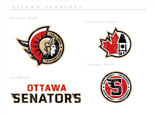
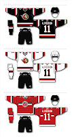
This logo set appears to be merely a revision of the current look of the Ottawa Senators. Personally, I prefer leaning more toward the yellow-gold over the beige color seen here. That's not to say that this color scheme doesn't work well, though.

Do you guys like this designs, the current one, or the one rumored to be taking over in the fall?

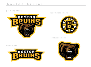
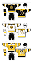
Next, we have a look at some logos that are irrelevant when you consider the Boston Bruins just changed their logos back in June. But have a gander anyway, if you're inclined.

If you ask me, that's a pretty sweet Bruins logo, setting aside the fact that a drastic change like this would likely send the Boston faithful into a frenzy. I'm not sure how I feel about the re-imagining of the spoked "B" though. It isn't sitting well with me.

I'm loving the bear, though no one's asking me, and wondering whether I like it more than the new one that was unveiled a couple months ago.

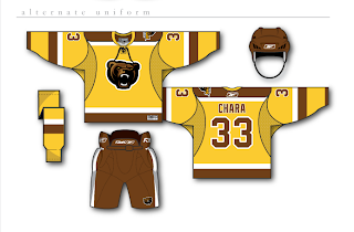
And then for those of you longing for the days of the yellow and brown, our talented designer leaves us with this other alternate uniform design.

Sunday
Aug052007

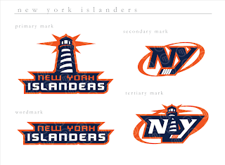
An Abundance Of Islanders Art

Every so often I find myself with just so many images for one team I feel like getting them all posted in one shot. Today that team is the New York Islanders. Remember that Atlanta Thrashers artwork I posted on Friday? Well, I've got more from that same artist (who's apparently been posting his awesome work over at the SportsLogos.net message board.

If you ask me, that's a pretty nice set of logos. Isles fans?

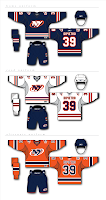
This is the uniform set that goes with those logos and they're just as cool. I really like the lighthouse as a primary element. I don't think you can lose the "NY" altogether because that's just one of those things that's always been there and it really does look good.

The Islanders tried out a lighthouse logo back in the mid-'90s when they switched to the fisherman logo. But nobody liked the fisherman, so they reverted back. I don't know why they didn't keep some version of the lighthouse, though.

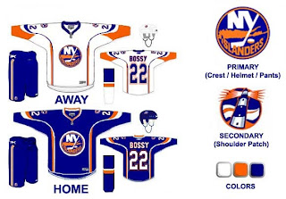
In fact, this next design makes use of that lighthouse. Before you look, though, just know that it is a design based off the dreaded all-star jersey template.

I like that its a Mike Bossy jersey. Good stuff. The only problem is, those logos don't really go well together. The waviness of this lighthouse logo just went better with those mid-'90s jerseys. I'm curious to know what Islanders fans thought of those — and this jersey design. Though I think the designer is trying to subliminally mess with your sense of nostalgia by placing Bossy's name on the back.

I'm just about done here. This is another example of a lighthouse-based logo. It doesn't necessarily have to be the primary mark, but I think it would make a good secondary logo. Put it on the shoulder patch or something. This one isn't extremely well-balanced for a sports logo, but I had it so I thought I'd post it.

One last thing and then I'll leave you and the Islanders alone for a while.

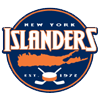
Sorry I don't have a larger size, but a reader emailed this logo to me. It's got some neat elements but I'm not sure what it would be for. Perhaps a seal logo for hats and t-shirts and the like.

To sum up, it's a lot of cool fan artwork and absolutely nothing official from the team. Sorry to disappoint, but nobody has been saying anything official these days and I still want to keep posting new stuff on the blog. So the only way is to post fan designs in the interim while we wait. As always, I'll be sure to let you know when something official is announced. Until then, enjoy the fan artwork, and feel free to submit any of your own.

Friday
Aug032007

Thrashers Fan Artwork

Get excited, Thrashers fans! You asked for it yesterday and some among you responded. I reader linked me to the following designs for a new Atlanta Thrashers jersey. Keep in mind they are only concepts and as far as I know, no change in logo is being contemplated at this time by the team.


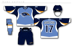
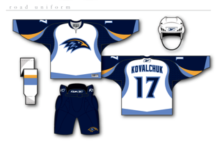
How about them apples? It's certainly a unique take on branding for the Thrash. The designer certainly took "Blueland" and ran with it. He dropped the maroon altogether. They're sharp designs but I don't think there's really anything wrong with the current uniforms.

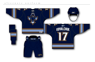
But if that wasn't enough for you, he also came up with an alternate jersey design, as seen below.

I really just think the color combination and jersey design of the current home uniforms work so much better. These are cool, but more like something I'd expect to see on the backs of a minor league club — that's certainly no offense at all. Still, Thrashers fans, we finally have something new for you to look at. What do you think? Go? No go?

UPDATE (8/6 5:30 PM): Good news for those of you who liked these Thrasher designs. I found better quality images. You can click on the images to enlarge them. These are the same jerseys posted above.

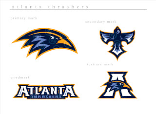
I also found graphics with a better look at the logo designs. If anyone else is seeing the Baltimore Ravens resemblance, I'm with you. It's a great set of logos, though. And any team would be lucky to wear them.

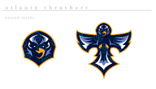
The second graphic features logos the designer created but ultimately did not use for this concept. They're all very sharp though with a very nice and clean color scheme. Thrashers fans, do you like these? Or do you prefer what your team wears right now?


Page 1 2