NHL Tournament of Logos

Entries in review (31)

Thursday
Oct042007

Rbk EDGE Review: Blues

Part 11 of 30. All 30 NHL clubs have unveiled new jerseys under the new Rbk EDGE Uniform System for the 2007-08 season. Here at the NHLToL, we're going to review every one of them. Read up and then rate the new sweaters. We'll do a full ranking after completing all of the reviews.

Rbk EDGE Uniform System

St. Louis Blues


New Uniforms

Old Uniforms

The Unveiling
Saturday, September 15. The Blues unveiled their new jerseys to fans at FANfest in St. Louis.

Home vs. Road
Home: Red. Road: White. The two sweaters are essentially mirror images of each other.

The blue home jerseys feature large dark blue shoulder yokes outlined in yellow piping that extends from the neck, down the front to the bottom of the sweater. Smaller white stripes extend under the piping from the neck to the shoulders. A curved white stripe wraps around the arm, beneath the elbow, bordered by a thinner yellow stripe. The cuff is dark blue from the yellow stripe down to the wrist. The collar is blue with yellow piping on the outside and the primary logo serves as the crest.

The white road jerseys feature large blue shoulder yokes outlined in yellow piping that extends from the neck, down the front to the bottom of the sweater. Smaller dark blue stripes extend under the piping from the neck to the shoulders. A curved blue stripe wraps around the arm, beneath the elbow, bordered by a thinner yellow stripe. The cuff is dark blue from the yellow stripe down to the wrist. The collar is blue with yellow piping on the outside and the primary logo serves as the crest.

In The Details
The same numbering and lettering style has been retained.

New & Old
The biggest difference between the new uniform and the old is that all of the straight and horizontal stripes are gone in favor of stripes and paneling with more curved lines. The yellow piping down the front and back of the sweater is also new. The shoulder yokes are very different between the two uniforms.

Standard FAQ
Numbers on the front? No.
Laces at the collar? No.

NHLToL Editorial by Chris
When I first saw photos of the Blues' new sweaters, my jaw hit the floor. I was almost immediately calling it the best new uniform this season. But if they aren't the best, they certainly are among the best. The striping works beautifully on this jersey and I'd even pose that the new ones are better than the old ones, as crazy as that might sound. With the days of the red trim behind them, the Blues have consistently been one of the best-looking teams in the league, if you ask me. They don't falter here. The shoulder paneling is my favorite part. Definitely a would-buy if I didn't feel it sacrilege to do so. 5/5


Buy your new Blues jersey!

Wednesday
Oct032007

Rbk EDGE Review: Canadiens

Part 10 of 30. All 30 NHL clubs have unveiled new jerseys under the new Rbk EDGE Uniform System for the 2007-08 season. Here at the NHLToL, we're going to review every one of them. Read up and then rate the new sweaters. We'll do a full ranking after completing all of the reviews.

Rbk EDGE Uniform System

Montreal Canadiens


New Uniforms

Old Uniforms

The Unveiling
Tuesday, September 4. The Canadiens unveiled their new jerseys to fans via their official web site. Players in attendance a golf tournament that day in Montreal also wore them.

Home vs. Road
Home: Red. Road: White. The two sweaters feature rather different striping patterns.

The red home jerseys have a thick blue stripe that wraps around the chest, bordered by two thinner white stripes. The primary logo, serving as the crest, is placed over these stripes. Similar blue stripes outlined by thinner white stripes wrap around the elbows. Thin white-blue stripes wrap around the waist a few inches above the bottom of the sweater. The collar is white with blue trim on the inside.

The white road jerseys have a red shoulder yoke, rounded at the ends. The cuffs are red extending several inches from the wrist. Thin red-white-blue stripes wrap around the waist a few inches above the bottom of the sweater. The primary logo serves as the crest and the collar is white with blue trim on the inside.

In The Details
The crest sits slightly higher on the white jersey than the red one. This is so that the logo can be properly centered on the blue stripe across the chest of the red jersey. The same numbering and lettering style has been retained.

New & Old
There is hardly a difference at all between the two uniforms. The old design was simply adapted to the new EDGE cut. The one noticeable difference is in the collar, which now, like all new jerseys, features the NHL shield.

Standard FAQ
Numbers on the front? No.
Laces at the collar? No.

NHLToL Editorial by Chris
I'm reviewing the Canadiens because of their big championship victory in the logo tournament today. There are some things you just don't mess with. And as liberal as I am when it comes to changing a team's jersey design, I still think you cannot mess with the Habs. I'm rather glad they left everything alone. My one nitpick is that I feel this would be one of the best jerseys for the lace-up collar. The Rangers and Bruins are the only Original Six teams that have it. And I am a little bothered by difference in positioning of the logo but that's something most people will never notice since only in rare cases will you see both jerseys side-by-side this way. Anyway, we're a third of the way through the reviews now, and for the most part, I'm liking what I'm seeing. 5/5


Buy your new Canadiens jersey!

Tuesday
Oct022007

Rbk EDGE Review: Panthers

Part 9 of 30. All 30 NHL clubs have unveiled new jerseys under the new Rbk EDGE Uniform System for the 2007-08 season. Here at the NHLToL, we're going to review every one of them. Read up and then rate the new sweaters. We'll do a full ranking after completing all of the reviews.

Rbk EDGE Uniform System

Florida Panthers


New Uniforms

Old Uniforms

The Unveiling
Saturday, July 28. The Panthers unveiled their new jerseys to fans at the Year of the Rat Alumni game in Sunrise. Nathan Horton and Stephen Weiss modeled the jerseys on the ice in full gear.

Home vs. Road
Home: Blue. Road: White. The two sweaters are essentially mirror images of each other and both feature secondary logo patches on the shoulders with the primary logo serving as the crest.

The blue home jerseys feature thick red stripes extending from the shoulder the length of the sleeve, bordered in yellow piping. Yellow piping also runs down the front of the sweater from the neck line to the bottom. Spaced yellow-red-yellow stripes go around the underside of the elbows, stopping at the yellow piping along the sleeves. The collar is blue outlined in thin yellow piping.

The white road jerseys feature thick red stripes extending from the shoulder the length of the sleeve, bordered in blue piping. Blue piping also runs down the front of the sweater from the neck line to the bottom. Blue-red-blues stripes with yellow spacing go around the underside of the elbows, stopping at the blue piping along the sleeves. The collar is blue.

In The Details
The logo on the chest is now much larger than before. The same numbering and lettering style has been retained.

New & Old
The Panthers new jerseys differ in several minor ways from the old ones. Gone are the slanted stripes around the sleeves and the pointed shoulder yokes. The horizontal stripes around the waist have also been removed. The Panthers did keep the primary and secondary logos in the same location as well as sticking with blue for the home jersey. Little else has really changed. Mainly, piping has been introduced along with stripes extending past the shoulders and down the sleeve.

Standard FAQ
Numbers on the front? No.
Laces at the collar? No.

NHLToL Editorial by Chris
My initial reaction to the new Panthers jerseys was good. On first glance, I thought they were really sharp. But if you really look at them, you notice how busy they are. We see a lot of piping and the clash of horizontal and vertical stripes at the elbow. While it doesn't look great on the rack, this is one jersey that is very nice looking on the ice. Still, one annoying trend among the new EDGE sweaters with piping is the captains' letter crossing that line. I could live without that. But aside from some tiny nitpicks, I think this is a very nice looking jersey. 4/5


Buy your new Panthers jersey!

Monday
Oct012007

Rbk EDGE Review: Blue Jackets

Part 8 of 30. All 30 NHL clubs have unveiled new jerseys under the new Rbk EDGE Uniform System for the 2007-08 season. Here at the NHLToL, we're going to review every one of them. Read up and then rate the new sweaters. We'll do a full ranking after completing all of the reviews.

Rbk EDGE Uniform System

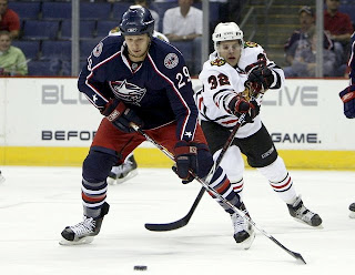
Columbus Blue Jackets


New Uniforms

Old Uniforms

The Unveiling
Friday, June 22. The Blue Jackets unveiled their jerseys at the 2007 NHL Draft in Columbus.

Home vs. Road
Home: Blue. Road: White. The two sweaters are essentially mirror images of each other and both feature secondary logo patches on the shoulders.

The blue home jerseys feature white and red piping that extends down the sleeves to the cuff. A white star is placed on each wrist and red piping goes around the cuff. The bottom of the jersey has red and white piping and the collar is also striped in red and white. The primary logo serves as the crest.

The white home jerseys feature a thick blue stripe extending down the sleeves, bordered by white and red piping that extends to the cuff. A white star is placed on each wrist and red piping goes around the cuff. The bottom of the jersey has blue and red piping and the collar is also striped in red and blue. The primary logo serves as the crest.

In The Details
The white stars at the wrist are a unique feature to these uniforms. The same numbering and lettering style has been retained.

New & Old
There are many changes between this year's new jersey and last year's. For one, the Blue Jackets have adopted their third jersey as a primary sweater, dumping the old logos altogether. Red is also less prominent in the new logo as well as uniforms. The horizontal stripes around the waist are gone.

Standard FAQ
Numbers on the front? No.
Laces at the collar? No.

NHLToL Editorial by Chris
When the first Blue Jackets logo was unveiled and it featured a bug, I was almost sure it was a joke. Yet it appeared on that jersey for way too many years. In adopting a new primary logo this year, the Jackets have quickly become a great-looking team. I think the new logo is a huge improvement and better than most currently seen in the NHL. And the uniform is fitting. The stars on the wrists are a nice touch. I also like the shoulder patch but could see it working better without the outer oval spelling out the team name. My one other quarrel is with the sleeves on the home sweater. I think they should be black like they were on the third jersey. But that's just my opinion. A decent effort. 3/5


Buy your new Blue Jackets jersey!

Sunday
Sep302007

Rbk EDGE Review: Coyotes

Part 7 of 30. All 30 NHL clubs have unveiled new jerseys under the new Rbk EDGE Uniform System for the 2007-08 season. Here at the NHLToL, we're going to review every one of them. Read up and then rate the new sweaters. We'll do a full ranking after completing all of the reviews.

Rbk EDGE Uniform System

Phoenix Coyotes


New Uniforms

Old Uniforms

The Unveiling
Saturday, September 15. The Coyotes unveiled their jerseys at CoyotesFest in Phoenix.

Home vs. Road
Home: Brick red. Road: White. The two sweaters are essentially mirror images of each other but for the shoulders and both feature secondary logo patches on the left shoulder.

The brick red home jerseys are completely solid in color except for three white stripes around each elbow. The middle stripe is about twice the thickness of the other two. White laces hang from the collar and the primary logo serves as the crest.

The white home jerseys feature a brick red shoulder yoke and three brick red stripes around each elbow. The middle stripe is about twice the thickness of the other two. White laces hang from the collar and the primary logo serves as the crest.

In The Details
The shoulder patch featuring the secondary logo is found only on the left shoulder of each sweater. The same numbering and lettering style has been retained.

New & Old
The biggest differences in the new jerseys are the lack of stripes around the waist and the addition of the shoulder yoke to the road sweater. One minor change seen here is that the shoulder patch has switched sides. It was previously worn on the right shoulder.

Standard FAQ
Numbers on the front? No.
Laces at the collar? Yes.

NHLToL Editorial by Chris
I have to say that I was always among the fools that loved the original Coyotes jerseys. They may have been a little busy, but boy were they unique. They looked like no other team on the ice. I especially liked the old logo as well. I'm not nearly as fond of the new one. Still, it's simplicity that works. I like the addition of the shoulder yoke to the road jersey and I think the "PHX" patch is top-notch. As a uniform, I won't say it's among my favorites, but I respect it. 3/5


Buy your new Coyotes jersey!

Saturday
Sep292007

Rbk EDGE Review: Predators

Part 6 of 30. All 30 NHL clubs have unveiled new jerseys under the new Rbk EDGE Uniform System for the 2007-08 season. Here at the NHLToL, we're going to review every one of them. Read up and then rate the new sweaters. We'll do a full ranking after completing all of the reviews.

Rbk EDGE Uniform System

Nashville Predators


New Uniforms

Old Uniforms

The Unveiling
Thursday, July 19. The Predators unveiled their jerseys at a fan event at Sommet Center in Nashville.

Home vs. Road
Home: Blue. Road: White. The two sweaters are essentially mirror images of each other but for minor alterations in terms of overall design and both feature secondary logo patches on each shoulder.

The blue home jerseys feature yellow piping extending down from the collar. The side panels are white. A thick stripe of silver outlined in blue extends from the neck to the cuff on the sleeves which are otherwise blue from the shoulder to the elbow and white to the cuff with blue piping around the wrist. The collar is blue and yellow and the primary logo serves as the crest.

The white road jerseys feature blue piping extending down from the collar. The side panels are blue. A thick stripe of silver outlined in blue extends from the neck to the cuff on the sleeves which are otherwise white with blue piping around the wrist. The collar is blue and yellow and the primary logo on a blue triangle serves as the crest with the word "NASHVILLE" just above it.

In The Details
The same shoulder patches featuring the secondary logo are found on both shoulders of each sweater. The white sweaters feature the city name above the logo, slightly differentiating it from the blue sweaters. The same numbering and lettering style has been retained.

New & Old
There are several differences in the overall design of the new sweaters when compared to the old. The silver shoulder yoke now extends completely down the arm. It also had yellow piping and a much thicker blue stripe around it that curved down to the wrist. The stripe and elements around the waist are also gone but replaced by side paneling. The new white sweaters do not include as much blue as the old ones did. On the ice, the jerseys look relatively similar, but you can find differences if you're really looking.

Standard FAQ
Numbers on the front? No.
Laces at the collar? No.

NHLToL Editorial by Chris
I've always been a fan of the Predators' jerseys. The old white is one of two non-Lightning jerseys that I actually own. (The other being a 1996 Mighty Ducks third jersey so that may not be a good barometer.) Looking at the home sweater on a rack, it can make you think of a t-shirt, the way the blue extends only down to the elbow. But I think that just adds to its uniqueness while many find that it's a fault. Another thing a lot of folks aren't fond of is the city name above the logo on the road sweater. That's one element I'm on the fence about. I see the merits of it while at the same time am bothered by it as a design element. On top of that, seeing these jerseys on a rack versus in action are two very different animals. I really don't care for how the whites look on the ice. I am impressed with the blues though. I'll call it a wash. 3/5


Buy your new Predators jersey!

Friday
Sep282007

Rbk EDGE Review: Lightning

Part 5 of 30. All 30 NHL clubs have unveiled new jerseys under the new Rbk EDGE Uniform System for the 2007-08 season. Here at the NHLToL, we're going to review every one of them. Read up and then rate the new sweaters. We'll do a full ranking after completing all of the reviews.

Rbk EDGE Uniform System

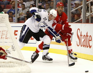
Tampa Bay Lightning


New Uniforms

Old Uniforms

The Unveiling
Saturday, August 25. The Lightning unveiled their new uniforms to fans at ICEfest held at the St. Pete Times Forum in Tampa. Among those players in attendance were Chris Gratton, Filip Kuba, Johan Holmqvist and Marty St. Louis donning their new jerseys.

Home vs. Road
Home: Black. Road: White. The two sweaters are essentially mirror images of each other in terms of overall design and both feature secondary logo patches on each shoulder.

The black home jerseys feature white cuffs with thin blue piping at the wrist. A blue stripe around the arm rounds up on the inside to the armpit. The collar is blue and the primary logo serves as the crest.

The white road jerseys feature black cuffs with thin blue piping at the wrist. A blue stripe around the arm rounds up on the inside to the armpit. The collar is blue and the primary logo serves as the crest.

In The Details
The same shoulder patches featuring the secondary logo are found on both shoulders of each sweater. The block style numbering and lettering have been retained. The white sweaters feature the jersey number on the front right shoulder. The black ones do not. The unique thin stripes found under the armpit have been carried over from the old style jersey. Another noticeable change was to the pants where the lightning bolt now sits on a blue stripe.

New & Old
The Lightning were one of seven teams to introduce new logos. Aside from that, the overall jersey designs saw drastic changes. The shoulder yokes found on both sweaters are now gone, making the jersey a solid color throughout. In addition, the horizontal stripes at the waist are gone and the sleeve stripes have been greatly altered.

Standard FAQ
Numbers on the front? Yes.
Laces at the collar? No.

UPDATE (10/5 2:01 AM): Originally, the Lightning were only going to be wearing the number on the front of the white jerseys. Apparently that's changed as they wore the numbers on the front of the black jersey in the regular season opener. So the information here has been changed to reflect that both jerseys now have numbers on the front.

NHLToL Editorial by Chris
I should first say that with the Lightning being my favorite team, I may come off as biased. But this is the opinion area after all. As a Lightning fan, I've always thought our uniforms were dull and second rate. I can now proudly say we've taken a huge leap forward. I don't know if I can honestly say I believe the new sweater stands up to the likes of some of the others, but I'm very impressed. My favorite aspects include the increase in the use of blue in the uniform and the removal of the shoulder yokes. A fact worth noting that I own a black Rbk EDGE premier jersey and I love it. 4/5


Buy your new Lightning jersey!

Thursday
Sep272007

Rbk EDGE Review: Devils

Part 4 of 30. All 30 NHL clubs have unveiled new jerseys under the new Rbk EDGE Uniform System for the 2007-08 season. Here at the NHLToL, we're going to review every one of them. Read up and then rate the new sweaters. We'll do a full ranking after completing all of the reviews.

Rbk EDGE Uniform System

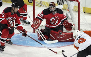
New Jersey Devils


New Uniforms

Old Uniforms

The Unveiling
Thursday, September 13. Photos of various Devils players wearing the new sweaters began appearing on the team web site. No unveiling ceremony was held.

Home vs. Road
Home: Red. Road: White. The two sweaters essentially mirror each other in terms of overall design.

The red home jerseys feature white-black-white stripes around the elbows and waist with the black stripe being roughly twice the thickness of one white. The black shoulder yoke is squared and slightly curved at the ends. The black collar features a thin white stripe within. The primary mark is featured as the crest.

The white road jerseys feature red-black-red stripes around the elbows and waist with the black stripe being roughly twice the thickness of one red. The black shoulder yoke is squared and slightly curved at the ends. The black collar features a thin red stripe within. The primary mark is featured as the crest.

New & Old
There are no major differences. The design of the old sweater was merely adapted to the Rbk EDGE cut.

Standard FAQ
Numbers on the front? No.
Laces at the collar? No.

NHLToL Editorial by Chris
Given that the Devils have had one of the league's best uniforms since exchanging green for black 15 years ago, I'd say this would be among the last uniforms to need a change. I'm glad to see they didn't do any major alterations and that some of the more glaring EDGE elements (e.g.: piping) were left out of this design. The colors make the jersey simple and strong. A split-second look leaves you with no doubt that you are watching the New Jersey Devils. I can't think of a single thing that would improve it. 5/5


Buy your new Devils jersey!

Wednesday
Sep262007

Rbk EDGE Review: Avalanche

Part 3 of 30. All 30 NHL clubs have unveiled new jerseys under the new Rbk EDGE Uniform System for the 2007-08 season. Here at the NHLToL, we're going to review every one of them. Read up and then rate the new sweaters. We'll do a full ranking after completing all of the reviews.

Rbk EDGE Uniform System

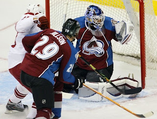
Colorado Avalanche


New Uniforms

Old Uniforms

The Unveiling
Wednesday, September 12. The Avalanche unveiled their new uniforms to the public at a press conference.

Home vs. Road
Home: Burgundy. Road: White. The two sweaters are essentially mirror images of each other in terms of overall design and both feature secondary logo shoulder patches.

The burgundy home jerseys feature thick, blue stripes down the sleeves. There is also a blue panel extending up the side of the torso to the armpit. Thin black and white piping lines the sides extending down from the collar.

The white road jerseys feature thick, burgundy stripes down the sleeves. There is also a burgundy panel extending up the side of the torso to the armpit. Thin silver and blue piping lines the sides extending down from the collar.

In The Details
The same shoulder patches featuring the secondary logo are found on both shoulders of each sweater. The collar is blue, outlined in a thick silver stripe. The unique numbering and lettering style has been retained.

New & Old
The biggest difference between the old new sweaters is the new striping and pattern of the Rbk EDGE jerseys. Gone are the zig-zag, mountain range-shaped stripes extending the length of the sleeve. A similar element around the waist is also gone, leaving the waists of the new jerseys blank.

Standard FAQ
Numbers on the front? No.
Laces at the collar? No.

NHLToL Editorial by Chris
If you'd asked me a year ago which NHL club had the best uniform, among the list of those I'd seriously consider would've been the Avalanche. That was until now. I recognize the limitations of the EDGE design but refuse to accept it as a valid excuse. I really liked the mountain range thing along the arms and waist. It's sad to see it go. Though, to be fair, the overall look of the jersey remains largely unchanged. Beyond that, the piping extending down from the collar makes the logo seem trapped. All in all, this could've been so much better. 3/5

Buy your new Avalanche jersey!

Tuesday
Sep252007

Rbk EDGE Review: Wild

Part 2 of 30. All 30 NHL clubs have unveiled new jerseys under the new Rbk EDGE Uniform System for the 2007-08 season. Here at the NHLToL, we're going to review every one of them. Read up and then rate the new sweaters. We'll do a full ranking after completing all of the reviews.

Rbk EDGE Uniform System

Minnesota Wild


New Uniforms

Old Uniforms

The Unveiling
Friday, September 7. The Wild unveiled their new uniforms via their web site.

Home vs. Road
Home: Red. Road: White. The sweaters feature different crests and completely different designs. The standard primary logo serves as the crest on the white sweater while last year's third jersey crest is seen on the red jersey.

The red home jerseys feature thin, wheat-colored piping around the shoulders. The upper-arms are green extending to the shoulder at the top and bordered by a wheat stripe beneath. The collar is wheat and laced at the front. There are no stripes at the waist.

The white road jerseys feature a thick green stripe along the tops of the sleeves, outlined in wheat and red stripes. The secondary logo is on the shoulders. Thick red and green stripes go around the waist, padded by a thin what stripe. The collar is double-striped with wheat on the inside and red on the outside.

In The Details
The shoulder patches featuring the secondary logo are found on both shoulders of the road sweater while the shoulders of the home sweater are blank.

New & Old
The major change is that last year's green jersey is gone. While it may return in the future as an alternate, last year's third jersey design paved the way for this year's new home sweater — right down to the same crest with the bear head logo inside a circle with the team name and two stars within it. The white sweater, however, remains largely the same, adapted to the new Rbk EDGE cut.

Standard FAQ
Numbers on the front? No.
Laces at the collar? Yes, only on the home jersey.

NHLToL Editorial by Chris
The order of these reviews is random but like the Bruins, this is another uniform I really love. When the Wild first introduced their third jersey, I was an instant fan. I thought, if every team looked that good, the NHL would really be on to something. But then we all know that story, don't we. I like this combination, though. It retains an old-fashioned feel at home with a unique, updated look on the road. However, I don't care much for the collar on the white jersey or the shoulder patches — elements which prevent me from giving the uniform a perfect score. 4/5


Buy your new Wild jersey!