NHL Tournament of Logos

Entries in sharks (70)

Sunday
Jul082007

Blues vs Sharks


vs
BLUES
SHARKS
4-2
3-4

The Aesthetics
Both logos have cool, unique colors but its the Blues that makes better use of it. That paired with the Sharks logo's use of a hockey stick will give the Blues this point.
Blues

The Nickname
Here's another one of those eternal questions. Why would a Blues singer ever have to face a Shark? I guess it doesn't matter, just that the shark gets dinner.
Sharks

The Analysis
Blues as a team name doesn't leave you with a whole lot of logo options, so this works. I was a fan of the trumpets though, which the team wore as a shoulder patch in the late '90s. Can't have everything, though. The Sharks logo is easy — it's a shark — the creativity comes with the triangle as a basic shape and the broken hockey stick. I don't love hockey sticks in logos but this sort of makes sense for the Sharks. Still, we have a pair of solid logos which makes this a difficult match to determine. But we'll give it to the Sharks for that fierce logo among other things.
Sharks


WINNER
2-1


Friday
Jul062007

Sharks vs Stars


vs
SHARKS
STARS
3-3
2-2

The Aesthetics
Both of these logos have lost as many matches as they've won. So it would appear we're looking at a pair of mediocre logos here. But it doesn't really feel that way. Despite the unique colors — teal and silver — the Sharks logo is complicated and rather minutely detailed. It also features a hockey stick rather prominently. As a polar opposite, the Stars logo is simple and too features unique colors with a heaping side of giant letters. Obviously both logos could use an overhaul or at least slight improvements. Ultimately the edge is going to the Sharks for actually being a logo and not a wordmark.
Sharks

The Nickname
Crazy huge, insane ball of fire hurling at lightning speed. The Star incinerates the Shark quicker than you could do half a blink.
Stars

The Analysis
Aside from its cosmetic shortfalls, the Sharks logo is rather fierce looking. It's what I think of when I think shark. It definitely captures the team's name. The Stars does a decent job too but it goes a step further, symbolizing its home state of Texas — the Lonestar State — with its single star. I'm not saying its perfect, but it gets my vote here.
Stars


WINNER
2-1


Wednesday
Jul042007

Avalanche vs Sharks


vs
AVALANCHE
SHARKS
4-0
3-2

The Aesthetics
I truly believe the West has some of the best logos in the league. The colors are even just cool to look at. But only one can take the point. I like the incorporation of the "A" in the Avs logo while at the same time being annoyed at the lack of color used in the Sharks. The graphic is misleading as the only teal in the logo itself is in a thin outline of the triangle.
Avalanche

The Nickname
This is another tricky one. What business would a Shark have on a mountainside during an Avalanche? Unless you make the case that by avoiding the mountain altogether, he's got the upper hand on the snowy slide.
Sharks

The Analysis
Okay, let's dig deep now. You can pretty much guess the team name from both logos though I wish they would've both done more to represent their city, but I'll live. However! There's nothing I hate more than the blatant use of something like a hockey stick (see Sharks) — despite it being eaten by a shark — and nothing I admire more than the subtle use of something like a puck (see Avs). And so as you can see the choice is rather clear.
Avalanche


WINNER
2-1


Thursday
Jun282007

Blue Jackets vs Sharks


vs
BLUE JACKETS
SHARKS
1-1
3-1

The Aesthetics
We've got a couple strong Western Conference logos here. Both pay attention to detail and have great colors but the Blue Jackets logo makes better use of it. Both logos have many pointy edges but ultimately I think it's the use of color that will make the difference for this point.
Blue Jackets

The Nickname
I'm not sure why a Blue Jacket and a Shark would ever have to confront the other but sharks eat people when provoked.
Sharks

The Analysis
As far as name symbolism, both logos are very appropriate. Despite there being no blue jackets in the logo, I think we all get it. The Ohio flag is a very nice touch in location recognition. I'm so glad the CBJ with the electric green went away. Whose idea was that anyway? This point may have gone to the Sharks except for the fact that I see no real connection to San Jose in it. That and the fact that there's a hockey stick in it and we certainly don't need that.
Blue Jackets


WINNER
2-1


Tuesday
Jun262007

Flames vs Sharks


vs
FLAMES
SHARKS
2-0
3-0

The Aesthetics
A couple of strong, undefeated logos here. For its simplicity and the Sharks logo's overuse of detail and underuse of color, the Flames will win this point.
Flames

The Nickname
Thanks to good ol' water and the depth of the oceans, a Shark never has to worry about being engulfed in Flames.
Sharks

The Analysis
Here we have two logos that are very good at symbolizing their team names. What I have to take issue with is the Sharks logo's lack of color. The teal and grey are used only in a thin outline of the triangle surrounding the shark. The Flames' "C" logo is a classic and the fire coming out of its back is scary.
Flames


WINNER
2-1


Wednesday
Jun202007

Sharks vs Ducks


vs
SHARKS
DUCKS
2-0
0-2

The Aesthetics
The Ducks' unfortunate choice to make a wordmark their primary logo may very well be their downfall in this competition. On the other hand, the Sharks logo is good enough to beat out just about anyone. Talk about fierce!
Sharks

The Nickname
A Shark could totally eat a Duck. The Duck wouldn't stand a chance.
Sharks

The Analysis
Ultimately the Sharks logo is nearly perfect for its location of San Jose, and with any California team you would expect non-traditional colors. I think it's great that the Ducks opted to go with the orange and gold after the name change, but a logo with an actual Duck or even just the footprint would be exponentially better.
Sharks


WINNER
3-0


Saturday
Jun162007

Red Wings vs Sharks


vs
RED WINGS
SHARKS
1-1
1-0

The Aesthetics
Neither logo would win a lot of points for color. The Red Wings features only red and the Sharks uses its unique teal very scarcely. That being said, the Sharks logo is very eye-catching and despite its tiny detail in the broken hockey stick, it squeaks by with the point.
Sharks

The Nickname
I can't think of a Red-Winged bird that would be flying anywhere near a coastline that would subject it to a Shark attack.
Red Wings

The Analysis
Like I've said, the Sharks logo has disappointed me in its lack of color. I can see where the black shark comes off as more fierce, but the teal color could be used better. And even though it does feature a hockey stick, I like the idea of it being bitten by the Shark. There isn't very much going on in the Red Wings logo. It's solid but could use a design upgrade, and up against the Sharks, it doesn't really stand a chance.
Sharks


WINNER
2-1


Thursday
Jun142007

Sharks vs Blackhawks


vs
SHARKS
BLACKHAWKS
0-0
0-1

The Aesthetics
The Sharks use a very nice teal as the primary color in their uniforms, but unfortunately it barely shows in the logo. We see it only in a simple outline of the triangle behind the shark. And while I feel that the Blackhawks use too many colors, at least they use color.
Blackhawks

The Nickname
I've said before that Chief Black Hawk was one tough son of a bitch, but if he ever found himself in the ocean surrounded by Sharks, he wouldn't stand a chance.
Sharks

The Analysis
The Blackhawks name is very fitting for its location and so is the Sharks, with its home city being found along the coast of California. And despite the Sharks logo's lack of color and incorporation of a hockey stick, I still think the fierce-looking shark is an awesome icon. The Blackhawks logo could stand an upgrade.
Sharks


WINNER
2-1


Monday
Jun042007

HF&P, Part 17: San Jose Sharks

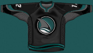
There's more in the "Hockey Fans & Photoshop" series today. Now we take a look at some interesting concepts for the San Jose Sharks.

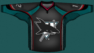
So that's one, simply replacing the shark-biting-hockey-stick logo with the shark fin logo, which I sort of like. What I think is really cool is this design.

The red trim adds an awesome "blood-in-the-water" feel. So I like it. However, I'm pretty sure the Sharks have plans to unveil a new logo this offseason so I wouldn't count on this one sticking around in any form.

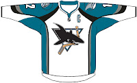
This is the last of the designs I wanted to post. It simply shows the current road jersey in the new Rbk EDGE style. It's rather basic and I kind of hope San Jose doesn't try anything similar to it.

There you have it. One more possibility for new uniforms come this fall.

Up next: the Los Angeles Kings — yes, for the second time. That will come tonight at some point.

Sunday
Apr292007

Sharks


San Jose SHARKS


Team Information
Team Colors / deep pacific teal, burnt orange, black
Inaugural Season / 1991-92 (16 years)
Current Logo / 2007-08 (0 years)

Tournament History

2007 Qualifying Tournament
6-8, 20 pts
Finished 8th in West; 17th overall

Page 1 ... 3 4 5 6 7