NHL Tournament of Logos

Entries in sharks (70)

Saturday
Aug252007

Poll: Sharks vs Canucks


vs
San Jose
SHARKS
Vancouver
CANUCKS


Place your vote and then feel free to leave a comment as to how you came to your decision. Tell all your friends to drop in and vote! The more voices heard, the more accurate the results! By the way, just as with the Lightning and Senators, when the Canucks unveil their new logo, it will take effect in the tournament that same day or the next. We're not expecting sweeping changes, just a recoloring of the same logo.

Poll opening date
Aug 25 @ 7:39 AM
Poll closing date
Sep 1 @ 11:59 PM

07CHTRN | #W1G | SJSvVAN

Tuesday
Aug212007

Sharks Jersey Concepts

Quick note before I call it a night. I recently got a few emails with concept designs for the new San Jose Sharks uniforms. Have a peek.

That's a pretty cool design but I have a feeling the Sharks will go with teal home jerseys since the logo sort of fades away on a black background. Not sure about "SAN JOSE" written across the bottom. The very Kings-like and unoriginal.

Last week we saw a video game magazine with what appeared to be a blurry screen grab from NHL 08. It seems we may have gotten a sneak peek at the new Sharks jerseys. With that concept in mind, one fan came up with these.


I don't hate them. They're very nice yet without a hint of their previous jerseys — which I felt were among the best in the league. Regardless, doesn't the new logo seem to stand out better on the teal sweater?

We'll have to wait until we hear official word from the team on when we'll get to see the new Rbk EDGE jerseys. Until then, speculation is all we have.

Friday
Aug172007

Sens, Sharks Uniform Fan Art

We've seen the new logos (unofficially for one) but we've yet to see the new uniforms that go with them. So why not muse on the Ottawa Senators and San Jose Sharks briefly?

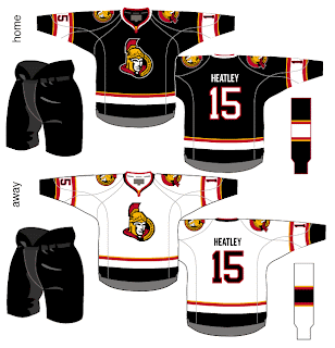
I like the red Senators jerseys a lot, but the black doesn't look half bad. Though in reality, odds are highly in favor of the Sens wearing the red at home this fall. The teaser pic on their web site seems to suggest that. Could be misleading, but I doubt it. I like the larger shoulder patch. More teams should do that. It looks really good.

The only problem I see with these two jerseys is the placement of the numbers on the sleeves. Way too low. Needs to be above the elbows. But wait! There's more!

Consider these concepts for the San Jose Sharks.

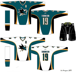
They're pretty sharp, if you ask me. They could do a lot worse. The new logo looks very good on these. I'd like to see a bigger shoulder logo a la the previous Ottawa concepts. But otherwise I don't have a lot to complain about. Though from everything we've read and heard, I'd lean more towards expecting less curved lines and more straight lines. However, I'm not sure how well that would go with this logo. It's quite curvy.

Anyway, it all remains to be seen. The Sharks have yet to announce a date for unveiling their jersey, but the Sens have said August 22 will be their release date.

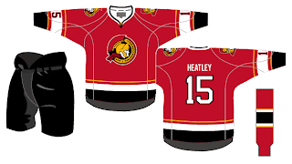
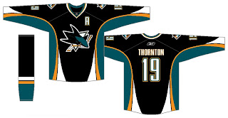
Before I leave you to your own devices for the evening, though, I have a couple of alternates from the same artists who came up with these designs. I know the NHL is dropping the third jersey program for this season, but we can dream, can't we?


Enjoy the rest of your night and don't forget to vote on the Senators-Rangers poll tomorrow morning!

Friday
Aug172007

Mailbag: You Can Stop Sending These Now

All right, I've said I don't want to get bogged down in the whole video game screen grab thing, but I think popular demand almost requires this one. I've gotten about a dozen emails in the last 24 hours with the following images attached or linked.

From what I've been told, what you're seeing in these pictures is a page from the official Xbox magazine — a yet-to-be released issue I'm assuming. Apparently, the picture above shows a game between the Coyotes and Sharks (a completely new San Jose design we've yet to be treated to officially) in EA Sports' NHL 08. The picture you see here to the left, although blurry, supposedly shows the Oilers and Canucks.

I can't speak to the veracity of these pictures nor really anything else with regard to them. But I just wanted to post them in the hopes that my awesome readers would stop sending me them.

Once again, I don't mind you guys sending in screen grabs from video games, but don't expect me to post them too often. If we're going to see official new jerseys, I'd prefer photos. Thanks everyone!

Saturday
Aug112007

The "SJ" In The Shark

I noticed that a few of you have been hard pressed to find the "SJ" I was referring to in the San Jose Sharks logo in this post from the other day. I thought I'd make things a little easier for those of you who can't find it.

Check it out.

How about that! Because of that little nugget, it's moved way up on my list of favorite NHL logos. It's stuff like that that can make logos so cool.

Friday
Aug102007

Sharks vs Canucks


vs
SHARKS
CANUCKS
5-8
5-8

The Aesthetics
Water-based creatures bearing teeth are prominently featured in these two logos. And they're both breaking things. The shark is breaking a hockey stick and the whale is breaking through ice. But as far as the overall look, I have to go with the Canucks. It's always been one of my favorites. As for the Sharks logo, while the recent change was an upgrade, they could've done better.
Canucks

The Nickname
Canucks are people and by and large, people are not impervious to Sharks. In fact, sometimes they lose limbs to big fish.
Sharks

The Analysis
Even though there isn't a "Canuck" in this logo, per se, I'm willing to give them a pass on that this time around. I love the Haida-style art and you can't say an orca in ice has nothing to do with Vancouver (which I may or may not have previously said). So here's why they're still getting beat by the Sharks. Call me slow, but I just found the "SJ" hidden in the Sharks' new logo and it's awesome! If you want to find it, check out the black in the fins. Look hard. You have to really want it. It's the last day of the tournament, so it's the final match for each logo.
Sharks


WINNER
2-1


Thursday
Aug092007

Kings vs Sharks


vs
KINGS
SHARKS
7-6
5-7

The Aesthetics
These two logos both have rather unique color schemes. You don't really see them anywhere else in the league. The Sharks recently introduced a new logo and this is its first time in the tournament. It's certainly an improvement over the previous logo, and even though sharks are grey, not teal, I like the extra color in the logo. What's unfortunate is that they kept the broken stick in the logo. The Kings logo is a good example of how you work in a hockey stick if you absolutely cannot help yourself. Make it subtle!
Kings

The Nickname
As powerful as King may be, if he took a dip in Shark-infested waters, he'd become lunch and nobody would be able to do anything about it.
Sharks

The Analysis
Despite getting an update, the Sharks logo still leaves a lot to be desired. I think the Kings logo is stronger and hey, what says California more than the suns on either side of the crown? Now, if you can, try and resist the urge to tear apart my reasoning. It's flimsy and would never stand up to it. Come back on Sunday and vote for yourself!
Kings


WINNER
2-1


Wednesday
Aug082007

Sharks, Oilers Fans Design Jerseys

As usual, I have some fan-designed jersey concepts to post today. First, we've got a look at what someone thinks the San Jose Sharks new Rbk EDGE uniforms should look like.

As you can see, someone borrowed elements from the new Florida Panthers jersey designs. Notice the choice of not using the announced secondary logo on the shoulders. Instead they take one of the many other logos and use it. The one we see here is the version of the full shark biting through a hockey stick, sans the background triangle.

Then I've also got a concept for the Edmonton Oilers to share.

It's a nice design that toys with the current jerseys. Don't expect to see a design just like this as we've been hearing the Oil plans to drop the oil man shoulder patches this season. Regardless of that, I like it.

You all have any thoughts on either of these designs? Feel free to leave them in the comments.

Monday
Jul302007

New Sharks, Canadiens Jersey Design Concepts

I was pointed the way of another fan-made jersey design concept for the San Jose Sharks. The designer doesn't seem to be a big fan of the orange being added to the color scheme as its used very sparingly here.


It's neat and I think it could probably work. Though I'd expect to see something rather different when the Sharks actually unveil their new jerseys in September.

And while we're looking at fan-designed jersey concepts, I've got one for Montreal Canadiens fans. Like many others, it's based off of this year's all-star jerseys so the real deal probably won't look anything like this. The one thing I wouldn't be surprised to see is the giant logo on the front. That seems to be a theme among all the jerseys that have already been officially unveiled.

Anyway, I haven't heard anything official from the Canadiens regarding an announcement or unveiling date, so we'll keep our ears and eyes peeled until we do.

Saturday
Jul282007

New Sharks Jersey Design Concept

With San Jose Sharks having just recently unveiled a brand new logo, we've got another fan-made concept design for the uniforms. First off, I'm going to take a wild guess and say this artwork was generated prior to the official unveiling of the new series of logos since it makes no use of the actual new secondary logo but rather a recolored version of the old shoulder patch. For your viewing pleasure.

I think the overall jersey design is pretty cool. I'm curious as to how it would look on a player. The only thing I'm not wild about is the lack of orange in the design. If used right, I think it could be a great and welcome addition to the Sharks' new look.