Result: Sharks Logo History
 Thursday · Sep 27 · 2007 | 11:37 PM PDT
  1 Comment
2007
69% 2,960 votes
4,270 total votes
 1991
199131% 1,310 votes
| Poll opening date Sep 20 @ 4:30 AM | Poll closing date Sep 27 @ 11:59 PM |
07BONLH | LHSJS

4,270 total votes
 1991
1991| Poll opening date Sep 20 @ 4:30 AM | Poll closing date Sep 27 @ 11:59 PM |
07BONLH | LHSJS
 |  |
Place your vote and then feel free to leave a comment as to how you came to your decision. Tell all your friends to drop in and vote! The more voices heard, the more accurate the results!
| Poll opening date Sep 20 @ 4:30 AM | Poll closing date Sep 27 @ 11:59 PM |
07BONLH | LHSJS
My concept art posts are making their glorious return this week with all the Rbk EDGE jerseys finally released. Today we're taking a trip out West.
 This one was interesting. It's a hybrid of the old logo with the new. I think it would be millions of times better if they just dropped the "ucks." How many times have I said that?
I mean consider how the wordmark logo actually looks on the jerseys. It's even got fewer letters than "capitals" yet it still seems smaller across the chest. I was really hoping for a change this year. Let them get the whole Ducks rebranding thing out of the way last season and then try something real this season.
I guess we can only ask for so much.
Here's something I don't love but thought it was an interesting idea. It's the current jersey with the old Mighty Ducks colors. Probably not a winner.
And then going all the way back we've got a simple recoloring of the old jersey and logo. Once again, it's not awful, but it just doesn't seem to fit.
Here's the winner.
I think if it were orange, that third jersey would just kill. The Ducks could be among the best-looking teams in the league if they wanted to. But the NHL doesn't hire designers like this. That would be too much to hope for.
So let's move along to Los Angeles. A while back I'd written a post suggesting using the old King head third jersey logo with some modern-day recoloring. The purple beard blended in too much on the dark jersey so I wondered what it would look like in silver. And I got my answer.
I'm sorry, but why isn't that the primary Kings logo anyway? That says "kings" to me! (Not that a crown necessarily doesn't.) Oh and as a personal aside to the designer, what's the deal with stealing the Lightning's armpit stripes?
Anyway, let's head up the coast to San Jose and check out some other Lightning-related designs. One Sharks fans created these concepts based off Tampa Bay's Reebok jersey design, replacing the blue with teal.
Actually, I'm a big fan of the one on the left. The full shark makes for a much fiercer logo if you ask me — not that you were. As for the shield logo, I don't feel it makes a very good crest. It's a little much. I think it looks great on the pants and might even look nice on the shoulder — maybe for a third jersey one day.
The other thing I like is the diamond fin logo found on the shoulders of these designs. I'm a little surprised and disappointed it was left out of the actual uniform design.
What do you guys think of these? And remember, if you've made an concepts or seen any around that I haven't already posted, feel free to send them along. You can email me at nhllogos@gmail.com.
The San Jose Sharks have become the final NHL team to unveil their new Rbk EDGE uniforms today.
How about those! To echo some other folks, we're definitely looking at a fancy new logo on a very retro sweater. What surprised me was the shoulder logo.
I was expecting a fin logo so I was a little shocked to see the full shark logo. And I'm pretty sure the shield logo will make its way onto the pants, leaving the fin logo homeless. The logos I'm referencing can be found here if you're interested.
 That teal looks really great on these uniforms, by the way. What totally sells it for me is the orange. I know a lot of fans aren't too keen on it, but I think it brings a great new dimension to a look that in recent years had been kind of monochromatic.
The cool thing is that the stripes around the elbows and waist are reminiscent of the original uniforms from 1991 which had grey in place of orange. And who here doesn't love retro? You know you guys do.
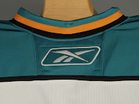
And then here's your close up of the collar. That teal looks really, really great.
Overall, I'm a fan. I think they could've gone with some more curvy lines and vertical piping to match, but they chose something a bit daring as far as these new Reebok sweaters. I'm impressed. I still prefer my Lightning jersey... which is coming in just a few days!
Got several emails today about EA Sports' NHL 08 which was released this week. We kept hearing an unlock code would be provided for the new Rbk EDGE uniforms.
 Apparently, that code was released today, supposedly unlocking all of the uniforms in the game. Here to the left you can see the unlock code available at official Rbk EDGE web site.
I've seen screen grabs for only a handful of team jerseys so I don't know that they're necessarily all available at this point. (Someone correct me if needed.)
The teams I've seen via stills from email and around the web are the Thrashers, Sharks, Coyotes, Stars, Oilers, Blackhawks, and Blues. And while they are from video games (which you know I'm opposed to), I'll post a few here just for fun. I'm still going to wait for teams to show off the uniforms themselves to count it as an "official" unveiling.
Many Thrashers fans may be happy to see the "ATLANTA" retained on the left sleeve of the home jersey. Of course, I'm just guessing it's there since we can't actually see it.
The Blues and Sharks sweaters look nice — if not like they've been swapped. I like the sholders of the Blues sweater and the striping on the Sharks.
And the conservatives among you will probably like the fact that nothing much has changed for the Chicago Blackhawks.
Just remember that while there's no reason to doubt the designs here are accurate, I won't call them "official" until we see it from the team or the league. That's just how I roll.
Thanks for all the emails on the subject, everybody! I'll try and get some more images up later on.
UPDATE (12:36 PM): Here's a great photo gallery featuring all the new AHL and NHL sweaters. Enjoy!
The San Jose Sharks announced via an email to fans and on their official web site that they'll be unveiling their new Rbk EDGE uniforms on Monday, September 17 at 2 PM. Here's the email fans received.
Thought the headline was funny so I stole it. And here's a screenshot of the Sharks' web site announcing the unveiling. The jerseys will be available to the public for a first glimpse at the Sharks Store at HP Pavilion.
Pictures will be posted on their web site Monday afternoon and I'll have them here and in the gallery as soon as I can. You can read more on this matter at their official site.
But as a special treat for those of you that have read on, the Sharks' prospects took part in weekend tournament with the Anaheim Ducks. Players were wearing what appear to be the pants to go with the new uniforms. You can tell by the new shield logo which appears on the pants. Check out some photos.
California is the running theme of today's concept art. We'll kick things off in the City of Angels. This first concept jersey for the Los Angeles Kings makes use of the original 1960s logo with silver replacing yellow.
Not terrible, but my personal favorite was the king face logo used on the mid-'90s third jersey. While the jersey sucked, I thought the logo was the strongest in the team's history. Once again, the gold is changed to silver producing a jersey that might look something like this.
I'm not a Kings fan, but I'd buy that jersey or one like it in a heartbeat. As a great alternate to a set like this, there's this design.
I like the silver in the beard of the king face logo on the shoulders. I think that would work better on the purple jersey above. Maybe it could be one of those logos where the colors change depending whether the jersey is light or dark — like the Flames and Canucks.
Moving along now to Anaheim, we have a Ducks jersey that isn't black.
Unfortunately, if it's gold, the logo (read wordmark) almost completely disappears. And I'm not sure it could be orange without looking like the Flyers. So black it is.
This concept might well turn out to be what the Ducks' new jerseys actually look like. I'd expect to see the team change the logo to the duck foot only, but that may just be wishful thinking.
My only other issue with this design is its lack of gold. That's an important part of this color combination and they should make good use of it.
And now we'll finish off this post with a trip up to San Jose. Got some interesting Sharks concepts to share.
These next images are renderings from a video game — not NHL 08 — featuring a concept someone created for the Sharks. Very simple and classic. Shouldn't garner many complaints.
This cool jersey concept utilizes the shield logo unveiled by San Jose back in July. I really like that idea and it's not completely unheard of to use two different logos on NHL uniforms. Look at the new Wild sweaters.
The white one feels a little plain but not terrible.
Now Californians, let us all know how you feel about these concepts.
We've already seen the Kings' new uniforms, but we're still waiting on the Sharks and Ducks. Word out of San Jose is we should expect to see the new jerseys on September 17 while Anaheim has a preseason game on September 13. So at the latest, we'll see the new Ducks duds on Thursday if they don't unveil them sooner.

San Jose
SHARKS
47% 9,279 votes
19,920 total votes
 Vancouver Canucks
 San Jose Sharks
| Poll opening date Aug 25 @ 7:39 AM | Poll closing date Sep 1 @ 11:59 PM |
07CHTRN | #W1G | SJSvVAN
So this week I'm running a series of crazy concept designs meant to freak you out a little bit. Let's get to it now.
I have to start with the colors we've all grown fond of this afternoon. Yes, you know the ones. But beware, you're about to see them on a jersey that will make you blink a few times and perhaps tap the side of your monitor. No need, though.
Being of generally slow wit, it took me a moment to realize that this Carolina Hurricanes jersey was being recolored based on the team it used to be. Yes, friends, the Hartford Whalers. But just look at that blue and green hurricane. Scary.
Somebody else had a similar idea. Look at that thing.
And then somebody with a twisted soul had an idea. Let's go all the way back to the New England Whalers... and kill Pucky... on a jersey... made by Reebok.
Yeah. And while we're on the topic of creatures of the deep, let's see what could've happened if certain fans had been asked to design the new uniforms and logo of the San Jose Sharks.
Huh? Wait, that one's actually kind of good. Dude, I like that logo. What is it doing here? Oh I remember. It's serving as a segue to this.
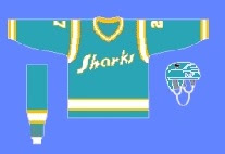
 I can hear the screaming all the way from here. But before you go all thinking this design is completely without merit, don't forget about our friendly California Seals. Yes, this design is based on that old '60s uniform.
Completely and utterly crazy if you ask me. And I know no one did, but I'm sharing my thoughts anyway.
Let's roll on, now. Because before I go, I need to show you this logo someone emailed me for the Dallas Stars. Yes, the Stars need a logo redesign, but is this really the answer?
There's only one way to find out. Comment now and come back tomorrow for Part 4.
My headlines seem to be getting more and more obscure. I guess there's only so many times you can say "New Concept Art For [insert team name here]" before going out of your mind. Whatever. I'll roll with it.
Anyway, the team to insert now is the San Jose Sharks. They unveiled their new logo just over a month ago but left us wondering what the jerseys would look like. Just one more thing to ponder this off-season. As expected, I have concept art to share.
First up is my personal favorite. If the Sharks wore something like this, they'd be among the sharpest-looking teams in the new Rbk EDGE jerseys. Boston's got some game so don't get too worked up. But these I like. The horizontal striping and traditional look totally clashes with the new-fangled, curvy-line logo but I don't know. I still like it.
This uniform set is based in large part off of the Panthers' new sweaters. I like them, but not as much as the ones above. And I really think those elbow stripes need to go all the way around the sleeve to work right. Still, not too shabby.
Nor is this. But I think this design takes most of its cues from what the Sharks have been wearing the last few years. I really did like the silver, but the orange works too. This design needs a black accent though, I think. It's very, very teal. Very teal. With some teal on it.
But before you go thinking that's all I have to offer, Sharks fans, wait until you see this. The addition of orange to the primary team colors has met a somewhat mixed response. Though to be honest, I have heard anyone love it so much that they'd want to see a jersey like this.
My eyes, my eyes! What a work of art. I'll tell you what makes me like it a little bit — the big shield logo on the shoulders. First of all, I like big shoulder logos. Second of all, I like that shield logo the Sharks came up with. So it's got a lot going for it in my opinion. Unfortunately, too much orange, not enough teal might well spell disaster.
Now I'm done. Take me to task with your comments.
For those who still haven't worked it out: Sharks circle their prey in the water. Get it? Something to circle in? No? Okay. It was a long shot anyway.

