NHL Tournament of Logos

Entries in sharks (70)

Friday
Oct262007

Just To Freak You Out XII

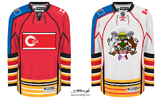
Welcome to the 12th installment of the Freak Out Fridays. Hope you enjoy this one. We'll kick things off with one of the craziest things I have ever seen.

Like the designer said, who needs a logo when you've got municipal and provincial art to plaster across your sweater? And I counted well over 50 stripes on each sweater. I love those right sleeves. So much so that I've gouged out my eyes. The rest of this will be written by touch-typing.

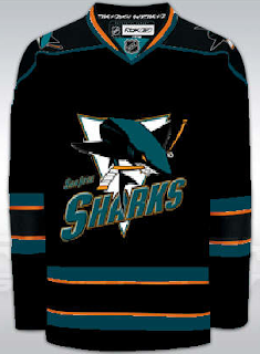
Now keeping it in the Western Conference, check this out.

I guess what troubles me the most is that someone has removed the shark's fin. That's just cruel.

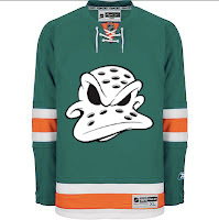
Speaking of cruel...

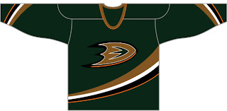
I dare any league to dress any team in that uniform. Make that a double dare! (Actually, I'm half-expecting to see that duck morph into a dolphin.)

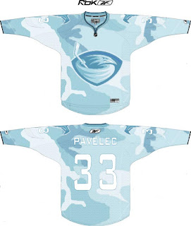
But wait, there's more. Say you're a team looking to blend in with your surroundings. Let's say your hunting ducks, for instance. Might this be a good way to camouflage yourself?

I think it might.

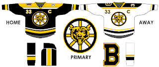
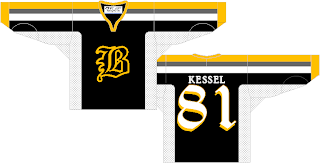
And finally, anybody here watch Conan? One of my favorite segments is "If They Mated." Someone sent in a concept that fits into that category well. What if we mated the Boston Bruins and Chicago Bears (of the NFL for those of us who think football is a waste of time and energy)?

Behold the answer.

I just don't know how I feel now. A little dirty. A little freaked. A little worried about the nightmares I'll have tonight.

Anyway, I hope you guys have enjoyed this Freak Out Friday. Looking forward to finding some great content in my inbox this week for the next episode! You can email me at nhllogos@gmail.com.

Sunday
Oct212007

Out West!

We're heading out west for some concept art this morning. I figure we'll start at the coast and work our way east.

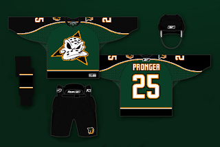
The Anaheim Ducks concept suggests workinng green back into the color scheme. I think that would be a wise move, but maybe something a little brighter would be in order. I do like the "D" logo on the chest as well. Definitely an improvement.

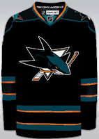
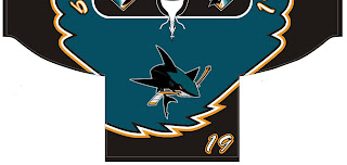
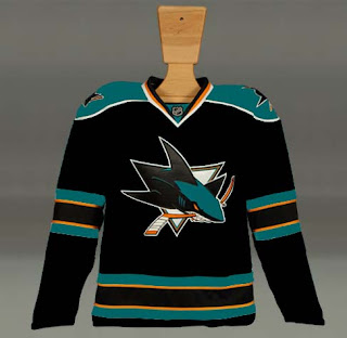
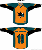
Another designer has also suggested that the Sharks try out black sweaters — be it on a full-time or part-time basis. This isn't half bad. The orange works very nice in this concept. Pretty sharp.

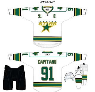
Here's a new design created for the Dallas Stars.

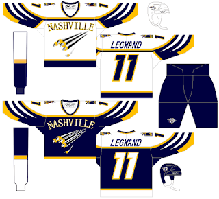
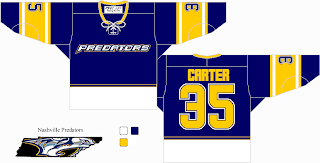
It's so weird looking. You really have to stare at it a minute. The stripes around the bottom are odd. Looks like they're going to eat me. Anyway, we'll finish things off in Tennessee with the Nashville Predators.

Also weird, but not quite enough to freak me out. I sort of hope that thing in the bottom left corner isn't meant to be a logo of any sort. That would freak me out. Anyway, not a terrible jersey, but also not one I'd be a fan of.

If you've got thoughts on any of these, feel free to leave them below.

Monday
Oct152007

Rbk EDGE Review: Sharks

Part 22 of 30. All 30 NHL clubs have unveiled new jerseys under the new Rbk EDGE Uniform System for the 2007-08 season. Here at the NHLToL, we're going to review every one of them. Read up and then rate the new sweaters. We'll do a full ranking after completing all of the reviews.

Rbk EDGE Uniform System

San Jose Sharks


New Uniforms

Old Uniforms

The Unveiling
Monday, September 17. The Sharks unveiled their jerseys almost two months after unveiling their new logo. Pictures were released via their official web site.

Home vs. Road
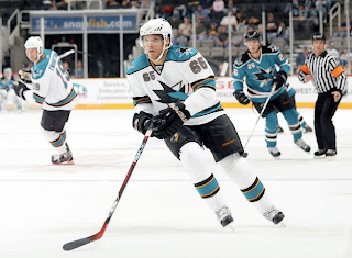
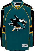
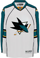
Home: Teal. Road: White. The two sweaters are essentially mirror images of each other and both feature secondary logo patches on the shoulders.

The teal home jerseys feature a black shoulder yoke with white trim. White-orange-black-orange-white stripes wrap around the elbows and waist. The collar is white, with orange-black trim inside and the primary logo serves as the crest.

The white road jerseys feature a teal shoulder yoke with black trim. Black-orange-teal-orange-black stripes wrap around the elbows and waist. The collar is black, with orange-teal trim inside and the primary logo serves as the crest.

In The Details
The shoulder patches feature a full-bodied version of the shark featured in the primary logo sans the triangle. A new, more traditional numbering and lettering style has been introduced.

New & Old
Not only was a new logo introduced, but sweeping changes were made to the uniforms. They are almost completely different from the old sweaters.

Standard FAQ
Numbers on the front? Yes.
Laces at the collar? No.

NHLToL Editorial by Chris
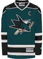
In a shocking twist, the Sharks ended up with one of the most traditional-looking sweaters of the new crop. I say that in reference to the striping and not the new-fangled sweater numbers on the front of the jersey — which I happen to like. I know, hang me now. Anyway, this isn't to say I wasn't a fan of the old jerseys. The Sharks have definitely been among the best-looking teams on the ice over the last decade, but numbers and especially names were often illegible on those sweaters. That's been rectified here. And the rust-flavored orange is a welcome splash of color to the jerseys. Quite possibly my favorite element is the use of the new shield logo on the pants. Overall, I'm impressed by the direction San Jose has gone. 4/5


Buy your new Sharks jersey!

Saturday
Oct132007

Stars, Sharks Fan Art

Some days I just love the concept art I get to post. I've got some well-designed stuff to show off today that I'm predicting will be met with an overall negative response. But that's never stopped me before, has it?

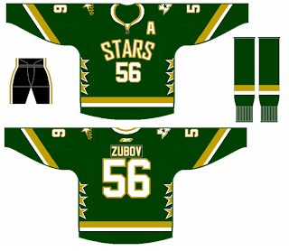
Personally, I like the Dallas Stars' new home sweaters. I know I'm among the minority on that. But here's something I would consider to be a great alternate in a year or so. I like that the shoulders have the primary and secondary logos. The Columbus Blue Jackets did that for a while prior to this season.

My favorite thing is the fact that it's a green jersey. My least favorite thing is that it has no black. I like the black. I think the jersey should be green overall, but I like the black.

And here's another idea for the road sweater. It's pretty much just an alteration to the striping, but it works well. It's not quite as boring as the current jerseys. I don't really understand the shoulder piping though. Carolina did that and I feel like it just bogs down the whole uniform.

Maybe that's just me.

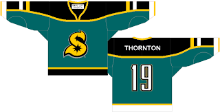
Another reader sent in this concept for the San Jose Sharks.

Before you tell me it looks like a roller hockey jersey, let me stop you. It is. He said the design was based off of his own roller hockey team's uniform. And while NHL teams tend not to wear things like this anymore, I totally could've seen it back in the late '90s alongside the Tampa Bay Lightning's storm jersey.

Oh and about that, speaking as a Bolts fan, I loved those jerseys. The regular ones were so boring. There may have been a lot going on with those blue sweaters, but at least there was something going on!

Enough about that. Feel free to leave your comments about these concepts. What are you thinking?

Friday
Oct122007

Online Petitions Seek New Unis

With so many new sweaters being unveiled this season, you just had to know that at least a few would be rejected by a large group of fans. It's inevitable. So a few online petitions have cropped up hoping to rid certain teams of their new duds.

Right now, 65 San Jose Sharks fans have signed a petition to "return to the jersey design introduced in the 1998 season along with the return of the color grey and the elimination of the color orange."

But one Edmonton Oilers fan has gone so far as to start a blog in an attempt to "revive the Oiler jersey." Certainly worth a read if you feel strongly about the craptastic nature of the new Oil sweaters. (And it takes a lot for me to use a made up word, just so you know.)

Anyway, if you've started a petition or a blog or know of one that you'd like me to post here, feel free. It should go without saying that while I don't necessarily endorse them (the Oilers site excepted), I wouldn't mind sending folks along to help your jersey-related cause.

UPDATE (10/13 7:14 AM): By the way, Oilers fans now have their own online petition, if you feel like signing it.

Friday
Oct122007

Just To Freak You Out X

It's like watching a trainwreck. It's horrible, but there's just something about it that prevents you from looking away. There's all manner of scary stuff out there and now I'm bringing some of it straight to you on another Freak Out Friday. Here goes.

I wouldn't be able to live with myself if I didn't start with this one.

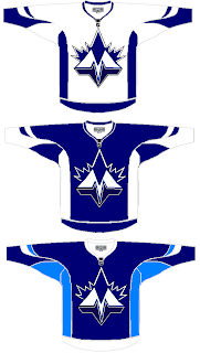
It shouldn't take you more than a second to realize the designer was trying to offer us something different for the Toronto Maple Leafs.

Leafs fans, I really want to hear from you on this one.

We've got a brand new logo with a very prominent "M" worthy of perhaps a place like Minnesota — or Montreal! And that leaf! Don't look it in the eye or it will cut you. Deep.

Even the second shade of blue worries me some. I'm not sure how I'm supposed to feel about this, but let's just say it's not great.

Anyway, I'd like to move along now because I can't take looking at this anymore. There's a point when doing this to a team like the Leafs starts to hurt.

Once again, Leafs fans, please comment.

Speaking of prominent letters in place of actual logos, I've got a pair of concepts from each coast.

Cleverly, though, we can't know exactly what these letters stand for as alliteration was employed to mask it. Is the "S" for San Jose or Sharks? And is the "B" for Boston or Bruins? Perhaps, the ultimate question is why dump perfectly good logos for these two teams in favor of members of the alphabet?

Even more disturbing is that "S" keeps reminding me of the Minnesota North Stars. Make it stop.

Each of those were delivered to me with a road sweater design to match. I wouldn't do that to you, though.

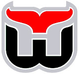
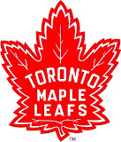
Here's what concerns me, though. I've been send a number of logos which have been converted to red and black for no apparent reason. Do any of these work?


It may be that the blood-in-the-water shark is the scariest one. I do see what's going on, though with the Hurricanes colors on the Whalers logo and the old Sabres colors on the new logo — but that doesn't make it any better.

I'm still worried about the killing to follow.

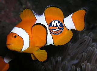
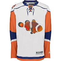
I'll wrap things up today with the thing that might frighten you the most. Did you ever get to feeling like that Rbk EDGE New York Islanders jersey reminded you of something? Perhaps you couldn't quite put your finger on it. But maybe it evoked feelings of being lost. In the ocean.

One reader thought so and sent in this.

If you wanted to know what they were thinking when designing the new Isles uniforms, now you do. Don't you wish you didn't?

So there it is. Another in the Freak Out series is behind us. I'm looking forward to next week. In the meantime, I await your crazy concept art. You can send it to me at nhllogos@gmail.com.
Tuesday
Oct092007

Caps, Sharks, Leafs Get Cool Concepts

Today I've got a post with some very cool artwork. Take a look.

Lots of folks have suggested using the Washington Capitals' secondary logo as a primary. Here's a sweater design with that in mind.

The only problem I have is the star beneath the wings. Other than that, it's the best design I've seen with the "Weagle" logo, as it's been dubbed. Even the stripes on the sleeves look awesome with that logo.

These San Jose Sharks sweaters are nice if not slightly reminiscent of the new Blues jerseys with the piping and the Islanders jerseys on the sleeves. I like the shield logo being used on the shoulders, but I think it needs to be bigger. For being a design I like, it sure sounds like I have a lot of complaints. But honestly, though, I am a fan.

Finally, I have a concept with the best Toronto Maple Leafs logo I've seen yet. It's the one on the right.

While I'm not loving the striping pattern, I really like that logo. It mixes the current leaf silhouette with the old Toronto Arenas logo. It kicks ass, to put it quite simply. Any Leafs fans out there that like that idea? Or is it just me?

And remember, if you have any concept art you'd like to see posted here or in the Concepts Gallery, feel free to send them along to nhllogos@gmail.com.
Friday
Oct052007

Reworking Some EDGE Jerseys

I've gotten some pretty decent artwork this week I feel like sharing today. We've got a handful of various Rbk EDGE jerseys that have been modified. I wouldn't necessarily categorize them as "fixes" but they're worth a look.
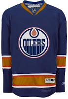
I actually like this one, but probably only because the elbow stripes go completely around the arm and don't stop inexplicably. But it could be anything.

It's a recolored Canucks jersey, obviously and the stripes aren't proportional to what the Oilers typically wear. Not that that's a bad thing entirely, but I'm not really a fan.

Otherwise, the Edmonton jersey's odd piping and lack of, well, anything visually appealing makes anything an improvement upon the present.

So it should be clear how I feel then.

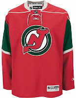
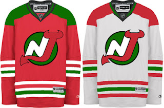
Had to laugh at this one. Imagine the Devils reintroducing the green.

And then imagine them putting it on a Minnesota Wild jersey. It's definitely one of the more interesting concepts I've posted here. But it looks horrible if we're talking about the New Jersey Devils. That does not look like them at all.

I do like Christmas though. So maybe I can find a way to use this in my favor. It needs a Santa Claus logo on the front. I wonder what that would look like.

Then some minor league team could wear it as a specialty jersey for a holiday game.

This San Jose Sharks concept is only interesting because it does away entirely with the orange in the jersey. And I have to say, I don't really like it. I think the orange is all right. It really works.

I did like the old jerseys but I like that striping pattern better for those colors than this one. This one needs brighter colors.

This design also features dark cuffs that extend down from the elbow stripes vis-a-vis the Canucks' new duds.

Finally, it's the Dallas Stars we're going to take a look at. Their whole marketing thing was "black is the new green." But what if, as some of you believe, Reebok hadn't brainwashed team management into going all black with no logo?

Might it look like this?

It might. I actually like that a lot. But as one of you humorously stated — the NHL has banned jerseys that aren't white, black, red or blue this season. (And while you could argue the Sharks aren't blue, I'd argue that they're more on the blue side than the green side. Beside the point.)

I like the new Stars' uniforms the way they are and there's nothing wrong with that. But this isn't bad either. Perhaps something to consider for a future third jersey.

So now's your turn to tell me what you like and don't like. Leave me a comment.

Sunday
Sep302007

Sharks, Here's How You Fix It

Speaking personally, I'm a fan of the San Jose Sharks' new logo and uniforms. So I don't see a need for "fixing" it necessarily. But others have complained that the modern logo design clashes with the more traditional jersey design.

One alternative to the stripes they currently wear would be something more along the lines of what the Florida Panthers do. I guess those designs match a little better. But for my money, I'd go with white piping over the orange on the home sweater.

Other complaints deal with not being able to move past orange gaining more prominence on the jerseys. Here's a solution.

I like this one because it looks like there are shark fins under wavy water on the sleeves. I think it works a little better on the white. But here's hoping the Sharks consider something of the like for a future third jersey. Speaking of the whole "fin" element, here are a bunch of ideas, seen with orange versus silver.

What I really like is the black jersey. Perhaps that would serve as a better third jersey as it has the last few years for the Sharks. But what do we think of it with the current striping pattern?

I know I said I like how the San Jose sweaters are now, but I'd be lying if I didn't say these were pretty awesome too. I guess it's hard to go wrong with the Sharks. So if they need fixing, there are plenty of ways of doing it.

Next up: Philadelphia Flyers.

Sunday
Sep302007

We Like Concept Art

Yes, we do. And concept art loves us. First off I just want to thank everyone who sends in their cool and crazy work. I love opening my email everyday to see what surprises await me.

One such surprise was this New Jersey Devils uniform concept. If I'm to understand right, the logo seen here is one of the original designs that never made the final cut.

The Christmas colors don't work. If you want to see how to make green and red work together, see the Minnesota Wild.

Here's an interesting Nashville Predators design that was actually a little too good to be considered for the Friday Freak Outs.

I say "good," but not necessarily on the level of the NHL. If not as a Preds third jersey, I could totally see something like this passing in the AHL or ECHL. I like the white swipes across the sleeves. Need to find a different font for the wordmark, though. That one doesn't work.

And then I have this San Jose Sharks concept which I think I'm only posting because the orange seems to annoy Sharks fans to no end. And I like a little ribbing now and then.

I was going to try to say this isn't that bad of a design, but it really is. The teal works too well for the Sharks. No need to go playing up the orange when you already have the best color in hockey. I would like to see more silver come back though.

They need to bring that back. Moving right along now.

This Anaheim Ducks design is a bit of a mix between concepts I've posted here in the past. While this jersey looked great with the flying duck logo, I can't honestly say it looks horrible with this one. I know it's a Disney cartoon, but they do some of the best animation work in the world, so let's not knock them there. And despite the fact that they're similar to the Dallas Stars, I think these colors would serve the Ducks well. Maybe use the logo on a third jersey, though.

That's enough out of me. What do you guys thinks of these? Are they total duds or do they have some redeeming qualities?