NHL Tournament of Logos

Tuesday
Jun102008

Western Identities

Concept art! We're sticking to the western conference for this one.

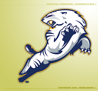
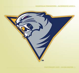
The same designer who created this logo for the New Jersey Devils has a few ideas for the Nashville Predators.

That's just cool.

And I have nothing bad to say about this one either. I love getting work from talented artists. Just makes the mind wander.

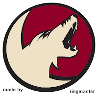
Next up is an idea for a hybrid Phoenix Coyotes logo.

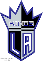
Hadn't considered that before. Also a Los Angeles Kings concept.

Resist the urge to start in with the comments about Sacramento of the NBA. We know.

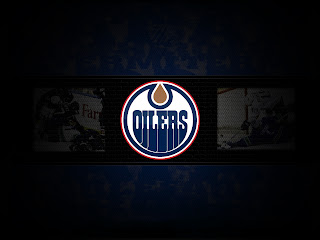
Lastly, I thought we'd finish up with another wallpaper. Tomorrow will be the big day though — the official start of Wallpaper Wednesdays. You guys liked the Boston Bruins wallpaper so much, the designer's made one for the Oilers as well.

This might also be a good time to drop a hint that the new Icethetics name will be taking over very soon.

Monday
Jun092008

Poll: Luongo vs Turco


vs
Roberto
LUONGO
Marty
TURCO


At last. We're down to the final two masks and somebody's walking away with bragging rights. I decided to wait to post this championship poll because the majority of you guys drop by on Monday night. I figured I'd take advantage of the blog's biggest night of the week.

You'll also notice this poll is open one more day than usual. Get everybody you know to come and vote. It's Luongo or Turco. You decide! Place your vote and then feel free to leave a comment about how you came to your decision. Tell all your friends to drop in and vote! The more voices heard, the more accurate the results!

Poll opening date
Mon Jun 9
Poll closing date
Sat Jun 14

Monday
Jun092008

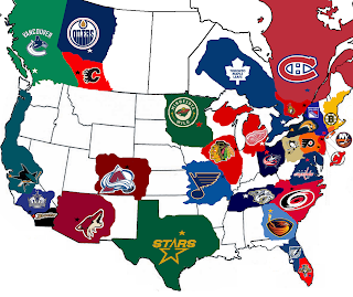
NHL Fan Base Map

I always like getting interesting emails from readers and I got yet another one today. This guy created an NHL "fan base map" to, I suppose, indicate where the followers of each club are geographically located.

It's different and I thought it was kind of cool.

The map doesn't indicate percentage comparisons in numbers of fans or anything like that, but rather it suggests that the majority of NHL fans in the colored areas might be fans of those teams. I just thought it was something funny and worth sharing.

Don't forget to vote on the final poll of the NHL Tournament of Goalie Masks this week! Luongo vs. Turco!

Sunday
Jun082008

The Blackhawks Saga

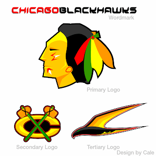
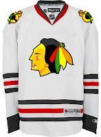
If you've been reading my blog for any length of time, you're more than well aware of my aversion to the logo and uniforms of the Chicago Blackhawks. Now it's not that I just dislike them, it's that they're consistently billed as being the best logo/uniform combination in the NHL.

Yet no one has ever supplied a good reason!

I like their uniform design just find but I think their logo is old-fashioned — and not in the good way like the Canadiens. Even the Bruins had the sense to keep their look updated without kissing tradition goodbye.

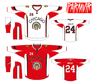
To that end, I got an email this past week with a great logo set I can't help but feel is an improvement.

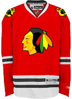
There are also jerseys — same design, just with the new logos.

Feel free to tell me I'm wrong and that the 'Hawks should change nothing, but know that I've heard it all before. And if you're among those who believe Chicago has the best look in the league, allow me to challenge you to explain. My position is that they are solid. They're not horrible, but how are they the best?

By the way, when redesigning the look of one of the league's oldest and most storied franchises, here's something to avoid.

Get ready. Monday's coming.

Saturday
Jun072008

Introducing Some Wallpapers

I've been inundated with wallpapers since announcing the new series. So I'm going to show off a couple of them as we lead up to next Wednesday.

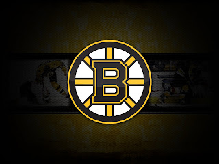
This Bruins design is simple and strictly logo-based.

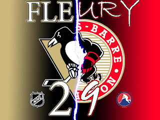
Then there's this one based on Marc-Andre Fleury but with a twist.

So keep them coming and hopefully I'll be able to make a regular weekly feature out of it.

Thursday
Jun052008

Taking The Day Off

Hi all! Today is my birthday and as such I'm taking the day off to relax. Not to worry, though, I'll have more stuff for you tomorrow. (Or you can go vote on the new poll at ToHL.)

By the way, I have been reading your comments and I understand you'd like to do a bit of a lead up to Wallpaper Wednesday. I have no problem with that. I'll post some stuff tomorrow. In the meantime, I have birthday pie waiting for me. Key lime.

Wednesday
Jun042008

Wallpaper Wednesdays

A reader recently emailed me with what I thought would be a really cool idea. This blog is all about showcasing hockey artwork so here's one more way to further that. I'm going to start posting desktop wallpaper artwork designed by you guys. Right now, it's just an idea I'm tossing around, but if it goes well, perhaps some contests are in our future.

Preferably, I'd like to start with logo-based designs. Maybe even goalie mask-based. Or whatever. Get creative and just go nuts. The sky's the limit. I'll post the ones I like. And the rest may be consigned to the Concepts Gallery.

I can't wait to see what you guys come up with. So get started on designing your hockey wallpapers and send them my way. Email me at nhllogos@gmail.com.

And just so you know, I had planned to put together a few examples to post today, but I seriously misjudged my schedule and a project I'm working on currently. Hopefully I'll have time soon.

Thanks to Dawson for the suggestion!

Tuesday
Jun032008

Concept Art Variety Show

All right, this is new for me but I'm going themeless today. There's no underlying theme that ties all of these designs together. They're simply the ones I chose to post today.

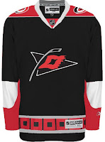
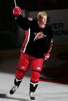
First up are the Carolina Hurricanes.

Here we have a couple of different designs. They have their similarities but overall are nothing like each other. I like the one with the red shoulders better.

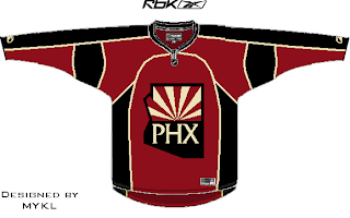
Also a pretty sharp Phoenix Coyotes concept was recently submitted.

Consider me a fan. I've been starting to see that is it possible to use the PHX logo on the front of the jersey. Didn't think it would look good at first.

That looks cool too. I especially like the non-traditional sand color for the sweater.

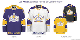
Finally, we're going all retro on you with these Los Angeles Kings jersey designs.

The yellow one makes me laugh and laugh. But shockingly, none of them suck. Maybe even the Kings have a potentially good alternate in their future.

Time will tell. Hope you enjoyed today's crop. Keep sending in your work and I'll keep posting it.

Monday
Jun022008

Polls Now Open For QMJHL

Just wanted to remind everybody that if you haven't yet, you can make your way over to ToHL and take part in the QMJHL Tournament of Logos which officially began today.

The Foreurs and Huskies are the first to square off. You can see the first round schedule over there as well. Happy voting!

Monday
Jun022008

Reworking Logos

It's time once again for some concept art. Today we're looking at reworking various team logos. Some with good results, others not so much.

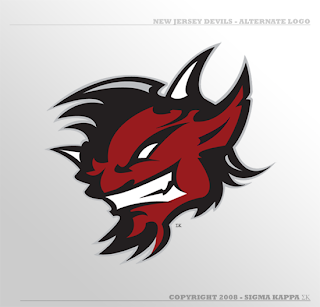
We'll start with an alternate logo concept for the New Jersey Devils. It bares some similarity to an idea created by Matt for his Rebranding the NHL series. Only this one is graphically simpler.

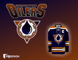
So that's pretty cool. We've also got an Edmonton Oilers logo here.

Nice, effective, but a complete disregard for the team's logo history and not modern enough to warrant it (like the gear logo on the old third jersey).

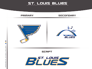
Got something new for the Blues as well.

Interesting turning the note into a hockey stick but the secondary is just to intricate to form a great logo. Nice idea, though.

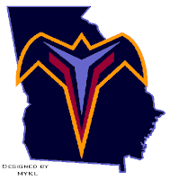
That's a simple concept but one that need never see the light of day. I think to some extent, incorporating the state or provincial outline works but not in every instance.

We'll finish things off with some new looks for the two teams currently battling for Lord Stanley's Cup. By the way, is it just me, or does it seem like they're dragging this series out with all the days off in between games?

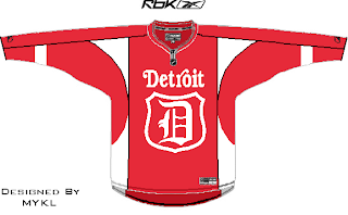
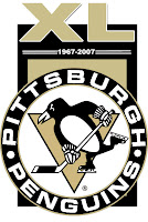
A simple flash to the past there. And with the Penguins celebrating 40 years in the NHL, one reader submitted a unique commemorative logo paying heed to the club's history.

Overall, a decent, if not above average, batch of concept art for you today. By the way, I've got a new series I'm kicking off on Wednesday. Tune in then to see what that's all about. (Just remember, I like alliteration.)