NEW SPECIALTY LOGOS
The Icethetics Season Preview begins today. All week, I'll do my best to get you caught up with what's new in the world of hockey as it pertains to the right side of your brain.
I consider specialty logos to be those that get sort of a one-time use — commemorative, tribute logos; anniversary logos and the like. And obviously there's no better place to start for the 2008-09 season than the Montreal Canadiens.
The Habs are launching a 100th birthday celebration that will span two seasons. For the event, they've created two logos.


The logo on the left can be seen on the right shoulder of Canadiens' home and road jerseys this season as well as doing double duty on the ice in the Bell Centre (more on that tomorrow). The one on the right will be featured on the the right shoulder of jerseys worn on Centennial Jersey Night — which brings us to our next logos.
On the eight Centennial Jersey Nights throughout the season, the team will don four different retro style sweaters, twice each. These jerseys will also feature the logo from that era.


The logo on the left is from the 1912-13 season. On the right is the 1915-16 logo. The Canadiens will also have throwbacks from 1945 and 1970, seen below.


The 1970 logo, right, is no different from the team's current logo — which is a cleaner version of the 1945 design, left.
The Habs aren't the only NHL club with a special anniversary this season. The Edmonton Oilers are celebrating 30 years — despite having been in existence for 37.
 The Oilers were one of four teams that joined the NHL when the WHA folded in 1979.
Interestingly, all four were formed in 1972 but only the Oilers remain in their original city. The New England Whalers have become the Hurricanes (who celebrated 10 years last season), the Quebec Nordiques are now the Avalanche and the Winnipeg Jets are now the Coyotes. None of those three franchises are doing anything to mark their 30th year in the NHL.
Having said that, no other NHL teams are introducing anniversary logos this season. But for the record, this year is the 10th anniversary of the Atlanta Thrashers.
 That brings us to the AHL. The Wilkes-Barre/Scranton Penguins have introduced a simple logo for their 10th anniversary. It features their skating penguin over a gold X with the years 1999 and 2009.
Oddly enough, this franchise has existed since 1981 when it joined the AHL as the Fredericton Express. In 1988, they became the Halifax Citadels and then the Cornwall Aces in 1993. But operations were shut down in 1996. The Pittsburgh Penguins resurrected the organization and moved it to Wilkes-Barre in 1999 — which is the year they count as their first.
 The Norfolk Admirals are celebrating 20 years. This is interesting because for the first 11 years of its existence, the team played as the Hampton Roads Admirals of the ECHL. They were admitted into the AHL as an expansion franchise in 2000.
The anniversary mark incorporates a major element of the Hampton Roads logo — the large yellow ship anchor — yet stays true to the Norfolk logo and the addition of blue to their color scheme after becoming an affiliate of the Tampa Bay Lightning.
Speaking of the ECHL, a couple of teams are turning 15 — last year, technically. The Charlotte Checkers and South Carolina Stingrays joined the ECHL in 1993 and so started their 15th anniversary celebrations last year.


On the left is the Checkers' logo — introduced last year — and the Stingrays logo on the right, which is new for this year (I believe). Both logos come with a completely new branding for the teams. We'll get a look at their new logos on Wednesday.
 Back on the NHL side, the Columbus Blue Jackets are honoring their late founder and owner John H. McConnell who died in April.
It's a sharp logo bearing his initials, a silver star and red stripes. The logo will be used as a patch on the team's jerseys this season.
There's more information on the Blue Jackets' official web site.
We can't forget about those all-star game logos. Along with their centennial celebrations, the Montreal Canadiens will host the 2009 NHL All-Star Game. English and French versions of the logo have been released.


It's a cool design that tries to play off one of the 100th anniversary logo (see above). It also features the Habs' famous CH logo in full — a rarity among all-star logos since 1993, which typically feature only small elements of the host team's crest.
We can't leave out the minor leagues. The AHL's All-Star Classic will be hosted this year by the Worcester Sharks and the Reading Royals will host the ECHL's All-Star Game for the second time in four years.


And that about does it except for one thing — a special logo for a special event.
 The Winter Classic will be held at Wrigley Field this season and feature the Chicago Blackhawks and Detroit Red Wings. The logo, left, works in the famous sign at the old ballpark.
For the game, the teams will don classic vintage sweaters — the Hawks in black and the Wings in white. I'll share pictures as soon as they surface.
Almost forgot a couple. Just like last year, the NHL is premiering its season in Europe.


On the left is NHL Premiere Prague featuring the Tampa Bay Lightning and New York Rangers. On the right is the Bridgestone-sponsored NHL Premiere Stockholm featuring the Pittsburgh Penguins and Ottawa Senators.
Now, I'm only human, so if you think I missed anything, shoot me an email and I'll be sure to add it. Otherwise, that wraps things up for the first day of the Icethetics Season Preview. See you back here for more tomorrow.


 10 Comments
 They beat me to the punch. On their official web site, the Montreal Canadiens are holding a poll, asking you to vote for your favorite of the six newly unveiled Centennial Jerseys.
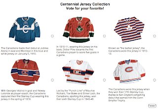
 There's no better team to start with for this topic than the Buffalo Sabres. I know a number of tradition-loving fans are thrilled at the prospect of the team's original logo making its' return — even if it is on a part-time basis.
  Speaking of the St. Louis Blues, they've also unveiled a new logo to go on their new third jersey. The main feature is the use of the Gateway Arch imagery but it's also got the classic circle style — similar to what the Wild did when they introduced their first and only third jersey in 2003.
 Technically, the Carolina Hurricanes also have something new on their new third jersey. This dark version of their primary logo can be found on the shoulders. It's nothing spectacular, but it sure is a nice touch. And I assure you it looks much better in context, on the black jersey.
 We'll begin with the Los Angeles Kings, who will be unveiling a new third jersey next month. The logo seen here fits the description for what we've heard about this particular sweater. It was discovered on a governmental trademark web site. And while those web sites generally tend to use only black and white images, it's believed this logo as well as the jersey will be black and white — and maybe silver.


 As of yesterday, we now know all of the


 As I mentioned in tonight's
  We already know the Oilers will follow with their unveiling a day later. Tonight's news is that the Atlanta Thrashers will follow Edmonton on Wednesday.