Icethetics

via Blogger

Sunday
Sep282008

Brief IceHL Update

Believe it or not we're now seven weeks into the process of creating our fictional hockey league — the IceHL. Just wanted to keep everyone up to date on where we are. The name nominations are now complete and we're starting the name ratings for our third division. You'll find links in the pollbar, off to the left, to rate the names available for the North Division. Next week will be the Northeast.

Logo submissions have started to trickle in since the final names were announced for the Pacific Division last week. Remember, the deadline is still two weeks away but I thought I'd point out that the only team I haven't received a single submission for is the Portland Pioneers. So if you're still contemplating which team to design for, that would be a good one.

Submissions begin this week for Central Division logos with the final names having been revealed yesterday. For each division, you'll have three weeks to get your logos created and sent in.

As always, any questions will be answered by email.

Sunday
Sep282008

Flames Developing Third Jersey

According to an article in today's Calgary Sun, the Calgary Flames will sport a third jersey for the 2009-10 season. They're keeping the design under wraps until next fall.

Sun writer Steve MacFarlane spoke with Flames president Ken King about the new sweaters.

Excited, maybe even a little nervous, you'd think it would be tough for Ken King to keep the new design under wraps for an entire year.

After speaking with the Calgary Flames president about a third jersey the team is going to launch next fall, there's little doubt King will be able to keep the secret.

Four franchises have unveiled new alternates, with another 14 rumoured to be doing the same in the near future. King confessed the Flames are in the final stages of putting theirs together, but was tight-lipped about the new look.

"It's pretty much complete," said King. "We're working on one aspect of one shoulder patch that we're figuring out a little bit, but the rest is complete. It's 95% complete."

So the Flames will join the Minnesota Wild who are also rumored to be planning a third jersey for their 10th anniversary next season.

I hate to copy so much from a single article, but this is a good one filled with lots of new information. MacFarlane went into a little more of an explanation about what to expect from the new design. Sounds interesting.

Hazarding a guess after grilling a few people who have peeked at the new threads and trying to read between the lines of a 10-minute talk with King, the Flames sound like they're putting together something of a departure from their Flaming C design that has become a best-seller.

Not quite an out-of-nowhere fire-breathing horse head — the last crest to adorn an alternate jersey in Calgary — but definitely a new twist.

"It's a different look," said King. "We like to think we've got a reasonable feel for our audience. You look at what other people do. You do look at what the trends are. You look at what you're working from and then what you do is try and come up with something that isn't a compromise.

"You also have to have some courage."

They could make a return to a black base like the horse head sat on, or put the new logo on a classic look similar to one from their past.

"We took a lot of colours into consideration," said King, apologizing for being unable to reveal more. "We looked at black and we looked at red and we looked at variations of them, and I think we settled on something that will work."

Confident as he is the public will approve, King says the venture is always a little scary.

"I'm pretty comfortable, pretty confident people will appreciate it."

I like the idea of third jersey introducing third logos. The idea is that it's something different for the fans to look at on a given night. The Bruins didn't seem to understand this notion at all.

I'll start keeping a list of rumored third jerseys for 2009 once we get them all unveiled for this season. And for whatever it's worth, I'll level my guesses for next year's crop of thirds. Aside from the Wild and Flames, I'd bet on the Avalanche, Predators, Rangers and Capitals.

Saturday
Sep272008

IceHL Central: Final Names

The final names for the IceHL's Central Division are in! Hundreds of you made your voice heard by rating the finalists for each franchise. So here are the winners.


  • Chicago HITMEN
    average rating 3.53/5 by 403 people

  • Detroit MOTORHEADS
    average rating 2.88/5 by 328 people

  • Milwaukee LAGERS
    average rating 2.92/5 by 312 people

  • Minnesota MAMMOTHS
    average rating 3.53/5 by 327 people

  • St. Louis ARCHERS
    average rating 3.85/5 by 376 people

Based on these names, your task — should you choose to accept it — is to brand the franchise. You choose the color scheme and design primary, secondary and script logos around that. Additional logos may or may not be included in the voting process.

Submit your logo art by email to me at icethetics@gmail.com. Do not post links to artwork in the comments. They will be deleted and not considered for use in this project. I'm also outlining guidelines for submissions below. I'm taking them a little more seriously than I did for the IHA. If you don't follow them, your work will probably not be included.

Central logo submission deadline: October 18

If you want your submission included, follow these instructions:

  • DO NOT STEAL ARTWORK. Logos copied or adapted from professional trademarked logos will not be permitted.

  • Submit three (3) logos: primary, secondary and script. Use a white background. If your logo requires a white outline (think Lightning or Capitals), then use a gray background with the white outline included. ALL 3 LOGOS will be used in the voting process. If you leave out one, your work may be disqualified.

  • Submit vector art if possible. I will accept .ai, .psd and .pdf files. If you cannot submit vector art, you must be able to provide high quality images in .jpg or .png files ONLY. All other file types may be disqualified.

  • You must include your credit within the graphic itself as well as the email. This can be your real name or a pseudonym. I need them in both places so I can easily search my email to find your artwork and email address. Failure to do so may result in disqualification.

  • By submitting your own original artwork to any Icethetics email address, you agree to grant permission of its use for online or print publication by Icethetics. Do not watermark your logos or they will be disqualified.

  • No jersey concepts, please. That will be a later step in this process.

I tried to be specific here but I'm happy to answer any additional questions you may have via email. I was very clear about this but keep in mind that if you do not properly follow the instructions above, your work will likely be disqualified. So read them carefully.

Just so everyone is aware, when it comes time to choose a logo for each team, the process will work basically the same as the name ratings. Logo rating pages will be posted for each team and up to 20 logo submissions will be available to rate. I'm sorry I can't include more but this assures that all worthy submissions will get a fair shake.

The difference here is that once the rating period has ended, there will be a vote on Icethetics of the top 3 rated logos for each team. This assures that we choose the logo everyone wants.

Start submitting your logos!

Friday
Sep262008

Face Time With Sabres' Artist

Charlie from Sabres Not Slugs pointed me to a cool new video from the Buffalo-based Artvoice. Buffalo Sabres creative services director Frank Cravotta is interviewed and talks about designing the third jersey and a new line of Sabres clothing that will be available soon.

You can watch the video right here on Icethetics.

He's done some awesome work there. I look forward to seeing what else that team comes up with. Any thoughts?

Friday
Sep262008

Fans Get Creative

I've been trying to get some concept art posted a little more frequently. So since we're lacking any real news today, I can offer you these concept designs created by some of your fellow readers.

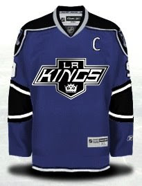
We'll start with the Kings and some ideas for their new third jersey.

And here's a series of various Kings logos from history in black and silver on a black sweater.

They don't all work, obviously. So let's get some color back in here.

I could really get behind a jersey like that.

Got a couple of concept logos to share as well. We'll start with the Blackhawks.

You already know I'm not a fan of their Indian head logo, but you can also be assured that I don't think this is the right direction. Very clean design though.

This would only work for the Islanders if the Rangers didn't exist. But this Big Apple imagery won't fly for the team on Long Island. Still, it's another excellent logo.

And we'll finish where we started — colorless.

These are some all-star game jersey ideas. Not bad, but very plain.

Thursday
Sep252008

The Slow News Day

Seriously, nothing seems to be going on today. Yesterday I had five posts. Seven on Sunday. Today, I'm barely going to get this one to count for Thursday. Anyway, it was a nice break and it gave me some time to start putting together next week's Icethetics Season Preview.

Anyway, just so you guys aren't left with nothing tonight, I'll respond to a few of the emails I've been getting pretty frequently these days.

No, the Detroit Red Wings are not changing the nameplate lettering on their jerseys. This is something we seem to go through every year around this time.
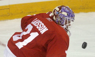
During the regular season and playoffs, each player has a custom made arched nameplate on his back. Obviously, something of that nature requires considerable time and effort — something wasted on the dozens of guys who are only trying out in the preseason and won't actually make the team. So a simpler lettering process is put to use.

That's a sample of what they're using for the preseason. Everything will be back to normal once the regular season begins. Count on it.

...

Back in July, I wrote up a bit after the draft about the Ducks enlarging the wordmark on the front of the jerseys. There appears to be new evidence of that in photos of preseason action.

It's a step in the right direction, Anaheim. Now if you just drop the UCKS, you'll have a happy camper over here.

...

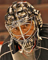
The Ottawa Sun, who I was recently mean to has pictures of Darth— pardon, Martin Gerber's new helmet.

Gerber made waves last season by wearing an unpainted black goalie helmet. It earned him the nickname Darth. Apparently he liked it because he's had his new helmet painted like Darth Vader.

During the Goalie Mask Tournament at NHLToL several months ago, he was unsurprisingly defeated in the first round, garnering only 25% of the vote against Mathieu Garon.

That's all I've got for tonight. Hopefully there's more going on tomorrow. If nothing else, I'll at least have some concept art for your viewing pleasure.

Wednesday
Sep242008

Oilers Set Third Jersey Unveiling

The Edmonton Oilers announced tonight during a game webcast that they will officially unveil their new third jersey for the 2008-09 season on October 7.
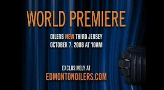
A couple of readers sent in screenshots of the announcement.

Rumors have indicated the Oil will be one of a handful of clubs reverting to vintage alternate sweaters. They've always managed top-notch third jerseys and I expect nothing less this time. According to information I've received, they'll debut the jersey in a game five days later on October 12 against the Avalanche.

The unveiling is scheduled for 10 AM local time on that day — that's noon here in the east for me. I'll probably hold another Live Chat for that.

Thanks to everybody who sent in emails. Let the countdown begin!

Wednesday
Sep242008

Habs Announce Plans For Centennial

The Montreal Canadiens have announced their plans for their 100th anniversary season. They also unveiled a collection of vintage sweaters which will be worn throughout the season along with the jersey for the NHL All-Star Game which will take place in Montreal in January.
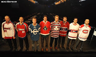
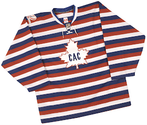
Four separate vintage sweaters will be used this season. Two will be introduced in the 2009-10 season. An image posted on their official web site shows the new duds.

According to the team, there will be eight Centennial Jersey Nights throughout the season where the Habs will don retro sweaters — two games for each jersey. Before I detail the schedule, I'll tell you about the four jerseys.

1912-13

1915-16

1945-46

1970-71

Interestingly, the jersey they seem to be indicating as the 1970 vintage style is actually just what they wear on the road currently. However, all of the Centennial Jersey Nights take place in Montreal.

The first one is October 4 against the Panthers when they'll wear the 1970 jersey. On November 15 against the Flyers, they'll wear 1945. They'll don the 1915 sweaters on December 4 against the Rangers. And on February 1 they'll wear the 1912 jerseys against the Bruins.

Those jerseys are repeated in the same order for the last four Centennial Jersey Nights on February 21 against the Senators, March 14 when they face the Devils, a week later against the Maple Leafs, and on March 31 when they face the Blackhawks.

As I said, two more jerseys will be introduced for next year from 1909 and 1910. You can see them below. Oddly, they each have 08 on the sleeves but they aren't indicated for use until fall of 2009.

It's going to be a big year for the Habs. I look forward to seeing them in all of these vintage jerseys.

Wednesday
Sep242008

Sabres Repaint Center Ice

According to our friends over at Sabres Not Slugs, the Buffalo Sabres are going retro with the paint job on center ice at HSBC Arena.

Charlie has pictures posted of the rink.


credit: Charlie @ Sabres Not Slugs

This news isn't too surprising. A lot of you noticed that the center ice circle was empty at Puck Drop 2008. Obviously, having this logo painted there at that point would've given away the secret that the team was going with the vintage look this year with their third jersey.

Wednesday
Sep242008

NHL.com Gets A Makeover

I'm sure the second site you visit every day is NHL.com — first being Icethetics, of course. Well if you haven't already heard, the NHL's official web site is getting a facelift and the beta version of it is now online.

It features a beautiful new sleek look and feel. I'm going to be spending a lot of time on it looking around today.

They've even introduced new logo graphics which even have me a little impressed.

You can get a complete look at them on the Standings page.

I wonder if this look will be made available to the individual teams for web site revamps. Certainly would help. The template handed down by the league last year was— is pitiful.

I want to know what you guys think, but first, call me crazy or a little full of myself, but don't some of the design elements of the new site remind you a little of Icethetics? The glassy look to the logo graphics — a staple of the old NHLToL... even the small area behind the NHL logo with the diagonal lines.

I'm probably just seeing what I want to see, but it's kind of interesting to me because the look of it is right up my alley. Comment away!