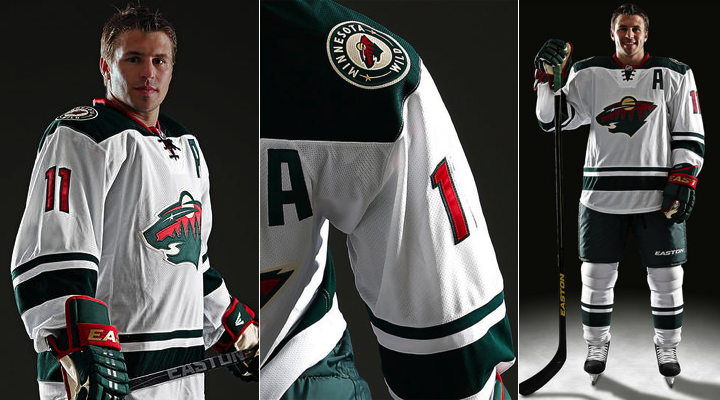
 Photo courtesy of Minnesota Wild
Minnesota got this right in many ways
Of all the NHL teams to launch new jerseys this summer, the Minnesota Wild might be the very model by which to judge how this sort of thing should work. A week's worth of build-up, presented by way of a series of unique and varied teaser photos, culminated in a fan event and online reveal for those who couldn't be there in person. And most critically, they produced a design that not only fits well into their existing look but that has been universally praised.
Knowing all this, I was thrilled to get the chance to talk with the Wild's manager of web and creative services, Matt Minnichsoffer. His answers to some of my questions give us a peek behind the curtain at the process of creating the team's newest sweater.
How did it all start?
The first thing I wanted to know — what motivated the redesign of only the road jersey?
 Photos from Minnesota Wild
Here's what Matt told me:
Our two home jerseys have a common theme. Both of them are nostalgic, throwback designs. The red home jersey started out as an alternate, then became the permanent home sweater. [When] the alternate green jersey came into existence, [it] was a big hit.
Then there was the road jersey, the only remaining link to the original Wild game jerseys. It was cool with the custom number font, but it really did not fit the brand of the Wild anymore, so it was time for a change.
 Photos from Minnesota Wild
As an organization we feel established with both of our home sweaters. They have common elements, that make them feel "Minnesota." The roads had just come to the end of their run and we wanted a jersey that was unique, but fit better with the two home sweaters.
The steps the Wild took in 2003 and 2009 with the alternate uniforms Matt mentioned definitely put the organization on a different path with regard to its visual identity. When the team was established in 2000, it had a hip and modern feel. The whole retro trend wasn't quite in vogue yet.
But Minnesota hockey has deep roots and a great heritage. It was only a matter of time before its' NHL uniforms started to reflect that. Today, I think we're at a point where that transformation is complete. But getting here didn't happen overnight.
 Photos courtesy of Minnesota Wild
What's the process of creating a new jersey?
I asked Matt whether the design process was simple and straightforward or long and drawn out. He had quite a lot to say on that subject.
The process takes 18 months with the NHL. First you declare you want to make a change to your team's jersey. Then the NHL has a number of options for the team. They are really involved, and very helpful.
In the past we have used outside partners to aid in the design process, but this time we worked directly with the NHL and Reebok. We felt since Reebok constructs the jerseys, they have a handle on the latest and greatest innovations in jersey design. And they did a great job.
There is a firm timeline that each team must hit in order for the jersey to make it into production on time. If the organization can't make the decisions necessary to select a jersey in that timeline, you start over.
The process begins with a group call to discuss initial design ideas. We had two major prerequisites: 1) the primary Wild logo had to stay, 2) we wanted to maintain the red collar [triangle], consistent with our two other jerseys.
From there it was a blank canvas. Reebok came back to us with some great designs. They looked into Minnesota hockey heritage and used that to deliver four unique designs. Then the modification process begins.
Once we narrowed in on a design, Reebok moved into prototype mode. These prototypes were then camera tested, both for still photos and TV. If you can't read the numbers from the press box, that's not a strong jersey design. Also, if any colors vibrate, or look undesirable on TV, you have to pull the plug.
Once we made it through this step, it was time for focus groups (i.e., the Season Ticket Holders). We had 3-4 opportunities to engage Season Ticket Holders in the development of the new jersey. At each opportunity we'd ask them to give feedback. This is vital to the acceptance of the new jersey. Even though it's a road sweater, it has significant impact on the brand and psyche of the team.
I was also curious whether this design was something they had in mind the whole time or if there were other options that just missed the cut.
We actually had two additional prototypes created by Reebok. They were very close to the actual jersey we ended up going into production with. However, due to fan feedback, camera tests, and logistical issues, they did not make it to the final round. Let's just say that the vintage wheat color was seriously considered.
There were four initial designs. Each of the four were pretty different from each other. They were all pretty cool, [but] some felt more "Wild" than others. We narrowed it from there and Reebok came back with a second round that was pretty close to the final product. I think we only had one minor tweak. From there we requested three prototypes for the camera tests and focus groups.
[But] I think we'll keep the original designs for "Eyes Only" at Wild HQ.
Well I tried, right? Still, interesting to hear the white jersey almost wasn't white. #WheatHot?
 Original photo courtesy of Minnesota Wild | Edited by Icethetics
How was the new sweater designed?
We've heard from other teams in the past about who had the most influence over a new design. For the Stars, it was the owner, who wanted a color to "own." For the Sharks, it was about player comfort. So I wanted to know who the driving force was for the Wild.
Obviously, we count on fan feedback as a litmus test on how well the jersey will be accepted and how well it will sell. Home jerseys sell best, but we still wanted a [road] jersey that fans would be proud to wear.
Team management and hockey operations also were shown the new designs and their feedback was put into the mix. The first players to see the jersey were Zach Parise and Josh Harding when we did the photo shoot. They both really liked the look.
 Photo courtesy of Minnesota WildThe next logical question was, who came up with the design? Reebok or the Wild's own staff? And what was the inspiration? Matt explained:
My internal creative team worked up some designs and sent them to Reebok as a starting point. Then we had a kick-off conference call with the Reebok design team and the NHL.
We really only had two or three constraints on the design. No new logos. The primary mark should stay on the front. And we'd like to keep the red collar insert with laces [found] on our other two jerseys.
Reebok did some good historical research on Minnesota teams to pull some elements for the initial designs. There were a lot of stripes. Some pretty cool stuff we hadn't thought of internally. But simple is best.
"Keep it clean" was the direction we aimed them after the initial concepts.
The words that immediately came to mind when I saw the final design: clean, tasteful and classic. So if I'm any kind of barometer, I'd say they achieved their goal.
The key feature of this jersey that makes it stand out above the club's existing uniforms is the squared-off shoulder yoke. But I was more intrigued by the fact that the Hurricanes just introduced something similar on their new road sweater earlier this summer.
Reebok came up with that on their own. They have created some new collar/shoulder cuts, and this one was pretty unique, so we went with it. The red accent around the collar itself also came from Reebok.
Knew Reebok had to fit in somewhere. Now it's clear. And maybe Reebok has some fresh blood on their design team because this is a neat feature with a nice retro feel. The Stars were also apparently on the receiving end of one of these new "shoulder cuts" with their new road sweater, if you recall.
Any future changes planned?
My last question for Matt was one I've seen a lot from readers in the comments and on Twitter. Are there any plans to change either the home or alternate jersey in the future?
Not that I know of. We now have a grouping of jerseys that fit well together as a family. I think were good for a while.
I think so too. I have to give an enormous thanks to Matt Minnichsoffer for taking the time to answer these questions and to give us a little insight into the process.
If you have any other questions about the jersey, let me know and I may pass them on.
By the way, the reason that last question is being asked has to do with the traditionalist view that home and road jerseys should match — basically, be reversed versions of each other. That was addressed in the team's press release on Sunday.
“It was important for our organization to maintain the primary Wild mark on the new road sweater,” said Vice President of Brand Marketing, John Maher. “We feel the theme of the white jersey fits well into our family of jerseys and wanted this sweater to have a unique look instead of being a reverse of our existing red and green jerseys.”
So they wanted it to be different. Thus, there's no reason for them to alter the home sweater.
New sweater to debut during pre-season
Also in the press release was a debut date. The new white jersey will hit the ice in less than three weeks when the Wild go on the road to play the Jets on Sept. 19 during the pre-season.
Now, I'll leave you with some photos from the Wild's jersey unveiling at the Minnesota State Fair on Sunday morning courtesy of Dean Thibodeau.
 Photos courtesy of Dean Thibodeau
 Wednesday · Sep 4 · 2013 | 10:07 AM PDT
  122 Comments
  Photo from Steve Ott (via Twitter)
 It started early this morning when the Sabres seemed to be releasing their latest teaser.
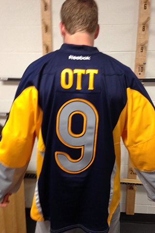 Photo from Steve Ott (via Twitter)I know Reebok's prototype process can be slow, but the season starts in a month and they only have two jerseys on hand? Come on.
 Chris
Chris
 Screen shot of Sabres' official website


