Wednesday
Feb162011

If the Wild Weren't the Wild...

If there's one thing apart from new uniforms and logos that gets Icethetics readers excited, it's what was left on the table. We love concept art, especially when it's in the form of professional designs once considered by NHL teams. We've actually had a chance to see a lot of that recently with the Lightning, Kings, Blue Jackets, DucksPanthers, and even the Coyotes way back in 2008.

Now the team we know today as the Minnesota Wild has revealed what might've been in a new image gallery posted on their website.

Did you know that among the names considered early on were the Blue Ox, Freeze, Northern Lights, White Bears and Voyageurs? You may have. Those names have been floating around for a while, so now as they celebrate their 10th anniversary season, the Wild have hooked up with Minneapolis creative firm called The Shinebox to give us a visual representation of how the club might have otherwise looked.

Note: The following artwork doesn't truly fit in with the other teams discussed at the beginning of this post. Those were actual concepts the team considered once they had their name selected. In this case, the Wild turned to SME Branding to create their bear head logo only after a name was settled on.

Minnesota Blue Ox / The Shinebox

Minnesota Northern Lights / The Shinebox

Minnesota Voyageurs / The Shinebox

Minnesota Freeze / The Shinebox

Minnesota White Bears / The Shinebox

All rather interesting concepts, but none beats the Wild. And just like the logo, even the name Minnesota Wild is one of the best in the NHL. (Second only to, say... the Tampa Bay Lightning?) It's kind of interesting to see some personality added to the names that were considered for the team.

The Wild name was revealed to the public on Jan. 22, 1998 and the logo still in use today was unveiled Nov. 18, 1999. I highly recommend reading the article on the Wild's website as it talks a bit about the process of choosing the name and the trepidation the higher-ups felt upon its unveiling.

Sunday
Feb132011

Uncertainty in Nashville and Tampa

The "limited edition" jersey / Nashville PredatorsDon't bet on this jersey. (Pun.)

The Nashville Predators hosted the GnashVegas Casino Gala and Auction on Thursday night. It's one of those events teams put on to let rich fans rub elbows with players in a casual setting. And it's only noteworthy here because of what the players showed up wearing.

The jerseys they sported for the event, fully customized with their surnames and numbers (even on the sleeves), are nothing they've ever worn on the ice. Nor will they.

Last month just prior to the inaugural edition of NHL JerseyWatch 2011, we got our first look at what might've been the Preds' new road sweater next season. Only there were many indications that it wouldn't be.

GnashVegas Casino Gala / Nashville PredatorsRumors had circulated for some time that the Predators wanted to simplify their color palette and exile their present home and road uniforms in favor of their current alternate along with a white version of it.

Said white version showed on a silent auction table during a game recently. It fanned the flames, feeding rumors about jersey changes. As did the fact that every player was wearing one on GnashVegas night. But the club's Facebook folks threw a bucket of cold water on that theory.

They posted a photo album from the event and the first person to comment on it asked, "Any mention about these jerseys becoming the new away uniforms next season with the current 3rds [sic] the new home uniforms?"

The direct reply from the Predators: "These jerseys are limited edition jerseys that were auctioned off at tonight's event."

But the ensuing commenters weren't deterred, one asking, "why do I get a feeling that we will be seeing a lot more of these amazing, fantastic awesomely cool jerseys?"

The team's Facebook operator tersely reiterated, "These jerseys will not be used next season."

Of course that leaves the door open to indeed using new jerseys next season, just not these. Which we already know to be the case, thanks to Reebok. If you'd like to see more pictures of the players sporting their "limited edition" jerseys on casino night, there's an additional photo gallery on the team's website.

And the point of all of this is that we still aren't quite sure what to expect from Nashville in 2011. By the way, I must've gotten more than a dozen emails about this so thanks to all of you who sent in links.

The other bit of news has to do with the Tampa Bay Lightning, who just unveiled their rebranding plans a couple weeks ago to mixed reviews. Turns out, those plans may not necessarily be set in stone. Or they are and some don't want to believe it.

On Friday, the always reliable Uni Watch posted a note in the ticker that I have to question as more wishful thinking than actual fact. But if it's good enough for Paul, it's good enough for me.

Very interesting NHL news from Cork Gaines, who writes: “One of the Lightning radio broadcasters was on a local station in Tampa talking and mentioned that what they unveiled last week may not be exactly what they wear on the ice next season. He mentioned possibly adding a lightning bolt to the shorts and some other unspecified tweaks. This makes me think we got a mid-season unveiling just so the team could gauge reaction and make adjustments — a concept I’m surprised we don’t see more often.”

First of all, can anyone corroborate this? The Lightning have two radio guys — Dave Mishkin, the PxP dude, and Phil Esposito who provides color for home games. I don't see Mishkin stepping outside the lines on this — unless it was a clever attempt by the team to drop a hint to fans unhappy with the recently revealed changes. Either that or Espo spilled the beans. Which would not surprise me in the least.

I'm not sure I agree with Cork that the midseason unveiling was a way to gauge reaction. That's what focus groups are for. I take Leiweke at his word that the timing was all about making sure they got the new logo out there the way they wanted, rather than some crappy website (like this one) leaking it before the summer.

Management said they expected some resistance from fans as it's a pretty sweeping change. But I think they may have gotten a little more than they bargained for. And one thing they've reiterated since the beginning is their intent to listen to the fans. If tweaks are being considered, I'd chalk it up to that.

Lightning customize logo for social avatarsOne more thing. I know the last time I talked about the Bolts, I referenced the makeover of their web presence but I didn't really offer much outside of the background image from the website. They also added new social website avatars, customized versions of their new secondary logo.

On the actual logo, it reads HOCKEY CLUB between the two mini-bolts at the bottom of the circle. It's replaced by Facebook and Twitter in these versions. It's not a big deal, just kind of a cool branding thing.

And in case you haven't checked out the Lightning's website lately, here's how it looks in the new colors:

Friday
Feb112011

Canadian NHL Uniform Ranking

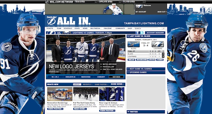
In preparation for tomorrow's Hockey Day in Canada, Icethetics has been conducting a series of polls with the goal of ranking the uniforms of the NHL's six Canadian teams. It's the very definition of a popularity contest. And with 18 sweaters and more than 75,000 votes cast, the results are in. 

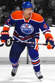
Rating: 8.6 (#1) 1979/2008

Rating: 8.2 (#2) 1917Coming in at No. 1 with an 8.6 rating, the Oilers' alternate sweater, a throwback to the days when things were brighter in Edmonton — both in hue and on-ice talent. Wayne Gretzky lifted the Cup four times in those colors. Now Taylor Hall hopes to lead a new crew to glory.

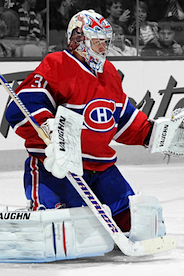
The Montreal Canadiens' red home uniform was a surprising and relatively distant second place with an 8.2. But it had some stiff competition. It's a look that's existed for as long as the NHL itself has. Its place among the best in well-deserved.

Rounding out the Top 3 is another blast-from-the-past retro jersey, this one belonging to the Calgary Flames. Rated by fans an 8.1, it was initially a hold-over from the Atlanta Flames after they relocated in 1980. And though the logo changed, the sweater remained the same for 15 years until the team's look evolved with black trim.

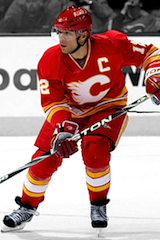
Rating: 8.1 (#3) 1980/2009 
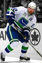
Rating: 7.8 (#4) 1970/2010 
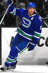
Rating: 7.6 (#5) 2008 
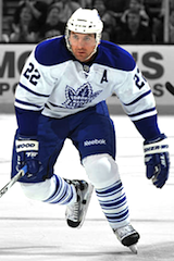
Rating: 7.4 (#6) 1958/2008

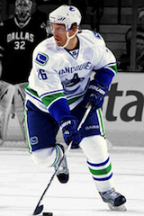
The first white jersey to show up in the rankings appears at No. 4 and it's another throwback! Something tells me we like our Canadian teams in retro sweaters. The Vancouver Canucks are wearing their inaugural season uniform to celebrate their 40th anniversary.

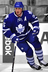
Fittingly, the Canucks also take 5th place with their alternate sweater. Toronto's alternate sweater follows close behind with a 7.4 rating. (Of course we won't be seeing Beauchemin in that jersey anymore.)

Rating: 7.1 (#7) 1992 
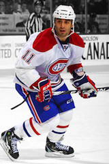
Rating: 7.0 (#8) 1941 
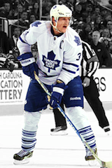
Rating: 6.4 (#9) 1992 
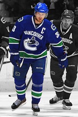
Rating: 5.0 (#10) 2007

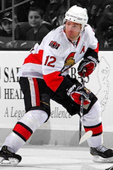
The next group includes the Maple Leafs' home and road sweaters and the Habs' road threads, making these the only two teams with all of their sweaters ranked in the Top 10. Of course it also leaves one team out of the Top 10 entirely. But we'll get to the Senators shortly.

Rating: 4.9 (#11) 2007 
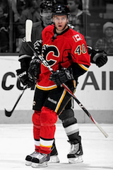
Rating: 4.8 (#12) 2007 
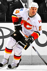
Rating: 4.3 (#13) 2007 
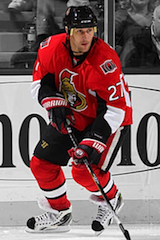
Rating: 4.2 (#14) 2007

As we start moving into the latter portion of the ranking, a couple of patterns are becoming clear. For every team but one, the alternate jersey is the most popular of the set. And the colorful home jerseys are certainly preferred over the bland road whites.

But the most noteworthy bit is that even though the Ottawa Senators have three sweaters to choose from, their most popular is 14th out of 18 in all of Canada. Perhaps a change is needed in the capital city, because Icethetics readers really do not like what they have to offer.

Rating: 3.9 (#15) 2007 
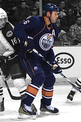
Rating: 2.6 (#16) 2007 Rating: 2.4 (#17) 2007 Rating: 2.2 (#18) 2008

The final group is not a huge surprise. Many have bemoaned the "practice jersey" look of the Oilers original Reebok Edge home/road set. When the throwback won fans over, it became the home sweater. Now, rumor has it, it's getting a partner in white next fall.

And readers always suspected the Senators had a terrible alternate uniform. Now we have the data to back that up. That 2.2/10 rating is an abomination. But it's also supposedly getting replaced for 2011-12.

I found there were a few more numbers to crunch. For instance, what if you average each team's jerseys? How does each team rank overall?

Unsurprisingly, the Habs averaged out at a 7.6, a decisive top finish. The Leafs were second-best with a 6.9 average uniform rating while the Canucks trailed behind with a 6.3.

The Flames' three sweaters work out to a 5.7 overall rating forcing the Oilers to second-worst in Canada with a 4.5, despite having the best individual jersey. Those other two really hurt them. Obviously the Sens sit at the bottom of the group with a meager 3.4 average.

Alternate and specialty jerseys averaged out at 5.9/10. Home sweaters were clearly the most popular with a 6.3 average compared to those road whites with just a 4.8. And the good news is that overall, fans like more than half of all Canadian NHL uniforms.

By the way, for as much as some readers complain about all the blue in the league, these results speak for themselves. Ten of the top 11 Canadian NHL sweaters have blue in them. What's your take on the results?

Tuesday
Feb082011

Inside the Lightning's New Identity

Just when you thought there was nothing more we could say about the recent rebrand of the Tampa Bay Lightning, we get an embarrassment of riches from the New York Times.

Times writer Jeff Z. Klein got the inside scoop on the Bolts' new look straight from the source, Ed O'Hara, the chief creative officer of SME Branding. SME is the creative force behind the branding of many NHL teams. And while reading this article, I was surprised to discover that, for as much work as they do, they only employ 15 people.

The article delves into details, including why an oval was used instead of a circle and how TV tests factor into the decision-making process. Even if you don't care for the Lightning's new identity, it's still worth a read just for the insight into how it all works.

Along with the article, the Times produced a video littered with some of SME Branding's conceptual work that ultimately led to the final design. I recommend watching the video, but here's some of what's in it.

Conceptual work for Lightning identity by SME Branding / New York Times

The whole process took six months and yielded a lot of interesting work. So what do you guys think? Are any of the early designs better than the final product?

Sunday
Feb062011

New Bolts Logo Already All Over

The Tampa Bay Lightning are wasting no time in getting their new branding out there. It started with the arena, of course. From what I understand, as of Friday, you can barely find the old logo in the St. Pete Times Forum anymore, including center ice.

Despite that, the team cannot wear their new uniforms and logo until next season. They also can't sell jerseys until after this season ends. But that's not stopping the marketing machine. And they've already got FOX Sports building brand new broadcast graphics.

Today's Super Sunday game against the Blues was not televised by Sun Sports today, so I had to watch on FOX Sports Midwest. And they already had the new logo built into everything but the animated wipes.

New Lightning logo already built into TV broadcasts / FOX Sports Midwest

It looks great, but why not use the version without the TAMPA BAY text? Isn't the point of the new logo to be an iconic symbol on its own? Guess that'll take a little time.

Now I don't know if this is a new development or if the new logo was in use on Friday night when the Lightning faced the Capitals. It was blacked out on GameCenter Live because NHL Network carried coverage. I won't be able to take a look until later tonight.

Meantime, here's a look at another graphic. You can also see here that the new logo is painted at center ice and even on dasher board advertising. So there's no turning back now.

And lastly, here it is on the FOX Sports scoreboard graphic. It features a darker blue than we saw on the uniforms when they were unveiled.

The Lightning wore their blue third jerseys for today's 4-3 OT win in Tampa. According to the team CEO Tod Leiweke, the BOLTS sweater will be retained next season. He didn't get into specifics as to whether they'll keep the black and gray, but I assume they'll at least put the new primary logo on the shoulders.

By the way, I realize NHL marketing rules prevent the team from changing uniforms midseason, but there's actually a precedent for NHL teams unveiling a new logo before summer. Graham Y. wrote in with this:

I was in Minnesota during the final days of the North Stars and remember an issue they had while changing their logo and uniform scheme.

With some obvious foresight to the move to Dallas, then owner Norm Green commissioned a new logo with just "Stars" across the front. They announced the new identity late in the season before the change just like the Lightning did.

Late that season the training staff on the bench began wearing windbreaker jackets with the new logo and the team was notified by the league that they would have to wait until the next season to begin using the new logo. I am not entirely positive but I think they were even fined for the early use.

Neither Graham nor I could track down any confirmation for the story, so I wondered if anyone else knows anything about it. The logo changed for the 1991-92 season, so presumably this all went down during 1990-91. I'm sure Icethetics readers would love any additional information.

Lightning rebrand web presence / TBL.comBy the way, I mentioned on Twitter last week that the Lightning have already started the brand transformation of their online presence.

Their website now features the new colors and logo as well as this background image (right) of Steven Stamkos and Marty St. Louis in the new sweaters.

Presumably, those photos were taken on Monday when the jerseys were unveiled. The players skated around in them a little bit.

The new marks can also be found on the club's Facebook and Twitter accounts.

So they're going all out here — or "all in," you could say — and certainly committing to the new brand. It's just surprising to see that commitment coming so soon.

This should be the last Lightning post for a little while — unless they get permission to change uniforms midseason too. At this point, I think we get it.

And the February update to NHL JerseyWatch 2011 should be coming in the next day or two.