Entries in jerseys (170)

Thursday
Aug042011

Attack, Blaze Unveil New Looks

A minor league and a junior league team have unveiled new identities for the 2011-12 season this week.

On Wednesday afternoon, the OHL's Owen Sound Attack held a press conference to show off their updated logo and new uniforms.

The revised primary mark consists of a new text element plus a simplified version of the ferocious bear featured in the logo the Attack had used since 2000. The broken stick and the rest of the creature's hulking body have been discarded leaving us with just the growling head.

They're following the trend we've been seeing throughout hockey branding lately... simplify. They haven't gone out and rebranded from the ground up. They've merely removed the extraneous elements of the existing brand.

Owen Sound Attack unveil new sweaters / AttackEven the jerseys are highly simplified — going for the Blackhawks-style stripes instead of the claw-shaped design that was previously featured.

The release on their website is poorly written, but includes this quote from forward Daniel Zweep:

“A bunch of us saw the new design halfway through last season and we loved it,” said Zweep. “It’s definitely a lot cleaner and more traditional. We can’t wait to throw them on and get back out on that ice.”

All right, something tells me that may not be a direct quote but I digress. For better or worse, traditional is indeed the trend of late.

Is the new logo an improvement? I'd call it more of a lateral move. The old one certainly had that late 90s look about it. This one just looks like any other simplified 90s logo. No better, no worse.

The only thing that bugs me about these jerseys is really a construct of the Reebok Edge template... that silly shoulder piping. If you're going to do the piping, it only makes sense for the shoulder yoke to be a different color. And even then, I'd do away with it.

You can read fan reaction to the new look on the Attack's Facebook page.


In the minors, the Central Hockey League's Bloomington Blaze unveiled their logo and uniforms on Tuesday, just a couple weeks after announcing their existence.

The CHL welcomed the team from Bloomington, Ill. in mid-July as a replacement for the Bloomington PrairieThunder. The Blaze will have the same general manager, coach, arena, and probably players as the PrairieThunder. However, since there's new ownership, I'm not sure the Blaze continues the PrairieThunder lineage. It's a little confusing.

The Pantagraph, a central Illinois newspaper, reported the logo was designed by "Skye Design Studios in New England." And while a Google search turns up a variety of companies (and individuals) under that name, none seem to be based in New England. I'd be curious to see what other work they've done.

The black burning "B" is not a bad logo. Bold and simple; and it manages to avoid looking like the Calgary Flames for the most part. I kind of like it. But here's where things get interesting. The jerseys...

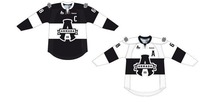
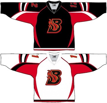
CHL Bloomington Blaze jerseys / BlazeThis week we got our first look at the Ottawa Senators' new Heritage Jersey. We could finally put the crazy-striped third jersey out of our minds. And then the Blaze came along.

Indeed, that is the "SENS" jersey template you see there (right) with the new Blaze logo plastered on the front. That sweater will not die. I suppose the good news here is that we get to see what it would look like in white.

Guess it's time for a confession. I never really hated the Sens' third jersey. I just hated that it said "SENS" on the front instead of bearing, you know, an actual logo. It may be a little odd-looking, but you can't deny this is a killer jersey. And honestly, it seems to work with the Blaze logo.

So all in all, I don't truly have anything bad to say about the Blaze's identity. All I will say to their marketing people is this: Get your website up already! (Not that it matters anymore. The logo and jerseys have been documented now.)

If you're so inclined, you can find commentary on their logo and uniforms from fans on their Facebook page — their only online existence at the moment.

Between the Senators, Attack and Blaze, that's a lot of red and black this week. But there's going to be more. The Sens are holding a press conference to announce 20th anniversary details on Thursday afternoon. Maybe we'll get to see the new jersey in color? Or perhaps in a photograph? Stay tuned to Icethetics.

Wednesday
Aug032011

The Summer of the Phony Leak

Presumably, you visit Icethetics to keep abreast of the latest hockey jersey and logo news. It stands to reason that you'd also count on this site to set the record straight when something is amiss. That's today's topic.

Leaking unreleased designs is by no means a priority here, but it happens on occasion — as seen yesterday with the new Ottawa Heritage Jersey. It's not my purpose to foul up any team's marketing plans. However, this summer has been especially lousy with "leaks" that aren't really leaks at all.

It's all thanks to a bunch of halfwits who aren't clever enough to find an honest way of making money. They sell cheap knock-offs of NHL jerseys. But this is old news. The new trend over the last few years seems to be these manufacturers turning fan-made, Internet-posted concepts into "authentic" merchandise.

Over the past few weeks, I've been inundated with emails from readers convinced that one of these aforementioned outfits has leaked the Winnipeg Jets or 2012 Winter Classic jerseys. Time for me to step in.

The apparent Winnipeg Jets jersey "leak" that's been floating around the web is nothing more than a mutation of Columbus Blue Jackets jerseys.

Alleged Jets leak is nothing more than a recolored Blue Jackets jersey

It doesn't take a trained eye to see this is a Photoshop job, not an official photo that's been leaked. The collar on both jerseys is a dead ringer for the collar on the official Reebok photo of the Blue Jackets' home jersey. Almost everything below the collar is taken directly from the official photo of Columbus' third jersey. Only the stripes and colors have been altered. 

If you're still not seeing it, study some of the details. Look at the creases and the way the sleeves hang. There's no question it's a direct copy. Even the stripes along the waist line up perfectly with the Jackets jersey. And to make all of this moot, True North chairman Mark Chipman has already said these are not the jerseys. He didn't say "no comment," he said this isn't the design. Take that for what it's worth.

Having made my point, I should also say that I haven't seen the design of the official Jets' uniforms, so I can't say with any certainty that they won't look anything like this. They might, though I highly doubt it. (I also doubted the logo leak an hour before I was proven wrong so there's that.)

The alleged 2012 Winter Classic jersey "leaks" bouncing around are based off of a concept posted on Icethetics in June.

Phony Winter Classic 2012 jerseys based on concept art

As you can plainly see, these jerseys were born out of a concept created by DC Visual Arts, which I posted on the blog in June. Not only have they ripped off the jersey designs — which, let's be honest, are not all that original in the first place, but rather based on historical sweaters — but they've even used the guy's Winter Classic logo.

Quakers-based Flyers concepts have been all over the place as have white Rangers jerseys with the logo instead of the wordmark on the front. You can see lots on the Icethetics Concepts page alone. Look, if it comes down to someone just wanting a physical representation of their own design, there are legitimate ways to go about it. But let's call this what it is. These boneheads are saying they're "authentic" just to make a buck. It's embarrassing.

As with the Jets, I'm not saying these designs could not possibly be similar to the 2012 Winter Classic jerseys, but simple fact is, the event hasn't officially been announced yet. We know from the schedule that the Flyers will host the Rangers in the elements on the afternoon of Jan. 2, but who knows whether they'll even have new retro jerseys. In fact, both teams are already wearing throwbacks on a regular basis.

My goal here isn't to be a downer. I'm just trying to help you separate what's real from what's not. You don't have to buy it, but I have offered evidence. And just understand that if/when any NHL uniform design does leak, it certainly won't be coming from an illegitimate Chinese company that makes lousy knock-offs.

Some final thoughts: If you're the sort of person who's eager to hand his money over to an illegal business for a fake NHL jersey, then you lose the right to complain when your team has a shitty season or the owner does anything you don't like — be it snubbing a high-value player or not fixing up a run-down arena. It just makes you a hypocrite. Buy officially licensed merchandise and support your team. That's my bit.

Tuesday
Aug022011

First Look: Senators Heritage Jersey

This one is an Icethetics exclusive! We've known for some time that the Ottawa Senators will launch a Heritage Jersey for their upcoming 20th anniversary season. Folks, here's your first look at it.

Take your first look at the Senators' new Heritage Jersey / Icethetics

An Icethetics reader was kind enough to pass along the above image along with several others I'll get to in a moment. I'm playing the anonymous card here so as to keep from getting anyone in trouble. So I guess you'd have to call it a leak.

Now what are we looking at exactly? I'm told the above image originates from a Senators alumnus. It's black and white because it's a photocopy, but I think it's safe to say you can mentally replace the grey with red. It's part of a packet that outlines the club's grand plans to celebrate its heritage this season. And the plans sound just as great as this uniform looks!

I'll get to all of it shortly but first, the jersey design itself. It's very close to the concept Jacob Barrette designed some years ago. The key difference is the striping around the waist. Plus, the above image fully lines up with the sneak peek the team showed us back in March, right down to the new shield logo on the shoulder — though we're not getting a good look at it in this image, obviously.

My take? Absolutely brilliant. This is precisely what the Senators needed to do with a Heritage Jersey. They recognized that and executed it deftly. I can only imagine how good it will look in action this fall. I'm a huge fan. And to be honest, I can't imagine we'll hear from any true dissenters. Who could really dislike this? It will be the perfect replacement for one of the ugliest third jerseys in the NHL.

What I've cropped off the top of the photo for aesthetic purposes is the following text: "New Heritage Jersey" in bold at the top; followed by "Worn at all 11 home heritage games and 2 national broadcast away games."

Now onto the rest of the packet. As I said, it basically talks about what the team is planning for this season in terms of marketing. Below you'll find transcripts of the photos I received. (Rather do it this way than posting a bunch of blurry photos. Spelling and grammatical errors attributed to original text.)


The Game Everything starts with the game and we'll celebrate the game over the entire season as well as having specific focus on some key areas for 10 games.

  • All-Star — games leading up to All-Star game recognize Ottawa All-Stars, All-Star moments
  • Legends Nights — Orr, Howe, Potvin, Lemieux, Yzerman
  • Team Canada 72 — Henderson, T. Esposito, Cournoyer
  • Women's Hockey — Cassie Campbell
  • World Juniors — 2009 Gold Medal win
  • Minor Hockey — tell the stories of the passion that kids have for the game, recognize the volunteers that give so much to our game. Bell Capital Cup.

Heritage Other heritage elements will include:

  • Jerseys worn for away game in Montreal and Toronto on National TV. Have team travel by train in heritage look (fedoras) and sell packages for fans.
  • Hockey Hall of Fame displays at Scotiabank Place at NHL All-Star Fanfest and at Governor General's Residence (leading up to and during All-Star)
  • Citizen special pages tied to each heritage game
  • Tickets for heritage games designed with heritage look/images
  • New heritage merchandise location at section 328

In Arena

  • Opening Week — luncheon with 92-93 team at Aberdeen Pavilion
  • Opening Night — celebrate 92-93 team
  • Game Nights — 20th Anniversary, Heritage, The Game
  • Fan and player stories — game, team
  • Interior / Exterior Exhibits and Installations

20th Anniversary 4 Key games to highlight significant moments in the modern era. Programming to include pin or handout, alumni/VIP appearances, luncheon, special merchandise.

  • 1992-93 Team — Boschman, Marsh, Turgeon, Brady, Shaw, Archibald, Lamb, Loewen, Smail, Sidorkiewicz, Rumble, Peluso, Murphy, McBain
  • First playoffs — Duchesne, Tugnutt
  • Wayne Gretzky's last game in Canada
  • 2007 Stanley Cup Finals

That's what has been sent to me — unofficially, of course. Sounds like there's a lot for Sens fans to get excited about this season — their new sweater especially. I can't get over how great it is that an NHL team is actually doing something that all of us jersey geeks have been hoping for.

The two road games in which the Senators will sport the Heritage Jersey are against the Maple Leafs and Canadiens. A quick glance at the schedule tells us the Sens are in Toronto on Oct. 8, Nov. 12 and Jan. 17 and in Montreal on Jan. 14, Mar. 14 and Mar. 23. 

Their home opener is on Oct. 11 against the Minnesota Wild, which is when the Heritage Jersey is likely to make its game debut. That should be the first of 13 total games in which it will be used during the 2011-12 campaign. I'm guessing the full schedule will be released at a later date.

If you've got questions, feel free to ask, but I've pretty much exhausted my knowledge on the subject with this post. If it's not here, I probably don't have an answer to give. I suspect my inbox will start filling up with concepts based on the above image, so it won't be long before you'll be able to see it in full color.


Related: Check out these Senators concepts from early March. I think you'll find Tex Fischer's is the closest to the striping pattern seen in the actual design. But they're all very similar to the real thing.

Wednesday
Jul132011

Behold the Gold: Preds Unveil Jersey

Predators unveil new home jersey / PredatorsThe Nashville Predators became the first team in 21 years to use a solid yellow primary sweater as they unveiled their new home uniform today.

(For the record, it was the Vancouver Canucks in 1989 to do it last. But then they've worn pretty much every color at this point.)

Here's a slick promotional photo.

The Predators revealed the new look Wednesday evening, literally, on the side of a skyscraper, at their Skate of the Union event. They also launched the Behold the Gold marketing campaign which is obviously meant to draw attention to the new brightly-colored jersey.

Here on the blog, we got our first look at it when it was leaked back in June. It's basically the same as that original image save for a minor detail or two. And it looks just as incredible as it did then.

Reaction was largely positive as we've been presented with a clean, solid design and bright colors you don't often see in the NHL. These are all good things and should be welcomed with open arms.

I give it three thumbs up (I'm going to need to borrow somebody's thumb) for standing out in a sea of sameness in this league. I'm thrilled to see them drop the blue jersey — which is becoming overused. I'd say it's one less we'll see in the NHL next season but then I'm betting on a blue sweater from the Winnipeg Jets, whenever that comes.

Enough chatter from me. I'll leave you with a collage of photos from Smashville 24/7. Also don't forget to check out photos tweeted by Preds winger Blake Geoffrion and of course, the Predators themselves.

Predators unveil their new home uniform for 2011-12 / Smashville 24/7

And just to be thorough, here's another look at the road jersey which was unveiled on Draft Day, June 24. These photos were posted to the Predators' official Facebook page.

New road jersey debuted on Draft Day / Predators

I like the details, including the keyboard inside the collar and the guitar strings across the numbers. This is a very musically-themed uniform set and it doesn't look minor league. A tough task, but they've pulled it off. I almost want one. (But my Bolts have two new sweaters coming out soon.)

Tuesday
Jul122011

QMJHL Adds Armada

The QMJHL team that didn't really have a name has been rebranded — and now it doesn't really have colors. The Montreal Junior Hockey Club moved about 20 miles northwest and are now the Blainville-Boisbriand Armada.

The new name, logo and uniforms were officially unveiled today at a press conference at team's arena in Boisbriand. The bland palette is black and white with what appears to be an inkling of silver as a trim color — a lot like the Los Angeles Kings' depressing new look.

Despite its unfortunate lack of color, I like the design of the primary logo. It's very clean and bold. And it looks like every element of the mark was carefully positioned. You'd think that'd be a given in logo design these days — but then you saw the WHL's Victoria Royals logo, right?

The sweaters are simple, but they almost feel like an afterthought. Here's a look from the QMJHL's website:

Blainville-Boisbriand Armada jersey design unveiled / QMJHL

One thing I will say about this branding is it's definitely not targeting children with bright colors and cartoon creatures. This is an all-out effort to create a professional look for a junior hockey club. I give it a tenuous thumbs-up overall. A solid effort in design but sorely lacking in personality.

Page 1 ... 5 6 7 8 9 ... 34 Next 5 Entries »