
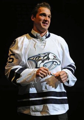
 The "limited edition" jersey / Nashville PredatorsDon't bet on this jersey. (Pun.)
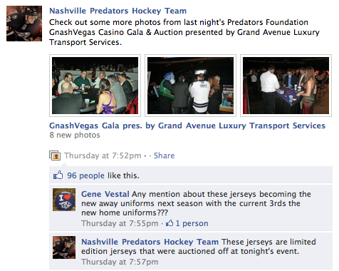
The Nashville Predators hosted the GnashVegas Casino Gala and Auction on Thursday night. It's one of those events teams put on to let rich fans rub elbows with players in a casual setting. And it's only noteworthy here because of what the players showed up wearing.
The jerseys they sported for the event, fully customized with their surnames and numbers (even on the sleeves), are nothing they've ever worn on the ice. Nor will they.
Last month just prior to the inaugural edition of NHL JerseyWatch 2011, we got our first look at what might've been the Preds' new road sweater next season. Only there were many indications that it wouldn't be.
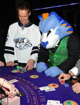 GnashVegas Casino Gala / Nashville PredatorsRumors had circulated for some time that the Predators wanted to simplify their color palette and exile their present home and road uniforms in favor of their current alternate along with a white version of it.
Said white version showed on a silent auction table during a game recently. It fanned the flames, feeding rumors about jersey changes. As did the fact that every player was wearing one on GnashVegas night. But the club's Facebook folks threw a bucket of cold water on that theory.
They posted a photo album from the event and the first person to comment on it asked, "Any mention about these jerseys becoming the new away uniforms next season with the current 3rds [sic] the new home uniforms?"
The direct reply from the Predators: "These jerseys are limited edition jerseys that were auctioned off at tonight's event."
But the ensuing commenters weren't deterred, one asking, "why do I get a feeling that we will be seeing a lot more of these amazing, fantastic awesomely cool jerseys?"
The team's Facebook operator tersely reiterated, "These jerseys will not be used next season."
Of course that leaves the door open to indeed using new jerseys next season, just not these. Which we already know to be the case, thanks to Reebok. If you'd like to see more pictures of the players sporting their "limited edition" jerseys on casino night, there's an additional photo gallery on the team's website.
And the point of all of this is that we still aren't quite sure what to expect from Nashville in 2011. By the way, I must've gotten more than a dozen emails about this so thanks to all of you who sent in links.
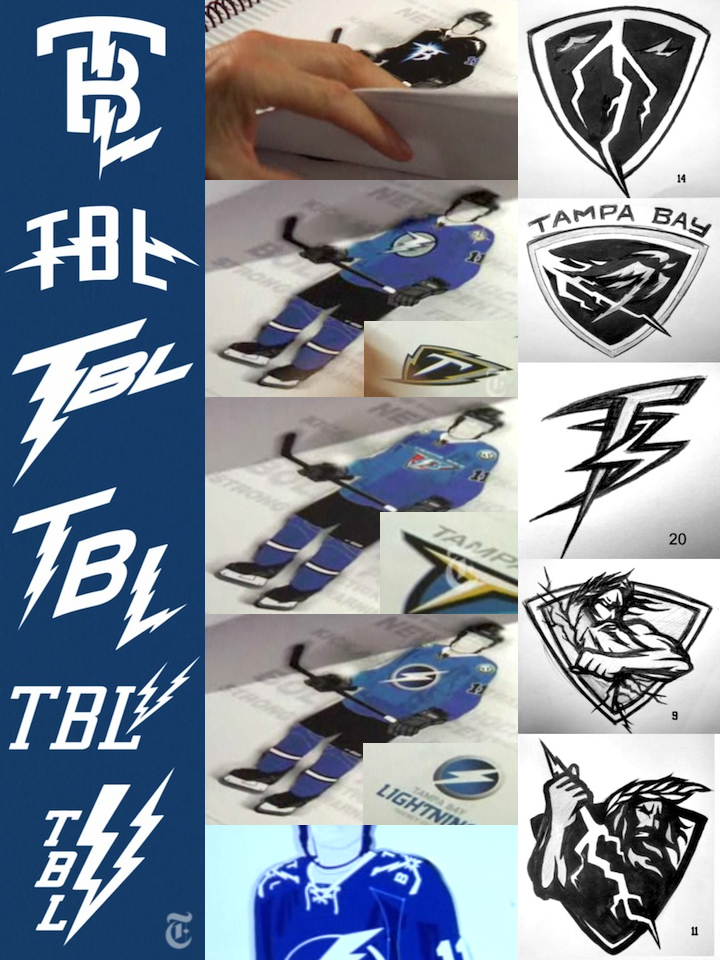
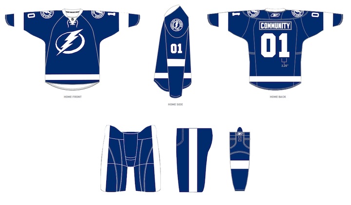
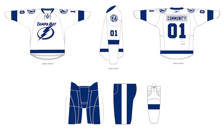
 The other bit of news has to do with the Tampa Bay Lightning, who just unveiled their rebranding plans a couple weeks ago to mixed reviews. Turns out, those plans may not necessarily be set in stone. Or they are and some don't want to believe it.
On Friday, the always reliable Uni Watch posted a note in the ticker that I have to question as more wishful thinking than actual fact. But if it's good enough for Paul, it's good enough for me.
Very interesting NHL news from Cork Gaines, who writes: “One of the Lightning radio broadcasters was on a local station in Tampa talking and mentioned that what they unveiled last week may not be exactly what they wear on the ice next season. He mentioned possibly adding a lightning bolt to the shorts and some other unspecified tweaks. This makes me think we got a mid-season unveiling just so the team could gauge reaction and make adjustments — a concept I’m surprised we don’t see more often.”
First of all, can anyone corroborate this? The Lightning have two radio guys — Dave Mishkin, the PxP dude, and Phil Esposito who provides color for home games. I don't see Mishkin stepping outside the lines on this — unless it was a clever attempt by the team to drop a hint to fans unhappy with the recently revealed changes. Either that or Espo spilled the beans. Which would not surprise me in the least.
I'm not sure I agree with Cork that the midseason unveiling was a way to gauge reaction. That's what focus groups are for. I take Leiweke at his word that the timing was all about making sure they got the new logo out there the way they wanted, rather than some crappy website (like this one) leaking it before the summer.
Management said they expected some resistance from fans as it's a pretty sweeping change. But I think they may have gotten a little more than they bargained for. And one thing they've reiterated since the beginning is their intent to listen to the fans. If tweaks are being considered, I'd chalk it up to that.
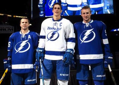
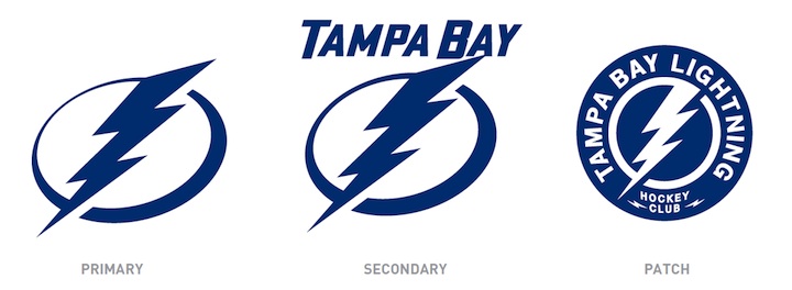
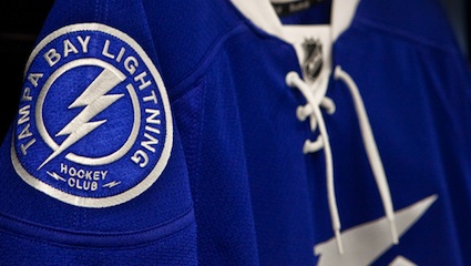
 Lightning customize logo for social avatarsOne more thing. I know the last time I talked about the Bolts, I referenced the makeover of their web presence but I didn't really offer much outside of the background image from the website. They also added new social website avatars, customized versions of their new secondary logo.
On the actual logo, it reads HOCKEY CLUB between the two mini-bolts at the bottom of the circle. It's replaced by Facebook and Twitter in these versions. It's not a big deal, just kind of a cool branding thing.
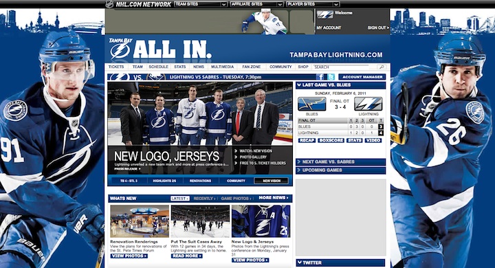
And in case you haven't checked out the Lightning's website lately, here's how it looks in the new colors:


 26 Comments
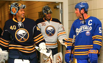 No changes to Sabres uniforms in 2011 / SabresThe Buffalo Sabres will retain their current home, road and alternate uniforms for at least another season, according to the club's new ownership.


