Entries in logos (67)

Friday
Jul222011

Boy, Was I Wrong About the Jets

It happens to the best of us. Bloggers, I mean. We get stuff wrong. This afternoon I tweeted what may indeed live on as my most infamous tweet ever. In case you missed it, at 12:56 PM Pacific time I wrote:

Literally, within six minutes of that tweet, at 1:02 PM Pacific time, the Winnipeg Jets tweeted this:

It was precisely at that moment I realized my previous tweet would be nullified. Why would the Jets scramble to unveil their logo — perhaps the most highly-anticipated ever — with less than an hour's notice? That is, unless it had been truly leaked. And as promised, at 4 PM Central time the Jets' new logos were posted on their website.

It's at this point you might accuse me of trusting lousy sources. Let me be clear. I had no sources whatsoever. This is all on me. I had only my years of experience in studying and writing a blog about professional sports branding and marketing at my back. Did it fail me? Or did the Jets? Well, I can't answer that without bias.

Honestly, when I first saw the leaked photo, I instantly thought, "there's no way." This is an ownership group who's been so meticulous in its branding strategy. Certainly, they wouldn't be satisfied with marketing their franchise under such a bland mark. And let me say this in the clearest terms possible: Boy, was I wrong!

The title of this post has a double meaning. First, I was wrong to tweet what I did. I should've indicated that it was my opinion rather than making it sound like a fact. Second, I was wrong to think that this team would blow us away with its branding effort. I do stand by one comment in that tweet. What a joke.

Winnipeg logos unveiled / JetsAt this point, another paragraph of expressing my disappointment could easily devolve this post into an irritating rant. And that's not really my thing. So now that you know my opinion, I'll try to handle the rest of my review a little more matter-of-factly. I'll have to start with a direct quote from True North.

"True North Sports & Entertainment felt it was important for the new Winnipeg Jets to develop a strong new identity," said Mark Chipman, Chairman & Governor of True North Sports & Entertainment. "We felt it was important to authenticate the name Jets and we believe the new logo does that through its connection to (Canada's) remarkable Air Force heritage, including the rich history and relationship that our city and province have enjoyed with the Canadian Forces." 

If they felt it was important to develop a strong new identity, then why didn't they? Shoot. Caught myself doing it again. Be objective, Chris. The logo has a silver jet aligned (to the north) with a red maple leaf all set within a blue circle. And the central element meant to draw your eye is muted and fails to do so. It looks like a secondary mark.

Speaking of which, the actual secondary mark is a lot better — for a secondary mark, anyway. It has all the elements you expect from a secondary mark. I like the wings and the hockey sticks. Unfortunately, it looks like the Molson maple leaf is here to stay with the Jets' new identity. Bummer.

To be quite honest, the wordmarks, like the rest of the identity, look rushed. True North took control of this franchise just 52 days ago and only officially decided on the name less than a month ago. So I guess it's to be expected.

I'm also perplexed by the addition of a different shade of blue for the "alternate wordmark." Perhaps a third jersey with a wordmark? Wouldn't put it past these guys at this point. Speaking of which, no date has been set for the jersey reveal, but I'm not holding my breath.

However... I'm sure most Winnipeggers will love it. And that's the important thing. A lot of folks dislike the new Lightning identity but I love it and I'm a fan. That's what matters.

I figured I should address one last thing. Many tweeters have questioned whether my disapproval of the new primary logo wasn't more about my being scooped (or wrong about the leak). I think it goes without saying, but I'm saying it just in case... of course not. This idea that Icethetics has to be first with this sort of news is a concoction of its readers.

I appreciate you all and your loyalty very much, but sometimes you set this blog on a pedestal it doesn't deserve. I'm often not first with this type of news and frankly, I don't feel I need to be. All I do is share what's already out there to a wider audience. (Plus, today was an especially busy day at work so I've only just now found time in my day to update the site. Some of you tend to forget I have that day job.)

Wednesday
Jul132011

Behold the Gold: Preds Unveil Jersey

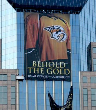
Predators unveil new home jersey / PredatorsThe Nashville Predators became the first team in 21 years to use a solid yellow primary sweater as they unveiled their new home uniform today.

(For the record, it was the Vancouver Canucks in 1989 to do it last. But then they've worn pretty much every color at this point.)

Here's a slick promotional photo.

The Predators revealed the new look Wednesday evening, literally, on the side of a skyscraper, at their Skate of the Union event. They also launched the Behold the Gold marketing campaign which is obviously meant to draw attention to the new brightly-colored jersey.

Here on the blog, we got our first look at it when it was leaked back in June. It's basically the same as that original image save for a minor detail or two. And it looks just as incredible as it did then.

Reaction was largely positive as we've been presented with a clean, solid design and bright colors you don't often see in the NHL. These are all good things and should be welcomed with open arms.

I give it three thumbs up (I'm going to need to borrow somebody's thumb) for standing out in a sea of sameness in this league. I'm thrilled to see them drop the blue jersey — which is becoming overused. I'd say it's one less we'll see in the NHL next season but then I'm betting on a blue sweater from the Winnipeg Jets, whenever that comes.

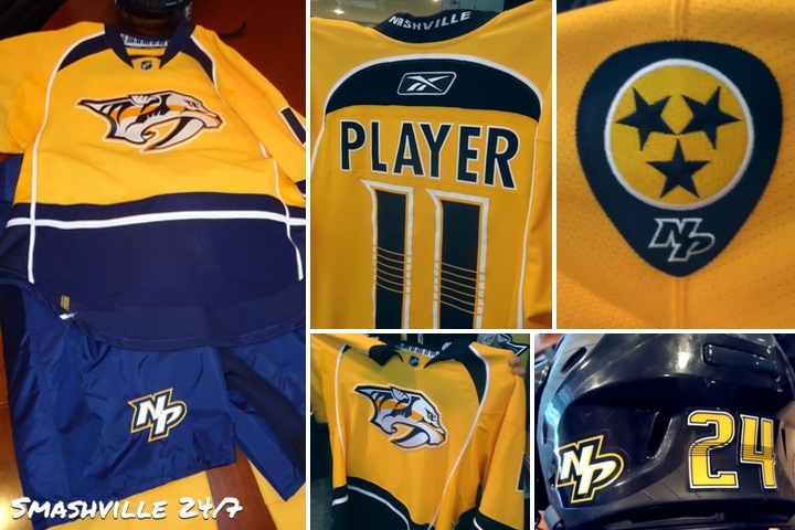
Enough chatter from me. I'll leave you with a collage of photos from Smashville 24/7. Also don't forget to check out photos tweeted by Preds winger Blake Geoffrion and of course, the Predators themselves.

Predators unveil their new home uniform for 2011-12 / Smashville 24/7

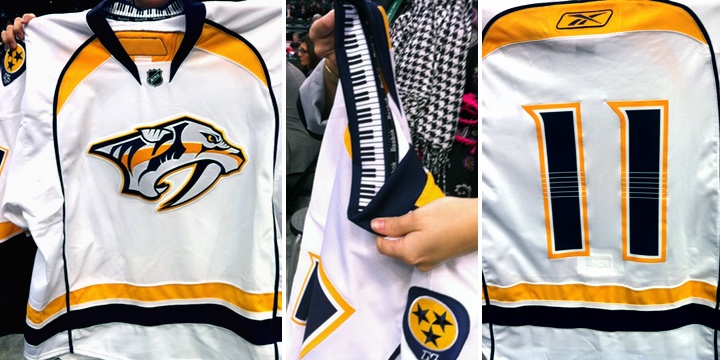
And just to be thorough, here's another look at the road jersey which was unveiled on Draft Day, June 24. These photos were posted to the Predators' official Facebook page.

New road jersey debuted on Draft Day / Predators

I like the details, including the keyboard inside the collar and the guitar strings across the numbers. This is a very musically-themed uniform set and it doesn't look minor league. A tough task, but they've pulled it off. I almost want one. (But my Bolts have two new sweaters coming out soon.)

Tuesday
Jul122011

QMJHL Adds Armada

The QMJHL team that didn't really have a name has been rebranded — and now it doesn't really have colors. The Montreal Junior Hockey Club moved about 20 miles northwest and are now the Blainville-Boisbriand Armada.

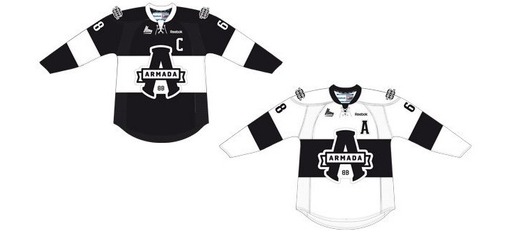
The new name, logo and uniforms were officially unveiled today at a press conference at team's arena in Boisbriand. The bland palette is black and white with what appears to be an inkling of silver as a trim color — a lot like the Los Angeles Kings' depressing new look.

Despite its unfortunate lack of color, I like the design of the primary logo. It's very clean and bold. And it looks like every element of the mark was carefully positioned. You'd think that'd be a given in logo design these days — but then you saw the WHL's Victoria Royals logo, right?

The sweaters are simple, but they almost feel like an afterthought. Here's a look from the QMJHL's website:

Blainville-Boisbriand Armada jersey design unveiled / QMJHL

One thing I will say about this branding is it's definitely not targeting children with bright colors and cartoon creatures. This is an all-out effort to create a professional look for a junior hockey club. I give it a tenuous thumbs-up overall. A solid effort in design but sorely lacking in personality.

Wednesday
Jun222011

Predators New Logos Unveiled!

The new and simplified logos for the Nashville Predators were unveiled today in Las Vegas, where the NHL Awards will be held tonight. Here's your first look at the new marks, debuting this fall.

Predators new logos unveiled / Predators

Smashville 24/7 provided its readers with the best look at the marks which now feature only blue, gold and white, dropping the orange, steel blue and silver from the old identity. The logos were officially on display on the Predators' website.

The new primary logo is a simplified version of the mark the Predators have used since their inception in 1998. It's much cleaner and more refined than the previous version. And best of all, it retains the unique identity of the team rather than going back to the drawing board completely.

There are two new secondary logos, including the NP lettermark which we first saw on the side of Pekka Rinne's new mask back in April. The other mark is in the shape of a guitar pick — perfect for a team in Nashville, the home of country music. And perhaps most notably, it honors its home state with the symbol found on the Tennessee state flag.

If we're being nitpicky, the stars aren't technically positioned accurately if they're trying to match the state flag. You can look it up for yourself to compare. Perhaps it will be fixed in time for the uniforms.

Finally, the new wordmark is probably the logo most similar to its predecessor. The text is positioned in the same way, but a new typeface is introduced. I think it looks more... "toothy."

All in all, I have to give this new identity high marks. They're taking their logo out of the '90s, simplifying it, yet not straying too far from the path that's worked for them. Regarding the jerseys for next season, I can't wait to see them.

Several reports have said the new road sweater will be revealed this weekend during the draft. It's worth noting the Predators do not currently own a first round pick, not to say that can't change. These same reports suggest the home jersey will make its first public appearance at the Predators' Skate of the Union event in July. I haven't seen an exact date for that yet.

In addition, RLD Hockey is reporting that Nashville will retire their current third jersey and stick with their two new uniforms next season.

Saturday
Apr232011

Does Mask Design Hint at New Logo?

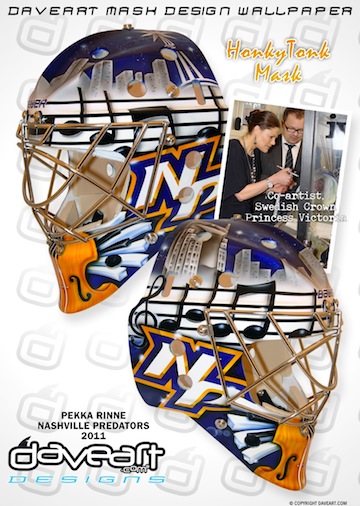
Pekka Rinne's new mask / daveart.comSwedish airbrush artist Dave Gunnarsson paints goalie masks for some of the best netminders in the world. His most recent work was done for Pekka Rinne and was revealed to the world via his blog this week.

Gunnarsson creates new masks all the time, but what makes this one noteworthy to Icethetics readers is the never-before-seen logo featured on both sides of the freshly painted helmet.

We already know the Nashville Predators are redesigning their home uniforms (presumably, the road ones as well). What we don't yet know is what they will look like.

The NP lettermark on Rinne's new mask does not look like any mark that the Predators have used before. So here's the question: Is it a future Predators logo that has yet to be publicly released? Or did it simply spring from Gunnarsson's mind?

[UPDATE 2:26 PM: For the record, if this is an actual Predators logo, my guess is that it would be nothing more than a shoulder patch or helmet decal or something.]

In his blog post, Gunnarsson talks about the HonkyTonk theme of the paint job but makes no reference at all to the NP logo. Is that because technically it's not supposed to be seen yet? Or are we reading way too much into this?

From what little I've seen of Gunnarsson's work, it seems he mostly adapts existing or past logos rather than creating new ones. This could be a departure from that. Or not. Don't know.

Your thoughts? Is this a sneak peek at a new Preds logo? Or am I making a mountain out of a goalie mask?

For a better look at the design, check out the mask gallery at daveart.com. My thanks to Nick F. and Kevin H. for sending along this information.

Page 1 ... 3 4 5 6 7 ... 14 Next 5 Entries »