Entries in logos (67)

Wednesday
Feb222012

At Work on Columbus' NHL All-Star Logo

Since I'm in the process of reinvigorating the Concepts page here at Icethetics (with new concept posts daily!), it seems only fitting that this latest blog update features a number of professional concept logos that have been created for the NHL.

It all comes by way of a video posted on the Columbus Blue Jackets' website — the first in a series chronicling the development of the 2013 NHL All-Star Weekend.

In the video, the guys who will be designing the All-Star logo talk about the process. It's all very fascinating to people like us.

Bill Frederick of the Frederick & Froberg Design Group and NHL Senior Design Director Paul Conway arrived in Columbus Tuesday to meet with Blue Jackets marketing and creative team members and begin planning the art for the 2013 All-Star celebration. Conway and Frederick have been a part of several NHL sanctioned event logo designs, most recently working on the 2012 NHL All-Star Game in Ottawa.

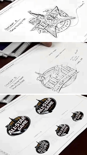
NHL All-Star 2012 logo developmentPerhaps the best part of the video is the B-roll in which we see the logo designers leafing through their incredible portfolio. Getting to see the logos that didn't make the final cut is very cool.

On the right are three screen grabs from the video that show the early development process of the 2012 NHL All-Star logo. Interestingly, it was the design labeled Concept A that appears closest to the final version.

Concept B is pretty nice, but it makes sense the overall shape of an All-Star logo is more of a — you know — star. And I guess the Peace Tower was kind of the obvious choice as far as a central design theme.

As the designers say in the video, the first thing they do is try to determine what makes the host city iconic — if anything. The goal isn't to rework the host team's primary logo with some stars in it — despite the fact that that's basically what happened with the 2011 game in Raleigh.

As Conway says:

“Some cities are more challenging than others, and Columbus certainly is one of those. There’s not that one key iconic aspect of the city that stands out, which makes this research phase and interview process even more critical.”

Columbus is a beautiful city, but I'm not sure the skyline is recognizable enough to cut it here. It'll be interesting to see what they go with since the Blue Jackets' primary mark is basically tailor-made for an All-Star logo — what with it being a giant star and all.

I hope the Blue Jackets continue to release videos throughout this process. It'll be fun to follow along with the development of an NHL logo. It's something we rarely get an inside look at — and something no Icethetics reader can get enough of.

Conway says the process can take about four to six weeks from start to finish. But that doesn't necessarily mean the official logo will be unveiled in April. It may not come until late summer. We'll obviously be keeping an eye on it.

One more thing. In the video we see someone thumbing through a Blue Jackets logo portfolio. It appears to share a glimpse of elements of an unused third jersey design.

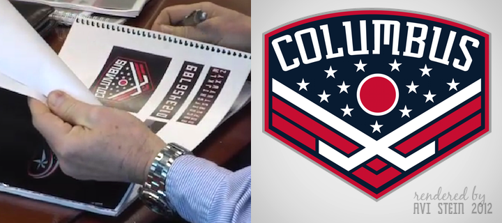
I would guess the logo we see there was probably an intended shoulder patch. Beneath it we can see the numbers and letters that are actually used on the current third jersey — only in different colors. Bet it would've been a neat look. (UPDATE 2/26: After the initial post, Avi Stein put together a hi-res rendering of what we can see in that video frame.) And if you feel like putting together a uniform concept featuring this logo, maybe you can take some inspiration from some other Blue Jackets third jersey prototypes seen here last year.

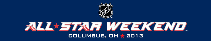
For what it's worth, the NHL is currently promoting the 2013 All-Star Weekend with graphics like the one seen here. But it's merely the Blue Jackets' custom font. Nothing special — or permanent.

My thanks to Mike R. for letting me know about the video.


While we're on the subject of logo development, Denver Post beat writer Adrian Dater posted a podcast he did with Dan Price, the creative director for the Colorado Avalanche in 1995 when the team moved from Quebec. He was responsible for the logo, but credits Michael Beindorff with actually designing it.

Perhaps the most interesting part of the interview to me was learning that the franchise was originally going to be named the Rocky Mountain Extreme. The name was actually leaked early by Dater in the Post but Denver hockey fans revolted and the marketing guys went back to the drawing board. Price points out that before the organization settled on Avalanche, they also considered naming the team Cougars and Black Bears. Glad they went with Avs.

Price is currently the head of a local marketing firm called Adrenalin. They are responsible for rebranding the Phoenix Coyotes in 2003 when Wayne Gretzky got involved with the team. Anyway, the podcast is a good listen if you've got a half hour to kill. But a necessity if you're an Avs fan.

Friday
Jan062012

Orlando Solar Bears Logos Unveiled

ECHL's Orlando Solar BearsSo... happy new year! And the ECHL's incarnation of the Orlando Solar Bears have officially unveiled their new logos. You can see them now on the team's website.

It's a very sharp look but the folks at Joe Bosack always do outstanding work so that's no surprise. It's certainly an improvement on the previous version of the logo from the 90s.

Quick bit of a housekeeping. Obviously, the updates have been few and far between. Part of that is lack of news. Part of it is lack of time on my part. So it goes.

Anyway, I'm taking a short vacation back to Florida for a few days — where I plan to take in a Lightning game or two — but when I get back I hope to be able to make a little more time for the blog.

In the next few weeks, we should start getting information about logo and uniform changes for the 2012-13 — and there will be a few. 

For those of you following the IceHL Project, I have an update over there for you.

Thursday
Nov242011

QMJHL: Sherbrooke Rises from the Ashes

Sherbrooke Phoenix jerseys unveiledThe QMJHL's only U.S.-based team shut down over the summer, but a new one will be resurrected in that franchise's old home next fall as the Lewiston MAINEiacs give way to the Sherbrooke Phoenix.

The club's new name, logos and uniforms were unveiled at a press conference today, according to this release written in French (translated). Click here for more photos from the event.

As you may have read in the (incomplete) Icethetics Season Preview, the league bought out the floudering franchise after last season and ceased operations.

At the same time, it announced an expansion franchise had been awarded to Sherbrooke, Quebec and an ownership group led by ex-NHLer Jocelyn Thibault to begin play in the 2012-13 season. I find it a little weird. Why end the lineage of one of the league's oldest franchises? Why not simply transfer the franchise? (In the end, I'm sure it all comes down to money.) As I wrote in the Season Preview post...

The franchise itself is actually one of the QMJHL's oldest. The Trois-Rivieres Ducs were a founding member of the Q in 1969. They were renamed the Draveurs in 1973. In 1992, the club relocated to Sherbrooke and became the Faucons for six seasons. In 1998, the name was changed to Sherbrooke Castors. The club moved across the border into Maine in 2003.

There had been speculation that one of the previous Sherbrooke monikers would make a comeback, specifically Castors or Faucons. But as it turns out, they went the more literal route for a team that's "rising from the ashes." Of course this will be confusing for folks in Quebec if the Phoenix Coyotes end up moving there. (Kidding!)

Here are the other logos that were on display at today's unveiling.

Sherbrooke Phoenix secondary logos

Brilliant logos and a fantastic overall look for this team. I'm impressed. But are you noticing a trend? Two other Q teams, the Armada and Olympiques, introduced monochromatic logos this season, just like the Tampa Bay Lightning and Los Angeles Kings. Seems like a trend toward less color. If so, I'm not sure that's a good thing.

But when you look at Sherbrooke's jerseys and logos, it's clear they're still a three-color team: dark blue, powder blue, and yes, that's the trendy vintage white rather than actual white. Don't get me wrong. I think these colors look great together, but they tick all the boxes in terms of what's "in" right now.

A local creative agency called Lubie designed the new brand (with an awesome video), which appears to have been influenced by the municipal coat of arms of the city of Sherbrooke, Quebec.

Anyway, what do you think? How is this not a great look for a hockey team?

Friday
Sep232011

NHL to Announce 2012 Winter Classic

On Monday, Sept. 26 the NHL will make a major announcement from a ballpark in Philly. Why are they beating around the bush? It's the worst-kept secret in hockey.

The league will announce that Citizens Bank Park will play host to the Philadelphia Flyers and New York Rangers for the NHL Winter Classic on Jan. 2, 2012. I think this may be the longest we've had to wait for official word on the annual outdoor game. The press conference usually happens during the summer.

Before I go on, credit where it's due. The Philadelphia sports blog Crossing Broad seems to have been the first with details, such as the confirmation of the new Winter Classic logo and a number of other details.

Yesterday, they posted a logo found on a fan-operated Winter Classic Facebook page. While they couldn't initially confirm its legitimacy, it sure looked like the real thing. Later in the day more details started to emerge, including a YouTube video labeled as the "official teaser" for the 2012 Winter Classic. It featured the new logo at the end.

Winter Classic presser preview / Matt GelbThen came this photo of the Citizens Bank Park scoreboard from Philadelphia Inquirer writer Matt Gelb. I assume there was some testing being done in advance of Monday's press conference. Either that, or someone punched up a graphic they shouldn't have.

Either way, it proves the Winter Classic logo is legitimate while also giving us a sneak peek at the throwback logos to be used by each team. For the Flyers, no surprises. They haven't changed their logo since they joined the NHL in 1967. The Rangers, on the other hand, have gone through a number of iterations of their classic shield mark. This particular shield design was used by the Blueshirts between 1926 and 1947.

Now the jersey speculation can truly begin. There's almost no doubt in my mind the Flyers will stick with their current orange home sweater. It's based on their original look and it's as retro as they're going to get.

For the Rangers, there's a little wiggle room. According to NHLUniforms.com, the Rangers never wore a white jersey until 1951. And since then, the only one they've used that didn't resemble what's still worn to this day was in 1976 and 1977 when the shield was used as a crest. But I don't see them going that route.

Instead, may we'll see a break from tradition. The first Winter Classic in 2008 was the only time the home team has worn white out in the elements. Will the Flyers don white again in 2012, as they did in 2010 when they played the Bruins at Fenway? If so, it would allow the Rangers to simply use their current dark blue retro third jersey, meaning we wouldn't be treated to any new uniforms at all.

Of course, even if the Flyers wore their home orange, the Rangers could still sport their regular road whites. Either that or they could introduce a white version of their new third. It's hard to say for sure right now. We should know on Monday. But I don't imagine we'll be all that surprised.

Should we expect one or two of these jerseys to appear at the 2012 Winter Classic?

What do you guys think? Are my expectations too conservative? Think the Rangers and Flyers have something special in mind that we haven't thought of yet? Speculate away!

Thursday
Sep222011

IceCaps Unveil Familiar Uniforms

IceCaps jerseys unveiled / Dave SalterThe AHL's St. John's IceCaps officially unveiled their uniforms today. It should surprise no one that they are identical to those of their NHL parent club, the Winnipeg Jets.

IceCaps owner Danny Williams and player Jason King were on hand this morning to model the new sweaters for cameras. And for an AHL team, they look incredibly good.

Now a moment ago I said "identical," but obviously that would be silly. The IceCaps have their own primary logo on the front and the Jets' logo on the shoulders. Add in an advertisement or two and that's it as far as differences.

Here's how the new look was described in a press release on the AHL's website:

The jerseys, which are modeled after the parent Winnipeg Jets uniforms, consist largely of two shades of blue. The primary navy blue base of the home dark jerseys is referred to as Polar Night Blue. The lighter, secondary blue is called Aviator Blue. Each jersey includes sleeve piping, accenting the colors. 

The IceCaps will wear the white jerseys at home and the blue jerseys for road games. 

“I could not be more pleased with the final product we are unveiling today which will be the signature look of the St. John’s IceCaps,” said Mr. Williams. “These are incredibly sharp looking jerseys that are sure to catch the eye throughout the league.”

If you haven't been following along this summer, the IceCaps were known as the Manitoba Moose until that club was displaced by the purchase and relocation of the Atlanta Thrashers to Winnipeg. The team, still owned by True North along with the Jets, moved to St. John's, Newfoundland and unveiled their logo on July 29.

As I said yesterday, I like the Jets' new uniforms, so naturally I like the IceCaps' as well. I almost like them better because I like their primary logo better. But despite my understanding that advertising is necessary to the business aspect of an AHL franchise, I've never liked it on the uniforms. Otherwise, solid look.

IceCaps uniforms nearly identical to Jets / AHL

But wait, there's more minor league news...

San Francisco Bulls joining ECHL in 2012

San Francisco Bulls joining ECHLYesterday, the ECHL Board of Governors approved the membership of a new franchise to begin play in the 2012-13 season. They're called the San Francisco Bulls and appropriately, they'll play at the Cow Palace.

But before you get too excited, the logo being used to represent the new California club on the ECHL's website is absolutely atrocious. It's not design. It's just a sad mess.

The bull head looks like some sort of futuristic, metallic thing while the font couldn't look more dated. And the crossed hockey sticks look like a tacked-on afterthought. Painful is what it is.

I'm hoping that by the time next summer rolls around, they'll have a real logo to show us. And maybe a revised color scheme? Who thought gold, red and black used in this way was a good idea? The 49ers do it right. This doesn't.

In any case, next year the ECHL celebrates its 25th anniversary and it's cool to see them adding new teams in west coast markets after so many have come and gone in the recent past. Heck, if the Florida Everblades were to visit, I might even fly down to see a game. 

Page 1 ... 2 3 4 5 6 ... 14 Next 5 Entries »