Entries in minors (159)

Wednesday
Aug142013

AHL Announces Frozen Frontier

Outdoor event will pit host Amerks against Lake Erie

On Tuesday, the league announced the Frozen Frontier, a 10-day outdoor hockey festival to be held at Frontier Field in Rochester, N.Y. It kicks off Fri., Dec. 13 with a game between the Rochester Americans and the Lake Erie Monsters. Later in the weekend, Sun., Dec. 15, there's a Sabres/Amerks alumni game.

And as to why the Monsters will join the Amerks outdoors:

Rochester’s opponent for the game, the Lake Erie Monsters, are based in Cleveland, Ohio, a city with a rich history in the American Hockey League and a long-standing rival of the Amerks. The Cleveland Barons were an original AHL franchise and went on to win nine Calder Cup championships. The Amerks and Barons twice met in the Calder Cup Finals, with Cleveland winning in 1957 and Rochester taking home the Cup in 1966.

So we can probably bet on throwback jerseys for the big game.

The logo, unfortunately, looks sloppy and rushed. The one creative thing about it that I like is the large snowflake that seems to be made out of hockey sticks. But more than half of it is hidden. And I've never seen anyone successfully cram 10 words onto one logo. Back to the drawing board.

The AHL has been putting on outdoor games since the 2009-10 season. And in case you were wondering, yes, the Frozen Frontier has its own website.

Tuesday
Aug062013

Blaze Become Bloomington Thunder

Central Hockey League forced name change

Back in May we learned the Bloomington Blaze were leaving the Central Hockey League for the Southern Professional Hockey League beginning next season. Seems that may have ruffled some feathers because the CHL's lawyers said the club would have to give up the Blaze name.

For that reason, according to the Pantagraph in Bloomington, Ill., the franchise renamed itself the Bloomington Thunder in late July. The move also helped the team align with the local youth hockey organization, also called the Thunder.

These teams are not to be confused with the Bloomington PrairieThunder which formed in the International Hockey League in 2006 and joined the CHL with the league merger in 2010. A year later, the PrairieThunder dissolved and a new group brough the Blaze to town in 2011.

I'm not sure why the CHL is so tied to the Blaze moniker considering the team only existed for two years. Unless they're just being petty because the team decided to switch leagues. This low-level minor leagues can be interesting. But nonetheless there's another new logo in the hockey world so it gets a place here on the blog.

For now, I'll leave you with a last look at the old Blaze logo.

Wednesday
Jul172013

Iowa's Wild New Logos

Back in April, the Iowa Wild unveiled their new logo and home uniform. Since then, we've gotten a look at some other elements of the franchise's visual identity. For one thing, the graphic above shows how the logo is colored on a dark background. It's been seen on the backdrop at recent press conferences.

Previously, we'd only seen the green version used on white backgrounds, including the white jersey that was shown to us. (We still haven't seen a road or alternate jersey yet.) Here's a reminder of what the green version of the logo looks like.

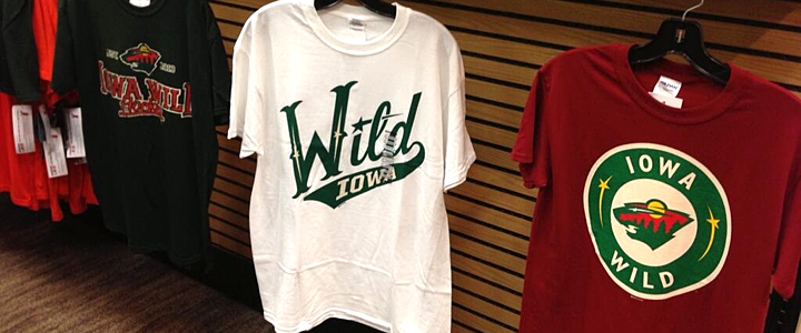
But that's not all. A few weeks ago, the Wild tweeted this photo of new T-shirts fans can get their hands on. And it showed yet

Photo from Iowa Wild (via Twitter)

On the right you can see a modified version of the logo Minnesota uses on their home sweater. Does that mean Iowa could be taking a similar route? Might not be the worst thing if they did. I know it's easy to complain when a minor league team takes on the branding of its NHL affiliate, but sometimes it's cool to see the variations.

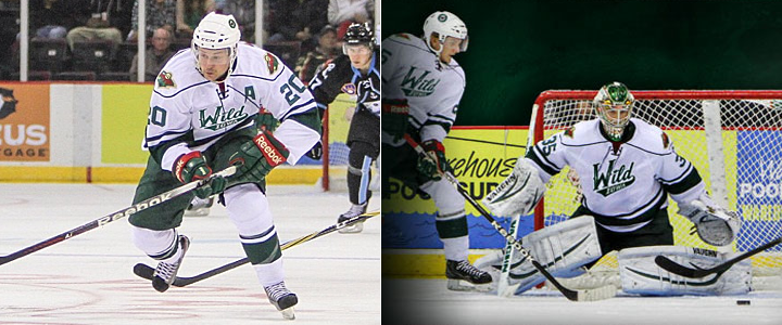
I believe that covers all of the Iowa Wild's logos for the 2013-14 season. But there is one more thing I wanted to mention. Obviously, this team has yet to take the ice, yet you can already find "photos" of the new uniforms in action — all thanks to Photoshop.

Images from Iowa Wild (via Instagram)

The image on the left was featured in an Instagram promotion and the one on the right was part of splash page graphic on the team's official website. (They have a different splash screen now but are still using a similarly Photoshopped player.)

It's basically just the old Houston Aeros alternate jersey with the new logo pasted on. Not a terribly complex solution, but at least fans get the feel of seeing the new Wild in action, right?

What do you think of teams Photoshopping new jerseys onto their players in the offseason? We've also seen it a lot with NHL teams given all the player movement since free agency began. Does it bug you? Could you care less?

Friday
Jun212013

Trio of New Jerseys at Q Draft

The 2013 QMJHL Draft was held in Chicoutimi, Quebec on June 8. And those interested in junior hockey jerseys got treated to a few new ones at the event.

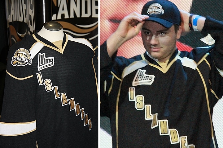
Islanders reveal black jersey at draft

Of course we have to begin with the recently rebranded Charlottetown Islanders, previously known as the PEI Rocket. Their new black sweater was on display at the draft and also given to their draftees. I haven't seen the white one so I'm not sure if it's the same style.

This is a bit disappointing. It's not like they knocked it out of the park on the logo, but why go even blander with a black text jersey? Charlottetown could've learned a thing or two from the mistakes of their NHL friends in Dallas. And what is with all the crazy piping?

Tigres switch from yellow to black

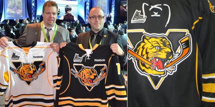
The Victoriaville Tigres have apparently dropped their yellow sweaters in favor of black. Seems like an odd move considering the trend in hockey jerseys these days, but these actually look pretty solid.

Photos from Victoriaville Tigres (via Facebook)

The Buffalo Sabres Edge template we're all quite familiar with, but it is an improvement on the Pens/Sens template they used to wear. And overall, it works.

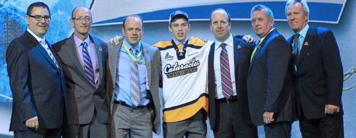
Lastly, the Shawinigan Cataractes apparently have a new alternate jersey. I say "apparently" because they only seemed to give it to one player at the draft. And because almost everything written about all these teams is in French — a language I don't speak.

Photo from Shawinigan Cataractes (via Facebook)

Maybe some of my bilingual readers might have some more information to pass along. Keep an eye on the comments for updates from those in the know.

As for me, I'm taking a step back from the blog for a little while. Not to worry, if there's news to report, it'll be here. But I need some time to get the next IceHL yearbook together and that means making the time for daily blog posts will be difficult.

That said, I'm expecting jersey news from Buffalo, Minnesota, San Jose, Montreal and possibly Calgary over the next few months. So as soon as I know anything, I'll be sure to let you guys know.

Sunday
Jun162013

Lethbridge Hurricanes Unveil New Logo

WHL team forced to rebrand by Washington Capitals

Back in March, we learned the WHL's Lethbridge Hurricanes would need to come up with a new logo. The NHL's Washington Capitals decided the Lethbridge logo was too similar to their own to continue being used.

That report came from CTV reporter Darrell Romuld, who then said that the Hurricanes would simply promote the logo being used on their alternate jersey at the time. That look was created by former IceHL GM and CanesCast founder Joshua Schroeder.

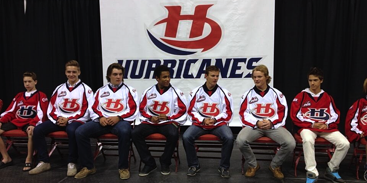
However, it seems that was not the case as Lethbridge unveiled an entirely new logo at a special event on Thursday. You can see it at the top of this post.

Photo by Patrick Burles (via Twitter)

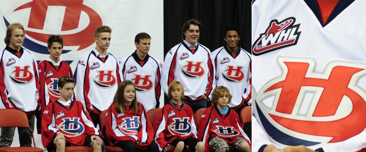
Despite dumping the Caps-style wordmark, the Hurricanes will still basically be wearing Caps jerseys. This is probably a Reebok thing. The new logo has two variations. The stylized H is in blue on the red jersey and red on the white one, as you can see below.

The Hurricanes have struggled with identity issues for as long as I've known them. This logo is an improvement on the ugly wordmarks they've used in the past. It's simple and bold. And original. Well, mostly original. Some readers have claimed similarity to the Hilton Hotels brand, but I think they're really just reaching.

The Hurricanes posted another article on their website about AKQA creative director Chris Polychronopoulos, who I'm assuming led the rebranding efforts for Lethbridge — assuming because article doesn't say so specifically. And all it really is is a bio. It outlines his credentials.

Photos from Lethbridge Hurricanes

Anyway, if you want to see more photos of Lethbridge's new look, a number of people were tweeting from the unveiling event, including Cody Nickolet (WHL From Above), Joshua Schroeder (CanesCast) and Patrick Burles (Country 95 News).

What's your take? Is this an upgrade for the Lethbridge Hurricanes or not? (Head over to this post to see the original logo.)