Entries in minors (159)

Saturday
Jun152013

Checkers Get New Uniforms

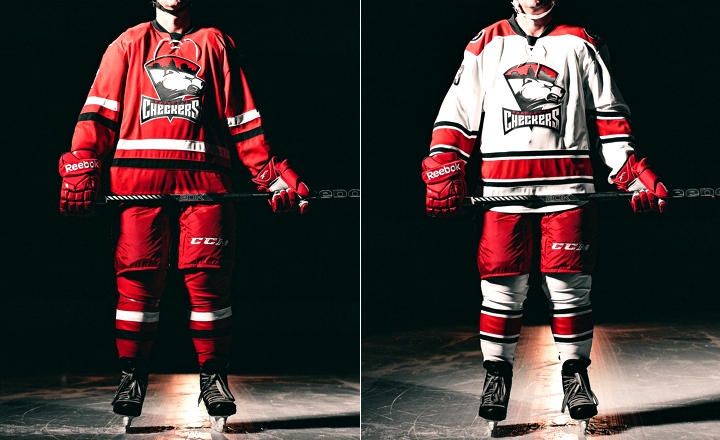
Following the lead of their NHL parent club in Raleigh, the AHL's Charlotte Checkers unveiled new uniforms on Wednesday. The redesigned sweaters are based on those of the Carolina Hurricanes, who revealed their look to the world on June 4.

Photos from Charlotte Checkers (via Flickr)

On first glance, it looks like they duplicated the Canes and swapped out the crest. But first glances can be deceiving. There are more differences than that and some are key to making this uniform work for Charlotte in a way it didn't for Raleigh.

By now you've probably read my review of what Carolina did. Overall, it wasn't great. But the Checkers have changed some details that really make their version easier to swallow. So let's go through them. The Checkers have made this very easy, outlining the differences on their website.

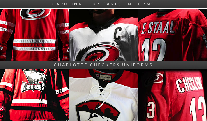
Some differences between the Hurricanes and Checkers' new jerseys

First, and most obvious is the black stripe on the red Checkers jersey. Come on Carolina, how hard would that have been? It wouldn't saved all the Team Canada grief you've gotten over the last week and a half. Then there's the lace-up collar on the white jersey. This isn't a big deal for me. A lot of folks bemoaned the non-matching home-and-roads in Carolina. I kind of liked that.

The Checkers also have a shoulder patch, something the Canes went without. Of course it's the standard Hurricanes logo, but at least it's something. Other changes pointed out on the Checkers' website include the Checkers retaining the shiny silver on the crest while Carolina opted for a matte finish. And, naturally, the collar doesn't have a row of storm flags like it does for the Hurricanes.

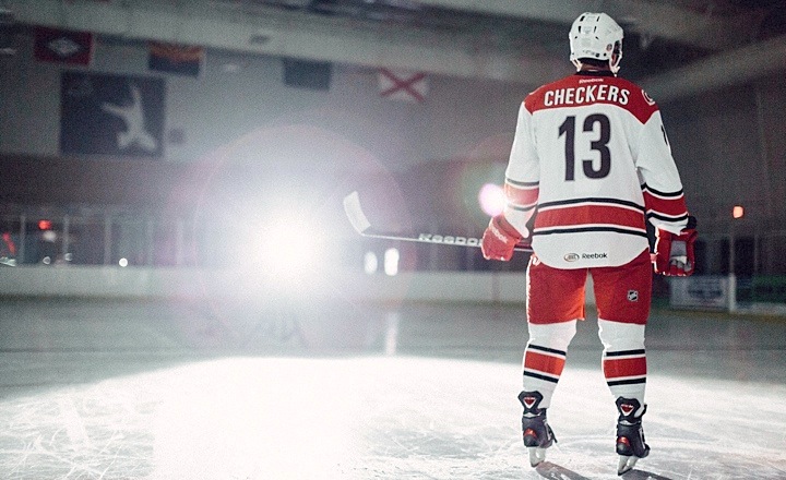
Photo from Charlotte Checkers (via Flickr)

The reason I like Charlotte's version better is quite simply the black stripe on the red sweater and the shoulder patches. Seemingly minor details can turn out to be important.

And there's something else. The Checkers identity dates back to the 1950s in the old Eastern Hockey League. That's about 60 years of history there. Because of that, a traditional-style hockey uniform works for them in a way it doesn't for the 16-year-old Hurricanes. Plus, it never made sense for them to wear those storm flags around their waist like it did for their parent club. Moreso now that the Canes themselves stopped using that particular feature.

So for Charlotte, this is an impressive upgrade to the look. They will be one of the AHL's best-looking teams in 2013. How can two teams wear jerseys so similar and yet look so different? Now you know. 

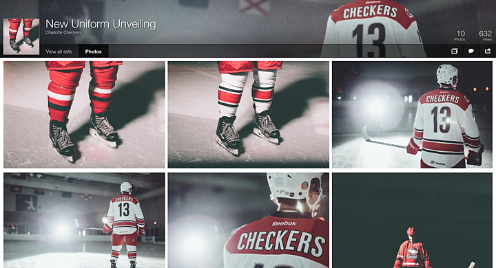
More photos of the new Checkers uniforms on Flickr

The Checkers have posted a series of artsy shots of their new uniforms on Flickr. I highly recommend taking a peek. There's also a video if you're interested in seeing the jerseys in motion.

Your turn. Did the Checkers make the right move? Share your take in the comments.

Friday
Jun142013

Introducing the Utica Comets

Canucks' AHL affiliate unveils name, logo and uniforms

The AHL's Peoria Rivermen have been searching for a new home over the last several weeks after the Vancouver Canucks purchased the franchise and announced it would be leaving Illinois. This afternoon at a press conference in Utica, N.Y., the team officially became the Utica Comets.

The new logo was first to be unveiled. Its shield design gives it an almost soccer-like quality. But the flying puck leaves no doubt this is New York's newest hockey team. The crest is styled after the look of the Canucks, the club's owner and NHL affiliate. Which is good because the jerseys belong to Vancouver too.

Utica Comets home, road and alternate jerseys (via Canucks website)

Comets to wear modified Canucks sweaters

Also unveiled at today's news conference were the new home and road uniforms, which are essentially Canucks jerseys with a different crest. And rather than using the Canucks' primary logo on the shoulders, it's the secondary mark — the stick in the rink. 

This has naturally led to questions from readers about whether it "means something" for the Canucks' future. I think it has more to do with aesthetics (the orca logo doesn't have any green) than anything else. And they're actually not alone. The Worcester Sharks wear on their shoulders the same shield logo the San Jose Sharks wear on their pants.

I like the simple carryover from the Canucks on the home and road designs. But that third jersey doesn't do it for me. There's clearly an effor there to call back to a Comets jersey from an earlier era, but text and numbers on the front rarely find favor with me.

Comets announce name, logos and uniforms at press conference (via Facebook)

New name a nod to the region's hockey history

Today's announcement marks the return of AHL hockey to Utica. The city had previously been home to the Utica Devils (who are now, somewhat ironically, the Abbotsford Heat) but that was 20 years ago. The franchise left town in 1993.

The name Comets has a long history in the area. Nearby Clinton, N.Y. was home to the Clinton Comets starting way back in 1927 — though they didn't pick up the Comets moniker until 1949. The team played in a number of leagues over the years but they made their name after joining the Eastern Hockey League in 1954. Can you name the other EHL team that's now a member of the AHL? It's the Charlotte Checkers.

The Canucks posted a neat infographic on their website that delves into the history a bit. It explains how the new logo was inspired by the old Clinton Comets logo. The mixture of Canucks elements really brings it all together if you ask me.

It's a great, simple design that accomplishes everything it needs to as far as establishing an AHL franchise in a new city. Sure we'll hear complaints about the text in the logo, the puck, and probably even cracks about the lack of creativity in the jerseys themselves. But consider the amount of time the organization had to put this all together.

The Canucks bought the Rivermen franchise in April. That's just two months to get logos designed and approved and put jerseys and other merchandise into production. That's a very fast turnaround for something like this. And it's rather impressive to see what the end result was.

Comets to begin play in Utica this fall

The Comets will hit the ice in October and have this inaugural season logo to mark the occasion. Looks familiar, right? Like the Canucks' 40th anniversary logo from a couple years ago? Certainly a logo design time-saver if I ever saw one. That said, it's well executed.

For more on the new Utica Comets...

There was a lot put on the web today about the Comets, especially through official channels. So if you want to learn more, how about a nice link dump? 

After you get your fill, drop back by and share your thoughts on the new Utica Comets.

Thursday
May302013

AJHL Celebrates 50 Seasons

Hey, let's keep this streak of new daily blog posts going. The AJHL, or Alberta Junior Hockey League, unveiled its 50th anniversary logo on Monday. The league has all sorts of plans for celebrating the occasion, which you can read about here.

Saturday
May252013

Texas Stars Introduce Sweaters

Dallas' AHL affiliate reveals redesigned uniforms

While we eagerly await the unveiling of the Dallas Stars' new branding, their AHL farm club just pulled the trigger on some new sweaters. On Thursday the Texas Stars revealed their updated threads — which I would've posted here sooner if not for all the NHL craziness of the last few days.

Photo from Dallas Stars Inside Edge

From the team's press release:

In preparation for the fifth season of AHL hockey in Cedar Park, the Stars will make a significant shift in their road jersey colors. Texas is replacing the all-black away uniform with a primarily dark green jersey, the same dark green that is featured in the team’s logo, and the crest patch will feature the team’s secondary logo.

The shoulder cap is white with a primary logo patch on each side. The collar is gold and includes a white lace tie-up. The sweater will also have thick white bands on each sleeve and along the bottom hem, trimmed with black and gold. The matching socks will be principally dark green with three bands of black, gold and white just below the knee.

The Stars' new home white sweater is simply their old third jersey, unveiled back on Oct. 5, 2011. No surprises there. But the new road sweater is now green instead of black — more in line with what Dallas is reportedly planning for their rebrand.

Francis Wathier and Toby Petersen model the new Texas Stars jerseys

As wordmark-based uniforms go, this one isn't at all that bad — even if it is set in the Batman Forever font. And if you're curious about who designed the new unis...

The new jerseys were designed by the Texas Stars in conjunction with Reebok, the official and exclusive jersey supplier to the American Hockey League. The jerseys will be available in both replica and authentic versions at the Texas Stars merchandise stands beginning this Fall.

Reebok is always involved now. We just need to accept that.

Photo from Texas Stars official website

The newer of the two jerseys also has a more traditional look — which is again in line with what we expect to see from Dallas on June 4. Even if you think Texas should've come up with all new logos — and I count myself in that group — this is hard not to like. Especially the added emphasis on green, a color that was more of an afterthought on the old jerseys.

Photo from Dallas Stars Inside Edge

I am concerned for the play-by-play guys, though, as the gold name on green jersey will be rather difficult to read if you're far away. Probably should've stuck with the safter white — but then I do like this color combination. More now that it seems Dallas won't be using it anymore.

That's all I've got. I'll leave you with this graphic the Stars put on their website.

Image from Texas Stars official website

Monday
May202013

Rivermen, Raiders Unveil New Logos

Peoria's new SPHL team reveals logo, uniforms

On Saturday, the latest incarnation of the Peoria Rivermen franchise — now a member of the Southern Professional Hockey League — officially unveiled its logo and uniforms.

Peoria Rivermen new uniform designs (via Facebook)

I briefly went over the history of the Rivermen in Friday's post. The new look came just a day later via the club's new Facebook page, where they also posted the progression of Rivermen logos over the years.

Rivermen logo progression, 1984—present (via Facebook)

The branding efforts are an attempt to capture history and tradition of the Rivermen franchise which has existed in some form for nearly 30 years. That's quite a run. For a deeper look, I recommend this article from Dave Eminian of the Peoria Journal Star. The write-up mentions that the logo and uniforms were designed by Carie Hanawalt.

The old Rivermen franchise of the AHL was recently purchased by the Vancouver Canucks and will no longer play in Peoria. So there will be a new name and a new location for the team at some point but nothing has been announced yet.

WHL's Prince Albert Raiders start "green movement"

The other big logo unveiling last week happened in the Western Hockey League. The Prince Albert Raiders decided to highlight their green and introduce all new logos and uniforms.

New jerseys modeled at Raiders unveiling (via Facebook)

Take a good look at those jerseys. They're Reebok Edge, but a brand new template we've ever seen. Factor in the colors, and what are the odds we're looking at the next Dallas Stars uniform with a different logo on the front? It was an IceHL GM, Mike Kelly, who first mentioned this via Twitter. And I have to agree.

Then again, it would be surprising for a couple of reasons. First, if Reebok is going to go out of its way to generate an entirely new sweater template, why would they do it for a junior league team. It's more likely that it'd be for an NHL club — like Dallas. But then if all that is true, why allow the junior team to hold its unveiling first — three weeks before the NHL club?

It could be a simple solution, like maybe Reebok works up new templates every year — some of which may or may not end up in use in the NHL. It could just be a way of expanding their own product line. In any case, it's something worth talking about.

What's your take? Both on the Raiders' new look as well as the possibility that they're a preview of the Stars' redesign. And how about the new Rivermen?