Entries in thirds (94)

Monday
Dec072009

Let's Catch Up

I made some free time tonight to get some new items here on the blog. I've got a bunch of items so settle in.

First on the list are the Pittsburgh Penguins. Tribune-Review beat writer Rob Rossi says the Pens are ditching the baby blues next season. That's his story and he's sticking to it.

Initially published just before Thanksgiving, this rumor is gaining new details — still from Rossi. During an ESPN.com live chat last Thursday, he added that a blue alternate jersey is still in the cards for the Penguins.

Rob Rossi: By the way, Pens donning the baby blues tonight. Best uniforms in team history, IMO; they will scrap them for next season, but I'm told the new alternates will have some blue coming back.

Joy_Russo: That's a travesty. Those power blues are great.

I don't know who this Joy is but she's right. If you'd like to read that chat in its original form, I'm told you have until Thursday before it turns into a giant pumpkin. My thanks to Ryan for the link.

And I'm done. Except to say this: Why shed the best jerseys currently in use in the NHL? Is a simple reason too much to ask for if you really have to do it? Regardless, we'll add the Pens to JerseyWatch 2010.


Anyway, the Kings are next on the list. Well, not exactly. Actually, Los Angeles is next on the list — having recently been announced as the host city for the 2010 NHL Entry Draft. The new palm tree-infused logo is making the rounds.

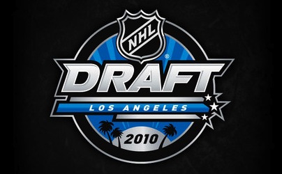
2010 NHL Entry Draft event logo

They could do worse. They have done worse. But it's just so not what you'd expect to see on NHL Draft Day. Palm trees and the like. It's what I see on my drive to work every day.

All right, knocked another one out. 


That brings us to Atlanta. Somehow the Thrashers' 10th anniversary logo managed to slip under my radar a few months ago when I posted the Icethetics Season Preview. Embarrassing. Anyway, a lot of you have been noticing it on the players' helmets.

Atlanta Thrashers' 10th anniversary logo on a player's helmet

It's wretched, is what it is. This is how you celebrate and symbolize ten NHL seasons? You know me. I rarely have a harsh word to say about a new logo or jersey. But this? Let's break it down.

What should we be seeing there? An "ATL" next to a stylized thrasher head? An "AT" (Atlanta Thrashers) next to a 10? A mish-mash of all of that? Whatever it is, it's bad. Go back. Try again.

Maybe the reason I overlooked it for the Season Preview was that my brain was unwilling to actually admit to seeing it. Let's move along now.


The Ottawa Senators are worth a mention here. Remember that whole ordeal back in August where The 6th Sens blog picked up on the "O" jersey making an appearance on the team's official web site?

via Sens ChirpWell another Sens blog has joined the third jersey fray. Icethetics reader Julian writes in to point out that Sens Chirp is adding to new unsubstantiated rumors. See the tiny, unenlargeable image to the right.

Why their version of the vintage alternate is red, I don't know. The Senators already wear red at home. However the red helmet is an interesting touch. But let's stick to the black "O" jersey as that is actually aesthetically pleasing.

Beyond this image, I have no new information regarding a change to the Senators' third jersey — except to say that they've only had it for two seasons. I think it's a little soon to be dumping it already.

Don't make me add the Senators to JerseyWatch 2010.

Fine. They're added.


Speaking of ridiculous/wishful thinking, the New York Rangers popped up on the old Icethetics radar this week. A reader sent in this picture claiming it was a leaked third jersey prototype.

This is not a Reebok Edge third jersey for the Rangers.

It doesn't take an expert to figure out it isn't. Sewing an NHL logo into the collar does not a legitimate Reebok Edge jersey make. And while I'm sure we'd all like to see the Lady Liberty sweater make a comeback, getting my hopes up for no reason is just... mean.

Anyway, thought you might like to know. 


That brings us to the final item of the night. The 2010 Olympic Games are just weeks away and so the IIHF has taken it upon themselves to give us a look at all the new hockey jerseys for the participating nations — all in one place.

There's Belarus, China, the Czech Republic, Finland, Germany, Latvia, Norway, Russia, Slovakia, Sweden, Switzerland, and the U.S.A. Wait, I feel like I'm forgetting one. Is Canada fielding a team this year? Someone double check for me.

You'll notice that the U.S. is the only country taking advantage of the third jersey cash grab. Because this is America, dammit, and if we're not selling something then the terrorists win.

Hey, incidentally, does anyone know how I can go about getting Canadian citizenship? That only sounded like I was kidding.

Thursday
Dec032009

The Orca Debate

I don't mean to dwell on a topic born out of speculation, but after Tuesday's post regarding the possibility of the orca logo going the way of the dodo, my inbox was inundated. And I feel like this is the kind of subject matter that we'll hear an awful lot of different opinions on. So here are some more of them.

Hey Chris! I do believe the Orca in Canucks nation is endangered and becoming extinct, but the logo that I believe that will take its place as the primary will be the Johnny Canuck V logo, not the stick in rink.

The licensing agreement for the Orca logo is almost over, not sure exactly when, but possibly in time for next season, and the clues of the Johnny Canuck V logo becoming the primary are all over the Canucks website as well as on merchandise. I've attached a few pics to this email which lends me to believe this is true.

Matt

That's an interesting notion. A free Johnny Canuck t-shirt along with your orca jersey, perhaps so that when the orca is phased out you won't be completely left without a current Canucks logo? Just a hunch.

Here's another email regarding new upcoming merchandise.

I work at a sports store and we get all the merch catalogues early. I never thought much of it until I read the article. But after reading that I do notice that the Canucks stuff (hats, shirts, mini-sticks, etc.) has changed.

There is still stuff designed with the current logo but the new catalogues compared to the old ones do have a lot more of the non-orca logos. The stick-in-rink logo is used the most and the Johnny V and Johnny Canuck logos are popping up all over the new stuff.

There is also a lot more of the green being used as well. Not sure if this is really an indicator of a change or just a money grab though.

Adam

The money-grab idea does make sense. But is that really all it is?

This last email may just be silly, but it's worth the read nevertheless.

Take it for what it's worth, but while working a concert at the Commodore Ballroom a couple months back, a gentleman presented the local band that was on stage with a maroon Vancouver Millionaires jersey and proceeded to claim that this was going to be new third jersey for the Canucks next year — which coincidentally is the 40th anniversary. 

At first I brushed it off, but now I'm starting to see these great vintage maroon jerseys in local hockey shops. I, for one, would love to see the Canucks playing in the only Cup-winning sweaters this city has seen.

It looked great on the Giants when they wore it and I believe it'll look fantastic on the Canucks if they do as well. Hopefully this does indeed become reality.

Michael

Ridiculous? Maybe. But the Canucks never cease to surprise us with their new sweater choices — however usually for the worse.

Feel free to add to the discussion in the comments. I'm going to put it to bed as far as new posts go — at least until we start getting some concrete information. But we can bet that won't happen until at least the summer.

By the way, big day in Montreal tomorrow! A century in the making.

Friday
Nov272009

Blackhawks Unveil 3rd Jersey!

First, huge win for my Bolts tonight over the Rangers — despite the shutout-spoiler with two minutes on the clock.

As expected, the Chicago Blackhawks today followed in the footsteps of the Pittsburgh Penguins and revealed their new third jersey to be that which was designed for last season's Winter Classic. But there was a twist.

But before that, a video on the Blackhawks' web site served as an unveiling of sorts. We watch Patrick Kane, Jonathan Toews and Marian Hossa struggle to wrap the new form-fitting jersey over their bulky gear. Seriously, it's the worst video I've ever seen an NHL team produce.

Patrick Kane tries on the Blackhawks' new third jersey

Look how uncomfortable he looks. Anyway, beyond that, what do you notice? Check out the shoulders.

New colors for the tomahawk logoThe classic tomahawk logo has been been altered to match the red/tan/black color scheme of the new alternate uniform. This was a feature missing from the Winter Classic version. 

I think it brings the whole uniform together quite nicely. I've always been a fan of this particular secondary logo and I'm glad the Hawks have found a way to freshen it up and keep it around for this new look.

The Blackhawks have also announced a 12-game schedule in which the new sweater will be worn. It makes its on-ice debut this Tuesday, December 1 when they face the Blue Jackets.

It sees the majority of its 2009-10 action late in the season, during six games in March. The full schedule can be found on their web site or in the Icethetics calendar found in the sidebar.

One more note tonight, also related to the Central Division.

Icethetics reader Jon writes in to point out something surprising in the Nashville Predators' new alternate uniforms — which made their debut tonight.

Check out the picture below and you'll see a third new logo on this uniform. Specifically, look at the pants. There's a stylized "NP" lettermark there — something we're seeing for the first time.

A new NP logo is featured on the alternate uni's pants

When the jerseys were first unveiled, the players were not wearing these pants so today was our first chance at seeing them. I've yet to see an up-close or high-res version of this logo, but from this perspective, it doesn't look like anything that's currently part of the Preds' design package.

It's not a big deal, but certainly worth mentioning. Thanks to Jon for picking that out. If I learn anything more on the subject, I'll keep you posted.

By the way, a quick note on comments. If you guys want to ask me a question directly — whether it's related to the topic of the post or not — don't bother putting it in the comments. I will read and respond to it only if you email me at icethetics@gmail.com. Thanks!

Thursday
Nov262009

Hawks Jerseys & Soldier Tributes

Never ones to miss a Black Friday cash-making opportunity, the Chicago Blackhawks have announced plans to officially unveil their new third jersey. And they're not going to make us wait long at all.

The Hawks have posted on their web site that the new alternate sweater will go on sale Friday, November 27 — tomorrow — and that Patrick Kane, Jonathan Toews and Marian Hossa will be featured in a video about it.

Patrick Kane at the '09 Winter ClassicI'm assuming the short notice goes to the fact that the design has been long-rumored to be based on the special Winter Classic sweaters worn on New Year's Day last season (pictured to the right) against the Red Wings. While they don't say so specifically here, I'd be shocked if they do anything different.

Obviously, Icethetics will have coverage of that tomorrow. So check back for details and pictures.

For whatever it's worth, this is my favorite Winter Classic jersey yet — and quite possibly my favorite NHL jersey of all time. I'm not sure why. I just know I want to own one.

Also while we're on the subject of the Blackhawks, I got an email from a reader today on a topic I never made it around to covering a couple weeks ago.

Why were the Hawks wearing these camouflage jerseys during warm-ups on November 11?


Well I think the answer is obvious. The Hawks were honoring American soldiers on Veterans' Day. But if you'd like more details on the tribute, click here.

For the record, the Anaheim Ducks did the same thing the week before. On November 3, they donned camouflage jerseys in their pre-game skate. The sweaters were then auctioned for charity.

In case you were wondering, they are the exact same jerseys — only with different logos and numbers. And from the cut of the collar, it appears Reebok was in on the whole thing as well — which explains why both teams wore the same jerseys.

Anyway, I know I'm late on this story. And I apologize to all of you who sent in emails this month which seemed to go ignored. I read them but I just never managed to find the time to get it posted.

Actually, I had prepared an entire post talking about the lack of updates lately. It then got accidentally deleted before I could post it. Then I figured, who really cares anyway. You've heard it all before and I'm sure you guys are just happy when there's new content.

And this happens every hockey season. Work gets busy for me and when I do get home at almost midnight, the last thing I want to do is have to write more. Plus, I have a hockey team to follow too, you know.

One last note regarding KractIce. A couple of you have asked why it disappeared. Unfortunately it was due to a lack of interested just like the IceHL. And I understand that. The hockey season is back in full swing and no one really cares about logos and t-shirts anymore. We just want to see our teams to win.

We'll shoot for another competition this summer. In the meantime, enjoy the season and I'll keep posting new stuff whenever I have the time — except in January. I'm getting married in Las Vegas in January and I have no plans to keep the site updated during that time. I'll be back after though.

Tuesday
Nov242009

Panthers Unveil 3rd Jersey!

Last night just prior to their game, the Florida Panthers unveiled their brand new third jerseys. The sweaters are primarily dark blue with gold accents and introduce an entirely new color to the scheme — light blue.

The Cats then debuted the new sweaters in the game against the Pittsburgh Penguins. It shouldn't go without saying that these jerseys do feel awfully reminiscent of the Winter Classic sweater the Pens introduced in 2008 — which later became their third.

Keith Ballard, Nathan Horton and Bryan McCabe in their new threads

It also seems to borrow elements from the Minnesota Wild home and St. Louis Blues third jerseys. So unfortunately it's not a totally original look. Having said that, I like them a lot more than the home and road looks. It's a solid design and when you really get down to it, they look like hockey jerseys should.j

Where the design falls down is that new secondary mark on the helmet, pants and shoulders. Yes, the Sunny FLA. Why? I'm intrigued by the irony that Reebok starts introducing abbreviation-based NHL logos and uniforms just after dumping their own abbreviated (Rbk) logo. (I know, I can't blame Reebok for everything.)

Despite that, I wouldn't be surprised to see that panther head logo soon take over as the team's primary mark. They've already chopped off the legs. Seems like a natural progression. What's disappointing is that along with that will probably see the end of red in South Florida. But it's been a staple since 1993 when the team first joined the league.

In fact, their original road jerseys were red. But suddenly in the last couple of years the red jersey was relegated to third status when the dark blue alternate was promoted. Then in the Age of Reebok, the red jersey went away completely. Fans hoping to see it return with this third were left disappointed as it's not even an accent color. In fact, they just added another shade of blue.

Still, it's always nice to see a team try something different. I have to give the Panthers credit for going out on a limb. But traditional sweaters in a non-traditional hockey market just seem to clash. St. Louis and Minnesota got it right. Nashville and Florida need some work.

I'll finish my analysis with something positive. I do like the custom type used for the lettering on the nameplate as well as the numbers. At first glance, it looks like a standard block font, but look closer.

The Panthers have said the jersey will be worn for 12 home games this season — including last night's — but I have yet to come across the schedule. If I do, I'll be sure to add it to the calendar in the sidebar.

So what do you guys think of the new threads?