Entries in thirds (94)

Saturday
Jan082011

Reversing the Curse of the Cannon

One of the last stories I posted before my brief leave of absence — to move 5,000 miles from my home in Tampa — was the unveiling of the Columbus Blue Jackets third jersey. That story then proceeded to take on a life of its own while I was getting settled in Seattle.

R.J. Umberger / photo by Bill Wippert/NHLIIf you're all about superstition in sport, then this story I'm about to recount is certainly for you. It's been said the Blue Jackets were cursed by the cannon jersey. Why?

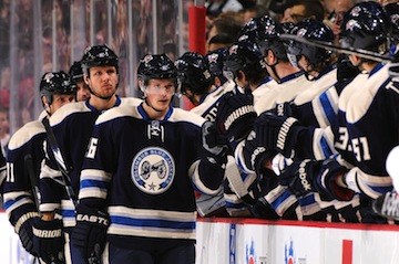
It started with the official unveiling at a mall in Columbus while the players were on the road facing the Islanders — who, by the way, were 0-11-3 in the 14 games leading up. The Jackets took a 2-1 lead into the intermission. Then the jerseys saw the light of day for the first time between periods back at the mall. It only took 51 seconds of the second period for the Isles to tie the game.

A team that hadn't won a game in over a month proceeded to force the Blue Jackets into overtime. It was a W for Columbus, but only just. Still, it put the Blue Jackets atop the Central Division. So it was back home to take on the perennial division champ, the Red Wings.

The jersey made it's debut on Nov. 26, as scheduled, as the Jackets hosted the Wings. But Columbus was edged out, 2-1, ending a five-game winning streak. Two nights later, they brought the new threads to Detroit. Lost again, 4-2.

Almost a week later, the third jersey was on the schedule again. This time, the Blue Jackets were demolished by the Sabres in Buffalo, 5-0. And the next night, back in Ohio's capital city, the Penguins handed them a 7-2 thumping.

Head coach Scott Arniel had enough of this. The cannon sweater was back on the schedule a week later, Dec. 11, when his team was hosting the Rangers. Yet they skated out in their standard-issue home attire.

Blue Jackets wear the cannon / photo by Jamie Sabau/NHLIColumbus Dispatch writer Michael Arace quoted Arniel as saying, “I just thought our red pants against their red pants would look really cool.”

Sure, coach. It wasn't the 0-4 record in the third jerseys. It was your sense of style. Still, the Jackets came away with a 3-1 victory that night. It broke a streak of seven games in which Columbus couldn't close the deal in regulation time. 

On the heels of the swirling rumors that superstition was behind the last-minute change, the third jersey schedule was mysteriously removed from the team's website. But it remained on Icethetics for fans to be reminded of the team's original intentions. So we watched and waited for Dec. 18, the next third jersey date on the calendar.

Sure enough, the Blue Jackets wore the alternates against the Stars. If they had killed the jersey, it would've been bad. For one thing, there was all the publicity surrounding the unveiling. And let's not forget the boatloads of fans who bought them. But Dallas won. That made Columbus 0-5 in the new duds.

The losing streak finally came to an end on Dec. 27, when the Blue Jackets beat the Wild in a shootout. And four nights later, they closed out 2010 with an overtime win against Ottawa, all while wearing the third jersey. But they still haven't managed a regulation win in the alternate sweater.

Is the cannon jersey really cursed? If so, their next chance to break it is Jan. 14 against the Red Wings. But let's not forget this is a team that struggled all month, regardless of what uniform they wore. And the remaining dates originally scheduled for the third jersey are back on the team's website.

So, now I have to ask: Do the hockey gods have something against the cannon? Against it being the umpteenth dark blue alternate jersey in the NHL? Or is it just getting a bad reputation for being in the wrong place at the wrong time?

Friday
Nov262010

Ducks 3rd Jersey Unveiled!

The Anaheim Ducks skated out in their brand new alternate uniforms for this afternoon's game against the Chicago Blackhawks.

Ducks debut new thirdsThe jersey was leaked online some time ago but today provided our first look at the smaller details like socks, numbers and nameplates. And I will say this — they've handled the orange rather well. By that I mean there's a lot more of it on this uniform.

In addition, the duck mask logo from the '90s makes its glorious return to the Anaheim uniforms with this effort. But probably the best sign that the team is moving forward with its identity is the full webbed D on the chest.

The wordmark has been the second biggest downfall of Ducks sweaters since 2006. However, the biggest issue was the overuse of black and that hasn't gone anywhere, as you can see.

My favorite part of this uniform is the added orange. I don't see the point of it outlining the shoulders, but I like it on the socks, jersey cuffs and sides. Just wish they could've outlined the numbers in it, rather than gold.

The Ducks neat stuff related to the jersey on their website. Here's a PDF talking about the design development and here's the third jersey schedule.

So now that you've seen the uniform in its entirety, what do you think? Has your opinion changed at all? Is black becoming more acceptable in a league where blue is becoming the go-to alternate jersey color?

Wednesday
Nov242010

Jackets Unveil 3rd Jersey

The Columbus Blue Jackets unveiled the second alternate jersey in team history tonight at a special fan-centric event, while the players were away at a road game.

Now, normally I'd go into all the details about the unveiling and post lots of pictures with different angles of the new sweater. But instead, since I'm unable to write up a full blog post right now, I'll supply you with a link to the Jackets' website.

And if it's commentary you're hoping for, I'll say this: I'm a fan. I like them because they're both familiar and different at once. We can all give Columbus a hard time for being yet another team to go with the two-tone blue palette, but I'm not going to go that route. In fact, their twist on the recent trend is actually kind of refreshing.

We get our first look at it on the ice on Friday along with the Anaheim Ducks' new third jersey. Sorry again for the minimal content lately. Just another couple of weeks and I'll get everything back to the way it was.

Friday
Nov122010

Rangers Unveil Heritage Jersey!

New York Rangers Drury and Lundqvist sport the new sweaters

The New York Rangers officially unveiled their new Heritage Jersey tonight in front of fans gathered at Rockefeller Center.

Rangers unveil Heritage JerseyThe retro look comes as no surprise to anyone who saw the photo Sean Avery posted on his website in September, but we got a much better look during tonight's unveiling, as seen in above photo of Chris Drury and Henrik Lundqvist.

The new sweater, dubbed the Heritage Blueshirt by team marketing gurus, features darker and more subdued colors than the Rangers' standard palette. The blue is darker, the red is duller and the white is more... vintage.

Across the front reads NEW YORK in red, but in a font more typical of 1920s sweaters and different from what the team currently uses. The right shoulder features the 85th anniversary patch being used on the home and road uniforms this season — but in the "Heritage" color palette.

The surname runs straight across the shoulders, not arched, and the Rangers' retired sweaters numbers are stitched onto the inside hem in the back.

If you'd like to see the full photo gallery on the Rangers' website, here's a handy link. And another. Their website is filled to the brim with all sorts of pictures and other features relating to Heritage Week, which officially kicked off tonight.

I haven't managed to track down any details on whether this sweater will only be used this season or if it will be the new third jersey indefinitely. Also I don't believe a schedule has been released at this point. To be fair, I haven't looked very hard either.

One more note somewhat related to the Rangers.

Their AHL affiliate, the Hartford Wolf Pack will officially transition to the Connecticut Whale moniker effective Nov. 17. The team is promoting Saturday's game as the Wolf Pack's "last." Last we heard, the change was to happen between Thanksgiving and Christmas. Looks like they got things in order a bit early. Thanks to Alan H. for the tip!

Wednesday
Nov102010

Rangers Sweater Leaks — Again

Rangers' jersey leaked againIf there were any doubts before, let them certainly be quashed now.

Icethetics reader Sean (presumably not Avery) sends in photos of the New York Rangers new Heritage Jersey he found hanging on a store shelf.

I won't mention the name of the store where the pictures were taken as I'm not interested in getting anyone in trouble. But there were a number of them hanging on the rack (right).

And to be fair, these are pictures of the youth version of the jersey. But you get the idea. It's further proof of the sweater's "retro" design, which will be officially unveiled this Friday — in just two days.

The way the Rangers have been promoting the Heritage Jersey, I'm not sure if it's also going to serve as a third jersey for any indefinite amount of time. It looks good so I'm hoping it sticks around a while.

Back of new Rangers jerseyThis jersey was first leaked by Sean Avery back in September. What we didn't see in his lone photo were the details, such as the number and lettering styles.

We've got that covered now (left). And if you're also interested in seeing the special design on the inside of the collar, look no further. It reads "Established 1926" on the back.

Again, these are youth sweaters, so the collar design and jersey material don't match actual Reebok Edge specs, but all the critical design details should be accurate.

Just in case there's any question, I'm told the name and number outlines are in vintage white, not true white. And it appears the number font is the same as the home and road sweaters without the shadow effect.

Despite this pre-release look at the Rangers' newest jersey, I'm still looking forward to seeing it on a player in a game. I'm sure we all are.

Page 1 ... 3 4 5 6 7 ... 19 Next 5 Entries »