 Jacob Barrette and Daniel AlfredssonBy now, nearly every Icethetics reader knows his name. In 2008, Jacob Barrette took up the cause of fixing the Ottawa Senators' third jersey. The team's design was widely panned and in a ranking conducted on Icethetics last year, it finished 89th out of 90 NHL uniforms.
His push to convince the team to break out a Heritage Jersey won immense support from fans — and eventually — the club itself. This fall, the Senators finally opted to redesign their alternate uniform and enlisted Barrette in that undertaking.
This week, using Icethetics.info as a platform, Barrette unveiled his next attempt at improving the look of an NHL team with a bit of history. His Winnipeg Jets jersey design received mixed reviews but sparked an impressive discussion over the club's branding decisions.
Now, because I know you just can't get enough of him, Barrette has agreed to answer some questions for Icethetics and its readers. Here they are:
Chris: What was your experience interacting with an NHL club's marketing department? In other words, was it smooth sailing or did it take some convincing to get the design where it ended up?
Jacob: It was a great experience. Clearly the marketing department and I, as a fan, both had the team's best interest at heart and wanted to come up with the best possible look. We were all pulling in the same direction from the get-go, in the sense that we all felt the perfect look was out there, it was just a matter of doing the research and bringing it all together properly. I don't think any convincing was necessary. If someone had an idea, I would execute it to see if it worked. And we pretty much agreed on everything.
Chris: The final design of the Heritage Jersey differs from your original concept in a few ways. How involved were you with the revisions? Did you or the team suggest them? Do you think it still lives up to your original idea?
Jacob: I was lucky enough to be involved all the way. This wasn't a situation where they told me they would use my original concept and then modify it. They showed a tremendous amount of confidence in me and surrounded me with the right people. I think at the initial meeting, we all felt, myself included, that while the concept was nice, it could be better.
Like many other Senators fans, I wasn't fully aware of the extent of the team's history, therefore it was important to take the time to educate myself on that and go through a variety of images, old jerseys, etc. I feel like (hockey historian) Paul Kitchen's involvement is a bit overlooked. He was instrumental during the research period and opened a few doors for me and showed me quite a bit of elements that I otherwise wouldn't have had access to.
I think the final result is way better than the original concept. Every element has a reason to be there, there's no added bells and whistles. I think the simplicity and historical accuracy of it is special to us Senators fans.
 Chris: Is there anything about the final uniform design that you dislike? Anything you didn't have a say in?
Jacob: I love everything about it. At first, I was skeptical about the use of "vintage white," but ... I was sold on the vintage white when the shoulder patches were added. The design for the shoulder patch had been developed and presented in another context and [the marketing team] suggested we try it on as a shoulder patch. It made perfect sense and when the final prototype came.
Chris: Do you think versions of the Heritage Jersey should one day become the Senators' home and road uniforms or do you prefer it as an alternate only?
Jacob: In all honesty, I prefer it as an alternate. I think it's a great uniform but we have 20 years of great hockey here in Ottawa under the new brand and that's just as much part of our history as the old days.
Chris: Do you have any advice for others who might want to follow in your path?
Jacob: I think that in order to approach a team, organization or what have you with an idea like this, you must be confident in what you're pushing for. When I say confident, I don't mean to pump your chest and go all in. Those who have followed this story know that I was careful in getting people's opinion on the design before attempting to contact the team.
The petition, for example, was never meant to pressure the team into giving in. I created it to act as market study and, if support for the design came pouring in, which luckily it did, then I would have something of substance to present. In other words, I wasn't presenting them something that I wanted, I was presenting something that many of us wanted.
In addition to my questions, there were a few that Icethetics readers wanted to ask.
Stéphane Vigneault: [Where can we find] other examples of [your] work?
Jacob: The best place to see updated work would be on my Facebook page, although it hasn't been updated lately but will be shortly with — among other things — [additional] projects I have developed for the Senators.
Stéphane Vigneault: What [do you] think of the "diaper effect" the Edge template creates? [Were you] tempted to reduce the thickness of the bottom white stripe to reduce that effect?
Jacob: I think the curves at the bottom of the Edge template are unfortunate for this jersey, however I don't feel they take away too much from the idea. Also, they are designed this way to make them more comfortable for players. It's hard to understand if you're only reference are the premier replicas, but when putting on a pro-stitch, you get a better understanding of what Reebok has done. For example, the jerseys are tighter around the chest to make them more snug and widen a bit towards the bottom to accommodate the size of players' pants. I actually like the EDGE template very much.
 QMJHL's Gatineau OlympiquesStéphane Vigneault: Since [you are], like me, from Gatineau, [what are your] thoughts on the [QMJHL's] Olympiques' colour switch and use of the Kings' template?
Jacob: That I felt could've been 100 times better. More could've been done than just switch the colors. I feel the logo could've used a facelift, perhaps be simplified a little more, review the font used in the actual logo, etc. There's just too much going on in grayscale, therefore no colors making any specific element distinctive.
I like that they went back to the old colors but cleaning up the logo and making it less cluttered would've been a better way to go in my opinion. As for the jerseys themselves, I would've liked to see something more unique to the Gatineau Olympiques, wether it be a visit in the past or something completely new. Same with the number font. As a fan, I'm disappointed in the effort.
Matthew Rodgers: Did you want the jersey to use pure white and not the — [in my opinion] — fake "heritage" white? I think it would look even better in white. At this point it's the nicest jersey the Senators have ever worn, says me.
Jacob: Originally I wasn't on board with the antique white idea. However, after going to see some of the archived old wool sweaters to match colors, I started warming up to the idea as I felt this was one of the contexts in which it was justifiable. We had no shoulder patches on the jersey originally and once those were added, I think it brought it all together. As simple as it sounds, the shoulder patches made the antique white look better than the actual white.
Kris Lutes: How did the jersey evolve from your original concept?
Jacob: The jersey changed quite a bit, though the general idea is still there, only executed better. The original concept had no stripes at the bottom and only highlighted one set of stripes across the chest with the "O" and a thinner set of 2 stripes on the arms, which in my mind were to be repeated on the socks.
Austin Fischer: Why aren't there any stripes on the Sens heritage pants? That would just be the icing on the cake.
Jacob: Great question, and a continuation of the previous one. After researching the history of the old Ottawa Senators with hockey historian Paul Kitchen, we concluded that the most predominant part of the old Senators were the barber poles, a term that was given to them in a negative way back then, more as a mockery. Now [the look] has become iconic and the most important part of the Heritage uniform.
We wanted to modernize the old look ... so the idea was to create a subtle nod to them throughout the uniform, and we chose to do it by having three sets of stripes separated by black space: The first going across the chest and arms, the second at the bottom of the jersey and the third on the socks. Adding vertical stripes on the pants would have broken that subtle pattern. The all horizontal look was very much intentional. The final result, when seeing all the players in line (for the National anthems, to use an example) makes for exceptional visual impact.

Jordy Moughtin: [Were you] worried about the legibility of the numbers on the back of the jersey? White (or off-white) numbers with a white and red stripe running through them could have definitely not worked out as well as it did. Were there any alternate ideas to overcome this potential problem, such as having the stripe only on the front of the jersey?
Jacob: The stripes were going to go around the whole jersey, there was never any question about that. The two options that were considered were to have white or black numbers. We felt with the black numbers that it would 1) take away from the impact of the "O" as the main crest and 2) wouldn't be consistent with the sleeve numbers, nameplates and captain or alternate captain letters. These decisions aren't taken lightly as TV tests were done to determine if the numbers would be legible. This consists of someone skating on the ice with the jersey and having a broadcast camera on it, chasing the jersey around the ice, in and out of the penalty box, players bench, etc. With the black and red outline and the weight of the typeface, we didn't identify any issues.
Joey Langdon: Does your Canadian background have an influence on your design?
Jacob: I don't think my background had anything to do with the design, but it sure as heck did when it came to breathing some life in this project in order to get it noticed by the organization! Any good designer would tell you, your own preferences shouldn't matter; it's all about what the client needs. In this case, it was a matter of finding the best elements to put in place and how to bring them all together in one uniform.
We return to our regularly scheduled non-Jacob Barrette programming tomorrow. But for the record, I do believe him worthy of four days of coverage for the simple fact that he's actually done what almost everyone here wants to do — see a great fan-made concept design become a real NHL uniform.


 The Boston Bruins are bringing back their black third jerseys for a fourth season this year. On October 21, the club released a schedule detailing when it will be worn during the 2011-12 season.
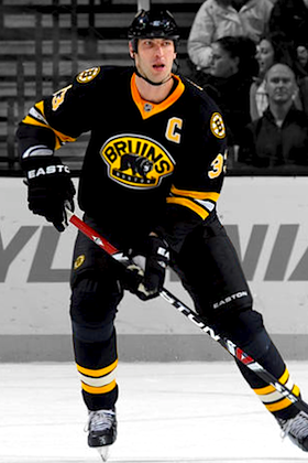 Zdeno CharaThe alternate threads will see action in 11 home games throughout the year. Here's the breakdown:
 The Los Angeles Kings basically have two alternate jerseys to wear this season. And according to the team, both are going to be used rather sparingly.
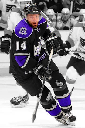 Justin WilliamsBut first, the third jersey will see action in just eight games (two on the road), about half of the league maximum.
 Chris
Chris
 The Florida Panthers confirmed via Twitter last week that the blue third jerseys will be worn for all Sunday home games during the season.
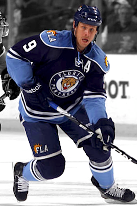 Stephen WeissSo I went through the Panthers' season schedule these Sunday home games appear to be the final eight for this doomed sweater:


;)


