NHL Tournament of Logos

Entries in avalanche (42)

Thursday
Sep062007

Poll: Avalanche vs Oilers


vs
Colorado
AVALANCHE
Edmonton
OILERS


Place your vote and then feel free to leave a comment as to how you came to your decision. Tell all your friends to drop in and vote! The more voices heard, the more accurate the results!

Poll opening date
Sep 6 @ 4:23 AM
Poll closing date
Sep 13 @ 11:59 PM

07CHTRN | #W3A | COLvEDM

Monday
Sep032007

Result: Avalanche vs Wild

Colorado
AVALANCHE

52% 8,078 votes

Minnesota
WILD

48% 7,441 votes

15,519 total votes

Colorado Avalanche
Advancing to Quarterfinals to face Blackhawks or Oilers

Minnesota Wild
Eliminated


Poll opening date
Aug 27 @ 4:22 AM
Poll closing date
Sep 3 @ 11:59 PM

07CHTRN | #W2A | COLvMIN

Monday
Aug272007

Avalanche Concept Art

The Colorado Avalanche are one of five teams we have yet to see jerseys or get word of unveiling dates for. (The other four teams are the Sharks, Ducks, Sabres and Devils, by the way.) Anyway, I've got concept designs to share, as usual.

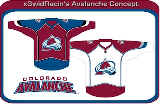
I'm beginning with something recognizable. Something like that would look very similar to what the Avs currently wear and there would likely not be the upheavel of discontent like what we're hearing out of Ottawa. And all said, those are pretty sharp anyone. The Avs would be lucky to wear something that nice.

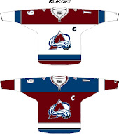
These are pretty interesting too. The one on the left completely does away with the angled stripes along the sleeves and bottom of the jersey. I'm not sure how I feel about it — probably because its unfamiliar. I've always thought the Avs have been among the best in the league with regard to logo and uniforms. To see a big change from them would be jarring.

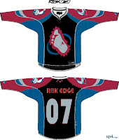
So you can imagine how I might feel about the "alternate" jersey on the right. I'm a fan of the over-sized shoulder patch but that's about the extent of it. Black does not work with the Avs' look. However, the bigfoot secondary logo on the front of the jersey is growing on me a little. Maybe they could go in that direction with the new jerseys.

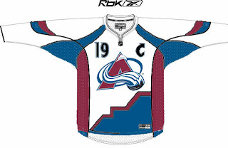
Then I have this design. If the numbers on the front didn't turn you off, check out the bottom of the jersey. I'm not really sure what's going on there or what the artist was trying to achieve.

And finally, while I was in the middle of writing this post, I got a great email from Capouel. Check out these works of art.

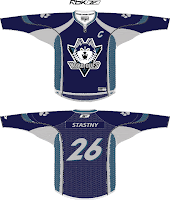
Being that the Avalanche once existed as the Quebec Nordiques, I felt these were relevant to this post. For those who don't know, the crest featured in these designs were not created by the designer. In fact, this logo was meant to be used by the Nords beginning in the 1995-96. But before they could put the logo into effect, the team was moved to Denver.

This is what the Nordiques might look like today if they never moved. Anyway, that's all I have to say on the matter. What do you guys think?

Monday
Aug272007

Poll: Avalanche vs Wild


vs
Colorado
AVALANCHE
Minnesota
WILD


Place your vote and then feel free to leave a comment as to how you came to your decision. Tell all your friends to drop in and vote! The more voices heard, the more accurate the results!

Poll opening date
Aug 27 @ 4:22 AM
Poll closing date
Sep 3 @ 11:59 PM

07CHTRN | #W2A | COLvMIN

Monday
Aug062007

Avalanche vs Stars


vs
AVALANCHE
STARS
11-2
8-5

The Aesthetics
This is the end of the line for both of these logos in this tournament. But its just the qualifying round. You will get to decide how good they really are. But I'll make this short and sweet. No logo has ever been helped by incorporating the text of the team name.
Avalanche

The Nickname
An Avalanche of snow has nothing on a Star of fire. Forget the snowslide, a big one could incinerate the planet. Then there's no snow to fall on anybody.
Stars

The Analysis
The giant avalanche across the "A" is a classic logo, not that you asked me. I see it being around a very long time. However, I can think of better ways to deal with a logo for the Dallas Stars. Maybe one day we'll get one. Until then, I like the "lone star" element, but not more than the Avs logo.
Avalanche


WINNER
2-1


Saturday
Aug042007

Flames vs Avalanche


vs
FLAMES
AVALANCHE
10-1
11-1

The Aesthetics
Despite what some readers may think, I actually like letter-based logos. We've got flames on a "C" and an avalanche on an "A." Plus, I've said before that I feel like the Avalanche logo will be an all-time NHL logo classic. But that's not to say the Flames logo isn't already. However, when we look at the elements of these logos, the avalanche is being led by a subtle puck and that is cool.
Avalanche

The Nickname
This is the ultimate battle. Fire and ice. The Flames melt the Avalanche, turning it into a waterfall which extinguishes the fire. That was a pretty good one.
Flames

The Analysis
This is another hard call to make. If you want to know my thoughts on these logos, you should go back and read their previous matches since I'd rather not go through it all again. The deciding factor, though, will be that as one of the few Canadian teams, the Flames logo's "C" can stand for Calgary or Canada. The "A" is only for Avalanche.
Flames


WINNER
2-1


Tuesday
Jul312007

Red Wings vs Avalanche


vs
RED WINGS
AVALANCHE
4-8
10-1

The Aesthetics
When these teams get together, it's usually the greatest playoff hockey you could hope for. But when comparing their logos head-to-head, there's really no question in my mind as to who takes the cake.
Avalanche

The Nickname
Red-Winged birds have no fearing falling snow as they can simply fly over an Avalanche. Not too close, though.
Red Wings

The Analysis
I would be remiss if I didn't at least mention the longevity of the Red Wings logo. I'd also get an earful from ultra-traditionalists who fear change with regard to the Original Six like the very plague if I suggested an upgrade of any kind for it. But let me just remind you all of the new Boston Bruins logo. No limbs were lost when that was unveiled. So open your minds a little... and accept the fact that one day the Avalanche logo will be looked upon as a sports logo classic in the same way — except better because as of right now, it doesn't need an upgrade. Any changes would only hurt it. You see where I'm going now?
Avalanche


WINNER
2-1


Monday
Jul302007

Avs, Blues Jersey Concepts

Just when you thought I'd posted enough fake jersey designs for one day, oh no, just you wait. First we'll have a look at something that was put together for the Colorado Avalanche.

If you can look past the poor design quality, well, there's not much to this that rings of goodness. It's certainly interesting to look at, but Avs fans shouldn't worry about this. From what we've heard, there won't be any changes to the logo or uniforms — just an adaptation to the new Rbk EDGE style.

Now here's a look at a St. Louis Blues concept design.

I'm not real keen on the color scheme, but hey, it's not my team. As far as design, it's simple and rather close to what they currently wear. Although we haven't heard anything specific from the team regarding an unveiling of the new uniforms, I wouldn't expect to see anything much different from what they currently wear.

Friday
Jul272007

Wild vs Avalanche


vs
WILD
AVALANCHE
11-0
9-1

The Aesthetics
I've been dreading this match. How do you decide between two of the league's best logos? And while not everyone will agree with me, for now I'm the one having to decide. I'm going to go with the Avalanche logo but I can't really explain why. Just accept it.
Avalanche

The Nickname
If we assume the Wild is a forest and all the life that's part of it, then an Avalanche has the upper hand. The falling snow would completely take out everything.
Avalanche

The Analysis
This is where the Wild can truly earn a point. It's impossible to look at that logo and not see something different every time. You've got so many different things going on that it makes for a logo that's always interesting to look at — not to say that the Avalanche logo doesn't, but you can't expect to sweep a logo that looks that cool.
Wild


WINNER
2-1


Tuesday
Jul242007

Avalanche vs Blues


vs
AVALANCHE
BLUES
8-1
4-6

The Aesthetics
It's been hard for any team to beat the Avalanche in this category but the Blues logo serves as stiff competition. I'm a fan of the two-toned blue in the Blues logo but with that subtle puck at the end of the Avalanche logo, I'm tempted to lean more in that direction. It's a tough call but it's gotta be made.
Avalanche

The Nickname
Not only would a Blues musician be inconsequential to an Avalanche, but you could argue that a trumpet if played loud enough could cause one. You'd have to be in a Wile E. Coyote/Road Runner cartoon, but you could.
Avalanche

The Analysis
I'm still none the wiser as to the reason for a wing being attached to a blue musical note in the Blues logo. I get it in the Flyers logo but I don't get it here. Don't misunderstand, I think it's a great logo but it leaves me with questions which must be asked in this section. I can hardly think of a single complaint or question for the Avs logo. It's that good. What's sad is I don't know how the Blues logo got swept in this match.
Avalanche


WINNER
3-0