NHL Tournament of Logos

Entries in avalanche (42)

Saturday
Oct272007

Poll: Avalanche Franchise Logos


NORDIQUES
AVALANCHE


Place your vote and then feel free to leave a comment as to how you came to your decision. Tell all your friends to drop in and vote! The more voices heard, the more accurate the results!

Poll opening date
Sat Oct 27
Poll closing date
Wed Oct 31

07BONRF | RFCOL

Wednesday
Sep262007

Rbk EDGE Review: Avalanche

Part 3 of 30. All 30 NHL clubs have unveiled new jerseys under the new Rbk EDGE Uniform System for the 2007-08 season. Here at the NHLToL, we're going to review every one of them. Read up and then rate the new sweaters. We'll do a full ranking after completing all of the reviews.

Rbk EDGE Uniform System

Colorado Avalanche


New Uniforms

Old Uniforms

The Unveiling
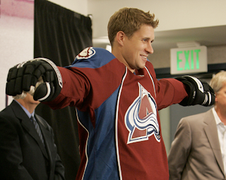
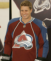
Wednesday, September 12. The Avalanche unveiled their new uniforms to the public at a press conference.

Home vs. Road
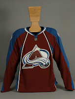
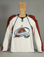
Home: Burgundy. Road: White. The two sweaters are essentially mirror images of each other in terms of overall design and both feature secondary logo shoulder patches.

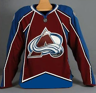
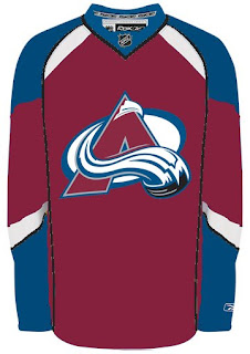
The burgundy home jerseys feature thick, blue stripes down the sleeves. There is also a blue panel extending up the side of the torso to the armpit. Thin black and white piping lines the sides extending down from the collar.

The white road jerseys feature thick, burgundy stripes down the sleeves. There is also a burgundy panel extending up the side of the torso to the armpit. Thin silver and blue piping lines the sides extending down from the collar.

In The Details
The same shoulder patches featuring the secondary logo are found on both shoulders of each sweater. The collar is blue, outlined in a thick silver stripe. The unique numbering and lettering style has been retained.

New & Old
The biggest difference between the old new sweaters is the new striping and pattern of the Rbk EDGE jerseys. Gone are the zig-zag, mountain range-shaped stripes extending the length of the sleeve. A similar element around the waist is also gone, leaving the waists of the new jerseys blank.

Standard FAQ
Numbers on the front? No.
Laces at the collar? No.

NHLToL Editorial by Chris
If you'd asked me a year ago which NHL club had the best uniform, among the list of those I'd seriously consider would've been the Avalanche. That was until now. I recognize the limitations of the EDGE design but refuse to accept it as a valid excuse. I really liked the mountain range thing along the arms and waist. It's sad to see it go. Though, to be fair, the overall look of the jersey remains largely unchanged. Beyond that, the piping extending down from the collar makes the logo seem trapped. All in all, this could've been so much better. 3/5


Buy your new Avalanche jersey!

Sunday
Sep232007

Avalanche, Here's How You Fix It

The introduction of Reebok's new EDGE Uniform System has left a lot of people stratching their heads. If you're among those questioning some of the design choices made here, then this series is for you.

Yesterday we contemplated fixes for the new Vancouver Canucks uniforms. Today we're going to look at the Colorado Avalanche.

Among the complaints for the Avs' new threads was the lack of the zig-zagged, mountain-range like stripes we're used to seeing. In fact, the sleeves even go from blue to burgundy on the home sweaters without so much as a stripe in between. One designer came up with a solution in this rough sketch.

Voila! But Reebok would have us believe such a design is incompatible with the cut of their uniforms. Well, Atlanta and Buffalo seemed to have gotten away with it all right.

No matter. Check out this design.

Personally, I've found that the Blues' new uniform is one of the best of the new crop and even in Avalanche colors it's still pretty damn nice.

When you come right down to it, I think the Avs still escaped with a relatively nice jersey. Seeing Joe Sakic's "C" overlap a big stripe on his shoulder will take some getting used to, but all told it could've been worse.

Any thoughts on improvements to the Avs or any other team's new threads? Email me at nhllogos@gmail.com.

Up next: Atlanta Thrashers.

Friday
Sep212007

Just To Freak You Out VII

I've decided to make the Freak Out series into a weekly feature to be posted on Fridays from now on as long as crazy artwork keeps landing in my inbox. And man, do I have some stuff for you this week.

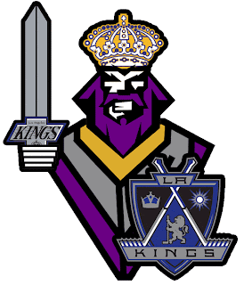
We'll begin with our friend Pfizer who's created mish-mash logos for the likes of the Vancouver Canucks, Buffalo Sabres and New York Islanders (check out the Freak Out series for those if you haven't yet). Now comes another shot at logo merging for the Los Angeles Kings.

For my money, it's not his best effort, but it makes me laugh no less. I'm a little disappointed he couldn't find a way to work in the current crown logo. But then it does feel a little thrown together. You have to admit, though, that king face is a great logo. Don't mess with that son of a bitch.

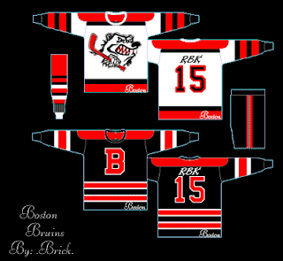
Meanwhile, I've got some completely new takes on a couple of team logos and uniforms. Imagine the Boston Bruins swapping out the yellow for red. Then imagine a cartoon bruin the likes of which might be owed money by Yogi Bear.

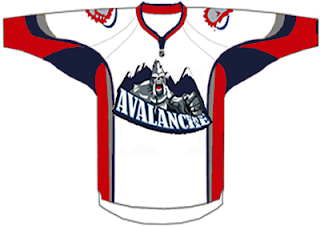
He's come to collect. Then imagine the Colorado Avalanche adopting a yeti for their primary mark. Might it frighteningly go a little something like this?

We should hope not. Lest ye bear the brunt of the abominable snowman's ever-clenched fist. And what's up with the upside-down feet on the shoulders?

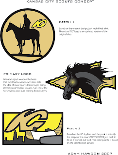
Speaking of what-ifs, let's say the Kansas City Scouts were to make their glorious return to the NHL. Let's also say their return was marked by the uprooting of the Pittsburgh Penguins. Yes, this design was made in the days when the Pens' future was uncertain. I point that out merely to explain its color usage.

If you enlarge the image, you can read the designer's explanations of the three logos, so I'll spare you the details here. What I will say is that I like Patch 2. I'm a big fan of city skylines in logos, though you don't see that a whole lot. What's cool about this one is the new Sprint Center being placed to look like a puck. Clever.

The horse's eyes are freaking me out, by the way.

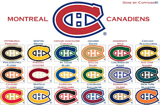
This next image is probably best viewed while high. I don't condone drug use, but chances of one having an "experience" are rather great. See for yourself.

Someone with a good deal of free time and an inability (or not) to cure boredom came up with this. He basically recolored the Montreal Canadiens' logo in the colors of various teams around the league. Conspicuous is the absence of the Tampa Bay Lightning's colors. But I guess not everything is about the Lightning.

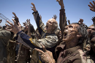
Now I want to show you some of the scariest things of all — because they're real! Okay zombies aren't real, but movies are real. A reader emailed me a production still from the new Resident Evil movie. One of the zombies appears to be wearing an old Nashville Predators sweater.

Talk about foreshadowing. That's not even right.

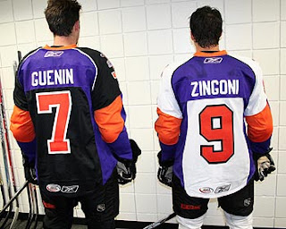
And finally, a reason for all those NHL fans out there bemoaning the arrival of the new Rbk EDGE jerseys to quiet themselves. It could have been so much worse. A fact proven by the AHL's Philadelphia Phantoms.

AHL fans, continue your bemoaning. It's perfectly warranted.

Freak.

Out.

Thursday
Sep132007

Result: Avalanche vs Oilers

Edmonton
OILERS

59% 12,229 votes

Colorado
AVALANCHE

41% 8,333 votes

20,562 total votes

Edmonton Oilers
Advancing to face Blues or Canucks

Colorado Avalanche
Eliminated


Poll opening date
Sep 6 @ 4:23 AM
Poll closing date
Sep 13 @ 11:59 PM

07CHTRN | #W3A | COLvEDM

Thursday
Sep132007

Random Concepts To Share

Aside from the NHL 08 news, it's been a rather slow day so it would be wrong of me to leave you without a concept post to get you through the night. But before I do that, I wanted to thank you all for continuing to visit and read this blog. Yesterday, we passed the two million hit mark. For those keeping track, it was over 1,000,000 hits in just two weeks. I'm still in shock.

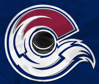
But moving along now. We'll begin with an amazingly cool concept logo which was emailed to me yesterday. It originates from the SportsLogos.net message board. It combines the tradition of the Colorado Rockies and the symbol on the flag of the state itself.

For my money, I'm sure it's just the thing hockey conservatives love. But the thing is, it's actually really good. Personally, I'm still partial to the "A" logo, but this could serve as show-stealing secondary mark for sure. I mention it because shortly after Altitude had the new Avs jerseys, somebody reworked it.

I never cease to be amused by people. Speaking of amusing — the New Jersey Devils have never had a secondary logo. Here's what one might look like.

Needs something to hold it all together, perhaps a circle or something. But I don't think it's half bad. Too boring for a primary but it's exactly what secondary marks are supposed to be.

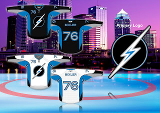
But while we're busy altering logos, I was emailed this Tampa Bay Lightning design.

While the silver and blue on black make a solid color combination, there really isn't anything to the logo. It's just... dull. I know we all like simple over busy but there's something to be said for finding a happy medium.

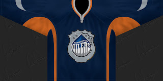
But let's not stop now. What if the Oilers were to don a redesigned logo at some point in the future? The riots in Edmonton's streets aside, it could look something like this if the right people were on the job.

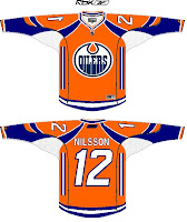
I can't speak for Edmontonians, but I like it, myself. What I don't like is an orange — and I do mean orange — jersey.

Like this one.

Yes it's a little busy but I can look beyond that. What I can't get past is all that orange. I'd take a copper jersey over that. What does that say?

Anyway, that'll do it for tonight. Leave your comments below as the designers who email me often peruse the feedback on their work. I'm sure they'll be interested in seeing what you all have to say.

I'll have more tomorrow if I don't get too bogged down in the four different teams unveiling jerseys.

One last thing... HOCKEY SEASON IS ALMOST HERE!!!

Wednesday
Sep122007

Avalanche Unveil New Uniforms!

I know we already saw images from Altitude, but this is the official post. The Colorado Avalanche have unveiled their new Rbk EDGE uniforms today. Photos follow.

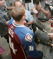
There they are. Now here's John-Michael Liles modeling the new duds at a press conference in Denver today.

I think he's been surrounded by the fashion police. I apologize, that was awful. I don't think my head's on right today. But seriously, I've been a big fan of most of these new Reebok jerseys. I'm sorry, this is not what I had in mind for the Avs. They had such a cool uniform.

Don't get me wrong, I don't think it's end-of-the-world horrible, but it's not great either. Couple more angles.

The lettering and numbering will remain the same apparently, so that's good. What I do like that all the new jerseys have is the giant crest. Show off that logo! No need for it to be so small.

Anyway. Love 'em or leave 'em, there they are. Avs fans, it's your big day. Is a celebration in order or shall we go back to the drawing board?

Wednesday
Sep122007

Altitude Exhibits Avs Uniforms

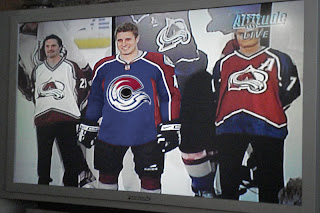
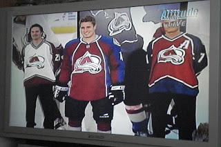
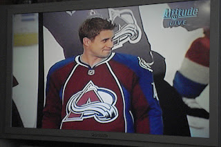
The images were just sent to me, showing the Colorado Avalanche unveiling their new Rbk EDGE uniforms on Altitude. Our first look compares last year's sweaters with this year's.

I'm not normally one to judge these new jerseys negatively, but yikes.

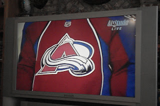
I guess it's not the worst thing in the world, but it's certainly not an improvement. It's a shame because I always thought the Avs were among the league's best uniforms. Not so much anymore. Doesn't do the logo as much justice anymore.

But that's all just my opinion. Feel free to share yours below.

Tuesday
Sep112007

Reminder: Big Day For Avs, Leafs

Tomorrow is going to be an exciting day for fans in Colorado and Toronto as the Avalanche and Maple Leafs prepare to unveil their new Rbk EDGE uniforms. To prepare us for the events, I have concept art — I know, your favorite!

But first, some notes. The Leafs' official web site has an article discussing the long history of the sweater. Worth a read. On the home page, they're saying fans can watch the unveiling ceremony on Leafs Today tomorrow at 3 PM. I'll watch if I can and try to grab some stills for you all.
Meanwhile, the Avs haven't even made mention of a uniform unveiling on their official web site. The information came from the Denver Post. They're saying the Avs will unveil their jerseys at a press conference.

Now let's dive into the concepts. We'll start out with the Avalanche.
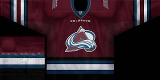
The team has said to expect only minor changes but logic would make us presume that the mountain range-like stripes along the arms are probably out with the EDGE design. I'm not the first person to suggest this. Chances are better the Avs go with something similar to last year's third jersey, retaining the primary logo as the crest. Let this serve as a good example of what that might look like.

But you came here for edgy concept art. Here's what you really want to see.
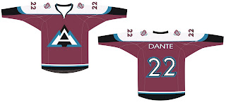
I laugh because the day I got the email with these images I was sitting there wondering what a more "traditional" Avs logo might look like. It's like the gods were answering me. It's a sharp concept but I can't see them changing the logo for another good 50 years.
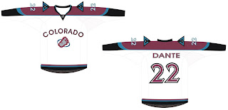
The typeface on the white jersey's chest is what I would consider to be brutal. But enough about the Avalanche, I know what you Canadians want. Let's check out some Leafs art.
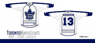
The stripes are going a little crazy here, but anyway, there it is. For something a little less drastic, I offer these.
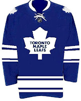
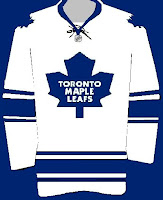
But wait, there's more!
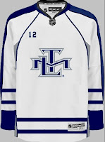
I know this is a risky move considering the number of Leafs fans who weren't behind the TML logo, but what about something like this for an alternate one day? I am under the impression, however, that this secondary logo will say goodbye when the new uniforms are introduced tomorrow.

One more! Let's go back to the Avs for this because I actually want to know what you guys think of it. Under the same guise as above of simplifying jerseys with a little too much going on comes this concept.
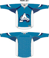
For me it's a little monochromatic but something about it says it could serve as a nice third jersey with a little help. The white "A" really shouts out "snow-covered mountain" to me.

Anyway, one last thing on what to expect for tomorrow. Avs fans, the club has said no major changes but the zig-zag stripe along the arms may not work. We'll find out for sure tomorrow. Other than that, expect something very close to what they've always worn. No logo or color changes.

Leafs fans, expect a much simpler uniform with no horizontal stripes at the bottom. I would expect minimalist stripes and constrasting color usage similar to the alleged Stars jerseys we've been seeing recently. In other words, I'm thinking a very plain sweater — and no TML logo. I doubt we'll see any change to the leaf silhouette, but the way the article above read made me feel like anything is possible.

Finally, feel free to share you're thoughts. I read them all.

Friday
Sep072007

No Change Is Word From Avs, Devs

We have news today regarding the new jerseys for the Colorado Avalanche and New Jersey Devils — who you might have noticed are absent from the sidebar countdown (along with the Anaheim Ducks).

Let's start with the Colorado Avalanche news. You might notice that the Avs have been added to the sidebar countdown with a jersey unveiling date of Wednesday, September 12. This information comes from The Denver Post. Beat writer Adrian Dater said yesterday in a blog post not to expect any big alterations.

We're anticipating an adaptation of the old sweaters to the Rbk EDGE style and cut. Here's an excerpt from Dater's post.

September 6, 2007

NEW UNIFORMS COMING

The Avalanche will unveil new uniforms on Wednesday, in a press conference. The uniforms will not have a newly designed logo or colors, but are representative of the new prototypes sponsored by Reebok that will be worn by all NHL teams this season.

The new uniforms are made of a different material that is supposed to absorb sweat better, are tighter on the bodies of players and allow them faster skating speeds.

In addition, the New Jersey Devils will apparently not be holding any unveiling ceremony or event for their new Rbk EDGE jerseys. According to The Record writer Tom Gulitti's blog, the jerseys will first be seen publicly in their first preseason game on Monday, September 17 against the Philadelphia Flyers.

Gulitti quoted Devils GM Lou Lamoriello as saying that the jerseys will not change. Basically what we were expected from the Devils. Here's the post.

September 6, 2007

No new jersey unveiling

Unlike most of the rest of the teams in the NHL, the Devils will not hold a press conference to show off their new Rbk Edge jerseys before the opening of training camp. All teams in the league will switch to the lighter, form-fitting uniforms (which also includes new, lighter socks) and some teams have taken this opportunity to make some cosmetic alterations, too, but Devils general manager Lou Lamoriello said that his team's jerseys will look essentially the same.

"Our jersey will still be our jersey," he said.

Fans can get their first look at them when the Devils play their first preseason game on Sept. 17 in Trenton against Philadelphia.

So to sum up, the Avalanche and Devils will simply convert their old sweaters without really changing anything. We'll see the Avs' on Wednesday and the Devils' five days later.

So to the fans who have been asking, there's your news. (Ducks fans, along with you, I'm still waiting for something.)