NHL Tournament of Logos

Entries in coyotes (57)

Friday
Aug172007

Mailbag: You Can Stop Sending These Now

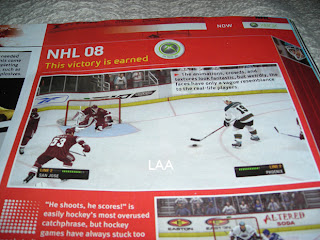
All right, I've said I don't want to get bogged down in the whole video game screen grab thing, but I think popular demand almost requires this one. I've gotten about a dozen emails in the last 24 hours with the following images attached or linked.
From what I've been told, what you're seeing in these pictures is a page from the official Xbox magazine — a yet-to-be released issue I'm assuming. Apparently, the picture above shows a game between the Coyotes and Sharks (a completely new San Jose design we've yet to be treated to officially) in EA Sports' NHL 08. The picture you see here to the left, although blurry, supposedly shows the Oilers and Canucks.

I can't speak to the veracity of these pictures nor really anything else with regard to them. But I just wanted to post them in the hopes that my awesome readers would stop sending me them.

Once again, I don't mind you guys sending in screen grabs from video games, but don't expect me to post them too often. If we're going to see official new jerseys, I'd prefer photos. Thanks everyone!

Thursday
Aug092007

Coyotes vs Oilers


vs
COYOTES
OILERS
5-6
2-11

The Aesthetics
The howling coyote actually gives us something to look at. Is the oil drop at the top of circle meant to be the focal point of the Oilers logo? If not, all that's left is the text and you know how that irks me. Don't you? Notch another one for the desert dogs.
Coyotes

The Nickname
An Oiler is probably a rather rugged fellow. I don't he'd find any need to worry about a little Coyote. Face to face, I think he could take it. Don't ask me how.
Oilers

The Analysis
There are things that bother about the Coyotes logo, small things like the fact that the ear is seen more easily than the eye. The Oilers logo is strong, solid and classic. I imagine it will be one of those that sticks around forever despite the fact that I think it could use an upgrade or two. But who am I to say? It may come as a surprise to you all, but overall, I think it's better than the Coyotes. Oh, and that does it for the Oilers schedule. When next you see them, you'll be placing a vote.
Oilers


WINNER
2-1


Wednesday
Aug082007

Predators vs Coyotes


vs
PREDATORS
COYOTES
7-6
5-6

The Aesthetics
Both of these logos are wild animals with wide open mouths. Because of that, there are a lot of similar elements. The biggest difference, aside from color, is the fact that the there's so much more detail in the Predators logo. Normally that wouldn't be a plus, but here it is. The Coyotes logo is just awkward looking to me.
Predators

The Nickname
We've got cats and dogs here. And normally you'd think the dog would beat the cat, but check out the teeth on the Predator. That Coyote never had a chance.
Predators

The Analysis
As a desert icon, the Coyotes couldn't have chosen a better name for the team — not that the Predators didn't. The Coyotes even have great colors, but I liked the original logo better. The Predators logo kind of has a lot of colors. All things considered, I think it wouldn't hurt to simplify it a little. But overall, I find it to be a little better of a logo. The Preds close out their schedule with the sweep.
Predators


WINNER
3-0


Saturday
Aug042007

Blue Jackets vs Coyotes


vs
BLUE JACKETS
COYOTES
11-2
5-6

The Aesthetics
These are a couple of young logos — less than five years under their belts. The Coyotes logo certainly says desert but not any better than the old one. I like it, but not more than the Blue Jackets logo. These is where small detail can actually help.
Blue Jackets

The Nickname
If a Coyote snuck up on a Blue Jacket while he was sleeping, do you think he'd be able to react quick enough to avoid becoming dinner? I have my doubts.
Coyotes

The Analysis
The Blue Jackets logo features an Ohio flag forming a "C" for Columbus. How can you improve on that? The Jackets definitely hit the mark with this logo. Nice to see them going with it as the primary this season. The Coyotes logo doesn't really have anything like that and it just looks awkward to me. By the way, this is the finale for the Jackets.
Blue Jackets


WINNER
2-1


Wednesday
Aug012007

Covered In Coyotes Concepts

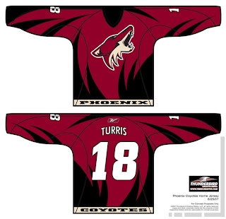
I feel like I've been ignoring the Phoenix Coyotes fans out there. This is certainly not intentional. There just hasn't been a lot of news to post for them. Until today, that is. I've scoured the far corners of cyberspace for a few images you might find beautiful or repulsive — or something in between.

This design was created by someone who designs the outsides of racecars, I believe. Anyway, it's really quite — something. I couldn't see them wearing anything like this because the whole reason they changed their logo was that they wanted to go the classic route and simplify everything.

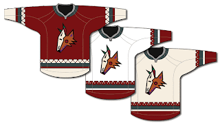
Well, to me, that was a sad thing. One fan designed this jersey set in memory of the old days when the Winnipeg Jets first arrived in the desert.

It's got that desert Indian look that was very cool. This design uses only the head of the original Coyote logo. It was first seen by itself on the green third jerseys they had for a short time. This is closer to what they actually wore in those days.

The big difference being that the Coyotes wore black dark jerseys, not maroon like they wear now.

I haven't seen any Rbk EDGE jersey concepts based on their current logo and uniform design, but haven't you heard, horizontal stripes are so out. Seriously though, don't be surprised if it comes out looking like the Capitals or Blue Jackets new jerseys.

It'd be nice if the league would unveil more of the new uniforms. Chances are we've still got another month ahead of us before we start to see the rest of the teams trickle out. Anyway, Coyotes fans and others alike, what do you all think of these designs?

Monday
Jul302007

Stars vs Coyotes


vs
STARS
COYOTES
5-5
5-5

The Aesthetics
Talk about an ocean of mediocrity (based on my ridiculous criteria). Both teams are 5-5 after their first 10 matches. Let's see how they fare versus each other. I like both color schemes but as you know by now, I'm tempted to go with the logo that doesn't so much symbolize the name as spell it out. And that's what's going to happen.
Coyotes

The Nickname
I don't think the Stars have lost this point yet. But come on, unimaginable celestial ball of fire. Little desert dog. The Coyote never had a chance.
Stars

The Analysis
It seems like the Stars logo goes farther in symbolizing the region as much as the team name. While there's a coyote in the Coyotes logo and it features desert colors, it doesn't scream Arizona to me. The big "lone star," on the other hand, says nothing other than Texas.
Stars


WINNER
2-1


Sunday
Jul292007

Wild vs Coyotes


vs
WILD
COYOTES
11-2
5-4

The Aesthetics
Well this is it for the Wild — last match of the tournament. They're going to be the first ones finished. And for that, we're going to milk this forest scene for all its worth. If you don't see how cool it is, then I'm convinced you're blind. That coyote just looks awkward to me. But then again I didn't hate the original Coyotes logo from the late '90s.
Wild

The Nickname
The Coyotes live in the Wild, true. But so do bears.
Wild

The Analysis
I've said it all before about the Wild logo. I'm not sure what else I can add. It's really a great team icon. But just one more time for posterity: Inside the outline of a bear's head you've got a beautiful forest scene featuring trees, mountains, a river, a sunset and — wait for it — the north star in a fitting tribute to the history of The State of Hockey. Anything I missed? I think the Coyotes logo is designed well but it doesn't have nearly the depth of the Wild. And that's that for the Wild in this tournament.
Wild


WINNER
3-0


Saturday
Jul282007

Coyotes vs Ducks


vs
COYOTES
DUCKS
4-4
1-11

The Aesthetics
The Coyotes logo isn't the greatest, but the Ducks logo is a wordmark. Lesser of two evils, here. Not sure what else there is to say about it.
Coyotes

The Nickname
If motivated, I'm sure a Coyote would eat a Duck.
Coyotes

The Analysis
Where is the duck? I see the coyote but where is the duck? Oh right, there's not one. Yeah, I'm still not getting over that yet. I understand the webbed duck foot "D" will become the primary this season. I guess they just wanted to establish the change of name. But in doing so, they get swept yet again.
Coyotes


WINNER
3-0


Friday
Jul272007

Blues vs Coyotes


vs
BLUES
COYOTES
4-7
4-3

The Aesthetics
Let's just get this out of the way. I'm going with the Blues logo here. The Coyotes logo isn't terrible, but nor is it great. They have yet to find a great logo in my opinion.
Blues

The Nickname
Coyotes howl and so does a Blues singer for that matter. Fortunately for the Blues man, if he ever had to face a Coyote, perhaps he'd have a saxophone with which to whack it on the head. (Try not to find the logic of a Blues singer carrying a sax into the desert. You'll never get there.)
Blues

The Analysis
Even though it probably won't live on as a classic NHL logo a hundred years from now, the Coyotes logo is at least a coyote. Sometimes I think a trumpet or some other musical instrument would be a better fit for the Blues logo. Despit that, I still like the musical note, I just don't quite get the wing attached to it. Anyone?
Coyotes


WINNER
2-1


Monday
Jul232007

Coyotes vs Sharks


vs
COYOTES
SHARKS
3-3
5-6

The Aesthetics
I continue to be disappointed by the lack of color in the Sharks logo and eagerly await tomorrow's unveiling of a new logo. The Coyotes logo at times looks awkward to me, but I certainly feel the action while looking at it. You can almost hear it howling.
Coyotes

The Nickname
This is one of those situations where I don't know why a Coyote and a Shark would ever come face-to-face, but my money is on the Sharks for sheer power.
Sharks

The Analysis
My first question is always, does the logo match the team name? Here, we do in fact see a coyote and a shark. Next I look at home town representation. Here, there's nothing obvious but the team names are good indications. An Arizona team named for a desert animal. And a California coastal team named for an underwater predator. Now I'm looking at features like the broken hockey stick in the shark's mouth. It's unnecessary. We should already know the logo belongs to a hockey team. This point goes to the Coyotes.
Coyotes


WINNER
2-1