NHL Tournament of Logos

Entries in coyotes (57)

Saturday
Sep152007

Waiting For Official Word

I first want to take this moment to apologize for posting almost nothing today. I'm going to rectify that here in the next hour or so. I've been waiting around pretty much all day hoping to see photos of the new Sabres and Coyotes jerseys on their official web sites. I mean I've been doing other stuff too, but I've been holding off on posting anything. So far, nothing.

However, a great reader sent in a couple of photos he took of the new Buffalo Sabres Rbk EDGE uniforms in the HSBC Arena store. So since I have nothing official, I'll at least show you those for now.

Basically they're last year's sweaters adapted to this year's new cut. And they still have the "slug" on them. What's changed is the NHL shield on the collar. Same as everybody else.

Unfortunately, we still haven't seen photos from CoyotesFest. So if you were there or you've seen pictures taken by someone who was there, please drop me a line. For that matter, if anybody notices the Sabres or Coyotes update their web site with photos, please email me and I'll get right on it.

Oh, and Sabres fans, if you need something to laugh at, click here. Though that might make you cry.

Friday
Sep142007

Sabres, Coyotes And Blues On Deck

Oh and as if it weren't enough that the Thrashers, Flyers, Stars and Blackhawks unveiled their jerseys and the Blues started selling theirs (prior to the unveiling I might add), there's still more news. Not huge, but worth posting anyway.

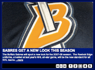
The Buffalo Sabres have acknowledged their new Rbk EDGE uniforms on their official web site. See the graphic.

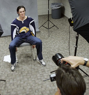
So there that is. Incidentally, the AP released this photo of Ryan Miller being photographed in said uniform. Solid, mostly unchanged.

So we move on to Phoenix where their web guy isn't even trying. I'm sorry, but really? A giant Rbk Hockey logo?

Tease us with a little logo embroidery like everybody else or something. Oh, that reminds me.

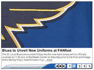
The Blues will probably be second as the Coyotes will launch their new threads at 11 AM. The Blues come about 30 minutes later. Anyway, that's what I was talking about with the whole logo embroidery teaser thing. It's fun. But teased we need not be. The Blues started selling replica jerseys today so we won't be surprised tomorrow.

Quite frankly, it's one of my favorites of the new crop. Those shoulders are nice. I wish more teams had tried something like that. This particular image was provided to us by Brad at St. Louis Game Time.

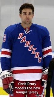
Anyway, I've got one more item as a special bonus for those of you who made it this far through the post. We've got another picture of the New York Rangers' new Rbk EDGE sweaters.

Check it out. Chris Drury is modeling the new home sweater for a camera. I don't know where this photo came from though. It was simply emailed to me. But we've seen the jerseys before. It's the same.

Enjoy your Friday night now, and don't spend too much time on the computer!

Saturday
Sep082007

Result: Blues vs Coyotes

St. Louis
BLUES

62% 8,392 votes

Phoenix
COYOTES

38% 5,104 votes

13,496 total votes

St. Louis Blues
Advancing to Quarterfinals to face Red Wings or Canucks

Phoenix Coyotes
Eliminated


Poll opening date
Aug 31 @ 4:28 AM
Poll closing date
Sep 7 @ 11:59 PM

07CHTRN | #W2C | STLvPHX

Monday
Sep032007

What If The Jets Were Still Here?

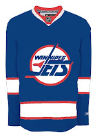
Over the past week, I've been surprised at the number of concepts I've been sent featuring the Winnipeg Jets. Surprised because that team no longer exists. Still, all the work people put in made me think I should share some of what I received.

Here's what the Jets might look like in a new Rbk EDGE jersey. This concept is based off of the new Canucks jersey. Not bad at all.

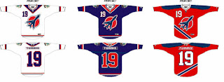
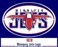
But with all the modernizing of this league, I have a feeling the logo would be different today. The logo you see on this jersey has been around since 1990. Don't get me wrong, I think it's a great logo, but I just feel like it would've been changed somewhere along the way.

Maybe to something like this.

The diagonal stripe in the red jersey freaks me out a little bit. Too steep? The designer wanted me to let everyone know that the shoulder patch emanates from the city of Winnipeg's coat of arms. I know it's small, but it's there.

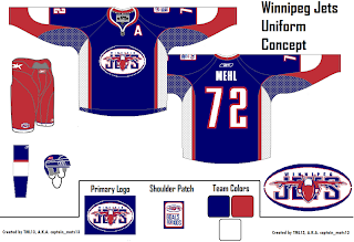
A different artists had a different idea for a new Jets logo and uniform set. It's also quite impressive.

I wish I could tell you it was an original design, but it's based entirely off of the AHL's Houston Aeros' logo. I do like the jerseys, though. Not too much to complain about there. A simple and classic sort of feel.

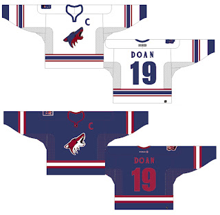
But despite all of this effort and toiling over Photoshop and Illustrator, the Winnipeg Jets moved to Phoenix in 1996 to become the Coyotes. So while I'm here, I also got emailed a great 'Yotes concept I can share.

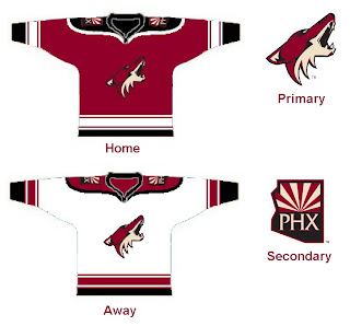
One thing I don't like about the current Coyotes jerseys is the monochrome feel. Black is a big part of the logo so why doesn't it have any part of the uniform?

I like that a lot! Coyotes fans, do you have an opinion. Do you like these or are you more supportive of Wayne Gretzky's prescribed design which the team currently wears?

Friday
Aug312007

Just To Freak You Out, Part 5 of 5

I know you'll all be sad to see it go, but today I'm wrapping up my week-long series of whacked-out and crazy images. So let's get this final show on the road. Our first stop is Pittsb— er, Kansas City. Or, well, I don't really know. You figure it out.

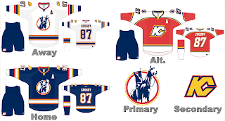
I know we've seen a lot of crazy shit, but wow. A Kansas City Scouts Rbk EDGE jersey with Sidney Crosby's name and number. I'm sure this design was concocted in the days when the Pens' future was largely uncertain. With KC looking like a predator ready to pounce, you never know. Just, wow. I don't really have any other words. Maybe you guys can find some.

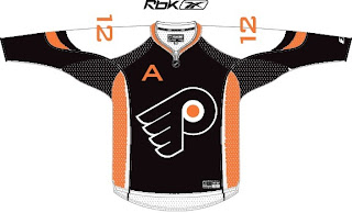
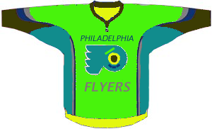
Over in Philly, there's a consortium that can't tell the logo forms a "P" unless it's cockeyed.

My neck hurts from looking at that. My eyes hurt after looking at this.

Ha ha. Now your eyes hurt too. I promise I won't do that anymore.

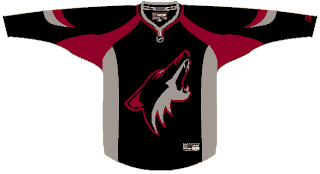
Oops, gotcha! You guys are easy. Anyone want to see a black coyote?

Probably not anymore, huh? Seriously, though. Charlie, from SabresNotSlugs.com really needs to see this. It could be the new logo for his site.

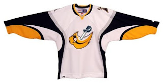
Somebody didn't like the slug. Showed it what a sabre is. Then gutted it. Sad story, really. But you guys haven't seen the half of it yet. Remember the amazing composite logo Pfizer created for the Canucks. He dropped the Sabres logos into the same blender. It produced this.

Maybe that should be your new logo, Charlie. Sometimes we just don't recognize how good we have it.

I hope I've been successful this week in freaking you all out a little bit. My goal is to show you that what you have, despite what some of you think, isn't that bad. We all like to moan and complain about changes but just remember, they could've done so much worse. And then where would we be?

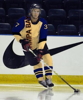
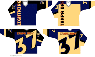
I'm going to leave you one last little nugget, though. On Tuesday I posted a crazy concept for the Tampa Bay Lightning. I also asked if someone might be able to show me what it would look like on a player. As I close out this series, let me leave you with that image. Let me burn it into your soul.

Big time thanks to Russ for that one!

Friday
Aug312007

Poll: Blues vs Coyotes


vs
St. Louis
BLUES
Phoenix
COYOTES


Place your vote and then feel free to leave a comment as to how you came to your decision. Tell all your friends to drop in and vote! The more voices heard, the more accurate the results!

Poll opening date
Aug 31 @ 4:28 AM
Poll closing date
Sep 7 @ 11:59 PM

07CHTRN | #W2C | STLvPHX

Thursday
Aug302007

Just To Freak You Out, Part 4 of 5

My week-long series meant to freak you out a little continues today. If you thought the last three days were something, just wait until you see what I have for you today.

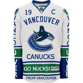
Canucks fans, a lot of you were unhappy with the new uniforms unveiled yesterday. But just remember. It could've been so much worse.

Told you. And what if they hadn't gone so far back to find vintage colors? What if they stopped in the '80s?

That's what.

Oh and I had to share this one. The Canucks seem to be all about mixing and matching. So here's what might've happened if they'd gone with this idea back in 1997 instead of the orca. A little scary but not horrible.

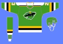
If you want to see horrible, imagine the Minnesota Wild in North Stars colors.

Try not to gouge your eyes out. It doesn't get any bigger for a reason. Quite frankly, I think the Wild have excellent colors. If you're among those who only see Christmas colors, I challenge you to find beige and yellow among the more common decorations. But that's neither here nor there.

Moving right along. While we're on the topic of throwback colors, what if the Phoenix Coyotes had gone with Jets colors?

It's a rather frightening thought. You don't know what bad is until you see and red and blue howling coyote.

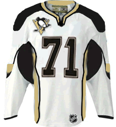
But I've saved the best for last, dear friends. My pals over at ThePensBlog.com came up with a good bit of satire that pokes some friendly jabs at the Reebok folks.

You may not realize at first glance, but that's the front of the jersey, not the back. I love the giant NHL logo at the bottom. If you want to see the number, there's the damn number. Crest be damned! But don't riot yet. You haven't seen the worst part.

Now you can riot.

Have a nice night. I'll be back tomorrow.

Tuesday
Aug282007

Result: Stars vs Coyotes

Phoenix
COYOTES

58% 5,706 votes

Dallas
STARS

42% 4,150 votes

9,856 total votes

Phoenix Coyotes
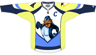
Advancing to Quarterfinals to face St. Louis Blues

Dallas Stars
Eliminated


Poll opening date
Aug 21 @ 4:29 AM
Poll closing date
Aug 28 @ 11:59 PM

07CHTRN | #W1E | DALvPHX

Tuesday
Aug282007

Just To Freak You Out, Part 2 of 5

I'm back with more weird and wacky designs from the world of hockey art. Prepare yourself.

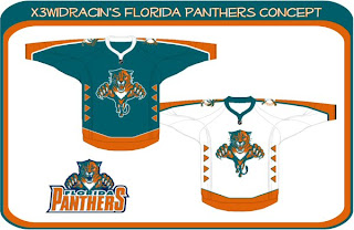
What sports franchise first comes to mind when you think Miami? The Dolphins, right? Well what made them famous? Was it their colors or the fact that football is one of the most popular sports in the U.S.? Well, the colors, obviously! So to help out the Florida Panthers in becoming more famous, one designer swapped out their colors. Take a look.

Go ahead. Rub your eyes. You aren't seeing things. Can you believe that? One incredible design after another, I tell you. Still, I can do better.

You'll have to look closely to tell, but that, my friends, is another fascinating concept for the Tampa Bay Lightning. No crest. Crazy numbers. The most original design I think I've ever seen. Here's my question: Can anybody Photoshop this jersey onto a picture of a player? Because I totally want to see how that bad boy looks on the ice.

The Phoenix Coyotes had a great logo when for some reason they decided to throw it to the wolves in 2003. They dropped out what made their logo unique and colorful. Guess bland is back. Or not, so this designer thinks. Check that out. It's a wonderful combination of old and new.

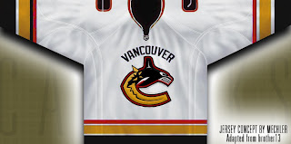
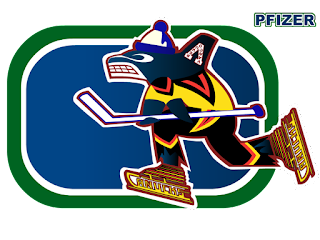
Kind of like this. And while we're on the subject of that crazy Canucks logo. What you really need to see is the fully-colored version.

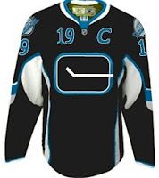
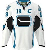
How can you improve upon something like that? It's like finding pure gold in the Black Hills. Oh, and while we're still on the topic of Vancouver — all you Canucks-haters — feast your peepers on these.

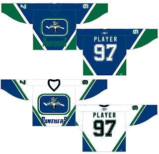
Yesterday we had black and neon green. Today we've got black and sky blue. If I haven't freaked you out enough yet today, just wait until you see this. I'm going to make this lousy post come full circle right before your very eyes. Behold.

From Panthers to Canucks. And I don't even have the words to describe it. No words would be worthy of describing it.

You'll tell your grandchildren this story. And you know it. Stay tuned. More is on its way tomorrow.

Tuesday
Aug212007

Poll: Stars vs Coyotes


vs
Dallas
STARS
Phoenix
COYOTES


Place your vote and then feel free to leave a comment as to how you came to your decision. Tell all your friends to drop in and vote! The more voices heard, the more accurate the results!

Poll opening date
Aug 21 @ 4:29 AM
Poll closing date
Aug 28 @ 11:59 PM

07CHTRN | #W1E | DALvPHX