NHL Tournament of Logos

Entries in fan art (328)

Wednesday
Aug082007

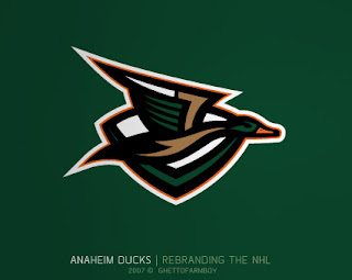
Amazing Ducks Concept Art

Earlier in the week I posted some awesome concept art that went over a storm with you guys. We saw designs for the Ottawa Senators and Boston Bruins as well as the New York Islanders and Atlanta Thrashers.

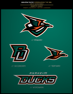
Today we're treated to some work on the Anaheim Ducks. These designs were based on concepts that "leaked" prior to the unveiling of the new Ducks logo last summer. Have a look and be impressed.
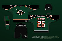
If you ask me, that's what the Anaheim Ducks should look like. And it couldn't be further away from the old Mighty Duck look. However, while the green is sharp, tan doesn't make for a vivid secondary color. So what about orange?

Our favorite designer upgraded his original logo with much more vivid colors. Can anyone deny this would be one killer logo package?

If the logos weren't enough for you, check out the uniform designs. Any NHL team would be lucky to look that good. How come this guy doesn't already work for the league?

Are there any Anaheim fans reading that would be repulsed by something like this? Would that even be possible?

Anyway, it's artwork like this that gets me so excited to do a blog like this. So what do you think? Am I going a little over the top with my glowing praise? Or are these designs really that good?

Wednesday
Aug082007

Advancing A Minnesota Concept

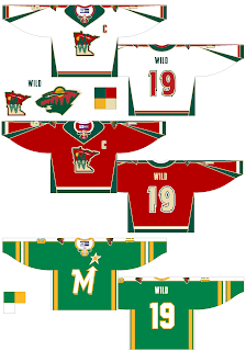
Last Friday I posted a concept design for the Minnesota Wild that featured a new secondary logo. It featured a cool lake scene inside the outline of the state of Minnesota. If you read any of the comments, you know it was a big hit.

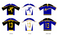
So apparently, that designer took another step with that design and created these.

It's pretty sharp though I still prefer the bear head design to the state design for the primary logo.

Then, how about that alternate jersey at the bottom? Any old North Stars fans out there feeling nostalgic? What do you think of that concept?

Wednesday
Aug082007

Sharks, Oilers Fans Design Jerseys

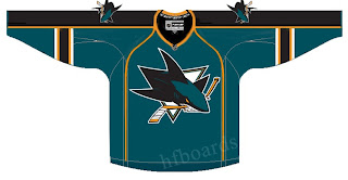
As usual, I have some fan-designed jersey concepts to post today. First, we've got a look at what someone thinks the San Jose Sharks new Rbk EDGE uniforms should look like.

As you can see, someone borrowed elements from the new Florida Panthers jersey designs. Notice the choice of not using the announced secondary logo on the shoulders. Instead they take one of the many other logos and use it. The one we see here is the version of the full shark biting through a hockey stick, sans the background triangle.

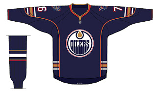
Then I've also got a concept for the Edmonton Oilers to share.

It's a nice design that toys with the current jerseys. Don't expect to see a design just like this as we've been hearing the Oil plans to drop the oil man shoulder patches this season. Regardless of that, I like it.

You all have any thoughts on either of these designs? Feel free to leave them in the comments.

Tuesday
Aug072007

Yet Another Leafs Concept

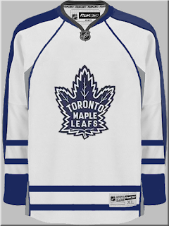
I posted this design on Sunday and another reader has emailed me his concept for the new Toronto Maple Leafs uniform. He tells me he based it off of the Nashville Predators new uniforms, so expect some of that piping that you all love so dearly.

Oh yeah, that's the stuff. I don't think it's terrible. It's a little similar to a design I posted on Friday with a few exceptions. This one doesn't have the drawstring collar and actually adds silver up the sides along with vertical stripes. The blue also seems to go the length of the sleeve as opposed to covering just the shoulders.

Any feelings on this one? Is all the speculating making you crazy? Should we stop and just wait until the Leafs feel like unveiling the jerseys? Leave your thoughts below.

Tuesday
Aug072007

Hurricanes Concept In Black

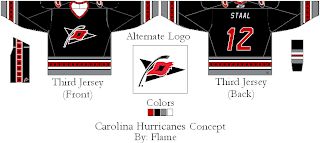
Thought this was cool. I know there won't be any third jerseys this season, but one fan came up with a notion for a black alternate uniform for the Carolina Hurricanes. It's far out.

This looks good to me because the Hurricanes are just so... red! No redder than the Red Wings, mind you, but stil very red. Sometimes all the red gives me a headache. This design tones down the red, like, a lot. Any Hurricanes fans reading? What do you guys think? Worthy of a third jersey? Worth of a primary jersey? Or worthy of nothing more than a trash bin?

Tuesday
Aug072007

Mailbag: More Lightning Logo Concepts

With the news breaking today that the Tampa Bay Lightning have been sold, I thought it'd be a good time to share some fan artwork I've received recently.

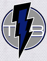
John emailed this design which is basically the allegedly leaked new Lightning logo that's been making the rounds, with a slight alteration. Instead of plastering Tampa Bay over the top of the bolt in weird lettering, he suggests going with "TB" on top of it all.

It's a cool idea. Personally, I like the TB but I'm not sure if I'd like to see anything on top of the lightning bolt itself. What do you guys think?

Then there's this design which puts the "TB" underneath the bolt. It also makes the bolt more vertical and in black and blue as opposed to white or white and blue. Would something like this work?

If you ask me, I'd like to see something entirely different from what we currently have so I can better judge. Perhaps not the giant "L" logo, though. I posted that design on Saturday. Along with it, the designer also sent jersey designs

As you can see, yellow might not be the best color to add to the Lightning uniform. But then I think he realized that and tried to correct himself.

He came up with this design, which features gray as a replacement. I don't know, though. I think it still leaves something to be desired. I do, however, like the lightning on the sleeves.

I don't know. I was always a fan of those late-'90s third jerseys that featured the storm scene. If there was some way we could revisit that without making the uniforms look silly, I'd be all for it.

Monday
Aug062007

Cool Sens Concept, Bruins Too!

A lot of people responded well to the Islanders concept art I posted yesterday. It came from the artist who also designed the Thrashers concept art from Friday. (NOTE: I updated that post with higher-resolution graphics if anyone's interested.)

Anyway, I have some more work from that same artist who posted his work on Chris Creamer's Sports Logos Community. As a disclaimer, I need to point out that none of this is official team artwork, but I thought it was fun to look at just the same.

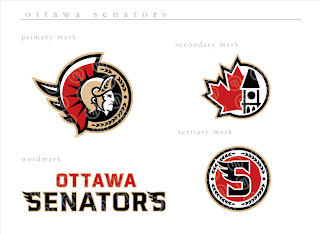
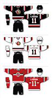
This logo set appears to be merely a revision of the current look of the Ottawa Senators. Personally, I prefer leaning more toward the yellow-gold over the beige color seen here. That's not to say that this color scheme doesn't work well, though.

Do you guys like this designs, the current one, or the one rumored to be taking over in the fall?

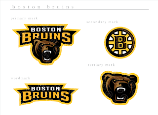
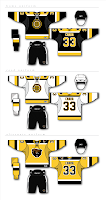
Next, we have a look at some logos that are irrelevant when you consider the Boston Bruins just changed their logos back in June. But have a gander anyway, if you're inclined.

If you ask me, that's a pretty sweet Bruins logo, setting aside the fact that a drastic change like this would likely send the Boston faithful into a frenzy. I'm not sure how I feel about the re-imagining of the spoked "B" though. It isn't sitting well with me.

I'm loving the bear, though no one's asking me, and wondering whether I like it more than the new one that was unveiled a couple months ago.

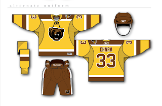
And then for those of you longing for the days of the yellow and brown, our talented designer leaves us with this other alternate uniform design.

Monday
Aug062007

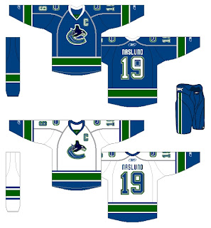
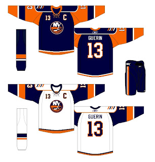
Fan-Created Canucks, Isles Jersey Designs

I know I've sort of been beating a dead horse with these two teams, but I've got a couple more fan concepts for the Vancouver Canucks and New York Islanders. These Canucks uniforms seem to be based off of speculation regarding the new sweaters that we have yet to see. Word on the street is Vancouver is keeping the orca logo but reverting it to the traditional blue and green colors.

Supposedly, the new Canucks jerseys will be officially unveiled later this month. But with no official date from the team at this time, it's difficult to say when we'll actually see them. And from what I understand Vancouver fans everywhere are on pins and needles waiting for word. (Guys, as soon as I know, you'll know.)

Then, from the same artist is this uniform set for the Isles. It appears to be based off that alleged cell phone photo that is now everywhere.

I'm still on the fence about it. It could work, but I think simpler is better in this case.

Remember, if you have any artwork of your own or which hasn't been posted on this blog, feel free to send it along and I'll try to post it at some point. You can submit questions, comments and fan art at nhllogos@gmail.com.

Monday
Aug062007

Possible New Blues Jersey?

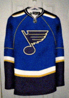
I've been getting lots of emails the last few days. Among them was this photo (?) which may or may not show the new St. Louis Blues Rbk EDGE uniform.

I don't know why, but it doesn't feel all that... real... to me. Perhaps it's the cynic in me having been drawn out by all the other fictional works we've been treated to lately? I'll say this, though. It does seem an awful lot like this Detroit design I posted Saturday.

What do you think? Will this be the new Blues jersey or are we looking at another fan-created, Photoshop-assisted design?

Monday
Aug062007

Mailbag: Flames Concept Logo

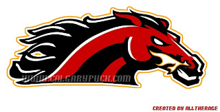
I had a reader send in this Calgary Flames logo which seems pretty cool. It gives a new perspective on the recent secondary logo that featured a horse with flames in its nostrils.

Flames fans might also notice the similarities between the flames coming off the traditional "C" and the mane of the horse in this fan-designed concept logo. It's pretty sharp. But can anything really be better than the flaming "C" or should the Flames go in this artistic direction?

As a side note, it also seems that we'll be getting a first look at the Calgary Flames new uniforms at the Flames Celebrity Charity Golf Classic on September 4. I can't completely vouch for the reliability of this info, but what could it hurt to add it to the sidebar countdown? Check it.