NHL Tournament of Logos
Entries in fan art (328)
An Abundance Of Islanders Art
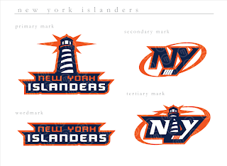
Every so often I find myself with just so many images for one team I feel like getting them all posted in one shot. Today that team is the New York Islanders. Remember that Atlanta Thrashers artwork I posted on Friday? Well, I've got more from that same artist (who's apparently been posting his awesome work over at the SportsLogos.net message board.
If you ask me, that's a pretty nice set of logos. Isles fans?
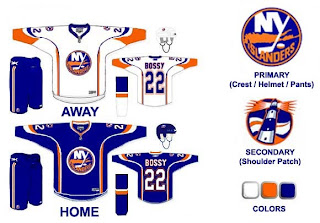
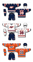 This is the uniform set that goes with those logos and they're just as cool. I really like the lighthouse as a primary element. I don't think you can lose the "NY" altogether because that's just one of those things that's always been there and it really does look good.
The Islanders tried out a lighthouse logo back in the mid-'90s when they switched to the fisherman logo. But nobody liked the fisherman, so they reverted back. I don't know why they didn't keep some version of the lighthouse, though.
In fact, this next design makes use of that lighthouse. Before you look, though, just know that it is a design based off the dreaded all-star jersey template.
I like that its a Mike Bossy jersey. Good stuff. The only problem is, those logos don't really go well together. The waviness of this lighthouse logo just went better with those mid-'90s jerseys. I'm curious to know what Islanders fans thought of those — and this jersey design. Though I think the designer is trying to subliminally mess with your sense of nostalgia by placing Bossy's name on the back.
 I'm just about done here. This is another example of a lighthouse-based logo. It doesn't necessarily have to be the primary mark, but I think it would make a good secondary logo. Put it on the shoulder patch or something. This one isn't extremely well-balanced for a sports logo, but I had it so I thought I'd post it.
One last thing and then I'll leave you and the Islanders alone for a while.
 Sorry I don't have a larger size, but a reader emailed this logo to me. It's got some neat elements but I'm not sure what it would be for. Perhaps a seal logo for hats and t-shirts and the like.
To sum up, it's a lot of cool fan artwork and absolutely nothing official from the team. Sorry to disappoint, but nobody has been saying anything official these days and I still want to keep posting new stuff on the blog. So the only way is to post fan designs in the interim while we wait. As always, I'll be sure to let you know when something official is announced. Until then, enjoy the fan artwork, and feel free to submit any of your own.
New Stuff For Ducks, Canucks
Got some fun stuff for your Sunday. The first is a jersey design for the Anaheim Ducks that playfully (and pitifully) attempts to look like a "leak." Thought it was funny.
The designer himself said it's a manipulation of the old Nashville road jersey. As far as the webbed duck foot "D" logo, I'm really hoping its what Anaheim goes with this season. I've heard that they will be dropping the wordmark on the uniforms, but we have yet to see anything official from them. Anyway, enjoy this and try not to take it seriously. It's not the real thing.
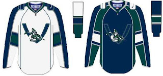
Looks like another fan came up with this concept for a new Vancouver Canucks uniform.
It seems to borrow from the newly unveiled Florida jerseys. It's not a well-balanced logo, but what do you Canucks fans think? Would you like to see something like this? Or do you prefer the orca logo, which we're hearing will stay on the new Rbk EDGE jerseys (in new colors)?
And for everybody else, what do you think about all this stuff? Don't be fooled. None of it is actual team artwork — just fan-created fun. But do you think it's good work? Or should it have stayed in the minds of these fans and off this site? Be gentle.
Mailbag: Senators Fan Art
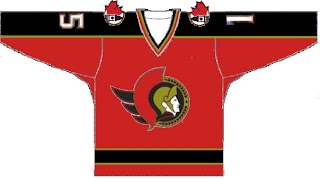
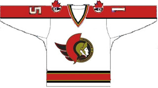
I got an email this afternoon from Pat with some neat fan art for the Ottawa Senators' uniforms. They have some slight similarities to work I posted back in June, but nevertheless, it's always nice to share.
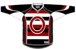
Those two aren't in the Rbk EDGE cut, but this next one is. Though some among you will complain about it being set in the template of those now-infamous all-star jerseys, try to deal. It's an alternate harkening back to the original Sens from back in the day.
I think the stripes would drive me nuts. Sharp design for the '20s but I don't think it would go over very well today. Feel free to leave your comments for the designer.
And as always, if you have fan art of your own or would like to get in touch, email me at nhllogos@gmail.com.
Deplorable Detroit Design
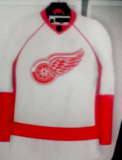
Not sure exactly where I first saw this design for the Detroit Red Wings new Rbk EDGE uniform, but not to worry, I'd bet money on it being a fake.
Now you can see why. It is rather ugly. I mean, like, really, really ugly! Scary ugly!
But what do you think? Is it really as bad as I'm making it out to be or would something like this work for the Red Wings?
Mailbag: Lightning Fan Concepts
A few people have responded to yesterday's post about the St. Pete Times requesting fan designs for the new Tampa Bay Lightning logo. I've received a couple of designs I thought I'd share.
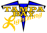
The first one comes from Doug and its simply the current primary logo sans the text.
It's very plain and it feels unbalanced. It's better than having the text, though, if you ask me. Then Michael emailed in with a completely new concept. And he likes yellow.
It sort of reminds me of a '50s high school jacket. What do you guys think? These two were also part of that set. Feel free to continue sending in your concept designs and I'll continue posting them.
By the way, if you've desgined a logo or uniform for another team and would like to have it posted, send it along and I'll put it up here. You can email me at nhllogos@gmail.com.
Design Your Own Lightning Logo
 All right, one final post for today and then I think I'll rest for a while. As you may or may not know, it is believed that the new logo for the Tampa Bay Lightning was leaked a few weeks back.
By and large, fan response hasn't been great. So as a way of letting people vent or something, the St. Petersburg Times is asking readers and fans to design their own Lightning logo and submit it for future posting on their web site. You can find more information on Damian Cristodero's Lightning Strikes blog.
I thought this was really cool and I recommend that anyone, Lightning fan or not, who has a concept to submit it. And if it wouldn't be too much trouble, email it to me as well. (I can offer the instant gratification of posting it within hours.) You can email me at nhllogos@gmail.com if you're interested.
More Thoughts On The Wild
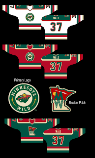
After I posted a Minnesota Wild uniform design yesterday, a reader pointed out another bit of fan artwork that made use of a really cool take on a secondary logo for the club.
If you ask me, that shoulder patch is seriously awesome! Like the Coyotes, I always thought the Wild would be a good team to use the outline of their home state in a secondary mark. This is just one example of how well that can work. This design is of major professional caliber if you ask me. I'd be surprised to discover it wasn't a pro behind it.
Anyway, I wanted to make sure this got posted today because I thought it was very interesting. Wild fans, I'm curious to know what you guys think of this concept. Could you see your team wearing these uniforms or are you happy with what they've got?
Oh, Canada!
I just posted Maple Leafs news with a tidbit about the Oilers' unveiling date. But wait! I have three more Canadian teams to work in today. Let's start out with the Montreal Canadiens because I haven't really had anything to post for them.
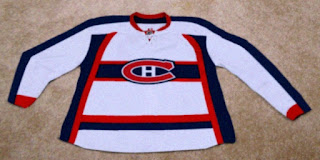
This is allegedly a photo of the Habs' new Rbk EDGE road jersey. But so much about it jumps out at me indicating that its not the real deal. First off, it's ugly as fuck (pardon that, please). Apologies to the person who designed it, but the stripage — yeesh! Anyway, the color at the cuff is off and the whole thing just feels very... fake, to me. Anybody else getting that feeling?
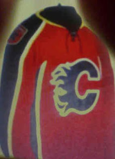
Next, we have another alleged photo of a Calgary Flames home jersey.
Don't we love how all these photos look so crystal clear? I get that many cell phone cameras are substandard, but are we to assume that everyone who has sneaky access to the new uniforms can't afford better than a $20 phone? And, exit soap box.
It's an interesting design and one that feels like something we've seen before. Anyway, if anyone can cull anything from that secondary logo, let us know. Can we find it on the shoulder of some minor league team someplace? Or are the Flames actually getting a new one as the horse with the flaming nostrils meets his maker?
Finally, I wanted to leave you with something to laugh at. It is in fact a Photoshop job, just as the upper right corner of the image informs us. The designer was just adapting a photo to the potentially leaked images we saw the other day if for no other reason than to supply us with a better visual.
So what are your thoughts everybody? The only other Canadian team I didn't cover today is the Ottawa Senators but we took care of them on Wednesday.
A Peek At The New Leafs Jersey?
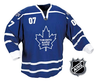
While making my rounds on the various message boards, I recently bumped into the image below which is being touted as a sneaky photo of the new Rbk EDGE jersey for the Toronto Maple Leafs.
As we've come to expect, it's blurry and doesn't show very much but for a number on the front of the sweater a la the Buffalo Sabres' new unis. Obviously, it's not out of the realm of possibility that this is the artistic work of a fan.
For one thing, I've been hearing for a very long time that the Maple Leafs are planning to update or modernize the logo. The one we sort of see here appears to be no different from what they've been using. Ah, but fear not, faithful Leafs fans, it won't be a drastic change. They do update it every couple of decades or so, so it's probably due.
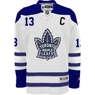
Anyway, while I'm on the topic of fan-created artwork, a reader sent me this image he made based off of the Boston Bruins' new road sweaters.
It's pretty solid. What do you guys think? Would you like to see Toronto in something like this or something completely new and different just to changes things up?
By the way, just as a side note, I added the Edmonton Oilers to the uniform countdown. A reader wrote in saying that the unveiling date is said to be September 17, the day of the team's first preseason game. Despite there being no official word from the team on this matter, I'm tempted to say that date is rather solid considering they wouldn't wear their old uniforms for a preseason game anyway. If it comes sooner, though, I'll surely let you know.


 Sunday · Aug 5 · 2007 | 11:29 AM PDT